<?xml version="1.0" encoding="utf-8"?>

Selection controls are an essential part of form design. They make forms easier to fill out and standardize the data collected. Usable, efficient forms improve conversion rates and stop deterring users from interacting with your product.

Mastering which selection controls to use in which situations makes your forms more usable. Understanding which icons to use for which selection controls is an important aspect of form design as well.

Exercise #1

Multiselect control

Multiselect control

There are two main types of selection controls: checkboxes and radio buttons. Checkboxes are the only selection control that allows users to multiselect more than one option or go with zero options. Individual checkbox selection doesn't depend on whether other checkboxes in the list are checked or unchecked.

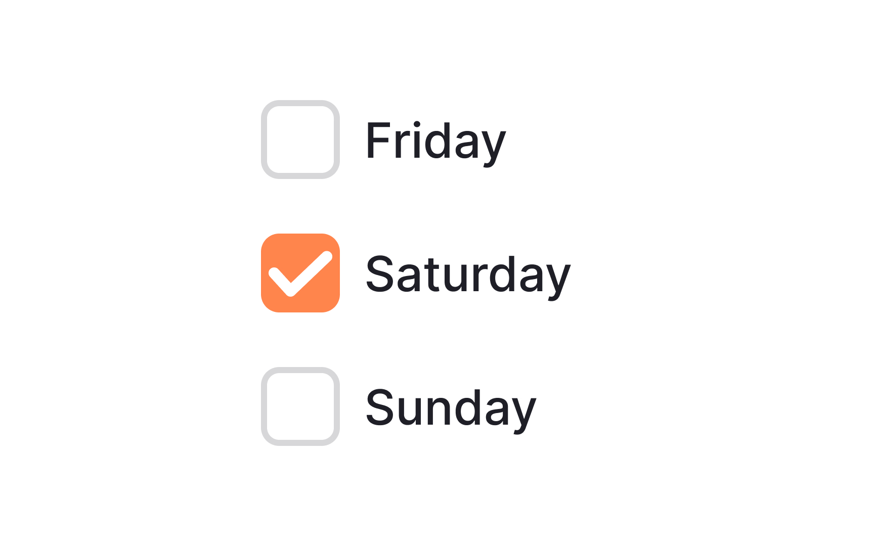
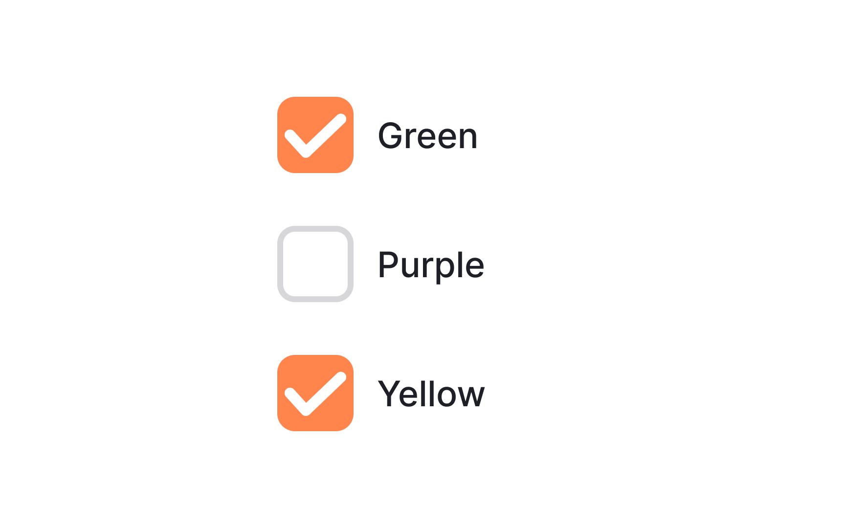
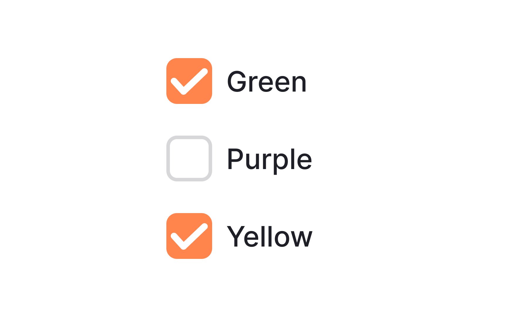
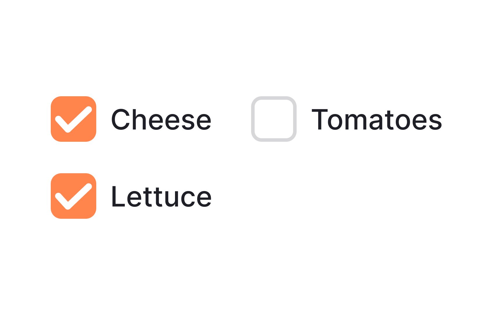
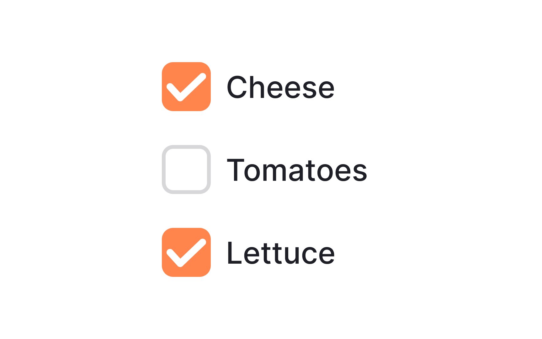
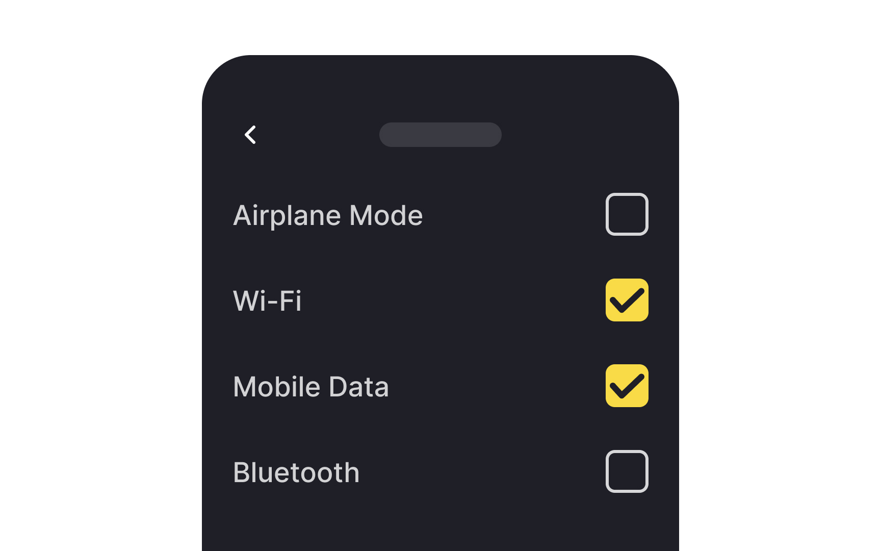
You can use a standalone checkbox to enable or disable an option, such as granting permission to email on a newsletter signup form or agreeing to terms and conditions.[1]

Pro Tip: If you have multiple checkbox options that are related, consider including the Select/Deselect All buttons.
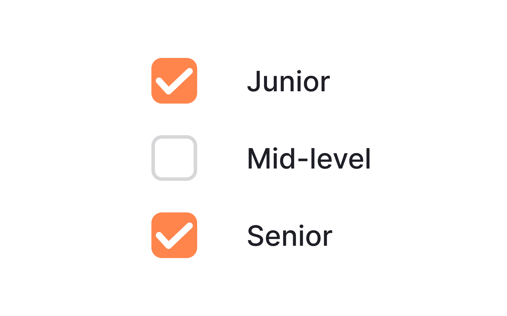
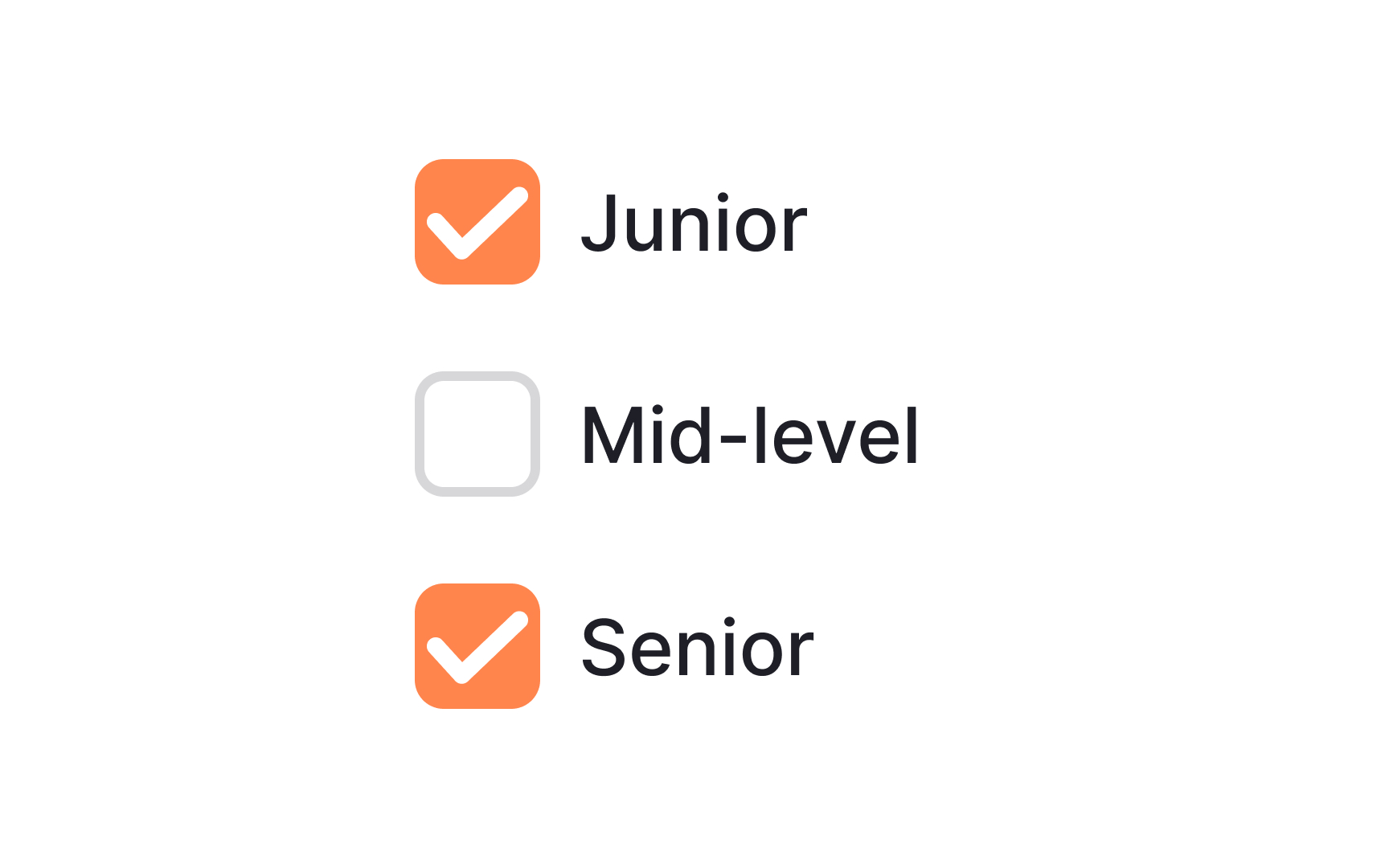
Exercise #2

Checkbox icon

Checkbox icon Bad Practice
Checkbox icon Best Practice

Checkbox icons should be square, with a checkmark or an X to indicate selected checkboxes. While it can be tempting to create a unique icon shape, unified elements provide consistency across systems. Square checkboxes mean your interface will be intuitive for users, and they won’t have to spend time familiarizing themselves with your product’s UI.

Exercise #3

Indeterminate state

Indeterminate state

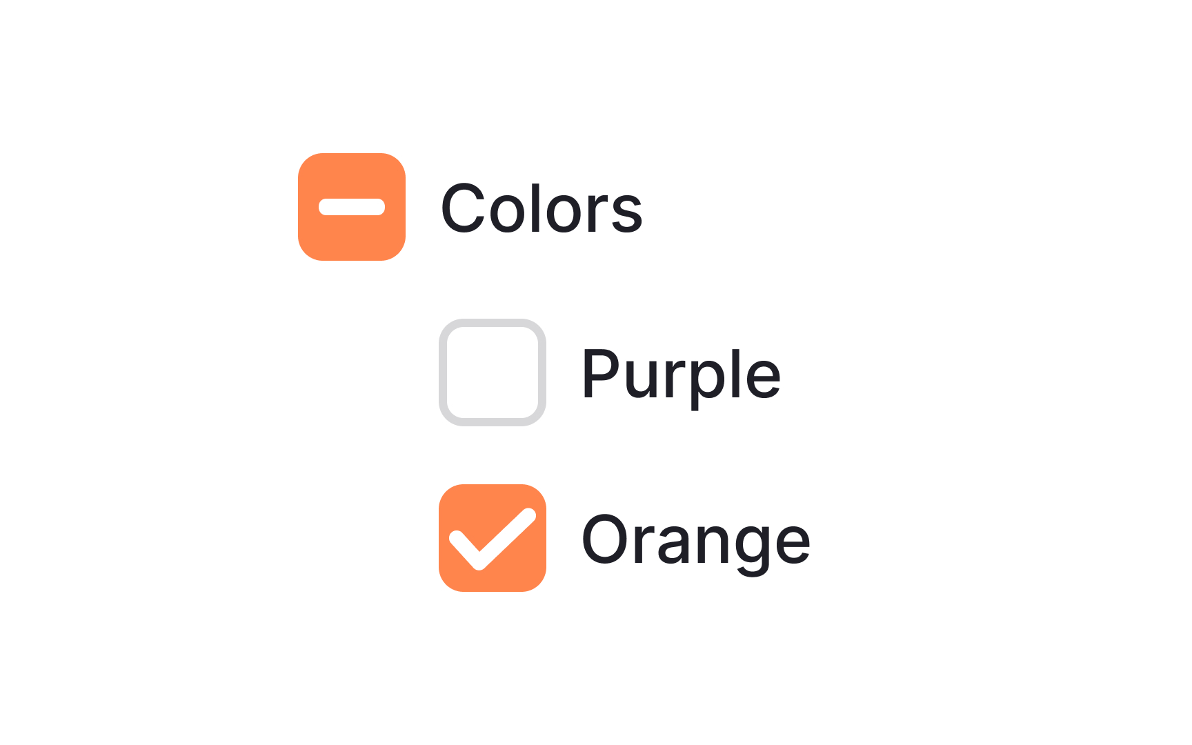
When a checkbox has multiple “child” checkboxes below it, and some are checked while others aren’t, the parent checkbox will be displayed in an indeterminate state. It’s generally signaled with a horizontal line or square.

Exercise #4

Single-select control

Single-select control

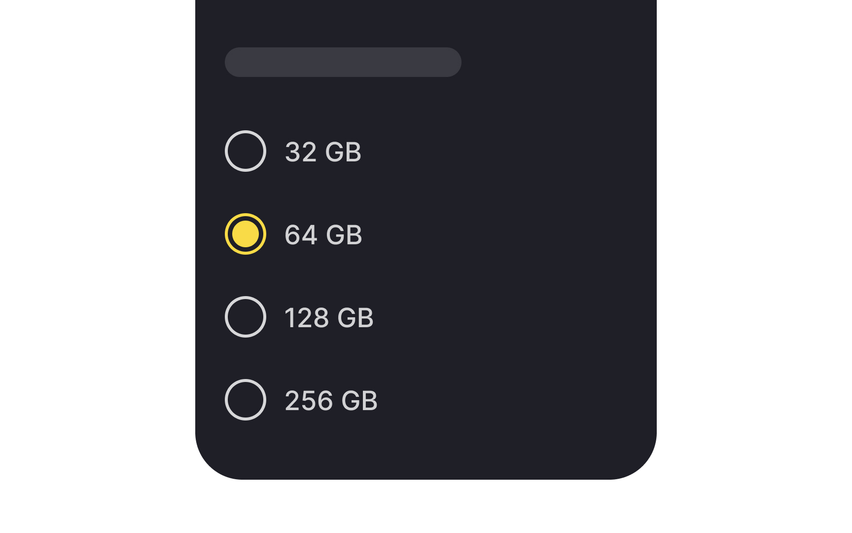
When only one option can be selected, it makes sense to use radio buttons. You might need single-select options for things like payment methods, delivery types, or similar options where more than one selection would create confusion.

In contrast to checkboxes, radio button options are mutually exclusive, and selecting one option deselects any other button previously selected in the list.

Pro Tip: Never use radio buttons for commands that should take immediate effect.

Exercise #5

Radio button icon

Radio button icon Bad Practice
Radio button icon Best Practice

Radio button icons are round, based on the physical buttons on early radios. They’re outlined circles with a dot or solid circle inside to show the selected option.

As with checkboxes, it’s important to stick to this standard design for radio buttons to prevent confusion among your users.

Exercise #6

Icon shape

Icon shape Bad Practice
Icon shape Best Practice

Icon shape is important when it comes to selection controls. Sticking to conventions (square for checkboxes, circles for radio buttons, and rounded rectangles for switches) makes your UI way more intuitive for new users and helps eliminate confusion about how to interact with your forms.

Exercise #7

Label size

Label size Bad Practice
Label size Best Practice

Your label size needs to be large enough for your users to easily read them when filling out a form. While the ideal size varies between platforms, 14px is generally a safe bet. Play around with the weight and color of your labels to make them stand out less prominently than body text while still keeping them readable.

Exercise #8

Labels should be actionable

Labels should be actionable Bad Practice
Labels should be actionable Best Practice

To improve usability, create actionable labels for things like checkboxes or radio buttons. Actionable labels are clickable, meaning users can click anywhere on the selection to activate it. Make sure clickable areas are large enough for people to hit comfortably, especially on touch interfaces. On desktop UIs, indicate that the label is clickable by using the pointer cursor.

Exercise #9

Label margins

Label margins Bad Practice
Label margins Best Practice

It’s important to include enough white space around your selection controls and labels so that they’re not crowded and are easier to scan. Label margins separate the label from the selection control, giving them breathing room and allowing users to complete forms faster.

However, large margins make it hard for users to tell which label corresponds to which selection control, especially if the list of options is long.

Exercise #10

Label commands

Label commands Bad Practice
Label commands Best Practice

Labels serve one primary function — to save users from having to think. That means it’s vital for you to avoid using ambiguous, potentially confusing label commands. Start your labels with a keyword (often a verb) and cut out any excess phrases or questions.

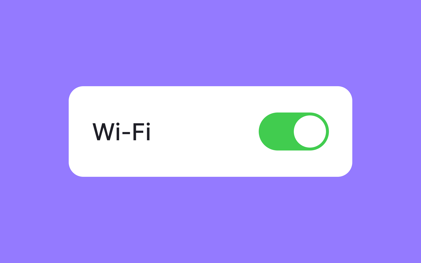
Labels should be short and to the point, and in the case of switches, they should indicate what happens when the switch is on. You can check if it makes sense by reading the label out loud and adding "on/off."[2]

Exercise #11

Checkbox alignment

Checkbox alignment Bad Practice
Checkbox alignment Best Practice

Align your inputs on a single column towards the left side of the screen. Why? There are two reasons:

  1. A single, vertical line is easier to follow.
  2. Studies have shown that users in left-to-right languages tend to scan pages starting from the left part of the screen.[3]

You can still use a horizontal layout, but your buttons and labels should be arranged so that users can tell without trouble which choice corresponds to which label.

Exercise #12

Mobile toggle switch alignment

Mobile toggle switch alignment Bad Practice
Mobile toggle switch alignment Best Practice

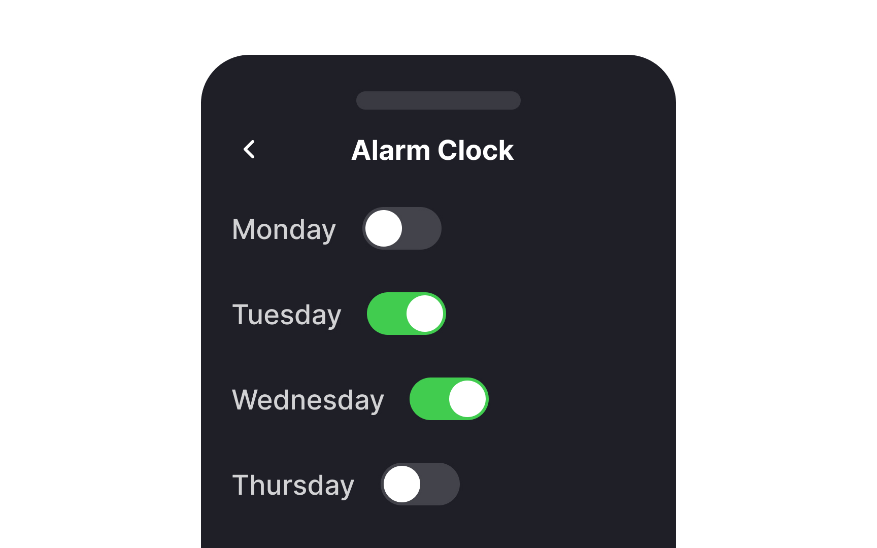
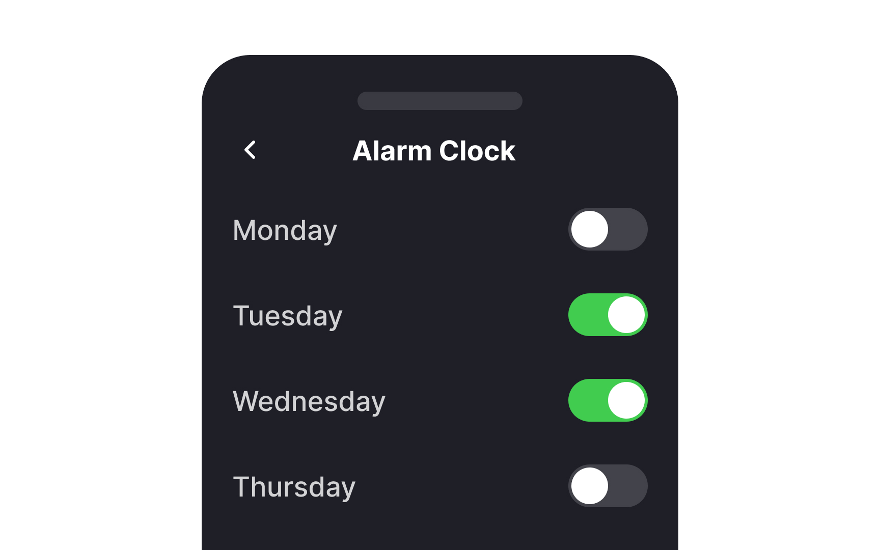
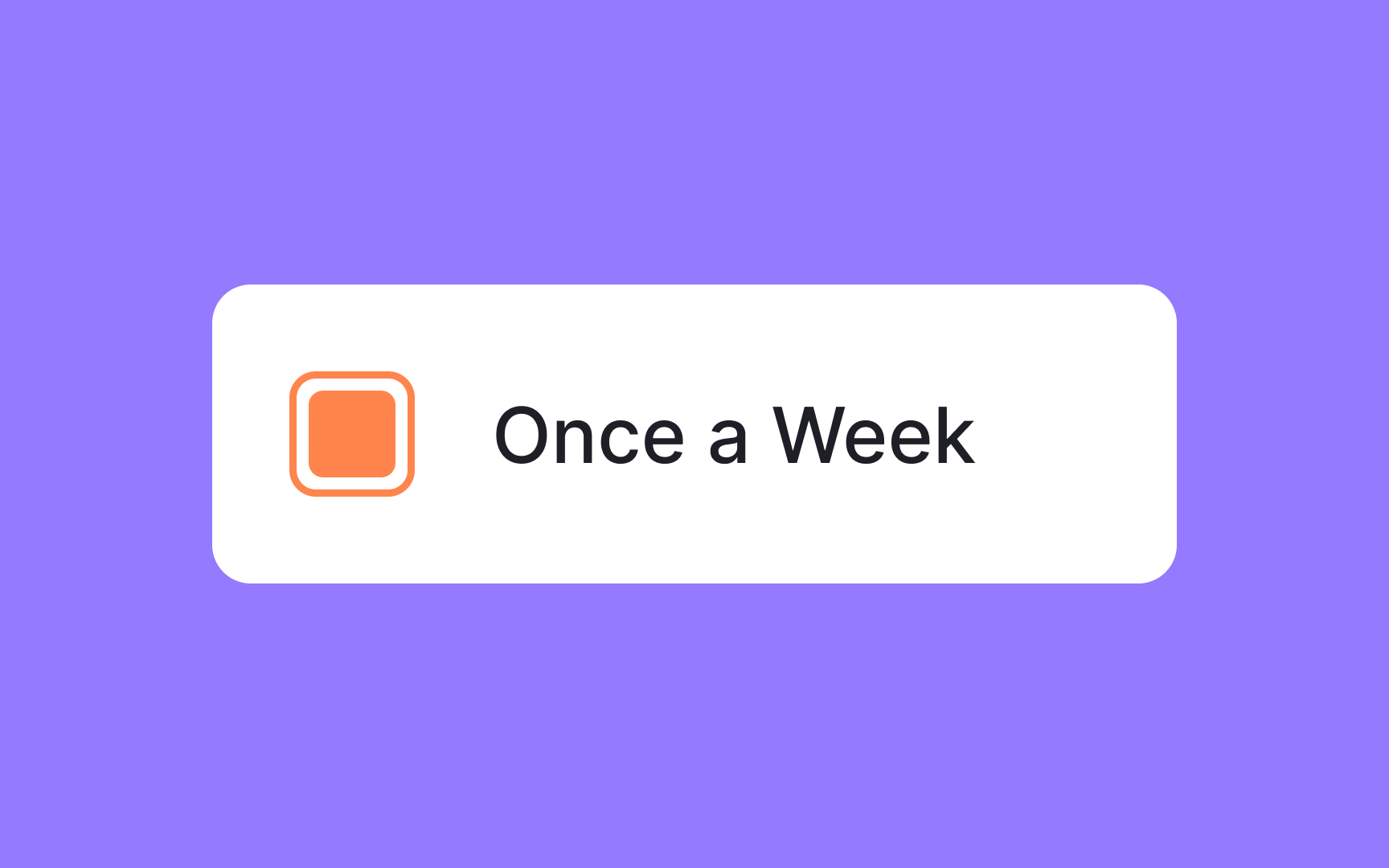
When using switches to toggle options on and off on mobile devices, be sure to align those switches to the right-hand side of the screen while keeping the
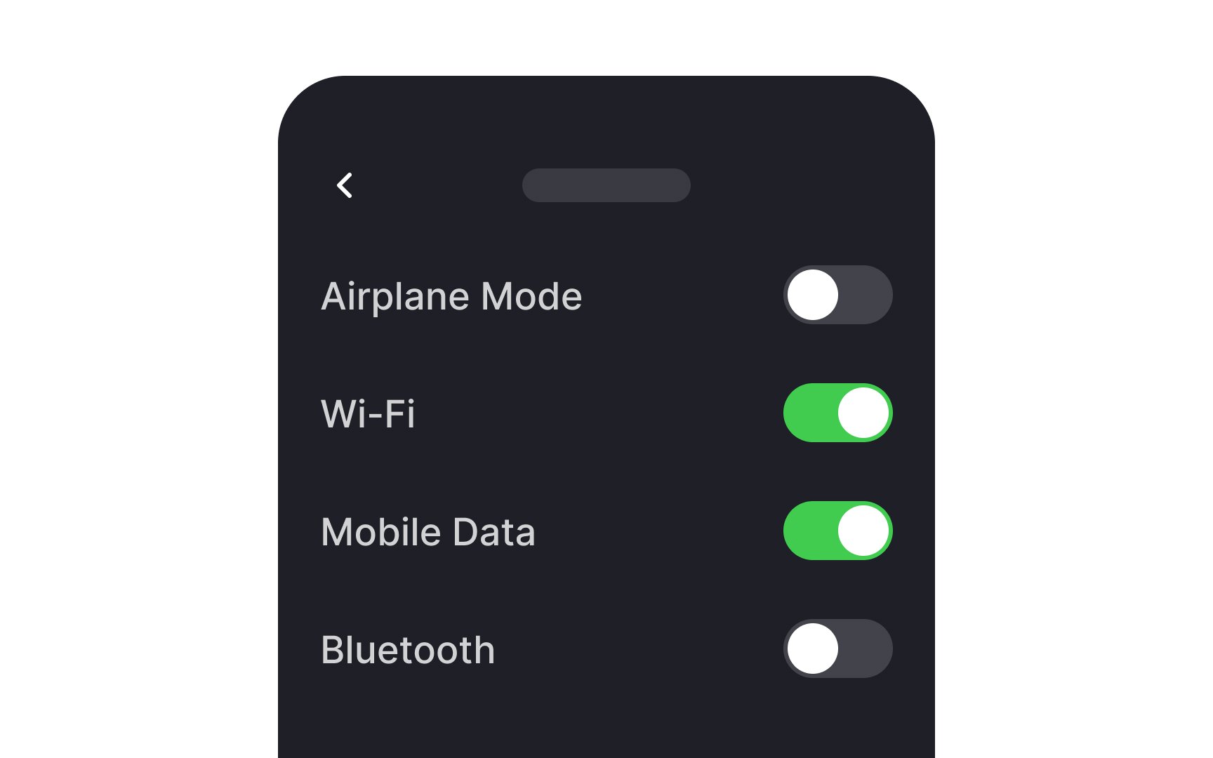
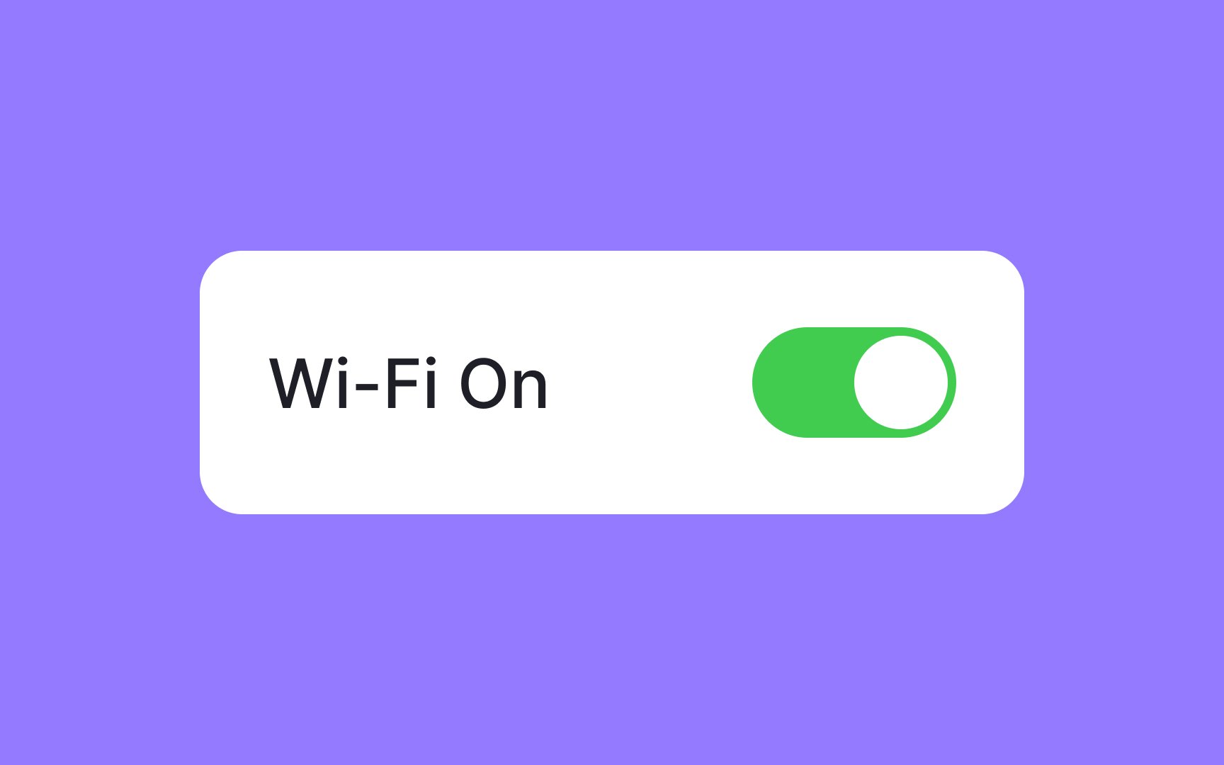
 labels aligned to the left-hand side. Because of the varying sizes of devices' screens, this kind of mobile alignment makes interfaces easier to scan and use.

Exercise #13

Toggle switch

Toggle switch Bad Practice
Toggle switch Best Practice

Toggle switches are selection controls that provide only two mutually exclusive options (usually "on" or "off") and always have a default value.

Toggle switches are the best solution for changing system settings where feedback is immediate, such as turning on dark mode or airplane mode.

The selection of a toggle switch takes effect immediately. On the other hand, after selecting a checkbox option, users have to press the Submit button.

Complete this lesson and move one step closer to your course certificate