Intro to Design Elements
Dive into the world of design elements, fundamental building blocks of visual design that are combined to create compelling compositions
All designs boil down to the most basic elements: planes, points, and lines. Combining those design elements, and adding volume to them as needed, can give you an infinite number of geometric and organic shapes to work with in your designs.
Learning how to take advantage of these basic elements presents a wealth of options for your designs. You can use them for everything from backgrounds to interactive elements to placing emphasis on specific content.
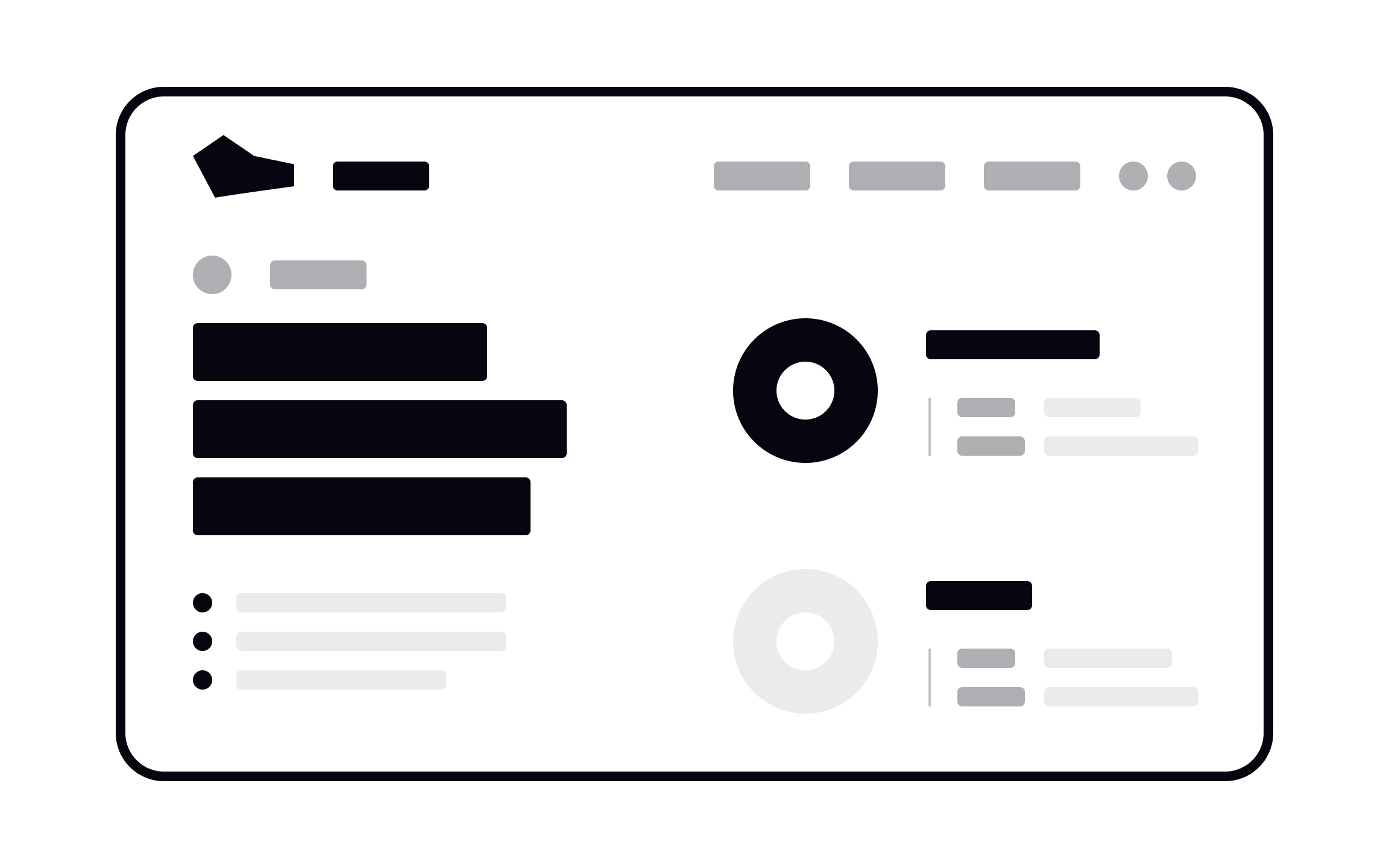
Designers combine basic building blocks — elements — to create their products. The most basic of these elements are dots, lines, and planes, all of which can be affected by the volume property. When working with these, artists and designers can create images, icons, textures, patterns, diagrams, animations, and typographic systems, among others.
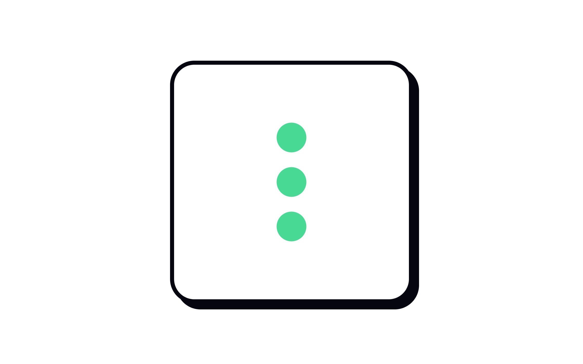
Points form the basis of every other design element. In math, a point is a set of coordinates indicating a position. It has no height, width, or depth — it’s invisible. In design, we use dots to indicate a point.[1] These dots direct and focus attention or create emphasis. We can combine dots to create interface elements (such as kebab menus).
Technically speaking, all other elements are created by combining dots and points. A line, for example, is simply a series of tightly overlapping dots connecting two points.
A line is one of the most basic
In design, lines are often used as dividers or to outline something like an
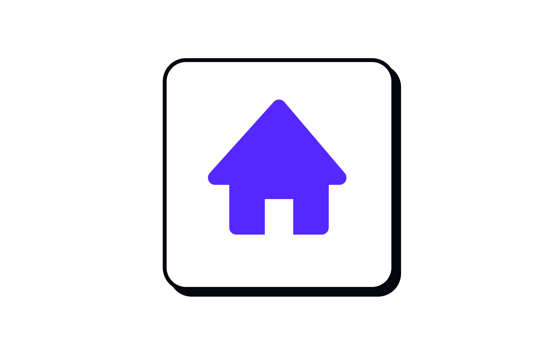
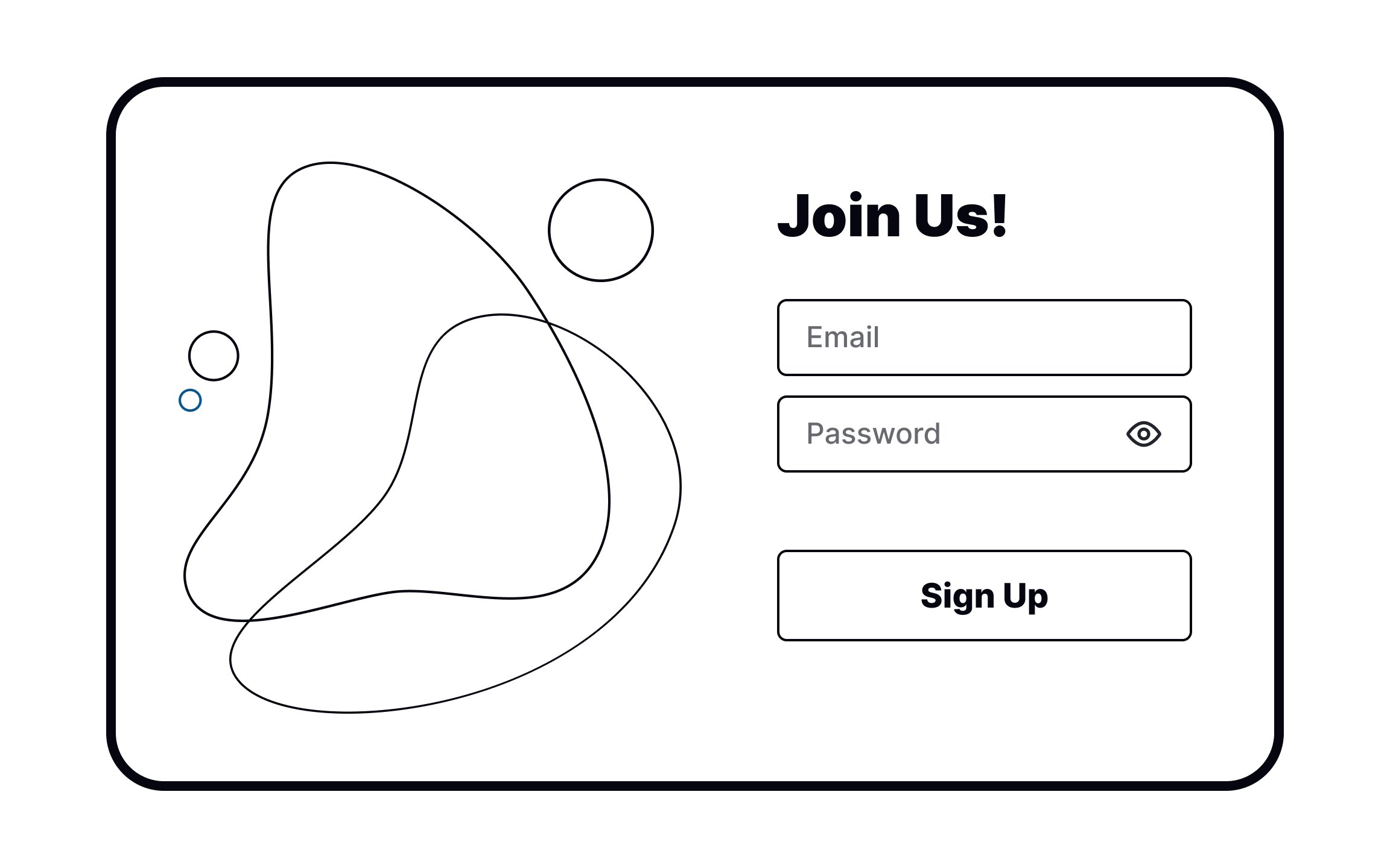
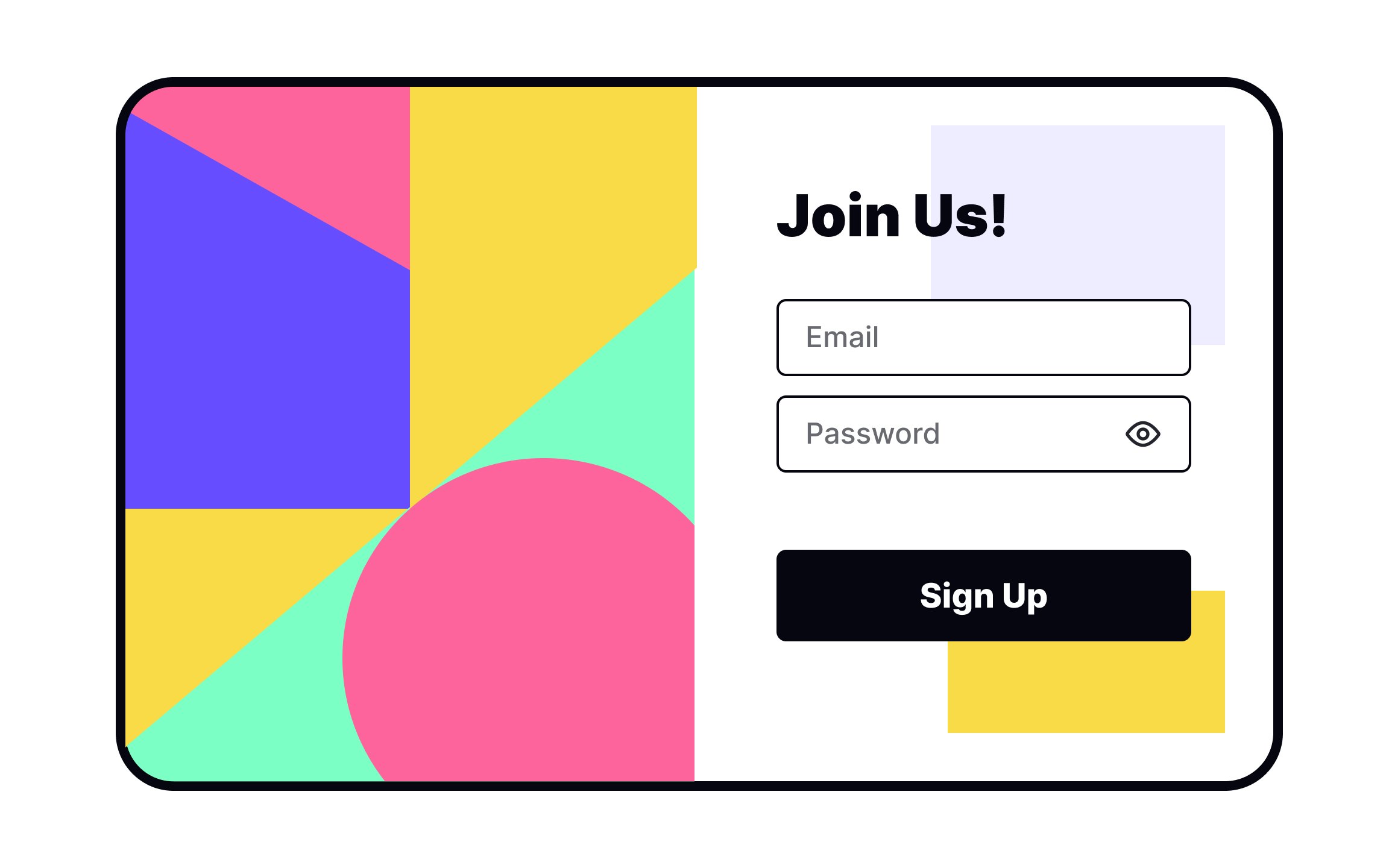
In design, planes are flat enclosed areas created through lines, textures, and colors. They can be made in any shape you choose.
Planes are excellent compositional tools for clustering elements into visual fields or, on the contrary, separating unrelated information.
Pro Tip: All UI components consist of simple geometric planes and lines. The arrangement of these planes determines how users interact with them.
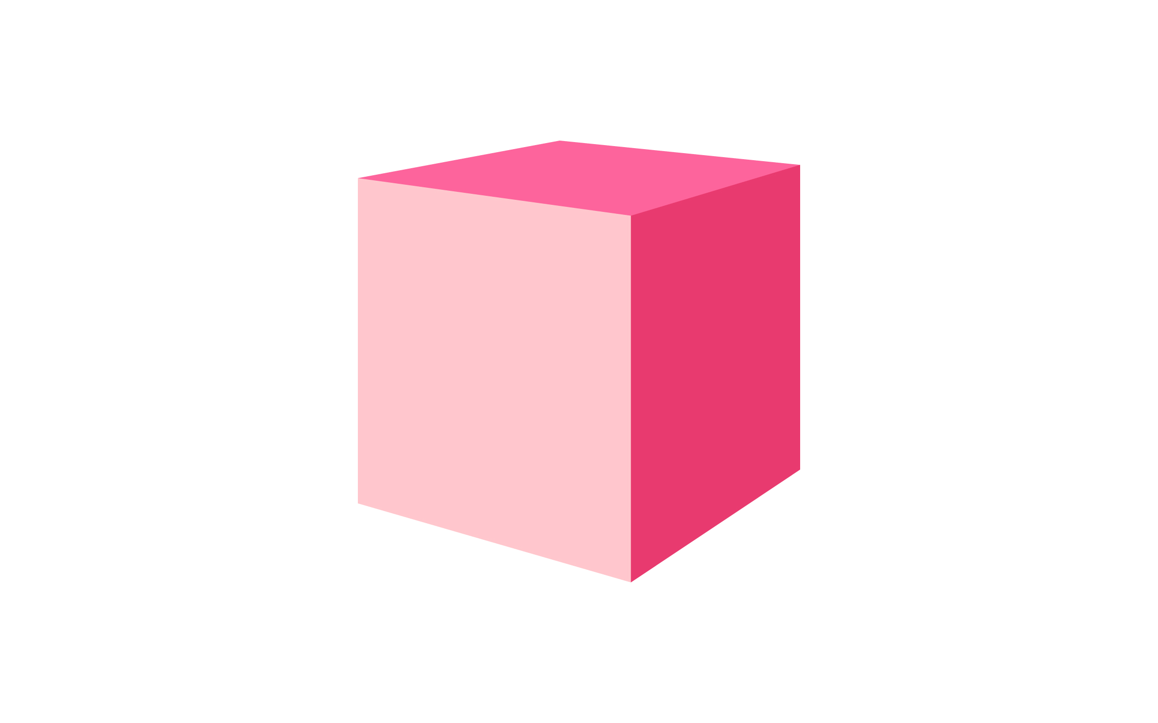
Three-dimensional objects occupy space — they have volume. For rectangular objects, volume is a product of their length, width, and height.
Adding a third dimension to your designs can create visual interest and make elements stand out. You’ll need to have a good understanding of perspective to create these objects (or rely on 3D compositing software), but they help achieve amazing results.
Pro Tip: A well-executed 3D design can be used for attracting user attention.

Dots are one of the simplest
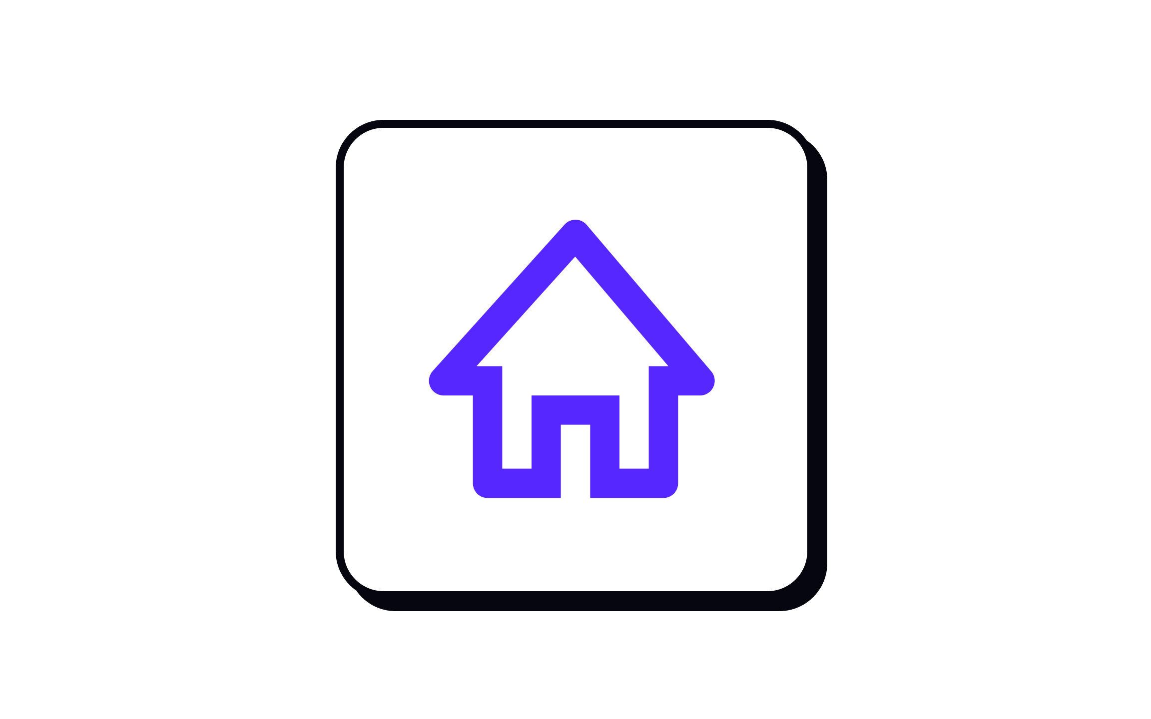
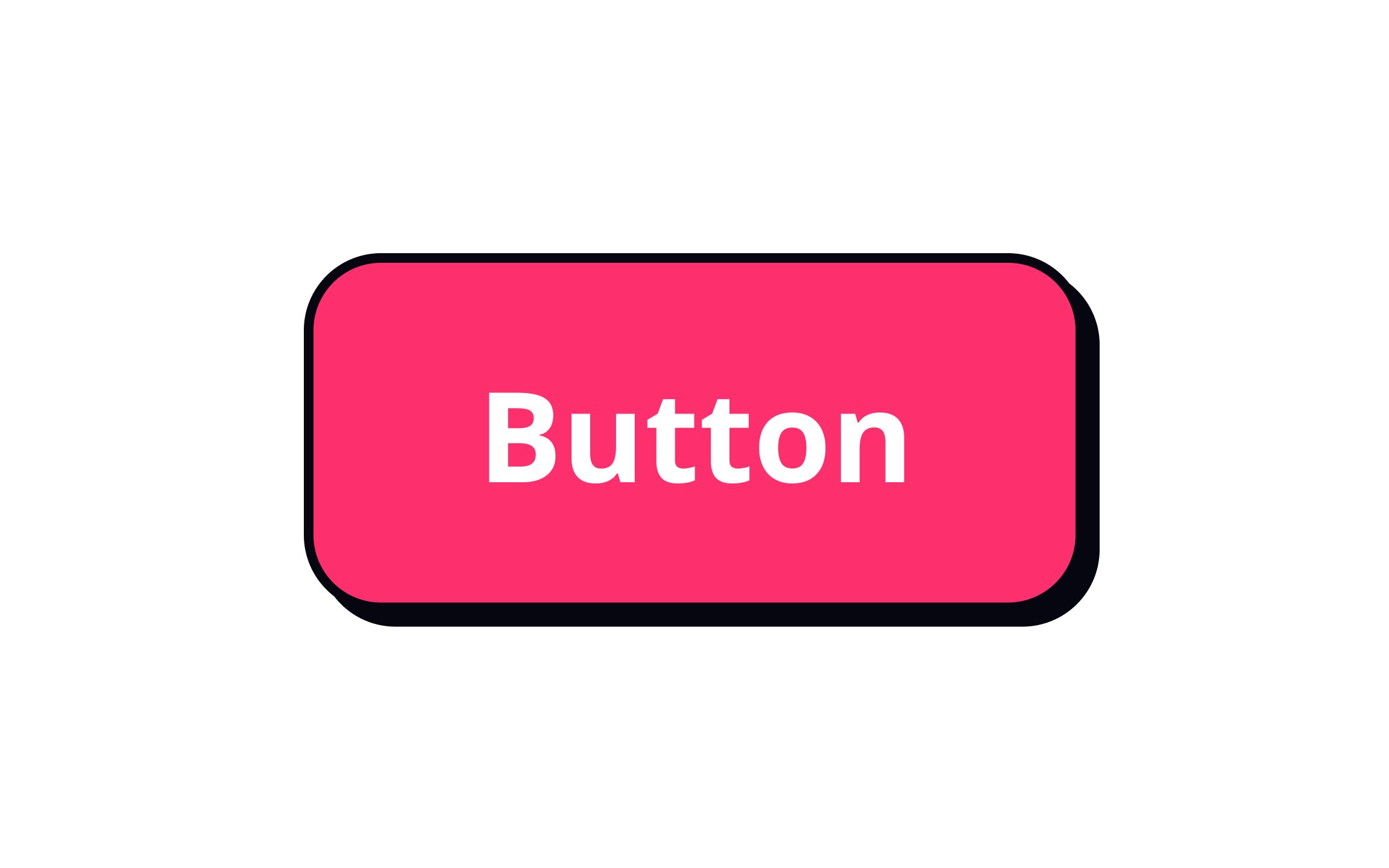
Linear elements consist of lines only with no internal fill. Examples include Like or Comment

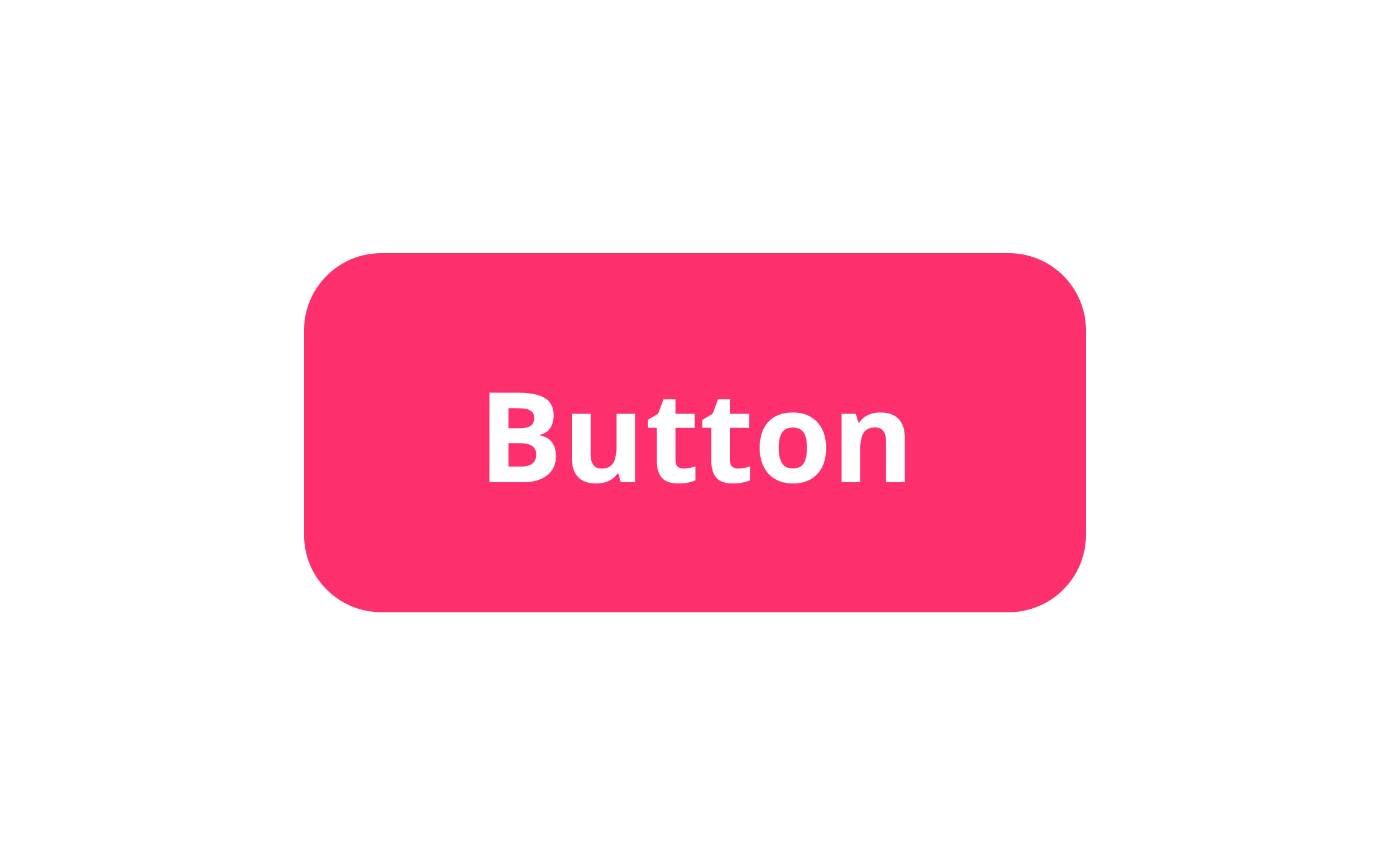
Solid shapes — planes — can be faster to recognize than outlined ones, as they appear more like physical objects. That said, you may want to use outlined versus solid
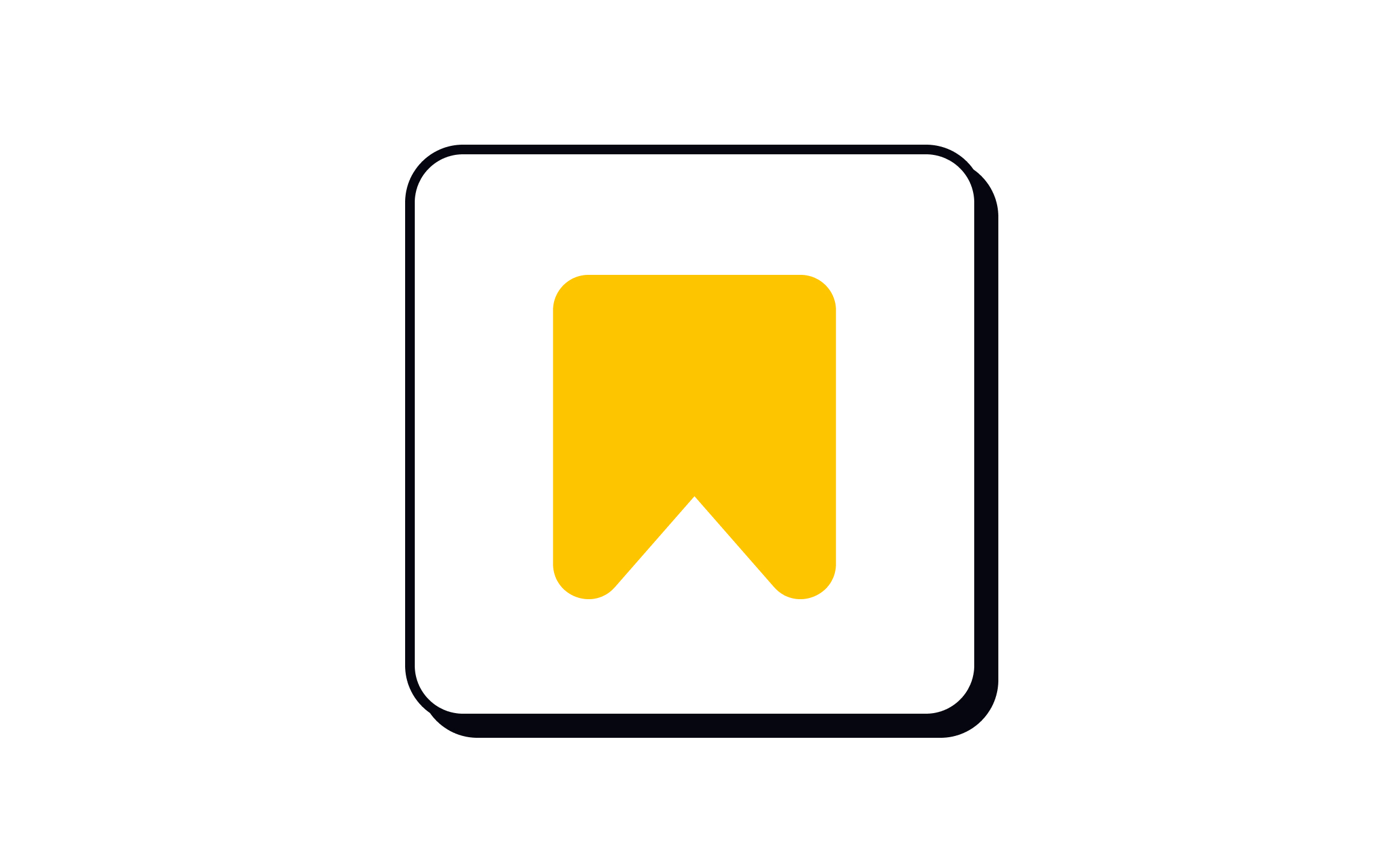
Pro Tip: Some icons like bookmarks usually change style depending on their status.
Volume assists with visual hierarchy in your designs. It can also help users determine which elements are interactive. With


Dot elements are an excellent way to attract just the right amount of attention. Showing a green dot to indicate that a user is online is immediately noticeable and recognizable without cluttering up your interface. Dots used in radio buttons help us immediately identify which control is selected.
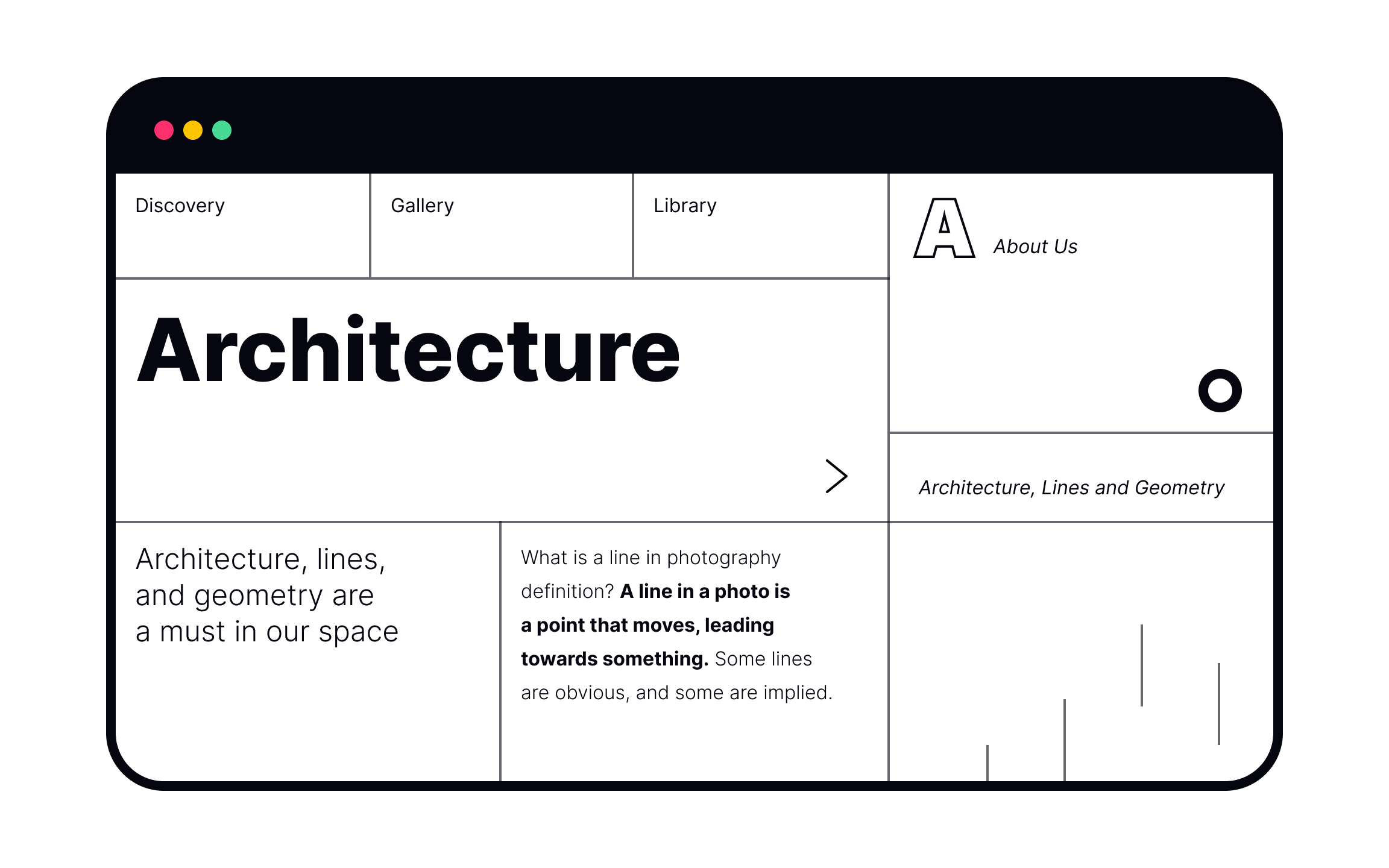
Lines can be used for a variety of purposes in design. They can help us structure a composition, direct attention, divide
Combining various planes, each in different

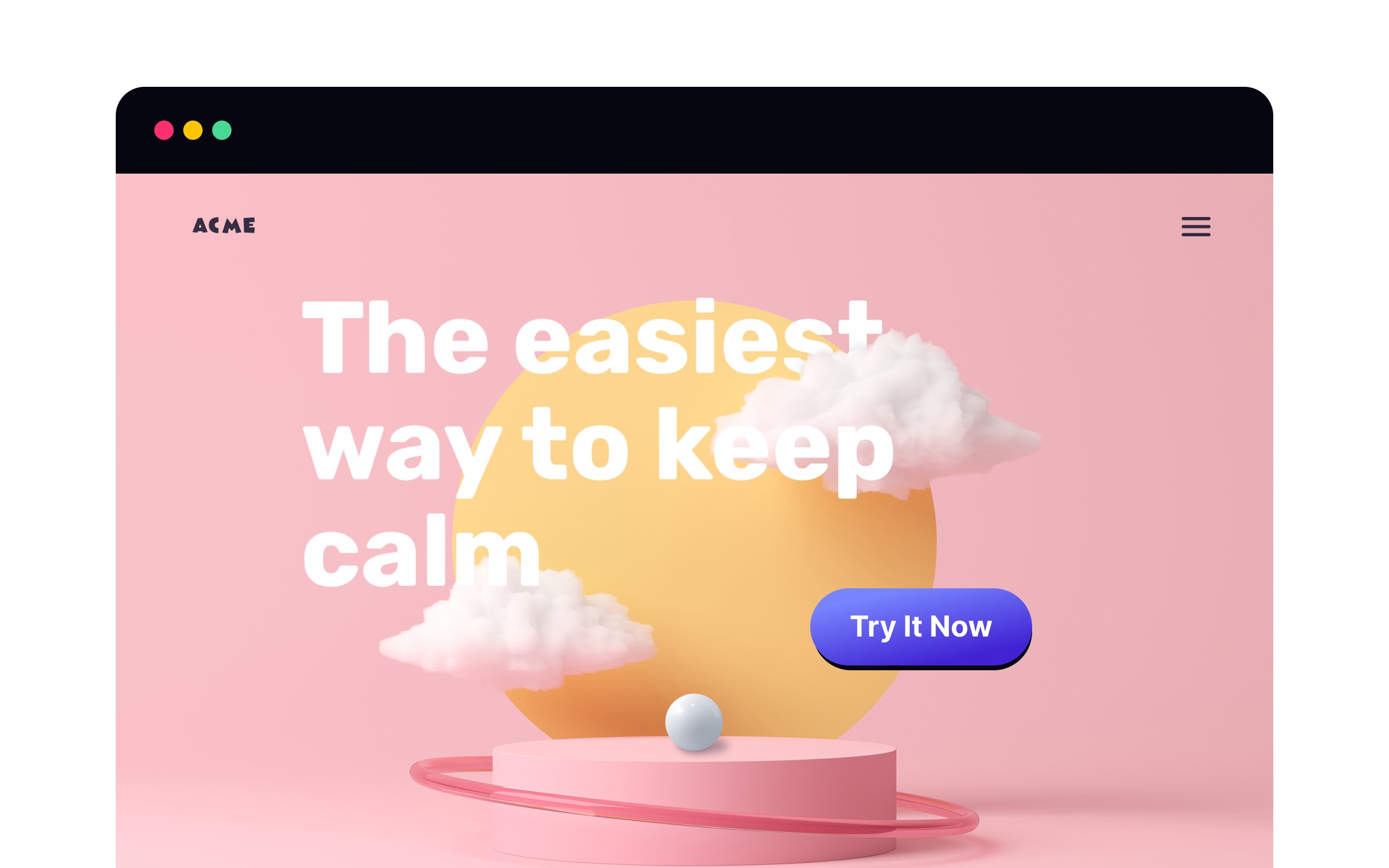
Volume isn’t just for interactive elements. Adding a 3D background to your designs can make for a whimsical experience for users. A sphere instead of a flat circle, for example, is more eye-catching.
3D backgrounds can even add a futuristic vibe to your designs. Just be sure not to go overboard, as 3D shapes can get overwhelming if used too much.
References
Top contributors


Topics
From Course

Share


Similar lessons

Common UI Component Definitions I

Image Terminology
