Typographic scale
Traditionally, typographic scale refers to the different font sizes used in a design for various types of content. In modern usage, it may also include things like font weight, style, and other elements that set each kind of text content apart.[1]
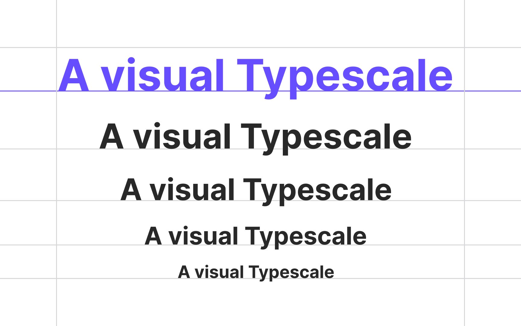
According to the Material Design type scale, there are 5 type categories each product should include:
- Headlines: The largest text that spans from a range of 1 through 6. They should use eye-catching, expressive fonts.
- Subtitles (or subheadings): These are smaller than headlines and shouldn't be as prominent.
- Body text: The main text of the content and is usually used for larger sections of writing. Serif and sans serifs are a good fit for this category.
- Captions and overlines: The smallest text and should use simple and legible fonts.
- Button or label text: The text used in buttons, tabs, dialogs, and cards. It usually uses serifs or sans serifs for better legibility and can be written in all caps.
There's no magic number of type sizes to use in design. As a starting point, you can take a browser default value of 16px and calculate the next font sizes using the golden ratio or another multiplier. As for type styles, rely on your sense of harmony and aesthetics.
Distinct differences between body text, headlines, subheads, and captions make the design look cohesive and add to its scannability, allowing users to navigate the content and use headlines and subheadings as anchors.
To pick the right type scale ratio for your design, you can check the Type Scale Calculator.
