Engagement Patterns
Learn how to analyze user interaction patterns to optimize product features and drive sustained engagement
Product analytics thrives on understanding how users interact with digital products over time. Engagement patterns reveal the rhythms of user behavior, from daily active usage to long-term retention trends. These patterns highlight which features drive meaningful interactions, when users are most active, and what behaviors indicate strong product adoption. By measuring engagement through key metrics like session frequency, time spent, and interaction depth, product teams can identify opportunities to enhance user experience and boost retention.
Pattern analysis transforms raw usage data into actionable insights about user segments, feature effectiveness, and overall product health. Understanding these behavioral signatures helps teams optimize the product experience, predict user satisfaction, and build sustainable growth strategies that align with natural user engagement cycles.
Engagement scoring quantify user
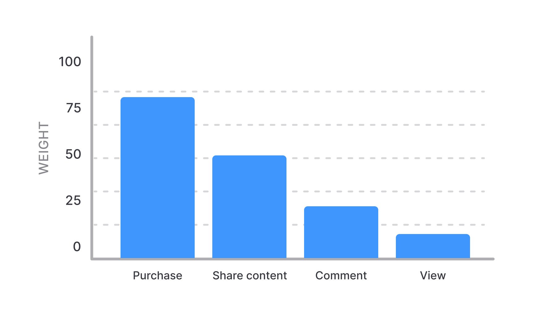
Product teams can implement scoring models by first identifying key actions that indicate user success and product value. Each action receives a numerical value based on its importance to business goals and user outcomes. For example, a purchase (weight: 100) carries more value than a content view (weight: 10), reflecting its stronger correlation with business success and user engagement.
Modern engagement scoring uses two advanced techniques to reflect real user behavior. First, it applies time decay — for example, a purchase made this week might count as 100 points, while the same purchase from last month would only count as 50 points, and from six months ago just 25 points. Second, it rewards meaningful sequences — like when users share content immediately after creating it, this combination might score 200 points instead of 125 (75 for sharing later + 50 for creating) because it indicates stronger engagement than performing these actions separately.
Active user analysis examines user engagement across different time frames to understand product stickiness and usage patterns. Daily Active Users (DAU), Weekly Active Users (WAU), and Monthly Active Users (MAU) form the foundation of this analysis, with each metric revealing distinct aspects of user behavior.
Different products define "active" based on their core value proposition and user journey. A social platform might consider
The relationships between different time-frame metrics provide crucial insights into user behavior patterns. The DAU/MAU ratio, known as the stickiness ratio, indicates how frequently users return within a month. A higher ratio suggests users find regular value in the product, while a lower ratio might indicate occasional or task-specific usage. For example, if a product has 1,000 Monthly Active Users and 330 Daily Active Users, the DAU/MAU ratio would be 0.33. This means users typically engage with the product for 10 days per month (0.33 × 30 days), indicating a healthy level of repeat usage without requiring daily engagement.
Feature usage patterns reveal how users interact with specific product functionalities over time. These patterns help identify the most valuable features, discover usage barriers, and understand the typical progression of feature adoption. Initial feature discovery often leads to experimental usage, followed by either sustained adoption or abandonment.
Feature adoption typically follows distinct phases during the user journey. Core features see immediate adoption and regular usage, while advanced features may experience delayed discovery or selective usage. Usage data shows whether features complement each other, compete for attention, or serve distinct user segments at different stages of their journey.
Cohort analysis of feature usage unveils how different user segments interact with functionalities. New users might gravitate toward basic features, while power users exploit advanced capabilities. This segmentation enables teams to optimize onboarding flows, improve feature discovery, and identify opportunities for user education and feature enhancement.
Session quality metrics evaluate the depth and value of user interactions during each product visit. Key indicators include session duration,
Session analysis focuses on critical user actions during each visit. For instance, in an e-commerce platform, adding items to cart, checking shipping rates, and completing purchases indicate high-quality sessions. Conversely, brief visits with minimal interaction often signal navigation issues or mismatched user intent. By mapping these interaction chains, teams can identify both successful user flows and drop-off points.
Moreover, activity clustering reveals common session patterns across user segments. A "discovery" session might involve extensive browsing and multiple product comparisons, while a "transaction" session shows focused progress toward purchase completion. These patterns help teams optimize user flows and predict likely user intentions based on early session signals.
Stickiness measurement quantifies how frequently users return to a product over different time periods.[2] Beyond simple DAU/MAU ratios, advanced stickiness metrics track return visit frequency, interval patterns between visits, and the consistency of engagement over time. These measurements help teams understand whether their product successfully embeds itself into users' regular routines.
Stickiness patterns vary significantly across different product types and user segments. A social media app might target daily return visits, while a project management tool focuses on consistent weekly engagement. By analyzing return frequencies against user personas and use cases, teams can set appropriate stickiness targets that align with natural usage patterns.
Return visit analysis reveals critical engagement drivers and barriers. For example, users who interact with collaboration features show higher stickiness than solo users, indicating that social connections drive
Behavioral
Natural user segments often emerge from usage data clustering. Some users might consistently perform quick, targeted actions, while others engage in lengthy exploration sessions. These distinct behavioral patterns help teams understand different ways users derive value from the product and identify opportunities for persona-specific optimizations.
Usage patterns within each persona inform product decisions and feature prioritization. For example, if data shows that efficiency-focused users rarely use certain features while exploration-focused users frequently do, teams can adjust the interface to better serve both groups. This behavioral understanding enables more targeted feature development and personalized user experiences.
Power users are those who demonstrate advanced product understanding and consistent engagement aligned with the product's core purpose.[3] These users vary significantly across different products — in a personal finance app, they might be diligent daily budgeters, while in a gaming app, they could be users who explore all game mechanics and achieve high scores.
Power users reveal different patterns depending on the product type and intended
The definition of a power user should align with product goals and user success metrics. Rather than assuming advanced feature usage equals power user status, teams should identify behaviors that indicate successful product use for their specific context. This understanding helps teams recognize and support users who are achieving their goals through the product, regardless of how technically sophisticated their usage is.
Churn risk patterns help identify users who might stop using your product. The most reliable warning signs are simple changes in behavior: users log in less often, spend less time in the product, or stop using their regular features. Think of it like a gym membership — someone who usually goes 3 times a week starting to show up only once a week might be close to canceling.
Early warning signs usually appear in a predictable order. First, users start skipping their regular usage times. Then they log in less frequently. Finally, when they do log in, they do less with the product. By watching for these basic changes in behavior, teams can reach out to users before they completely stop using the product.[4]
Some changes in usage are normal and don't indicate real risk. For example, many products see less usage during holidays or certain business seasons. The key is to identify unusual drops in individual user activity compared to their normal patterns.
Reengagement tracking measures how successfully dormant (inactive) users return to active product usage. It focuses on identifying which features, notifications, or prompts effectively bring users back and whether they stay active afterward. Success in this area isn't just about getting a one-time return visit, but about rekindling sustained product usage.
Users often return through specific paths that vary by their dormancy reason. Some respond to new feature announcements, others to personalized reminders about their stored data or unfinished tasks. By analyzing successful reengagement patterns, teams can develop more effective strategies for similar user segments.
Reactivated users show distinct behavior patterns compared to new users. They might either jump back into advanced features they used before or need a gentle re-introduction to basic workflows. These patterns help teams design better reengagement experiences and predict which dormant users are most likely to return successfully.
Pro Tip: Focus reengagement efforts on users who were previously highly engaged, as they're more likely to return to active usage.
Usage frequency analysis examines how often and consistently users interact with the product. This analysis goes beyond simple login counts to understand the natural rhythms of product usage — daily, weekly, or monthly patterns that indicate healthy engagement. For example, a
The timing and spacing of user
Usage trends across time periods also help distinguish between growing engagement and temporary spikes. A gradual increase in usage frequency typically indicates improving
References
- What Is The Customer Engagement Score? + Tips to Improve | Thoughts about Product Adoption, User Onboarding and Good UX | Userpilot Blog
- What is a Power User? Definition and Overview | Kissmetrics: Event Analytics for Web, Mobile and More
Top contributors

Topics
From Course

Share


Similar lessons

Analytics Strategy & Planning
Data Collection & Tracking
