Navigation in native apps
iOS and Android differ significantly in navigation, requiring designers to follow platform-specific practices for intuitive apps that reduce cognitive load and build user trust.
Key differences include:
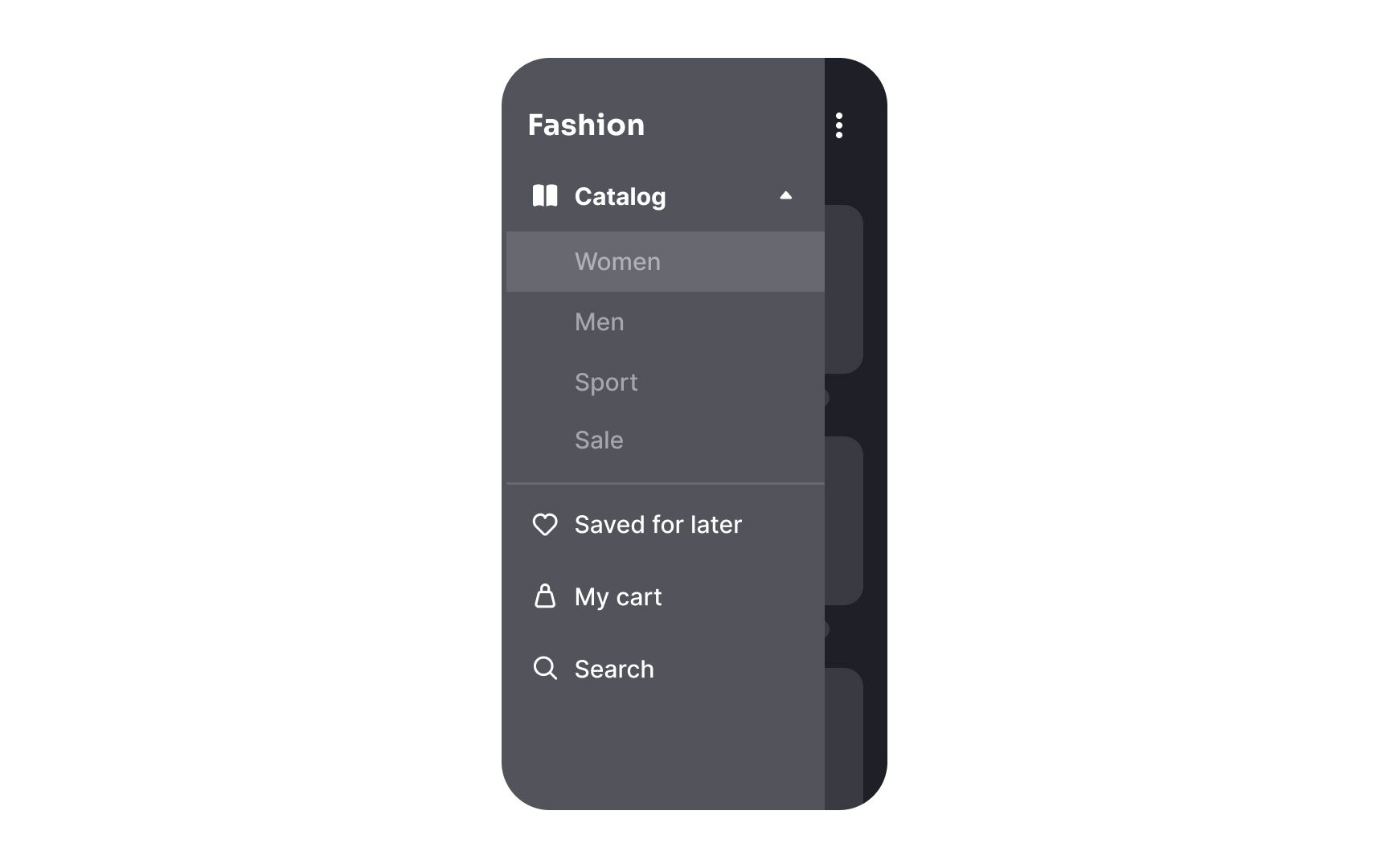
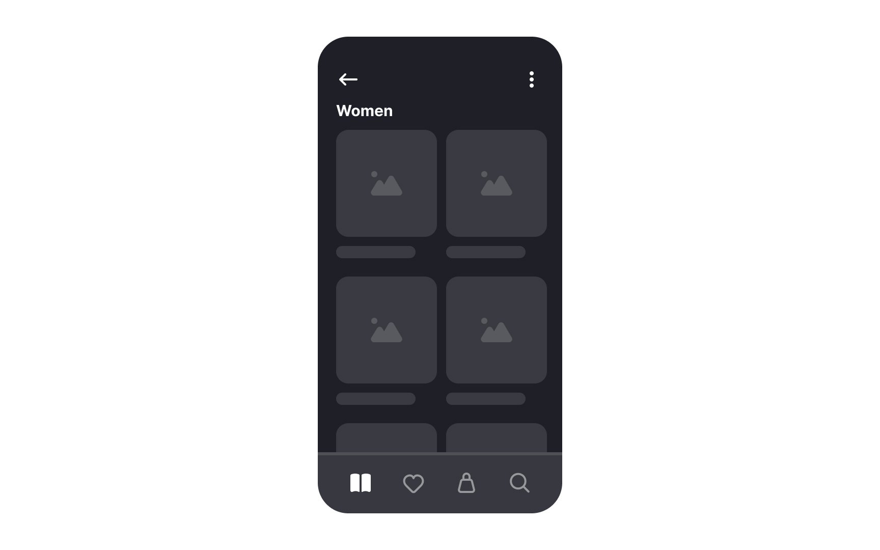
- Primary navigation: iOS apps use 2-5 labeled tabs at the bottom for primary destinations. Android apps often distribute these destinations in navigation drawers (hamburger menus), search bars, or floating action buttons. However, newer Android apps increasingly adopt bottom navigation bars.
- Action menu: On iOS, the action menu slides up from the bottom and can be accessed from any page. On Android, an overflow menu opens via the kebab icon (three horizontal dots). Context menus also differ: iOS uses long-press to show a small menu with a blurred background, while Android shows menus via the kebab icon, covering the icon itself.
- Back buttons: iOS apps feature a "Back" button with a chevron and the previous page’s name in the upper left corner. Modals or fullscreen views can be dismissed by swiping down or pressing Cancel/Done. Android apps use an arrow button in the same spot or a permanent back button below the screen.
Top contributors