Main app navigation
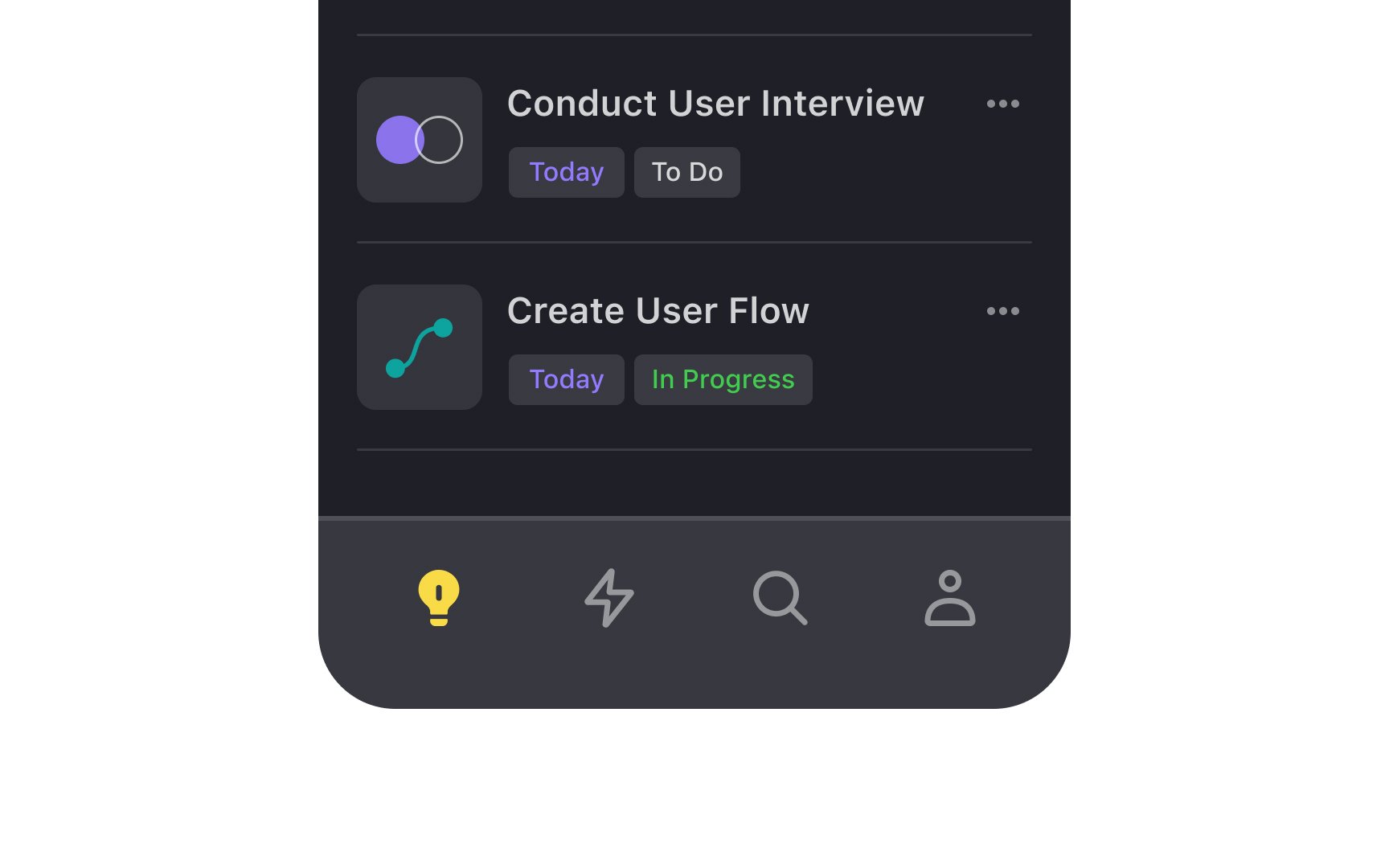
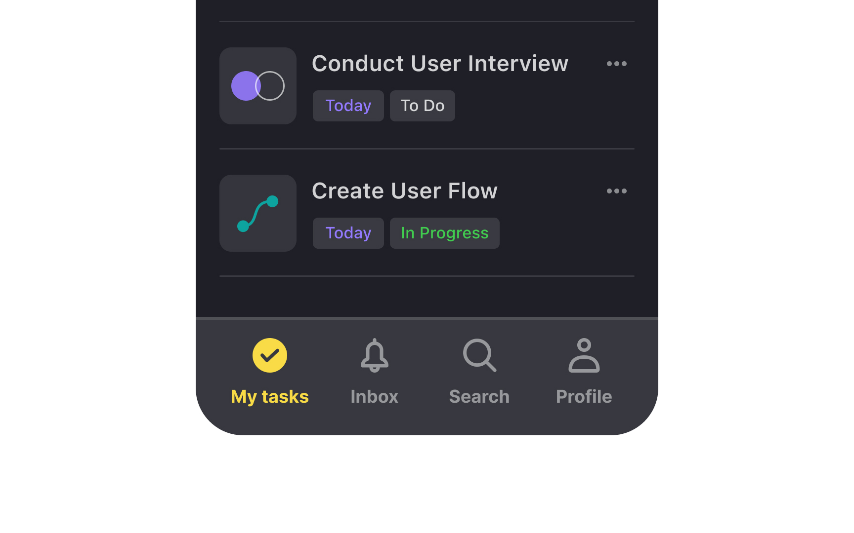
Primary navigation in iOS apps guides users to main destinations through a tab bar positioned at the bottom of the screen. This fundamental navigation pattern ensures immediate access to core app features while maintaining consistency with platform conventions.
On iOS, the primary navigation bar is typically placed at the bottom of the screen and contains up to 5 tabs, each with an icon and a label. While many apps reserve the center tab for key actions like creating content or initiating messages, others use this prominent position for their most frequently accessed feature.
Common navigation patterns include Home for main content, Search for discovery, Library or Profile for personal content, and Settings for app configuration. Apps should prioritize these destinations based on user behavior and feature importance rather than following rigid placement rules.
Pro Tip: Icons are supposed to help users recognize the meaning of actions faster. Use labels to prevent confusion about icon meanings and help users find what they're looking for.