How People Navigate
Discover how users typically navigate, and understand how to make the process intuitive for them
Users rely on a mix of cues, such as labels, context, and their past experiences to navigate a digital interface. These cues together form an information scent. As Jakob Nielsen once said, “Life is too short to click on things you don’t understand." Information scent helps users find what they seek by providing clear and helpful signals.
This lesson covers the best practices for creating a strong information scent. This includes choosing the right labels for links, organizing content contextually, and using visual design effectively. Understanding these practices will help you guide users smoothly through your digital interface.
According to information-foraging theory, people choose web pages based on how likely the page will answer their question and how quickly they can get that answer. This choice is called the information scent.[1]
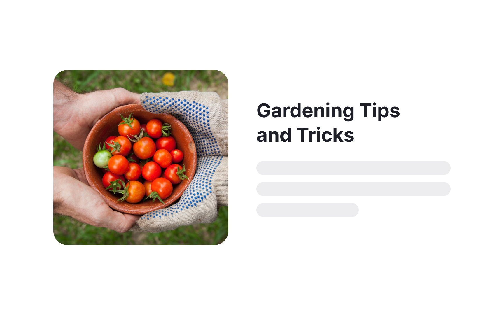
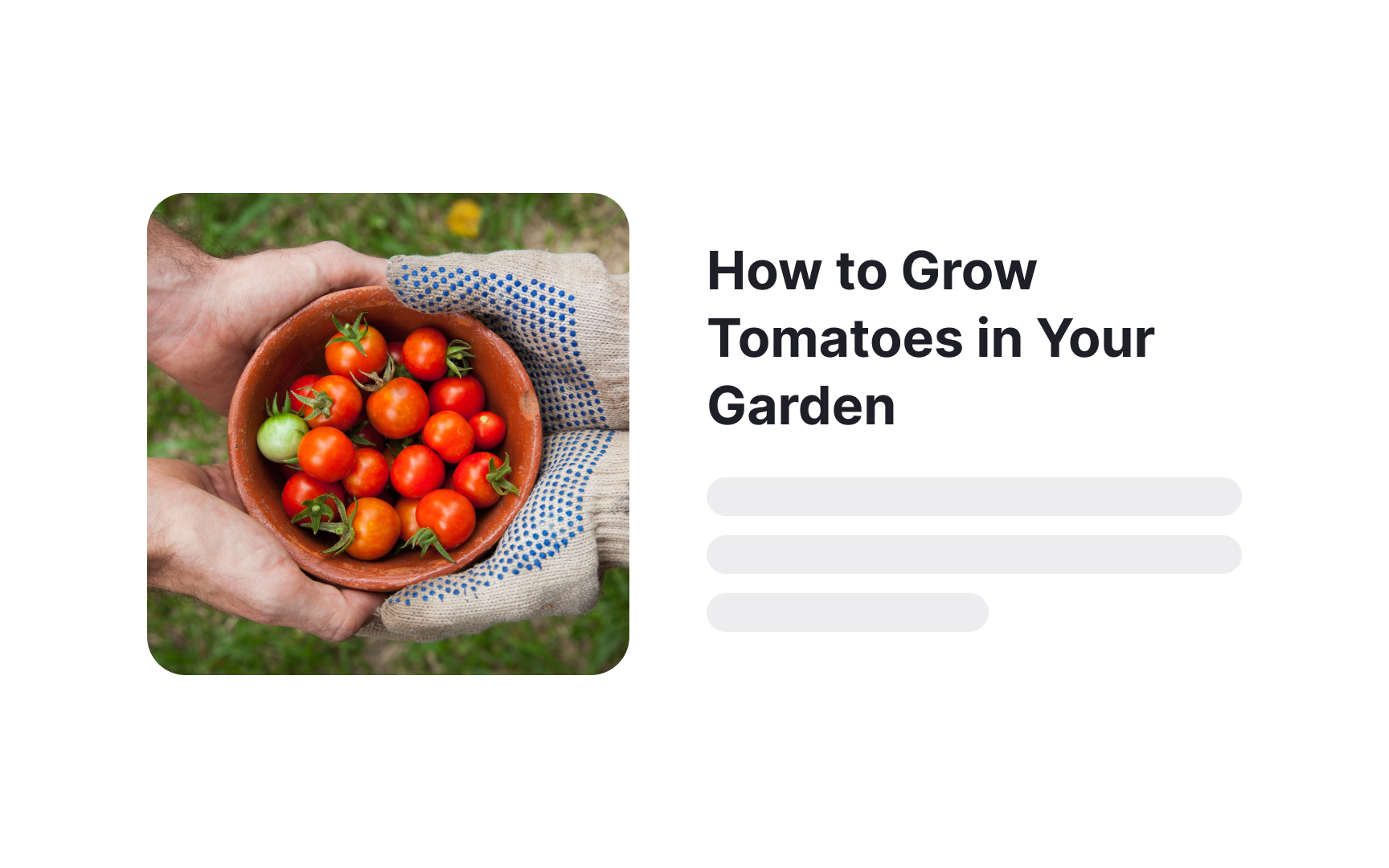
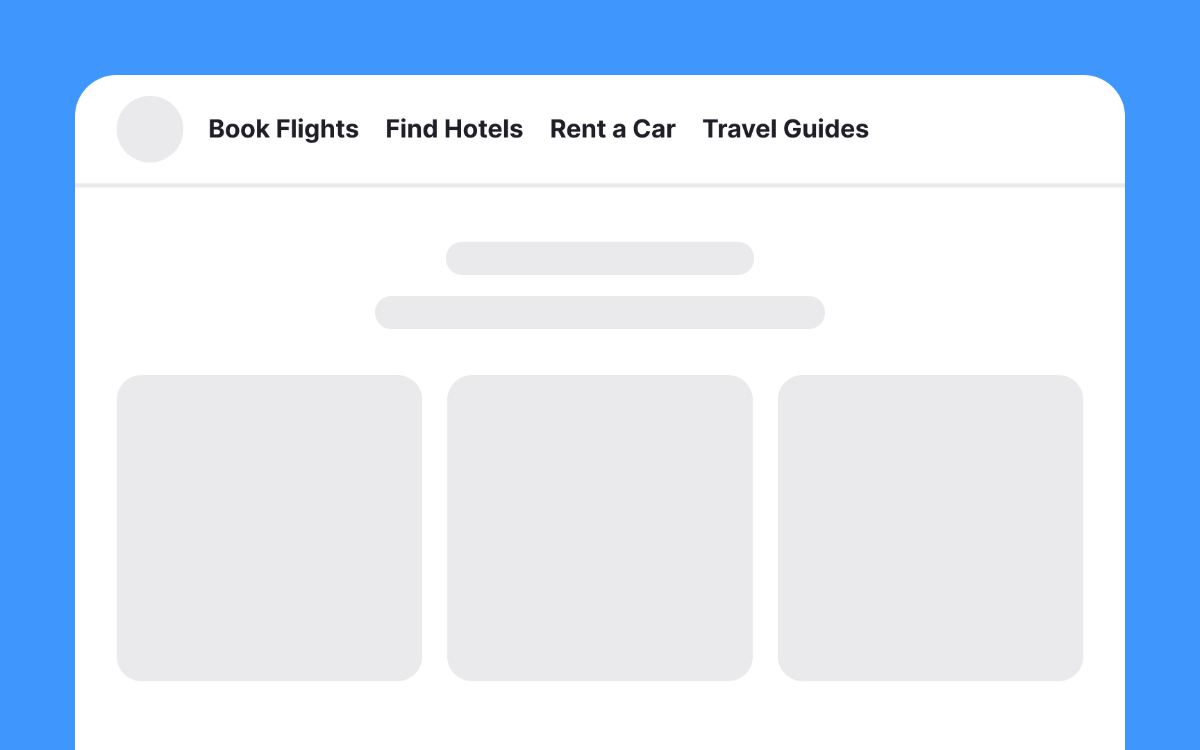
Imagine you're looking for a pizza recipe. You see two
Information scent is relative. For the pizza example, the "How to Make Pizza" link is great. But if you're looking for a salad recipe, the same link has a weak information scent because it doesn't meet your need.
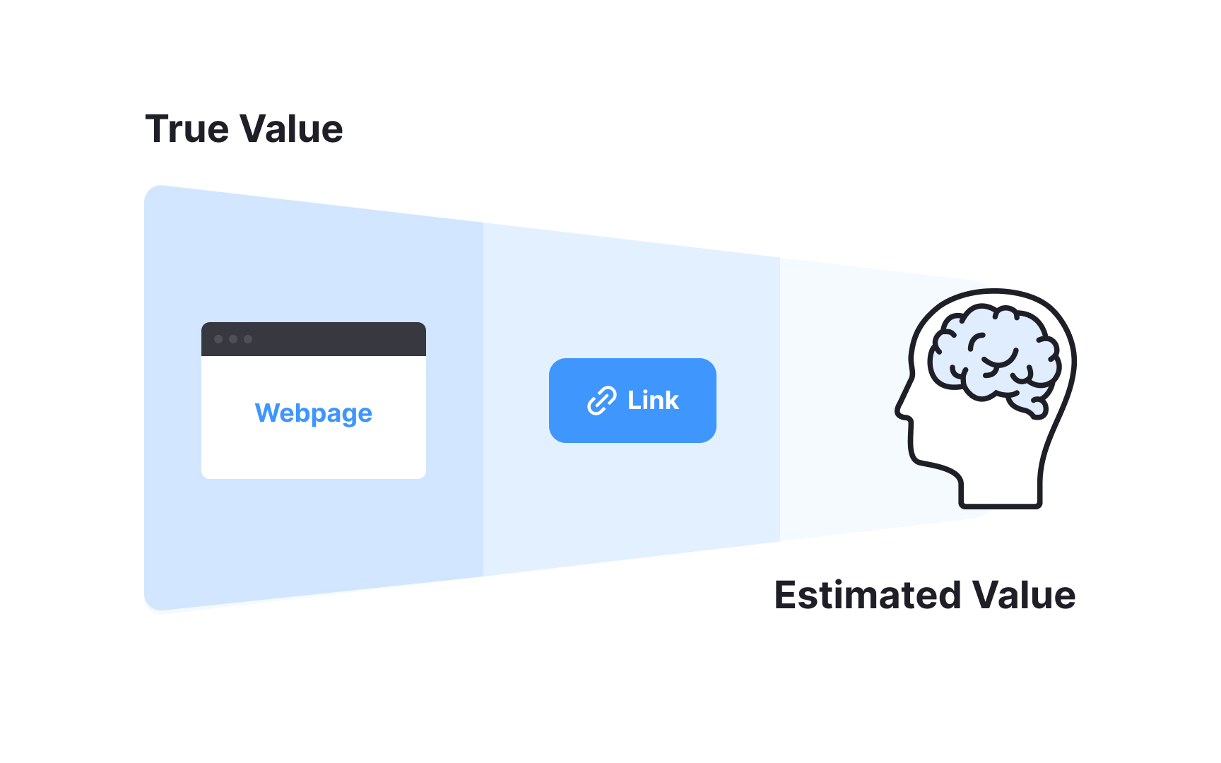
Information scent helps users make educated guesses about how useful a webpage will be before we click on it. It has two main parts:
- The source: This is the actual webpage users might visit. This is where the real information is. However, users won't know how valuable the
page is until they visit it and see the actualcontent . - The representation: This is what users see before they click, like a
link or a short summary. This gives them clues about what to expect on the actual webpage. For example, if users see alink titled "How to Fix a Flat Tire on Your Bike," they might guess it has the specific advice they need.
The estimated value users get from the representation helps them decide whether to click on the link. If they click and find useful information, the true value of the source matches their estimate. This means the link's information scent guided them to the right page.

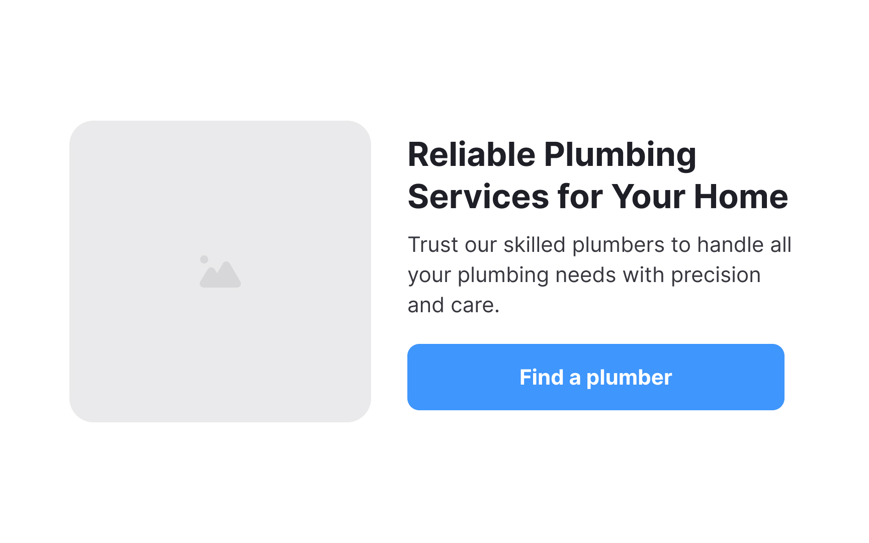
- Be clear and accurate: For example, if users are looking for advice on fixing a leaking faucet, a link saying "How to Fix a Leaking Faucet" is helpful. It directly tells users what the page is about.
- Be contextual: Labels like “More” or “Learn more” typically have very low information scent. This means it's hard to guess what the link leads to. On the other hand, "Repair Tips" has high information scent if users are looking for repair advice. But even if they're not, a clear label saves them from clicking a link that doesn't meet their needs.
- Avoid using complex words or jargon: For example, instead of "Plumbing Solutions," use "Fix a Leak." Simple, direct language helps users quickly understand the link and decide if it's worth clicking.
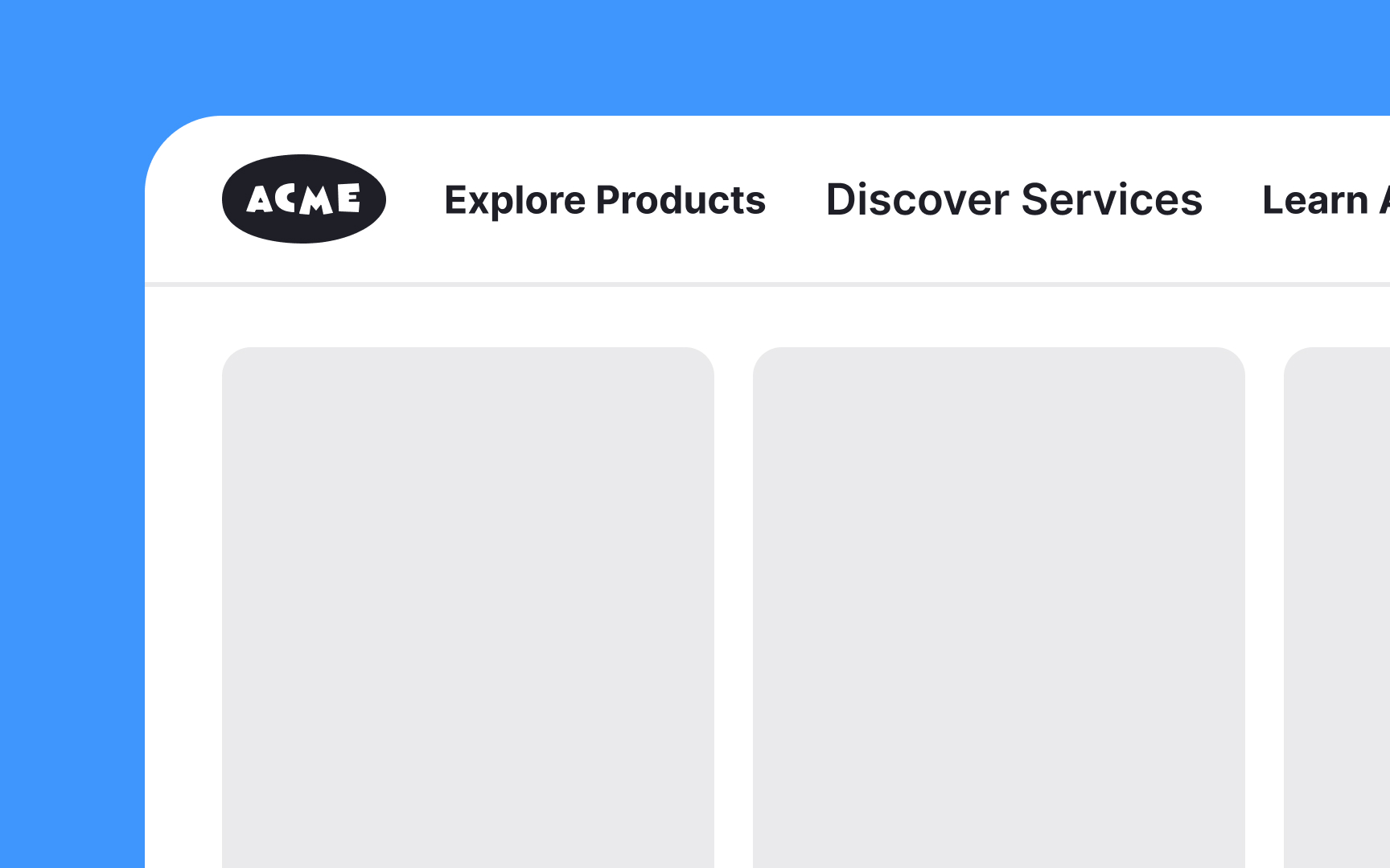
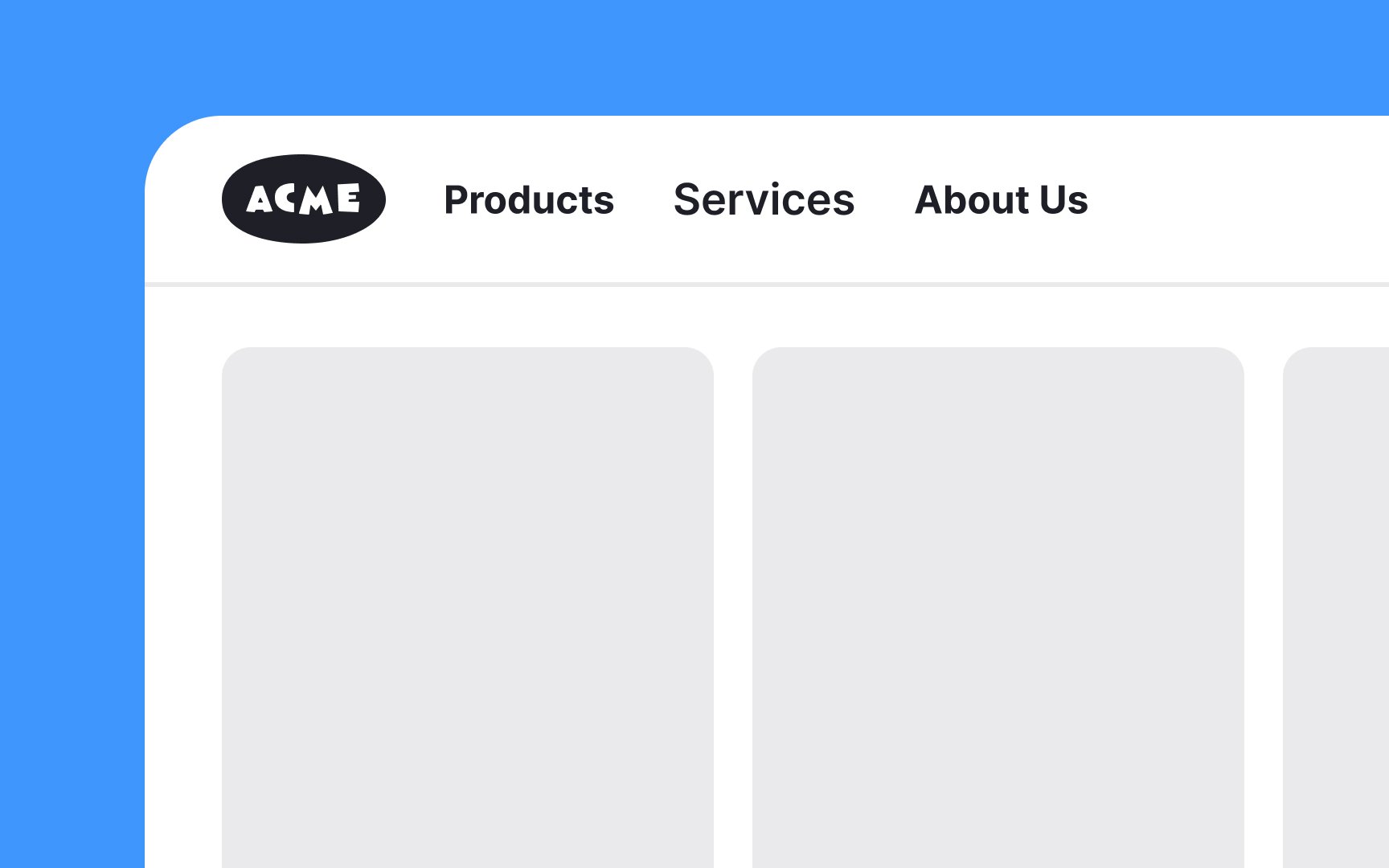
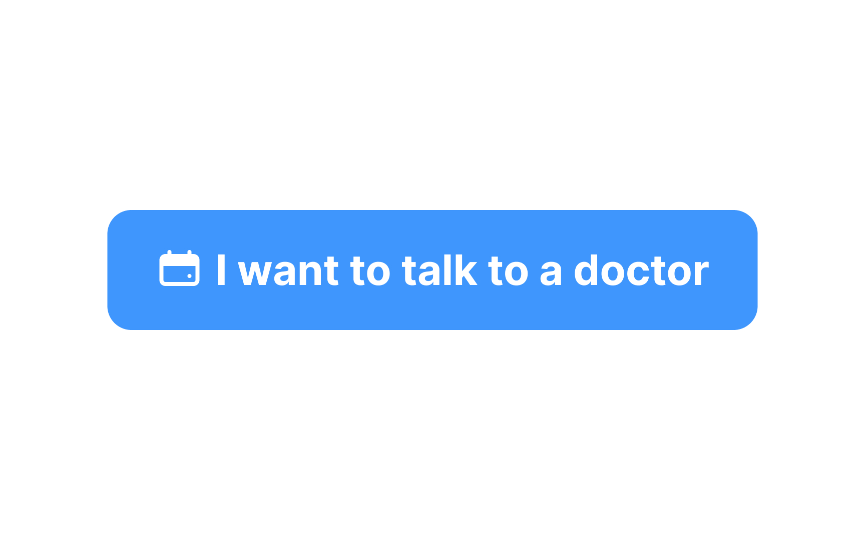
Avoid using calls-to-action (CTA) in navigation
Using such vague verbs in conjunction with navigation categories is also redundant. Users don’t need to see the same verb repeated in every label. For example, instead of saying "Learn About Us" and "Learn About Our Services," just use "About Us" and "Services." This keeps navigation simple and clear. For task-related navigation, use simple verbs. For instance, "Contact" or "Buy" is clear and direct.[2]
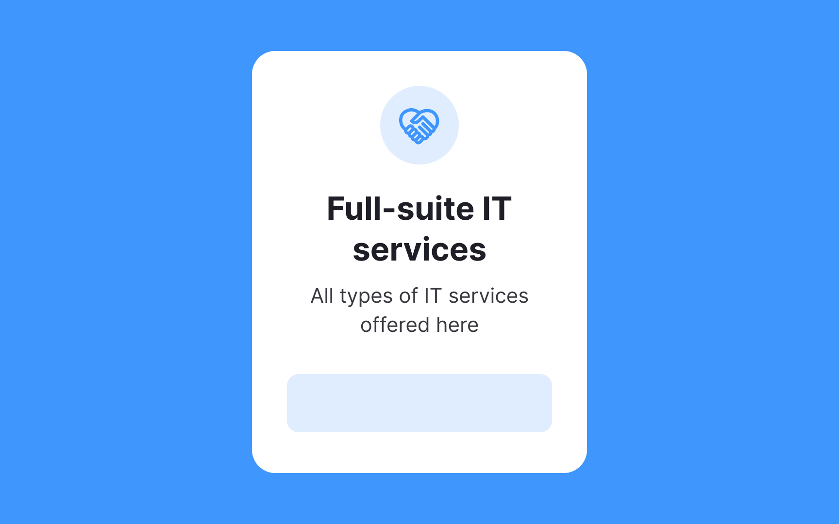

Summary text appears in various places like search results, blog lists, and category
Here are some tips for writing effective summaries:
- Keep it short but informative.
- Mention the most important information or arguments.
- Avoid jargon and complex words.
- Ensure the summary accurately reflects what the user will find once they click on the
link .
A poor summary wastes both the site's opportunity to attract users and the users’ time.
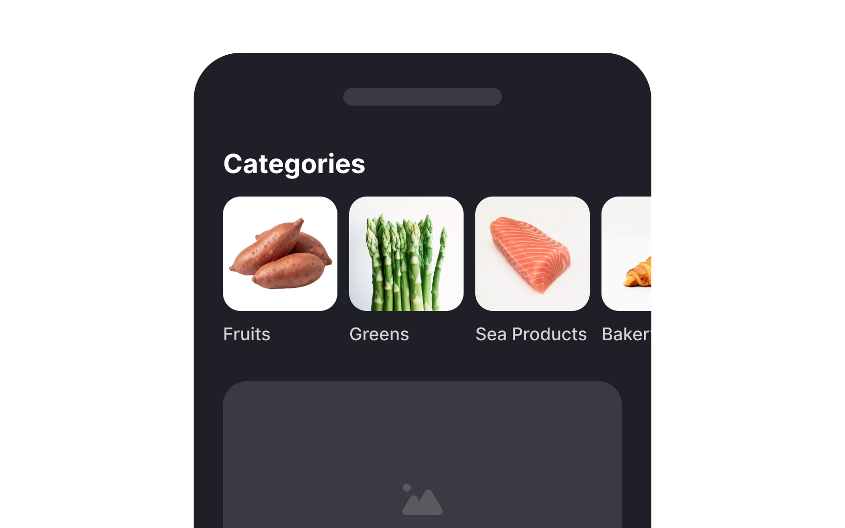
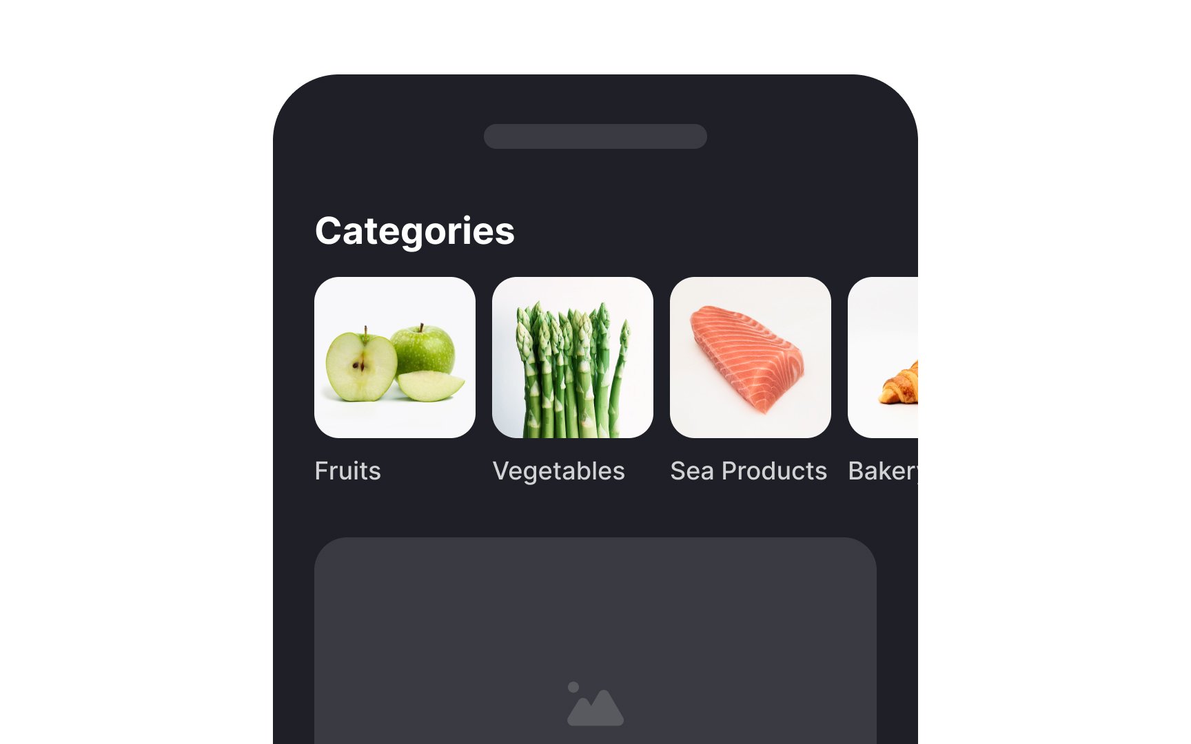
Images linked to a
Context helps users understand where they are and what they can do next in a digital interface. Without enough context, users might leave the
To add context in your information architecture, provide clear and relevant information right away. Avoid pages with just a big
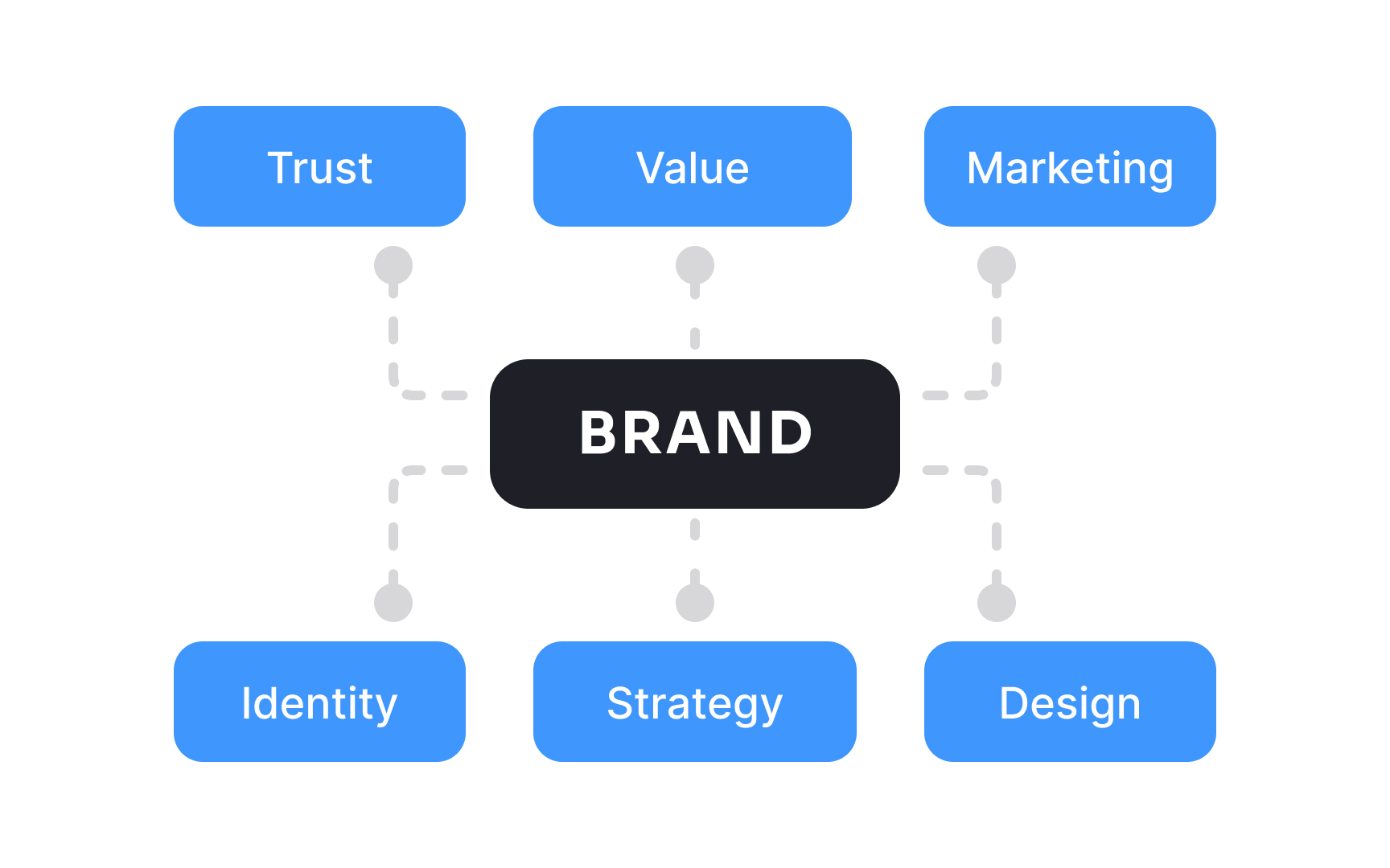
Users navigate better if they trust and are familiar with a brand. If they know and like a brand, they will likely understand what categories mean even without extra context. For example, if someone trusts Apple, they might click on a
To leverage brand trust and familiarity into your IA design:
- Ensure your logo, color scheme, and typography are uniform on all
pages . - Use industry-standard language or jargon that your audience understands.
- Keep
navigation simple, avoid clutter, and regularly highlight success stories or positive user testimonials.

Keep in mind that users navigate better when they are familiar with a domain. For example, if someone is looking for tax forms on a government website, they might know these forms are usually found under a section like "Resources" or "Forms and Publications." However, for someone new to the site and unfamiliar with tax filing, "Resources" might not be clear enough. They might not even know they need to look in the "Resources" section. This makes it hard for them to find the information they need. A label like “Tax Forms” would be more user-friendly in this case.
To ensure your
The social-foraging theory expands on information-foraging theory. It explains how people work together to find information. As people
To apply this theory in
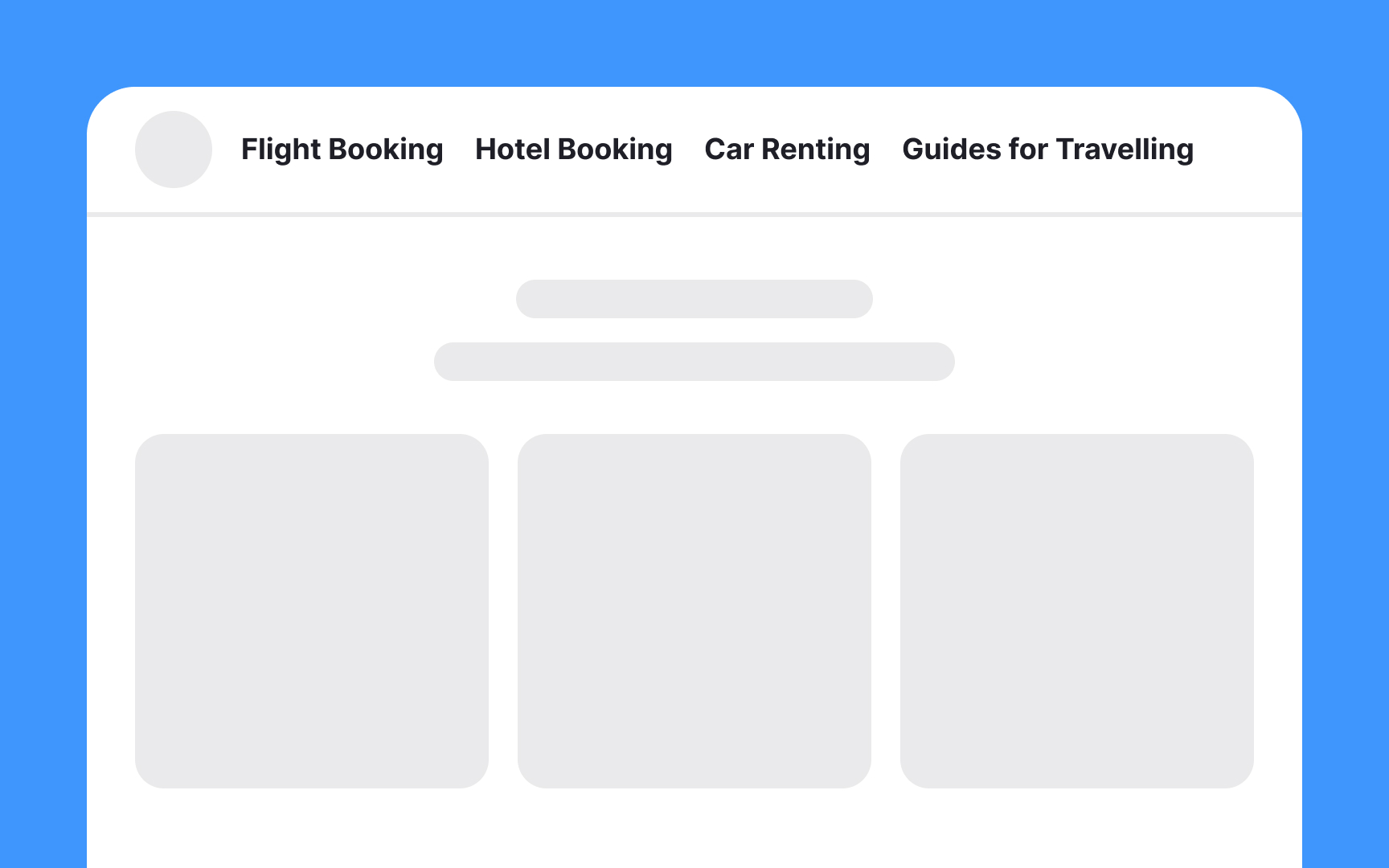
Parallel language in website
However, forcing everything into a single part of speech, like changing "Travel Guides" to "Read Travel Guides," might make the navigation
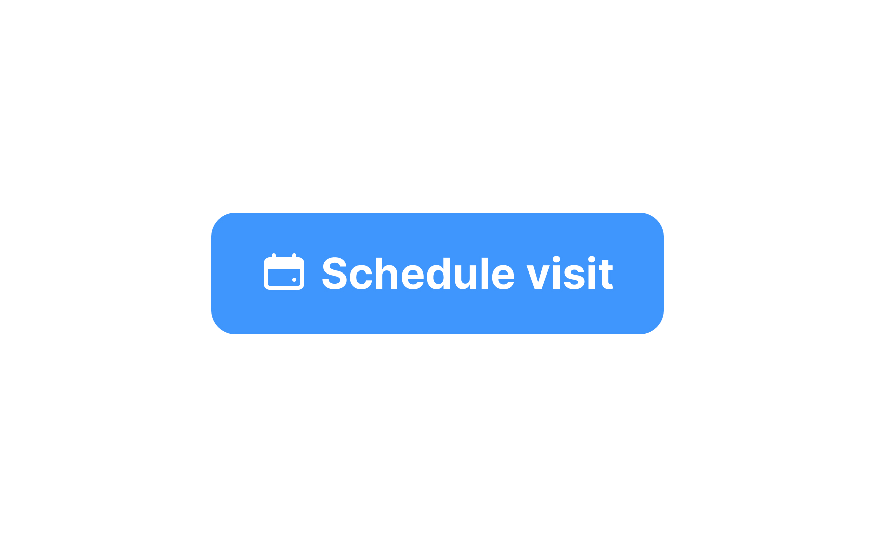
Avoid using overly conversational
- Conversational labels can be vague and low in information scent. For example, a label like “Get Started" leaves users guessing about what options are available. This makes it less likely they will find what they need.
- Cheerful language might conflict with how users feel. This is especially true during tasks they find stressful. For example, a label like "I want to pay my taxes" for paying taxes doesn’t match the user’s mood and can seem condescending.
- Conversational language isn’t always user-friendly. Website navigation doesn’t react like a real conversation. Users aren’t looking to chat — they want to find information quickly.
Instead, use clear, descriptive labels. For example, instead of "I want to pay my taxes", use "Pay Taxes" or "File Tax Return." Save conversational language for headers or descriptions, where longer phrases are appropriate.[3]
References
- Information Scent: How Users Decide Where to Go Next | Nielsen Norman Group
- 3 Common IA Mistakes (that Are All Due to Low Information Scent) | Nielsen Norman Group
- 3 Common IA Mistakes (that Are All Due to Low Information Scent) | Nielsen Norman Group
Top contributors
Topics
From Course

Share


Similar lessons

Intro to Information Architecture

Intro to Search Functionality in UI
