Setting up spacing variables for different devices
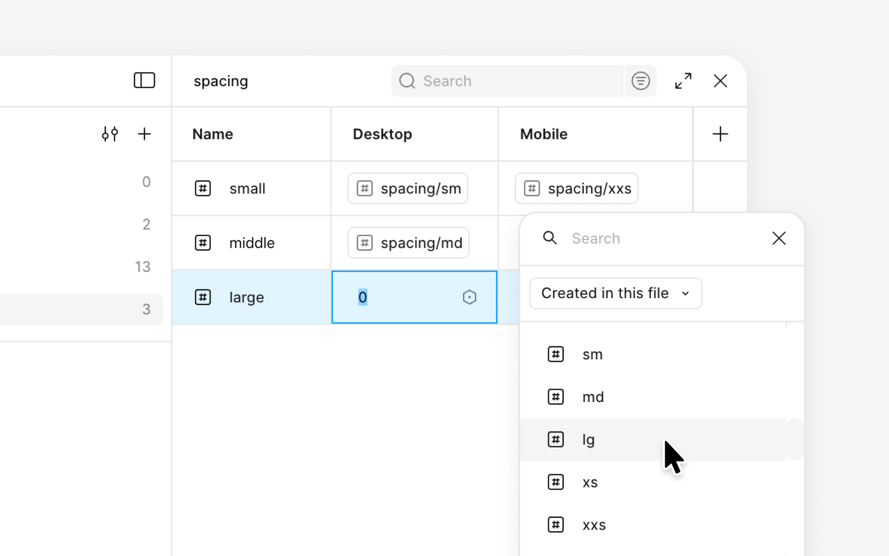
A spacing system becomes more flexible when its variables adapt to different device sizes. In Figma, this is done by creating multiple modes inside the same spacing collection. Each mode contains its own values while keeping the structure and naming of the scale unchanged. This approach allows the same spacing aliases to adjust automatically for mobile, tablet, or desktop layouts.
The setup begins by creating modes such as mobile, tablet, and desktop within the spacing collection. Each variable then receives a value for every mode. For example, the md alias can reference 16px in the mobile mode and 24px in the desktop mode. Both values come from the spacing ranges seen in systems that use an 8px base unit, which typically include 16px for medium spacing and 24px for roomier layouts. The name stays the same, but the spacing adapts to the screen size. Designers can switch modes to preview how those changes affect component spacing and overall density.
After assigning values, these adaptive variables can be used for auto layout gaps, paddings, and layout spacing across components. When a mode changes, all related spacing updates at once. This makes it easier to test how compact a layout should feel on mobile or how much breathing room it needs on larger screens.
Pro Tip: Keep each mode aligned to the same scale structure so spacing changes consistently across breakpoints.
