Applying element-first vs. content-first sizing
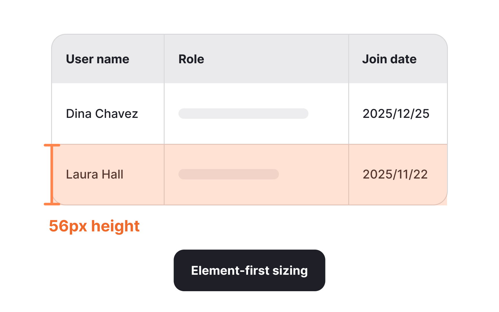
Component sizing can follow two different approaches depending on what the interface needs to prioritize. Element-first sizing focuses on setting a fixed height or width for a component. This method is useful when the element needs to stay visually consistent across many layouts. Buttons, inputs, and other interactive components benefit from this approach because their size signals their importance and helps maintain a predictable rhythm in the overall composition. Setting these components to clear increments helps keep the interface structured and easier to scan.
Content-first sizing takes the opposite direction. Instead of fixing the overall dimensions, this approach preserves the internal padding and spacing while allowing the outer size to grow based on the content inside. Components like table rows, text blocks, and containers with unpredictable content work well with this method. Their heights adjust as needed while still aligning to the spacing system. This makes content easier to read and prevents cramped layouts, especially when users input different types of information.
Choosing between the two approaches depends on the purpose of the component. Elements that need visual uniformity across screens are better suited to fixed sizes, while content-heavy areas benefit from flexible dimensions.
