Guiding the eye with movement

Movement describes the journey the human eye takes as it travels over a design. Visual prominence of elements allows designers to establish a hierarchy on a page and create a pathway through the composition. We use shapes, colors, alignment, and fonts to guide users to the right places.
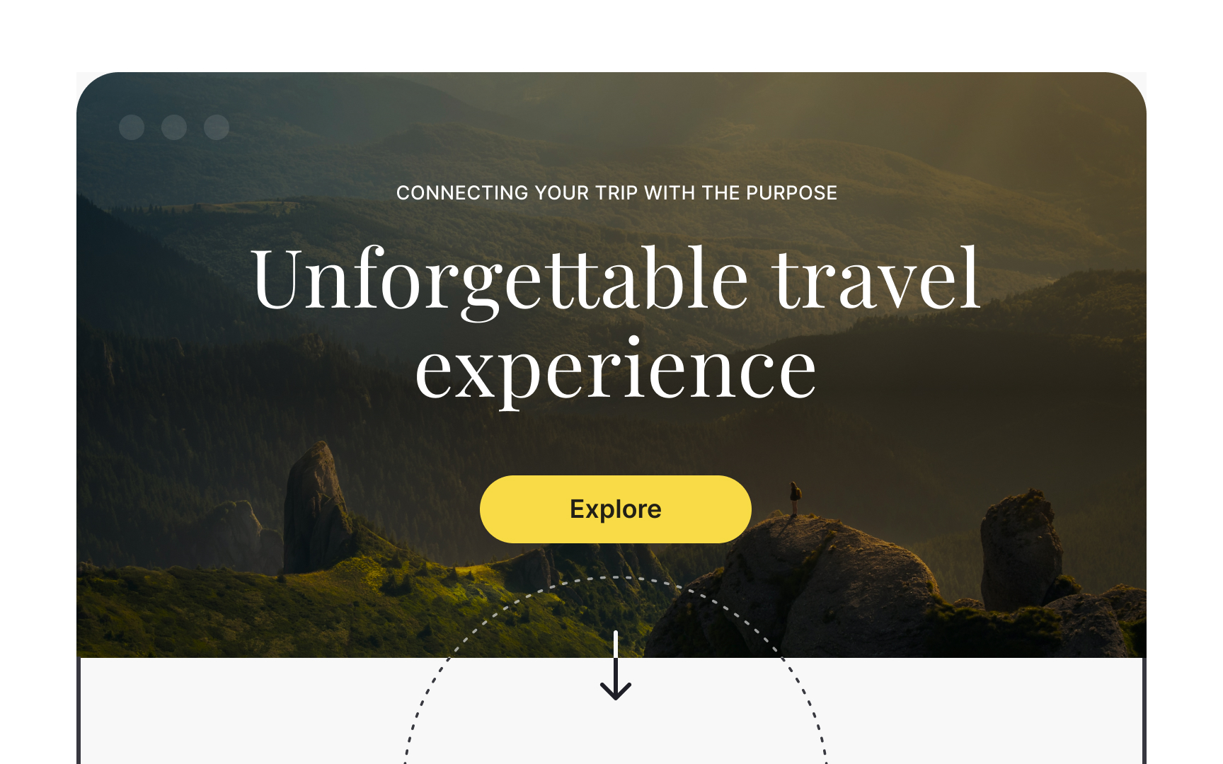
Start with establishing a focal point — an element that naturally attracts the eye. It could be a prominent headline, an attractive hero image, and a large appealing CTA — elements that help users complete their goal on a page. Less important content should be less noticeable — smaller sizes and softer colors are advised here.
