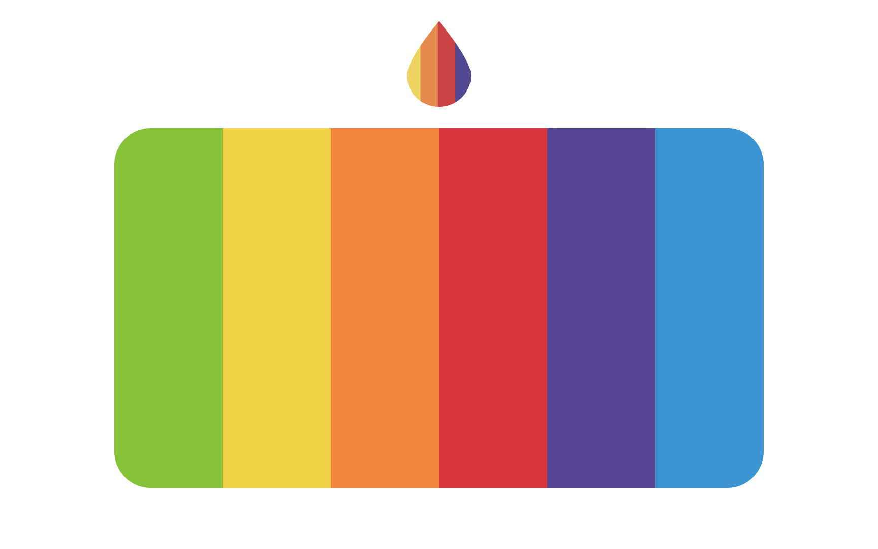
Color Properties
Explore the various aspects, attributes, and properties of color
Color properties are attributes of color itself, which can be a somewhat amorphous term. While we all understand what someone means when they say “color,” it’s not a very precise term. And in design, being able to discuss elements precisely is vital for good communication and preventing confusion.
Terms like hue, tint, tone, saturation, value, and brightness are vital to properly communicating what you mean when discussing color. Considering color meanings vary in different cultures, it's important to learn these concepts in order to generate visually pleasing color palettes by manipulating the various properties of color.
When we talk about red, green, or blue, we're talking about
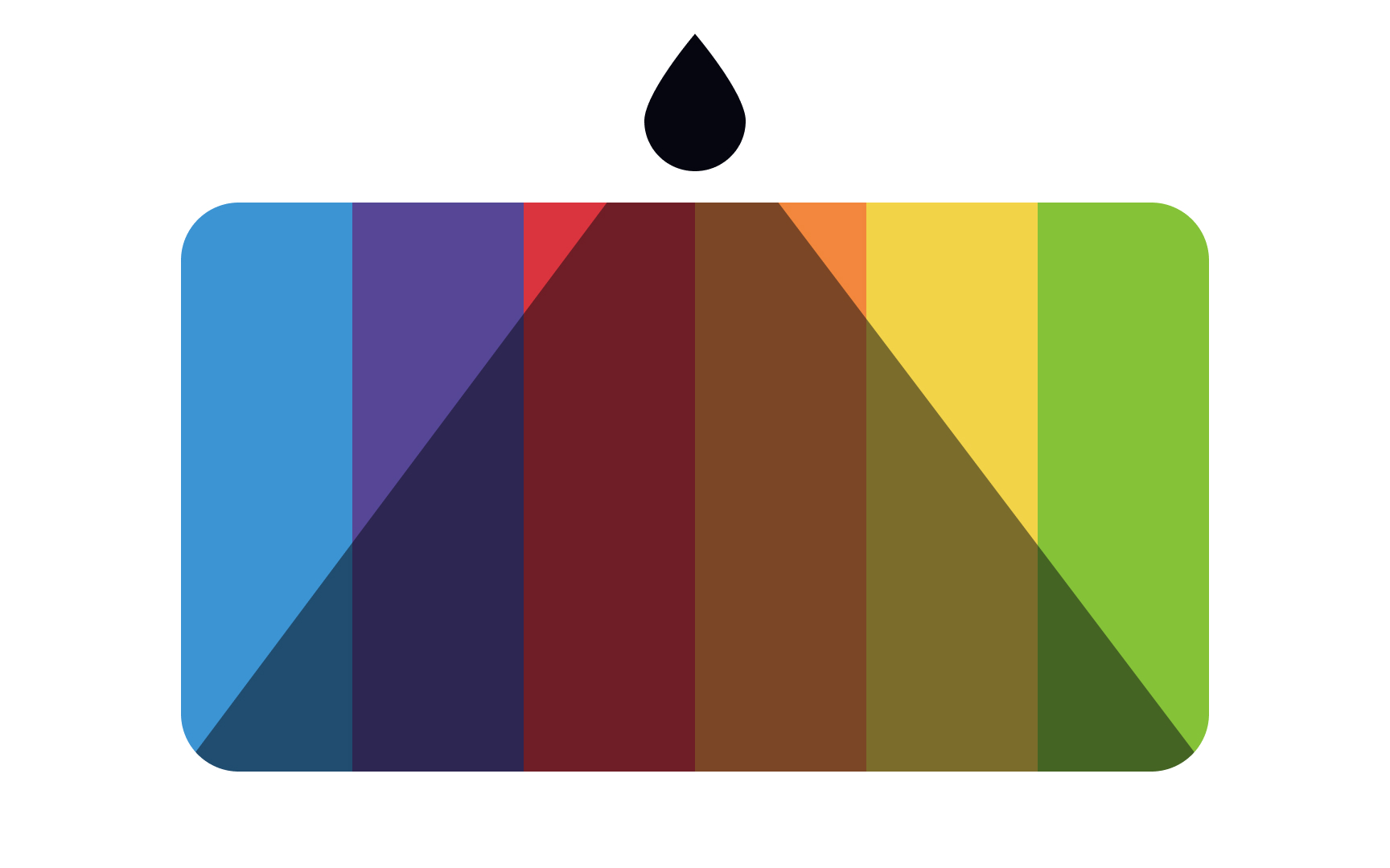
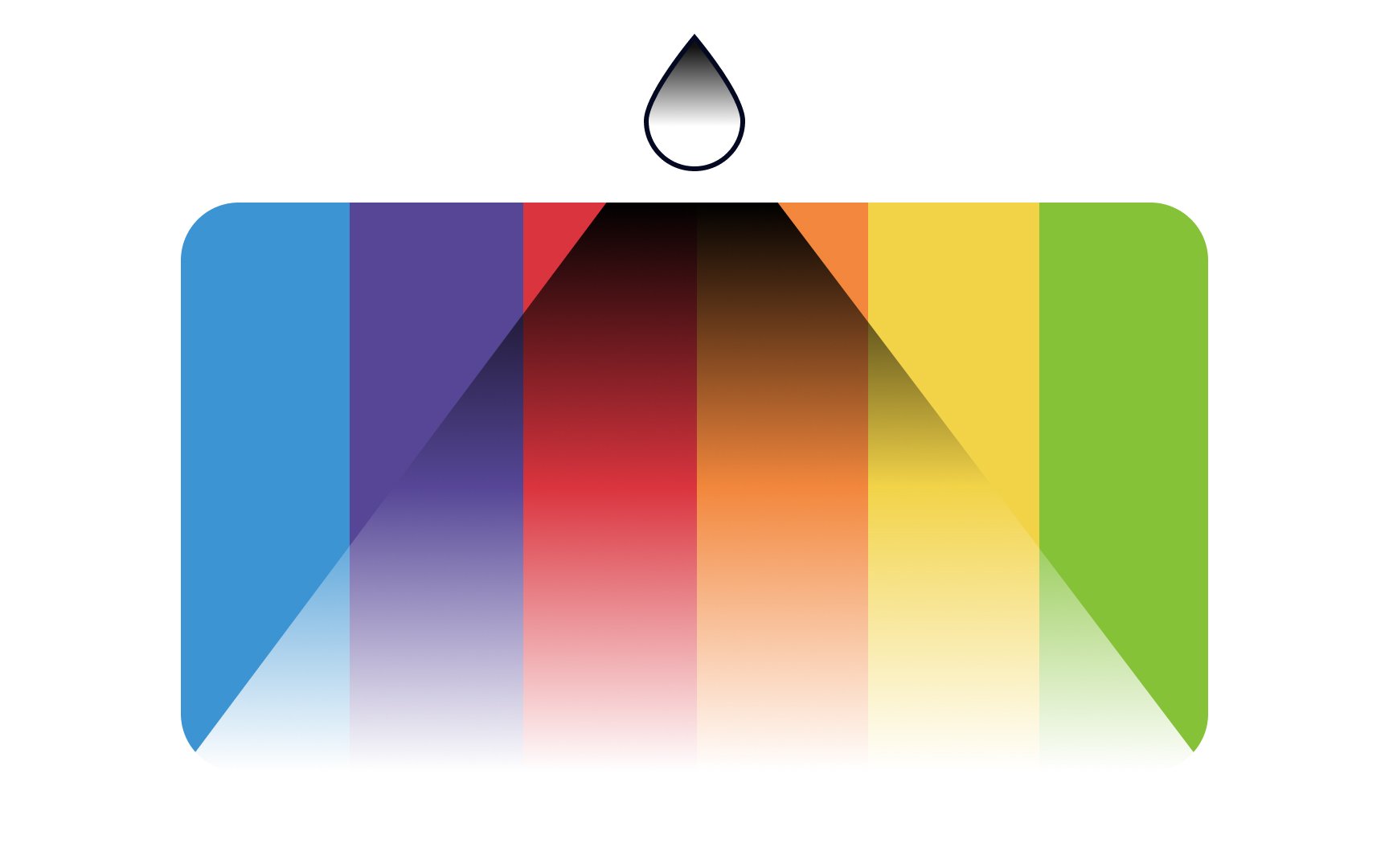
Shades occur when you add black to a pure
Many shades — such as forest green, navy blue, or maroon — are used to create a traditional mood in design. They can give a solid, formal impression to your creative work.
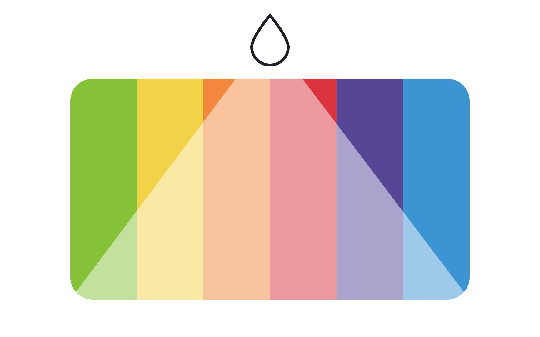
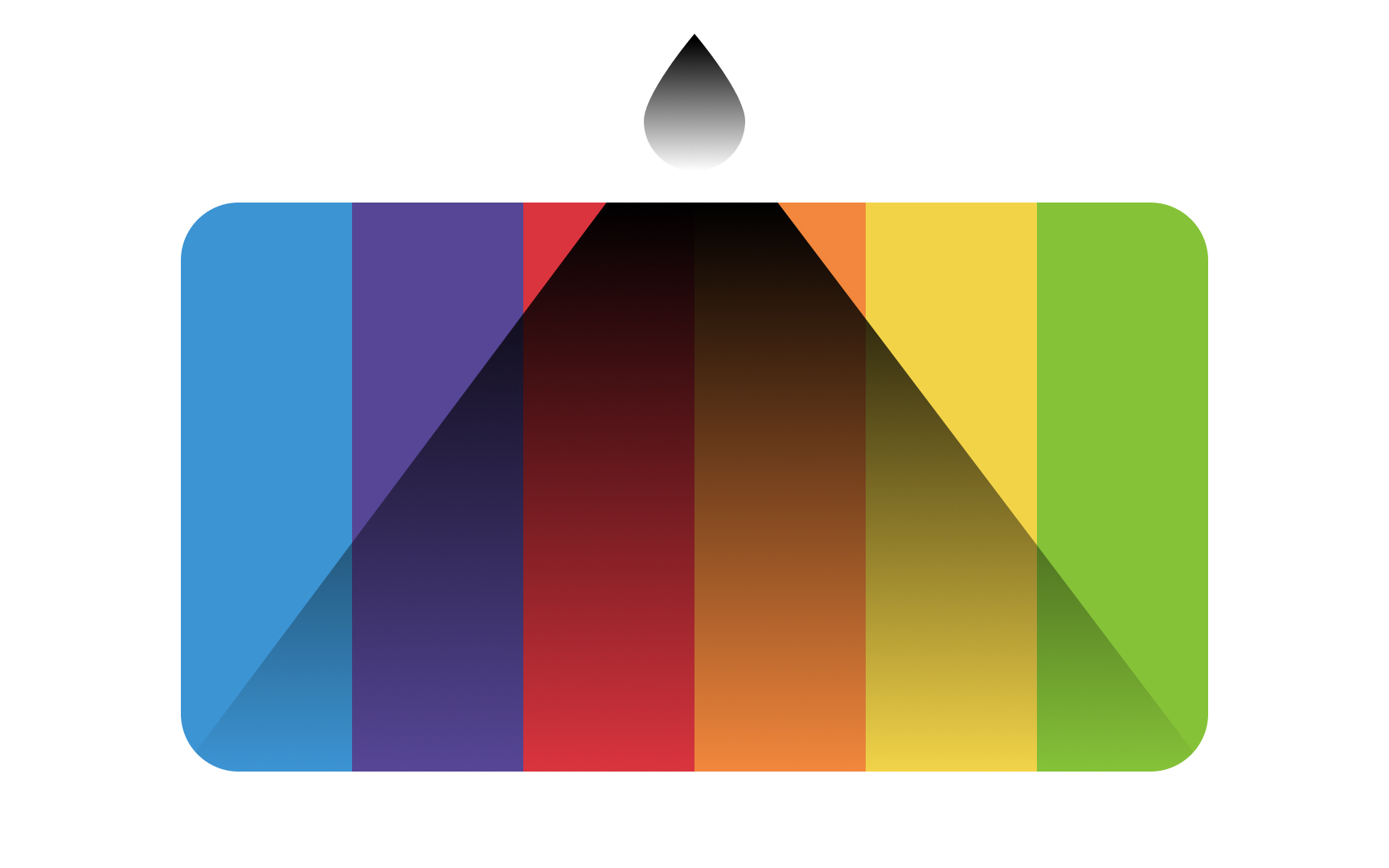
Tints are the opposite of
Tints can range from being slightly lighter than the original hue, all the way to off-white with barely any of the original hue present. Tinted colors appear softer and easier on the eyes, and the lightest of them are called pastels. Tints often create a youthful softer mood in a design.
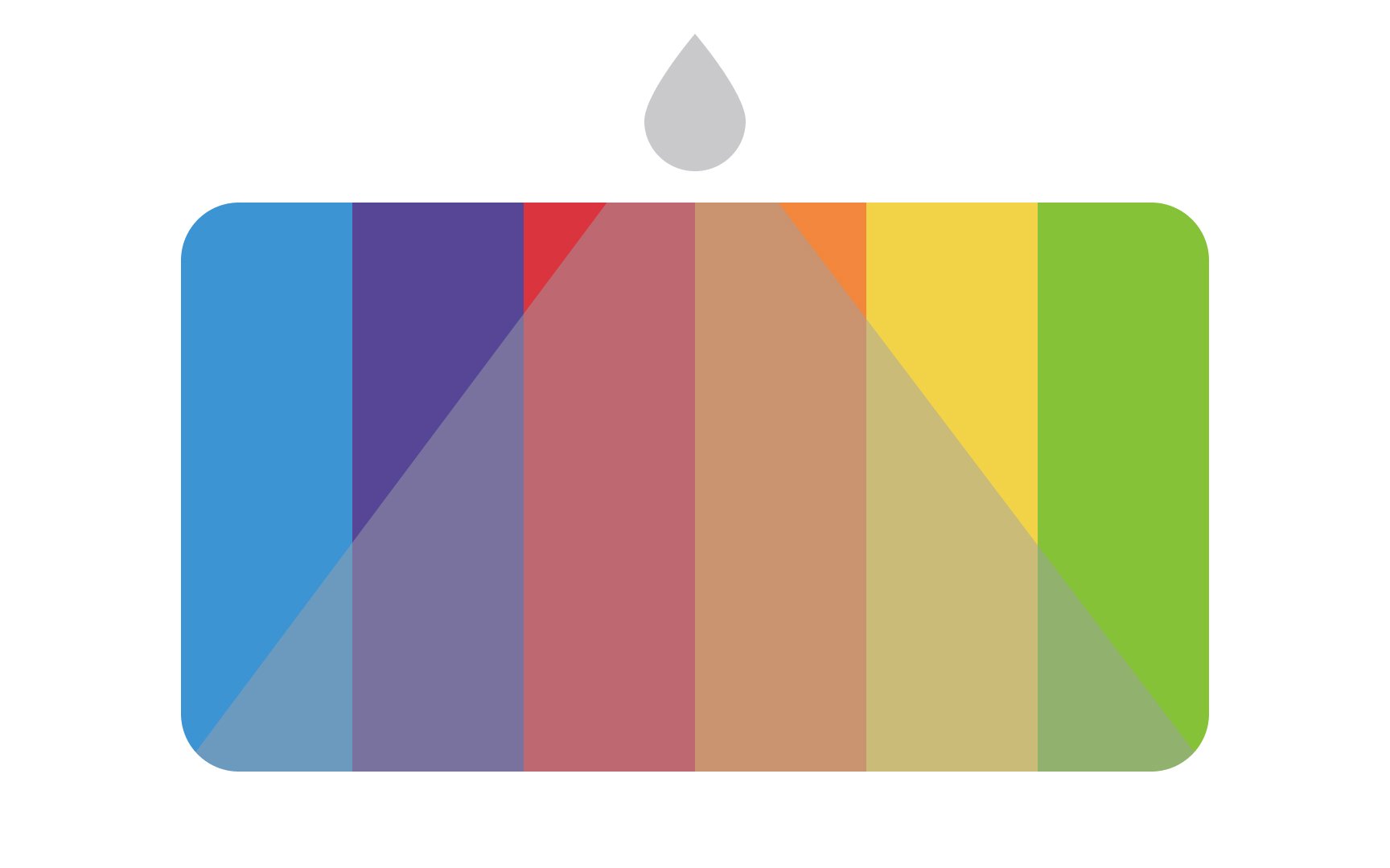
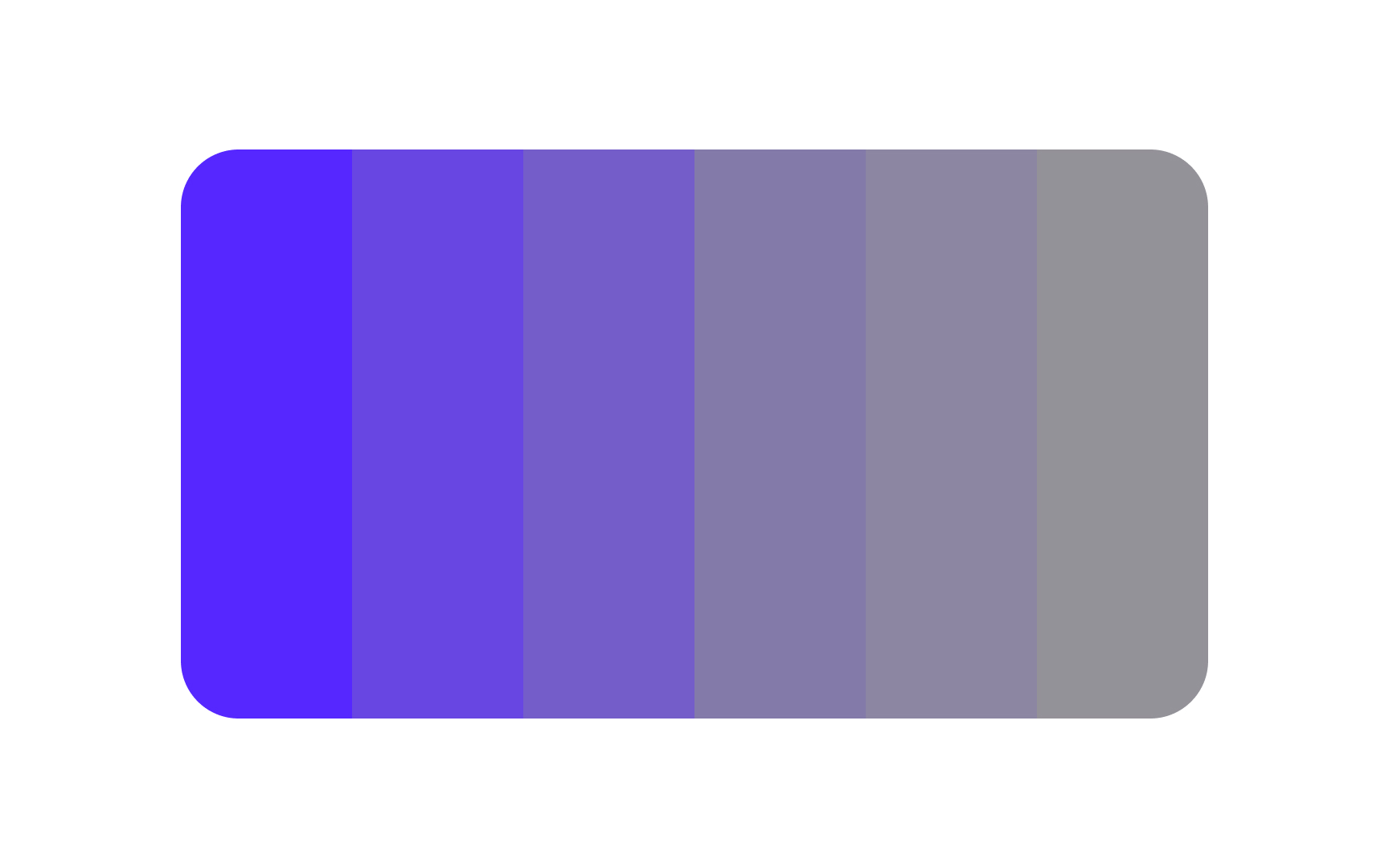
Tones are combinations of a pure
Subtle tones can make your designs look more mature since pure hues are sometimes considered childlike. Be wary of using too many tones, though, as they can dull your design and contribute to a boring
In the HSL
In the HSV
When talking about the intensity of a
When a color is fully desaturated, we end up with gray. Less saturated colors can create a calming effect in your design, but be careful that your palette doesn't end up boring.
Pro Tip: Use less saturated colors to create a calming effect in designs.
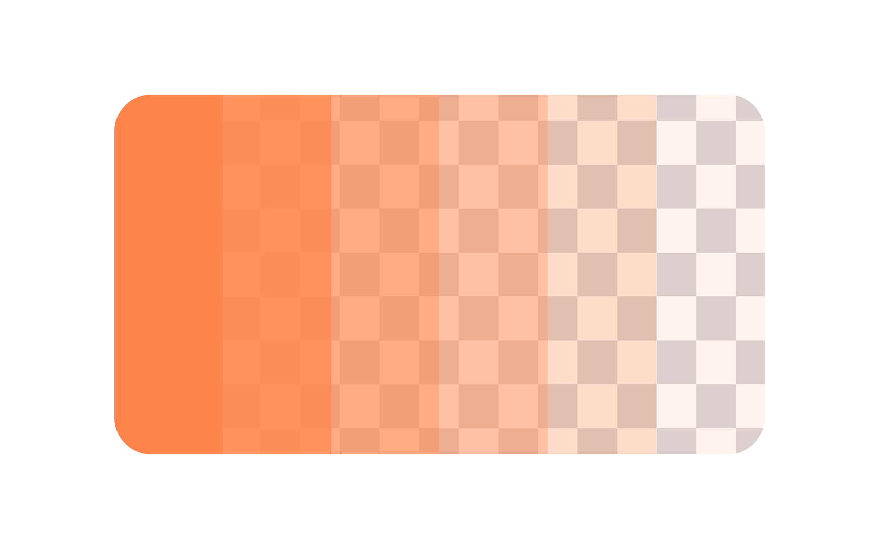
Opacity describes how transparent or solid a
Designers often use opacity to control focus and create visual depth. For example, lowering the opacity of a background element makes the content in front of it stand out. A button might have 70% opacity in its normal state and switch to 100% when hovered over, signaling that it is active.
Opacity can also be used to create overlays. Adding a semi-transparent black layer (around 40–60% opacity) on top of a photo can make white text easier to read. Similarly, lowering the opacity of colored shapes can create new blended colors when stacked together.[4]
References
Top contributors


Topics
From Course

Share


Similar lessons

Intro to Color Theory

How Color Affects Mood & Emotion
