<?xml version="1.0" encoding="utf-8"?>

Establishing relationships between elements in your design through subtlety and similarity can create an elegant, unified look for your designs when stark contrast just isn’t appropriate.

When used correctly, subtle differences between elements can add emphasis without allowing any single element to overpower the composition. And similarity is an excellent tool when you want to unify elements and create a cohesive whole. Learning to implement both expands your designer toolbox. 

Exercise #1

Subtlety

Subtlety, or subtle contrast, occurs when elements are nearly identical but each has a unique quality that sets it apart. It could be a subtle difference in color, shape, size, texture, or other properties. While contrast generally makes elements stand out, a slight difference is a more elegant and delicate approach to emphasize particular content and set elements apart.

Exercise #2

Similarity

Similarity refers to elements that do not contrast with one another. Like two peas in a pod, similar elements generally have the same color, shape, size, and/or other properties

Similarity can help designers achieve compositional emphasis, but compared to contrast, this principle is less potent in capturing and holding users’ attention. Where similarity really shines, though, is in making sure particular elements are perceived as a group.[1]

Exercise #3

Subtlety

Subtlety Bad Practice
Subtlety Best Practice

Using a subtle contrast can make a big impact on user perceptions. For example, buttons with slightly different corner radii stand out from one another. A button with a smaller corner radius looks more conventional, while one with a larger radius seems friendlier, encouraging users to interact with it. 

Be careful with subtlety, though. Too little contrast can actually feel like a mistake to users and make a composition appear unbalanced.

Exercise #4

Similarity

Similarity Bad Practice
Similarity Best Practice

Similarity doesn’t necessarily mean that elements need to be identical. But they should have enough in common to immediately be identified as related and in a single group.[2] Use shape, color, size, and similar properties to unify similar elements.

Exercise #5

Subtlety

Subtlety Bad Practice
Subtlety Best Practice

Subtlety is an excellent way to emphasize an element without overdoing it or making it stand out too much. A small change — say, the background color for a hover state on a product card — can set it apart in a powerful way without being visually overwhelming.

Exercise #6

Similarity

Similarity Bad Practice
Similarity Best Practice

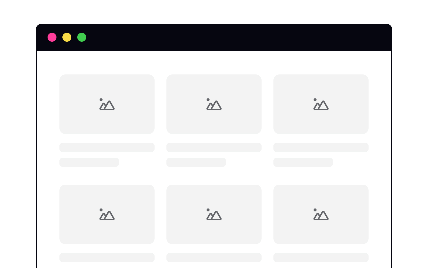
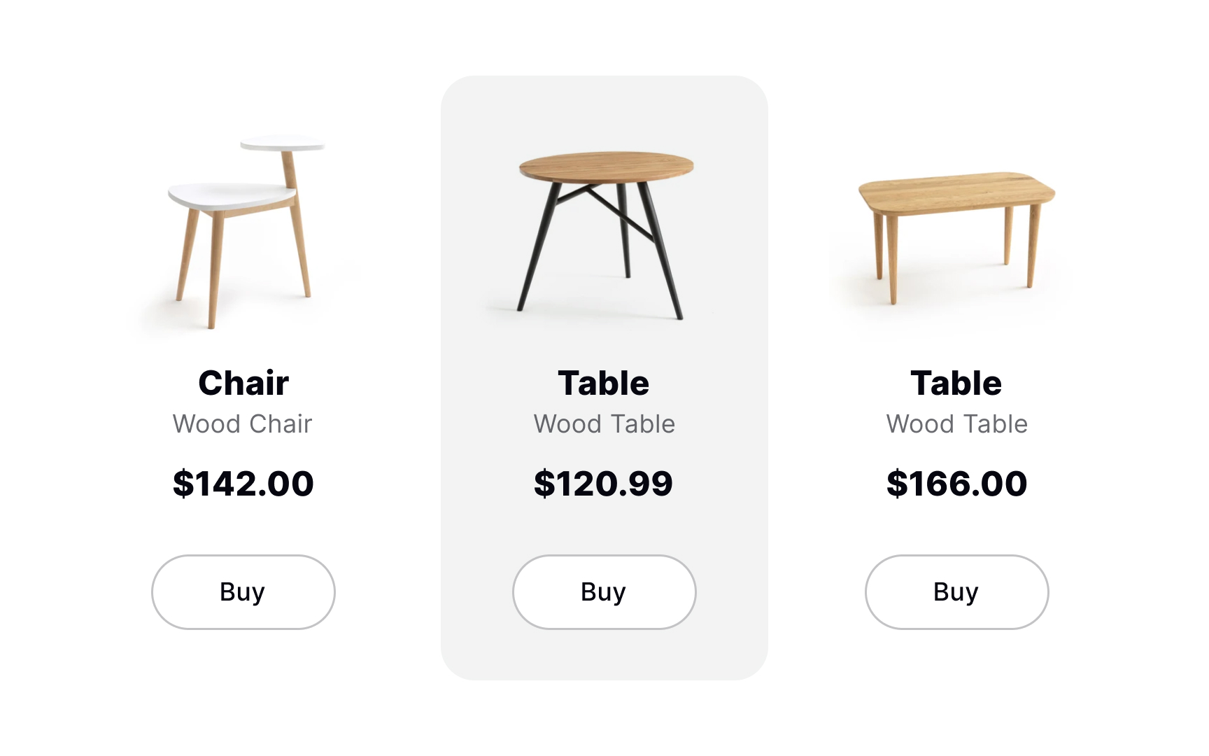
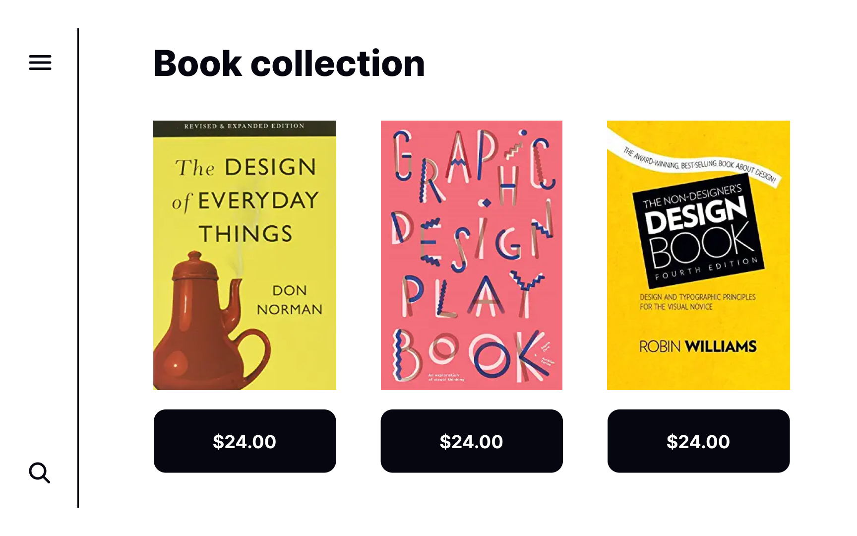
When your elements are of equal importance, similarity is your friend. Take a series of cards on a page. They’re all important and no individual card should try to steal the show. When they’re all formatted in the same way, they appear unified.

Exercise #7

Subtlety with shape

Subtlety with shape Bad Practice
Subtlety with shape Best Practice

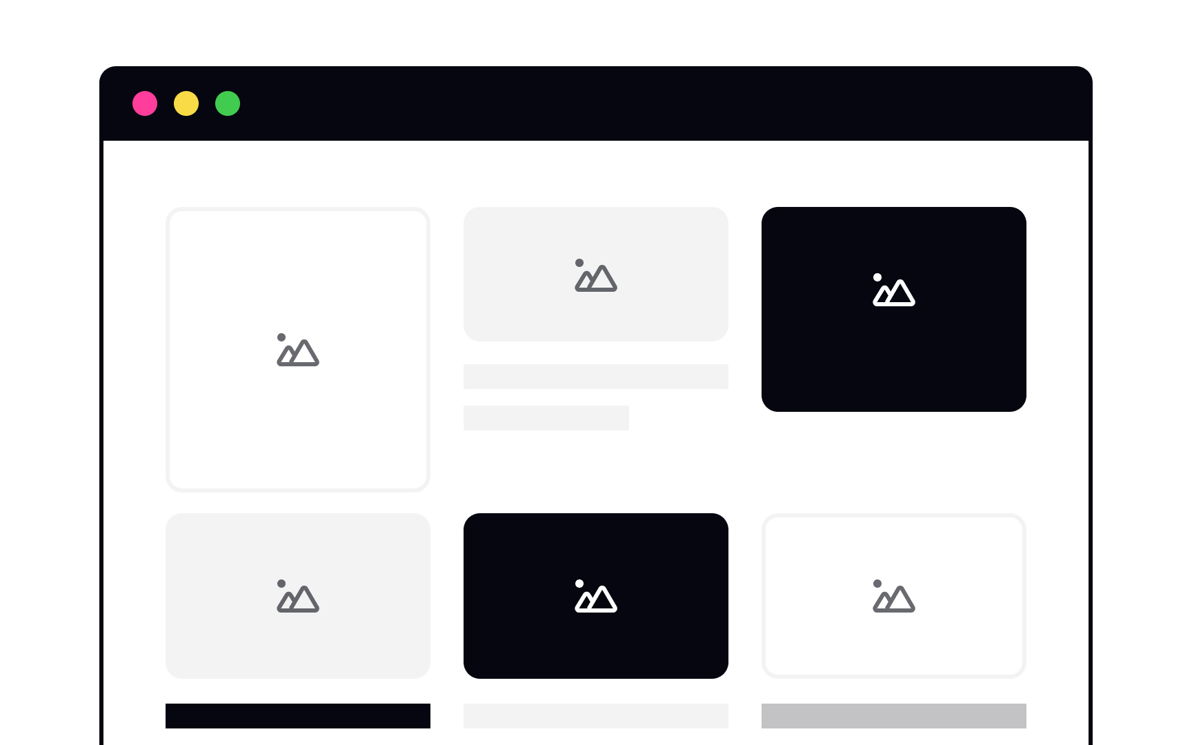
While all of these elements are rectangular, there are subtle differences between them. The cards have sharp corners, while the button corners are slightly rounded. It’s a small detail, but it helps users recognize and distinguish between elements to avoid confusion. The rounded corners on the buttons are also more inviting for users to interact with.

Exercise #8

Subtlety with size

Subtlety with size Bad Practice
Subtlety with size Best Practice

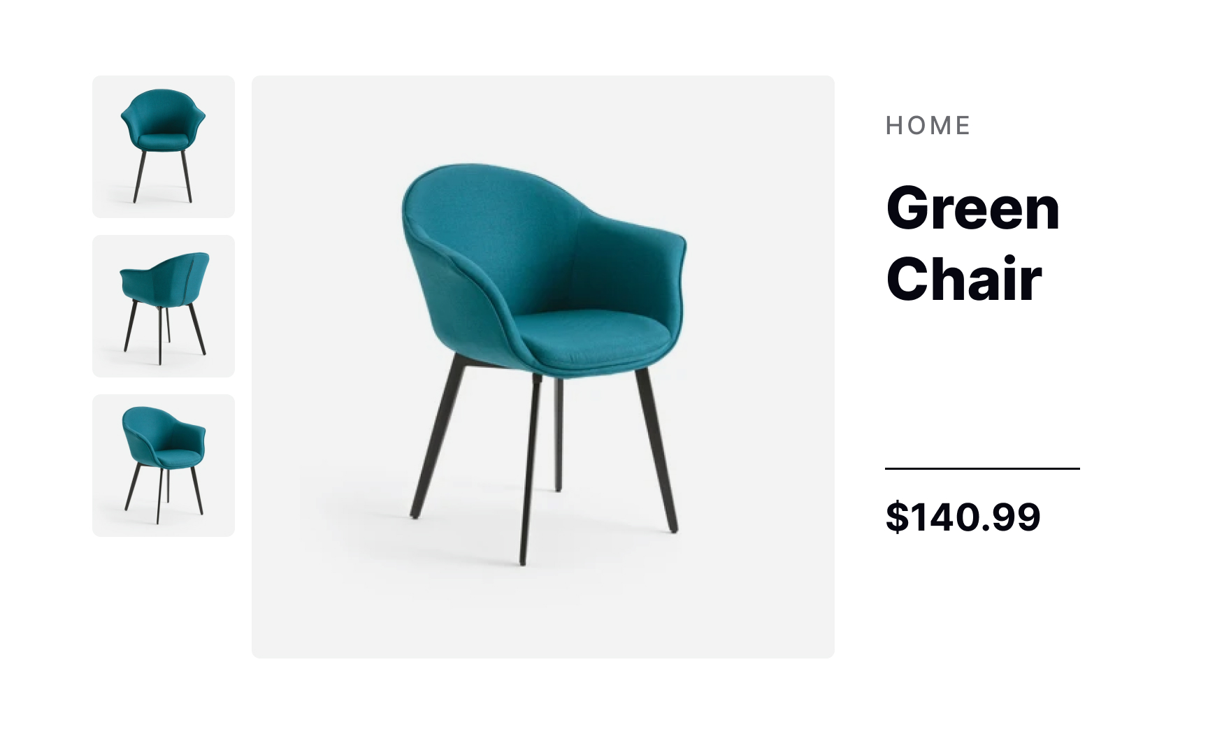
Subtle differences in the size of images on a page adds emphasis to the larger image while also capturing users’ attention. It makes a stronger visual impression than two equally-sized images while still allowing both images to shine.

Exercise #9

Subtlety with color

Subtlety with color Bad Practice
Subtlety with color Best Practice

While bright, contrasting colors have their time and place in design, they can run the risk of making your composition resemble Willy Wonka’s Chocolate Factory. An analogous color palette avoids that effect. Subtle differences in tints and shades help create a minimalistic and appealing look that’s easy to implement in many types of designs.[3]

Exercise #10

Subtlety with texture

Subtlety with texture Bad Practice
Subtlety with texture Best Practice

Playing with textures can add subtle differences between elements while also unifying them. A subtle texture effect on the sweater and skirt tie the two characters in this example together, without being mirror images of each other. At the same time, it balances out the composition.

Exercise #11

Similarity with shape

Similarity with shape Bad Practice
Similarity with shape Best Practice

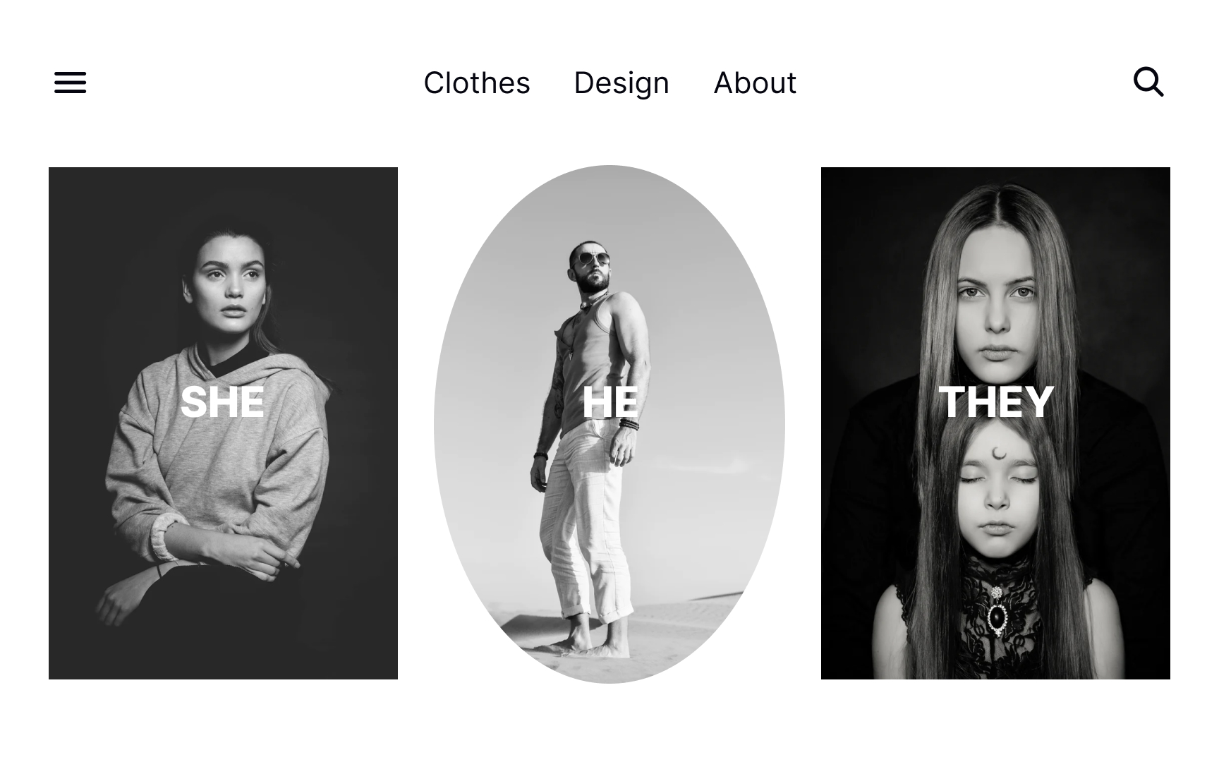
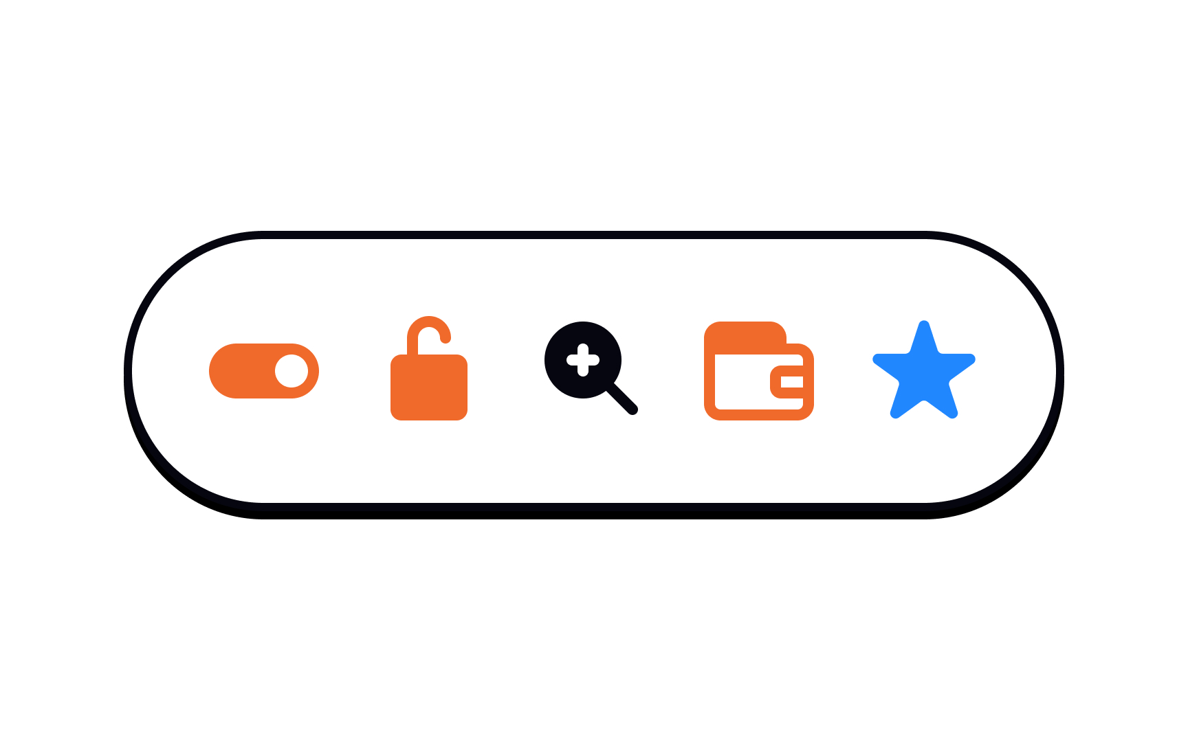
Similar elements are immediately perceived as related by users. Elements that share the same shape, color, size, or other properties are viewed as a group. It’s one of the main reasons designers stick to one button shape throughout a design or use all black and white images of the same size and shape. The same-shaped images in this example demonstrate they belong to a single group.

Pro Tip: Be careful not to use the same shape for elements that are not related, as it can make users perceive them as a group.

Exercise #12

Similarity with size

Similarity with size Bad Practice
Similarity with size Best Practice

Size is often used to emphasize an element and call attention to it. Same-sized elements, on the other hand, usually look related and carry the same level of importance. Due to size similarity, the example page from an e-commerce site looks consistent and makes it easy for users to scan and assess their options.

Exercise #13

Similarity with color

Similarity with color Bad Practice
Similarity with color Best Practice

Color is a powerful tool for designers and can help unify elements within a composition. Think of football players — they wear the same colored jerseys to signify that they belong to the same team. Using the same analogous color palette for elements — the CTA button, title, and hero image — creates a cohesive vibe and makes the entire composition look complete.

Complete this lesson and move one step closer to your course certificate