Comprehensive Research Methods
Uncover critical insights by researching both end users and implementation teams.
Effective design audits need solid research that captures insights from both product users and the teams implementing design solutions. By gathering diverse data types, you can evaluate how well your design elements perform across platforms and touchpoints. This approach combines website analytics, user feedback, visual heatmaps, interviews, and support tickets while also checking in with internal design and development teams. These multiple perspectives help spot usability issues, inconsistencies, and workflow problems that might otherwise go unnoticed.
Research transforms raw information into clear insights that bridge the gap between design intent and practical implementation challenges. Smart prioritization helps determine which problems need immediate attention versus long-term planning. Good research establishes clear benchmarks against which to measure improvements, creating an ongoing cycle that helps design solutions evolve based on evidence rather than guesswork. This balanced approach recognizes that successful design must satisfy end users while remaining practical for the teams building and maintaining them, ultimately creating more cohesive, efficient digital experiences for everyone involved.
Good design audit
Pro Tip: Link each research objective to a specific business metric to help stakeholders see the value of your design audit and get the resources you need.
Analytics data provides solid evidence about how users interact with your designs. Rather than guessing what works, numbers show exactly where users spend time, drop off, or convert. Start by identifying key metrics that align with your
- Focus on design effectiveness: Collect data that reveals how well
design elements perform, not just general traffic statistics - Use proper tools: Google Analytics, Hotjar, or Mixpanel can track user journeys through your product
- Identify problem areas: Look for outliers: pages with unusually high exit rates or features with low engagement
- Check cross-platform consistency: Compare metrics across different devices and platforms
- Segment by user types: Understand how different audiences interact with your design
This quantitative foundation helps prioritize which areas need deeper qualitative research and provides baseline measurements against which improvements can be tracked.[1]
Pro Tip: Create custom events to track specific design interactions that standard analytics might miss, like hover states, partial form completions, or scrolling patterns.
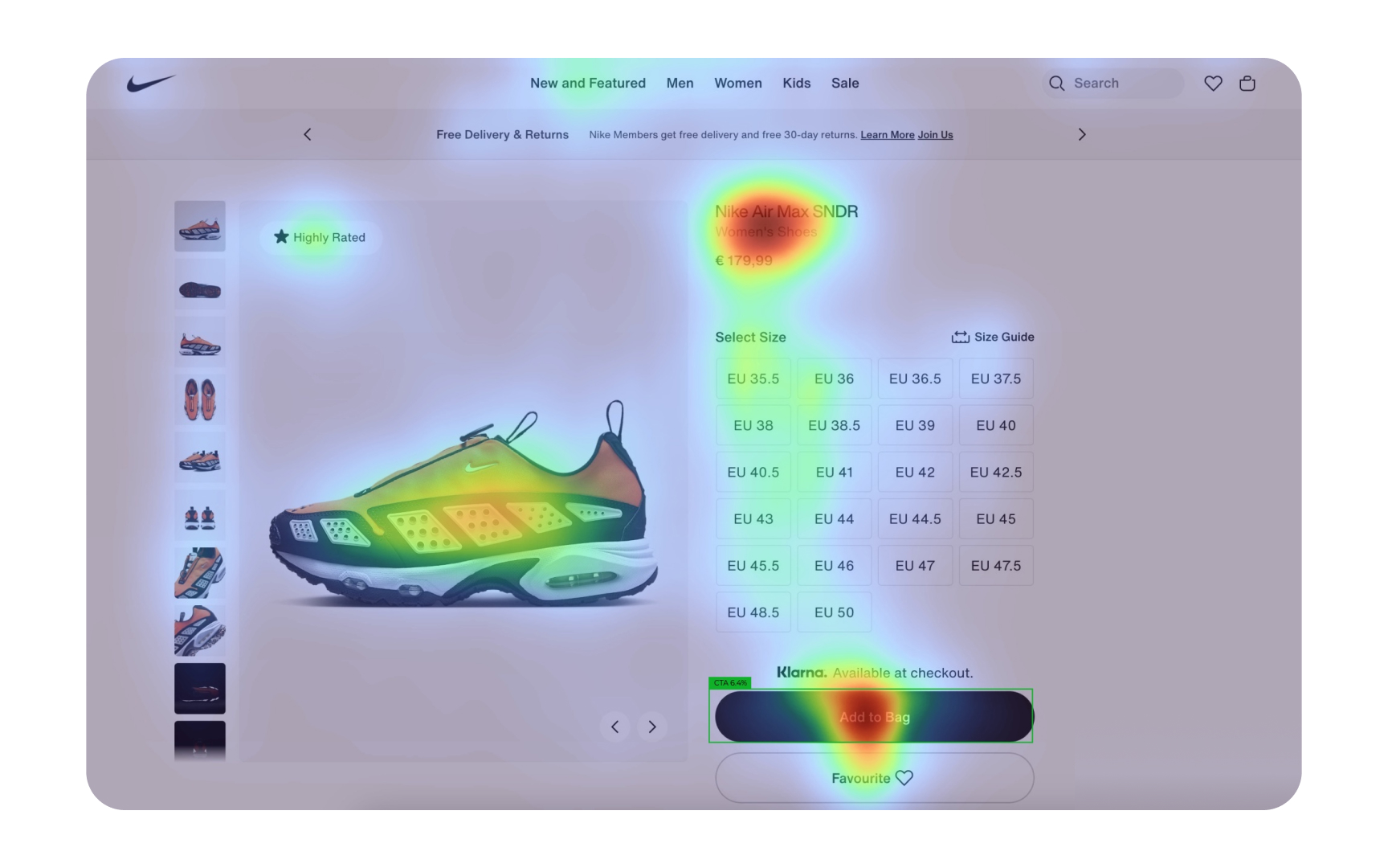
Heatmaps transform complex user interactions into visual data that reveals how users actually engage with your designs. These color-coded visualizations show where users click, move their cursors, and how far they scroll down pages. By analyzing these patterns, you can identify which
- Click heatmaps: Show exactly where users click, highlighting if they're missing important buttons or clicking non-interactive elements
- Move heatmaps: Reveal where users hover their cursors, indicating interest or confusion
- Scroll heatmaps: Display how far down the
page users typically read, showing if important content is being missed - Attention zones: Identify which parts of your interface receive the most and least attention
- Device comparison: Analyze how behavior differs between desktop, tablet, and mobile users
Look for unexpected patterns in heatmap data, such as repeated clicks on non-interactive elements or cursor "dead zones" where users rarely venture. These insights often reveal
Pro Tip: Create heatmaps for different user segments to see how behavior patterns vary between new and returning users, or between different demographic groups.

Unlike analytics or heatmaps, interviews reveal the "why" behind user behavior, uncovering motivations, frustrations, and thought processes that quantitative data can't show.
- Recruit diverse participants: Include both frequent and occasional users from different demographics
- Prepare a discussion guide: Create open-ended questions that encourage detailed responses
- Focus on experiences: Ask about specific
interactions rather than opinions or hypotheticals - Use the think-aloud method: Have users narrate their thoughts while completing tasks
- Avoid leading questions: Ask "How did you complete this task?" rather than "Was this easy?"
- Capture verbatim quotes: Record exact user language to preserve authentic feedback
- Watch for non-verbal cues: Notice hesitations, confusion, or moments of delight
Plan for 45-60 minute sessions to prevent fatigue, and always conduct a pilot
Internal teams that implement designs have valuable perspectives that often go untapped during audits. These teams, composed of developers,
- Target diverse roles: Include developers, QA testers, content writers, and project managers
- Focus on workflows: Ask about bottlenecks, workarounds, and efficiency challenges
- Ask about documentation: Determine if design specs are clear, complete, and usable
- Discuss technical constraints: Identify when designs conflict with technical limitations
- Explore collaboration gaps: Uncover communication breakdowns between design and implementation
- Assess consistency issues: Find areas where design standards are difficult to maintain
- Gather improvement ideas: Implementation teams often have practical suggestions for design systems
Anonymous feedback often yields more honest responses about process problems. Pay special attention to recurring themes across different team members, as these typically indicate systemic issues rather than personal preferences.
When auditing designs, developers provide crucial insights that others might miss. Their technical perspective reveals implementation challenges that affect the final product in significant ways.
Collecting meaningful developer feedback requires tailored approaches:
- Technical workshops where developers can demonstrate specific challenges they face with current designs. These hands-on sessions often reveal issues that wouldn't emerge in standard surveys.
- Code walkthroughs that examine how designs translate to implementation. Look for comments, workarounds, or custom solutions that indicate design-implementation gaps.
- Component usage analysis to identify which
design elements developers consistently modify or avoid altogether. These patterns often signalusability or technical compatibility issues. - Documentation review sessions focusing specifically on whether specifications provide sufficient technical detail for accurate implementation.
- Implementation time tracking for different design patterns helps identify the design approaches that are most efficient from a development perspective.
The most valuable feedback comes when developers feel comfortable sharing technical constraints honestly. Create a blame-free environment focused on improvement rather than critique.
Pro Tip: Schedule feedback sessions during the developers' less busy periods. Avoid deployment weeks when stress and time pressure might affect the quality of feedback.
Support tickets contain gold mines of user experience insights that often go untapped during design audits. These real-world problem reports reveal exactly where users struggle enough to seek help.
Start by collecting 3-6 months of support data to identify meaningful patterns rather than isolated incidents. Look beyond the surface-level categorization and dig into the actual language that users employ when describing their problems.
Key areas to analyze:
- Frequency: Which
design elements generate the most support requests? - Severity: Which issues cause the most significant user frustration?
- Resolution time: Which design-related problems take the longest to solve?
- Recurrence: Which issues keep happening despite attempted fixes?
- User segments: Do certain user types experience specific problems more often?
When reviewing tickets, pay particular attention to screenshots, screen recordings, or step-by-step descriptions that show precisely where users get stuck. These detailed cases provide context that quantitative data alone cannot.
Collaborate with support teams who interact directly with users. They've developed intuition about common pain points and can often predict which design elements will cause problems.
Pro Tip: Create a simple tagging system for support teams to mark design-related issues, making it easier to collect this valuable data for future audits.
Collecting data from different sources is only half the challenge. The real value comes from synthesizing these diverse perspectives into cohesive insights. This process transforms disconnected information into a unified understanding of design strengths and weaknesses.
Begin by organizing all
Next, look for patterns that appear across multiple data sources:
- When users report difficulties in interviews that also show up in support tickets
- When heatmap data confirms problems identified by implementation teams
- When analytics reveals drop-offs at points developers flagged as problematic
These multi-source confirmations typically indicate your most significant issues.
Equally important is identifying contradictions between sources, for instance, when users say they value certain features but analytics shows low usage. These contradictions often reveal the most interesting insights about the gap between stated preferences and actual behavior.
Pro Tip: Use affinity mapping with different colored notes for each data source to visually identify which insights have support from multiple research methods.
After gathering data from multiple sources, the critical step is to recognize meaningful patterns that point to genuine design problems rather than isolated incidents or coincidences.
Start by grouping similar observations from different research methods. For example:
- Multiple users struggling with the same interface element
- Consistent drop-offs at a specific point in the user journey
- Repeated complaints about particular features
Design elements that consistently cause implementation challenges
When assessing these patterns, consider their:
- Impact: How severely does this issue affect users or implementation teams?
- Scope: How many people encounter this problem and how frequently?
- Persistence: Has this issue appeared consistently over time or just recently?
- Root cause: Is the problem in the design itself, the implementation, or user expectations?
Look beyond superficial similarities to identify underlying issues. For instance, several seemingly different
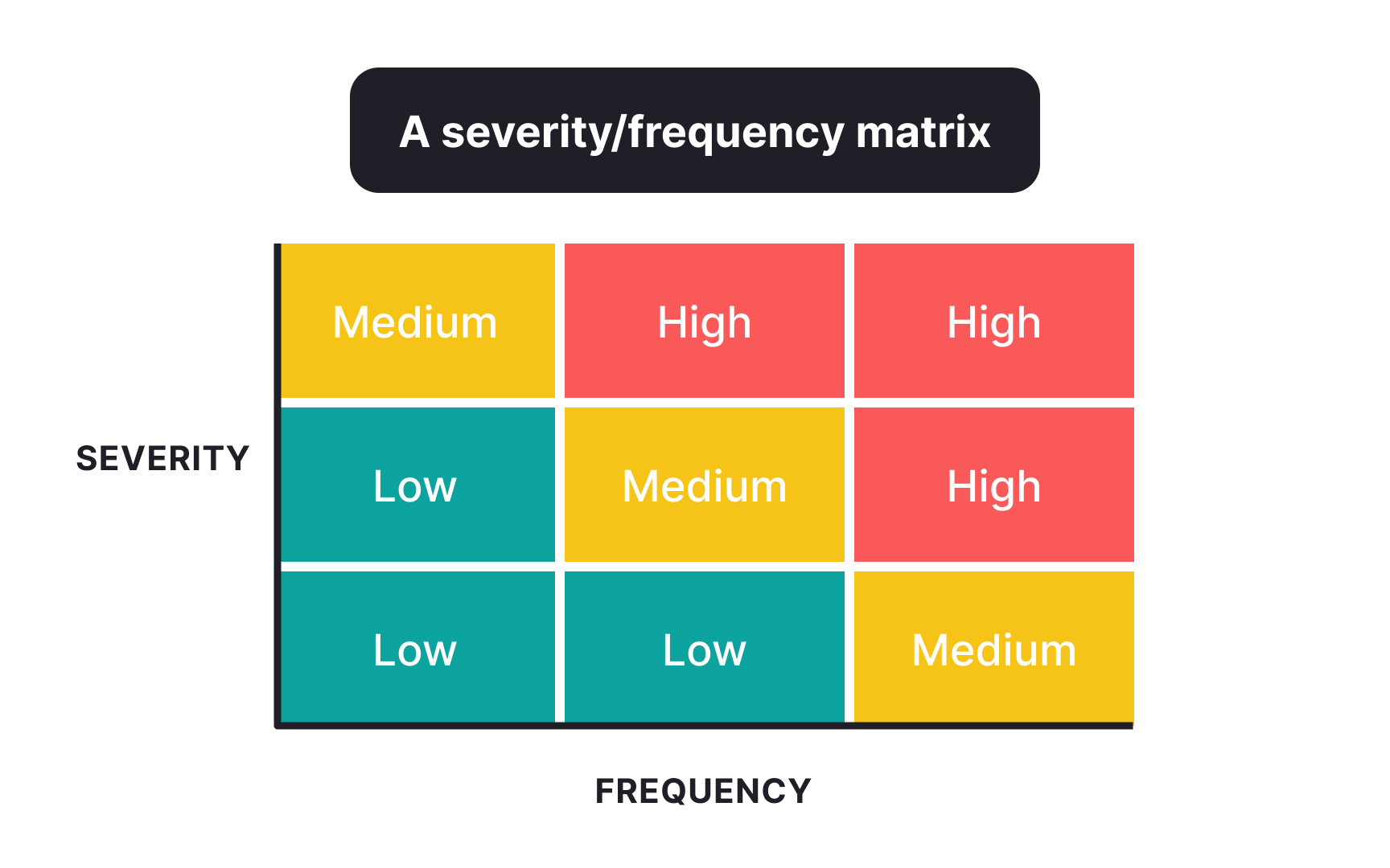
Pro Tip: Create a severity/frequency matrix to plot identified patterns, helping prioritize which problems most urgently need attention.
After identifying
A strong
- Business impact: How does this issue affect key metrics like conversion, retention, or revenue?
- User impact: How severely does the problem disrupt
user experience or prevent task completion? - Implementation effort: What resources, time, and technical complexity would be required to fix it?
- Strategic alignment: How does addressing this issue support broader product or company goals?
Start by establishing rating scales for each factor (typically 1-5) and scoring each identified problem. Calculate a priority score using a weighted formula that reflects your organization's values. For example, you might weigh user impact more heavily than implementation effort.
Visualize your prioritized issues using frameworks like:
- Impact/effort matrices
- RICE scoring (Reach, Impact, Confidence, Effort)
- MoSCoW method (Must have, Should have, Could have, Won't have)
References
Topics
From Course

Share


Similar lessons

User Research Basics

UX Research Strategy & Methodology
