Designing for Dyslexia
Understand the nuances of designing products that are easy to use for individuals with dyslexia
Dyslexia affects nearly 20% of the population worldwide, fundamentally changing how these individuals process written information and navigate digital spaces.[1] The neurological foundations of dyslexia create specific challenges with text recognition, working memory, and information processing that standard interface designs often fail to address.
Thoughtful spacing, appropriate font selection, strategic color contrast, and clear information hierarchy dramatically improve readability and user confidence. These design considerations extend beyond compliance checklists, representing the difference between exclusion and empowerment. Digital products incorporating these approaches show measurable improvements in comprehension, task completion, and user satisfaction across diverse cognitive profiles. This cognitive-focused approach to product development embodies how inclusive design drives innovation and expands market reach while respecting the full spectrum of human diversity.
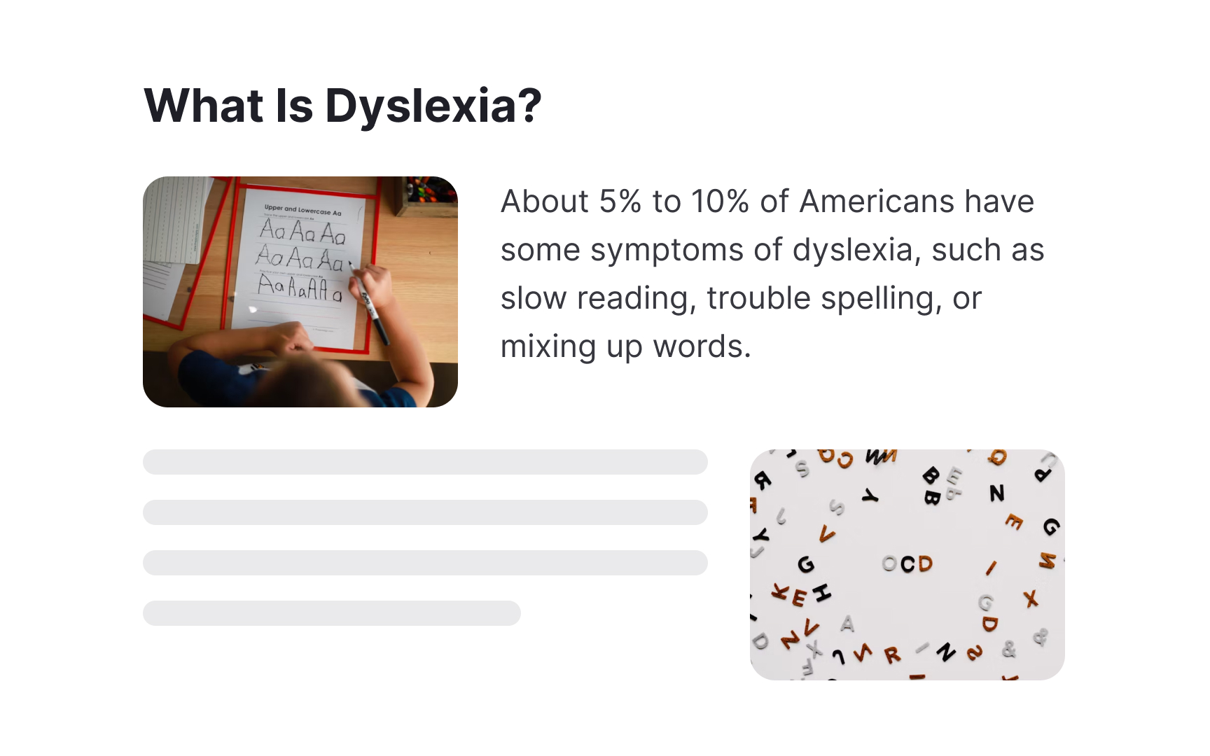
Dyslexia is a learning difference that affects how the brain processes written and spoken language. It impacts reading speed, word recognition, spelling, and pronunciation but does not affect general intelligence or learning capability. Many accomplished individuals, including scientists and entrepreneurs, have dyslexia.
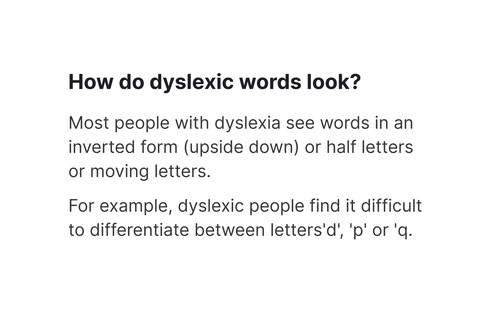
People with dyslexia may experience text in various ways, from letters appearing to move or flip to words seeming to blur together. These visual processing challenges can make reading slower and more demanding, requiring additional cognitive effort to decode text. Some individuals also experience difficulties with auditory processing and verbal expression.
Text layout,
Think of images as natural breaks in your
Getting the balance right makes a huge difference. Each image should earn its place by either explaining something complex, highlighting a key point, or giving readers a mental checkpoint in their journey through the content. But remember to give your visuals some breathing room. Cramming them too close to text can make things feel cluttered rather than helpful.
Not all visuals are created equal though. Skip the flashy patterns and overly decorative elements that might compete for attention. Clean, simple visuals that complement your content work best.


Serif
Sans-serif fonts like Arial, Open Sans, or Inter provide cleaner letter shapes that are easier to distinguish. Their simpler forms reduce cognitive load and improve letter recognition, especially at smaller sizes. Many dyslexia-friendly fonts like OpenDyslexic are specifically designed with letter shapes to prevent common reading errors like letter flipping or mixing.


People with dyslexia read by recognizing patterns in words. They spot familiar letter combinations rather than reading each letter. This helps them read faster and understand better.
Long, complex words slow down reading and make text harder to understand. Technical jargon creates extra barriers because unfamiliar word patterns take longer to process. Simple, everyday words help readers focus on the meaning instead of decoding complex terms.
Additionally, adding icons and visuals next to key terms helps build visual memory and speeds up reading. This combination of simple text and supporting visuals makes

Small text creates reading barriers for people with dyslexia as the letters are harder to distinguish and increase eye strain. Large, clear text helps readers identify letters more easily and reduces reading
Font size directly impacts reading comfort and speed, too. The British Dyslexia Association recommends using
Remember that font size preferences vary among users. Providing options to adjust text size helps readers customize their experience. This feature especially helps people who use screen magnifiers or need different text sizes throughout the day as their eyes tire.
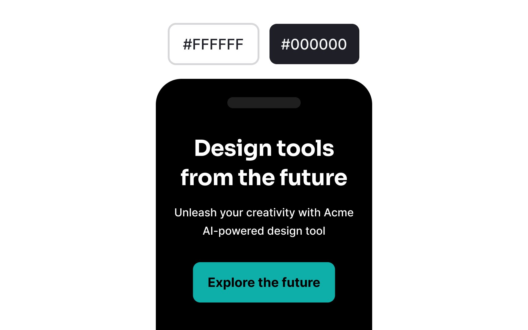

Dark mode affects how people with dyslexia read text. While dark backgrounds can reduce eye strain for some people[4], the wrong
A softer dark mode works better. Use dark gray backgrounds (#121212) instead of pure black (#000000). Pair them with off-white text (#DEDEDE) rather than bright white (#FFFFFF). This gentler contrast helps prevent text from appearing to
Let readers choose between light and dark modes. Some people with dyslexia find reading easier with dark text on light backgrounds, while others prefer the opposite.

Italic text and ALL CAPS create reading barriers for people with dyslexia. The slanted letters in italics blend together, while capital letters form uniform rectangular shapes that make words harder to recognize. Both formats slow down reading and increase
Bold text and sentence case work better for emphasis. When you need text to stand out, use bold formatting, different
Long lines of text make it hard to track words across the screen. When lines are too long, readers often lose their place or accidentally jump to the wrong line. This is especially challenging for people with dyslexia who may already struggle with text tracking.
The ideal line length for readable text is between 60-70 characters (12-18 words) per line. This length helps readers move smoothly from one line to the next without losing their place. On mobile devices, aim for 30-40 characters per line to maintain readability on smaller screens.
Use margins and padding to control line length in your
Proper line spacing helps readers track from one line to another. When lines sit too close together, words can appear to merge across lines. This makes reading more difficult, especially for people with dyslexia who may struggle to follow text.
For
Also keep in mind that different typefaces need different line heights. Typefaces with large x-heights may need more spacing, while those with smaller x-heights might work well with less. Always test your line height with your chosen typeface to ensure optimal readability.
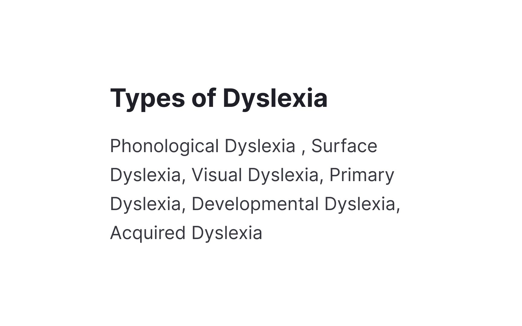
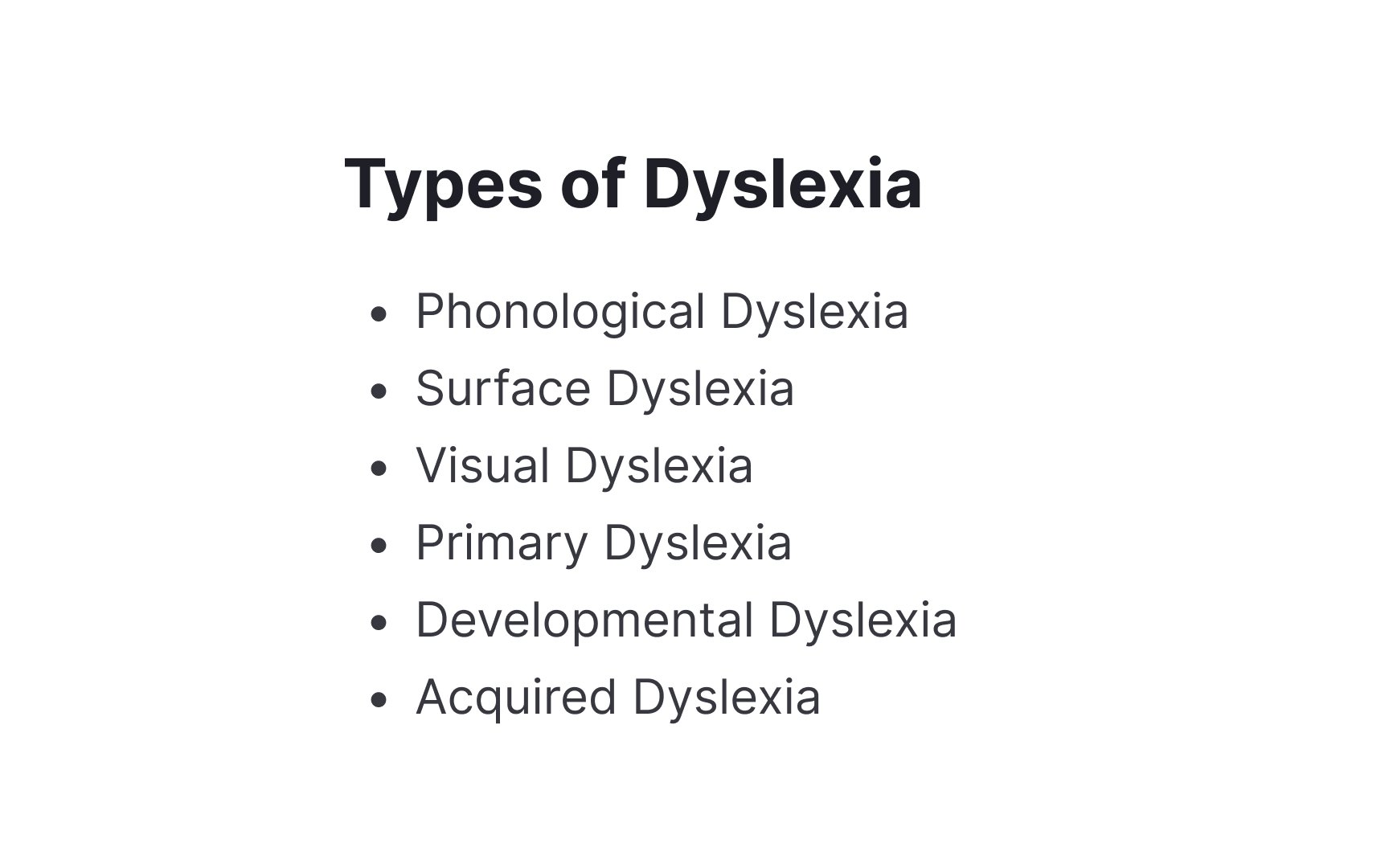
Lists help break down complex information into digestible chunks. They give readers clear visual breaks and make
Bullet points and numbered lists serve different purposes. Use bullet points for related items where order doesn't matter. Choose numbered lists when the sequence is important, like in steps or instructions. Keep list items short and start each with strong action words to maintain clarity.
Leave enough white space between list items. Add extra spacing before and after lists to separate them from regular paragraphs. This visual breathing room helps readers process information in manageable pieces and makes content hierarchy clearer.
References
- Dyslexia Basics - International Dyslexia Association | International Dyslexia Association
- Dsxyliea | geon
- The Pros and Cons of Using Dark Mode for Your Eyes | Ophthalmology24
Top contributors


Topics
From Course

Share


Similar lessons

Intro to Accessibility

Inclusive Design Basics
