CSS Color & Gradient
Learn how to use color and generate smooth gradients that create moods and capture users' attention
Color is probably the first thing people want to experiment with when learning HTML and CSS. Why? It creates the mood, captures users' attention, transmits system messages, and helps us make the website aesthetically appealing and unique.
We'll find out what meaning hides behind RGB and HSL acronyms and learn to generate beautiful smooth gradients between two or more colors.
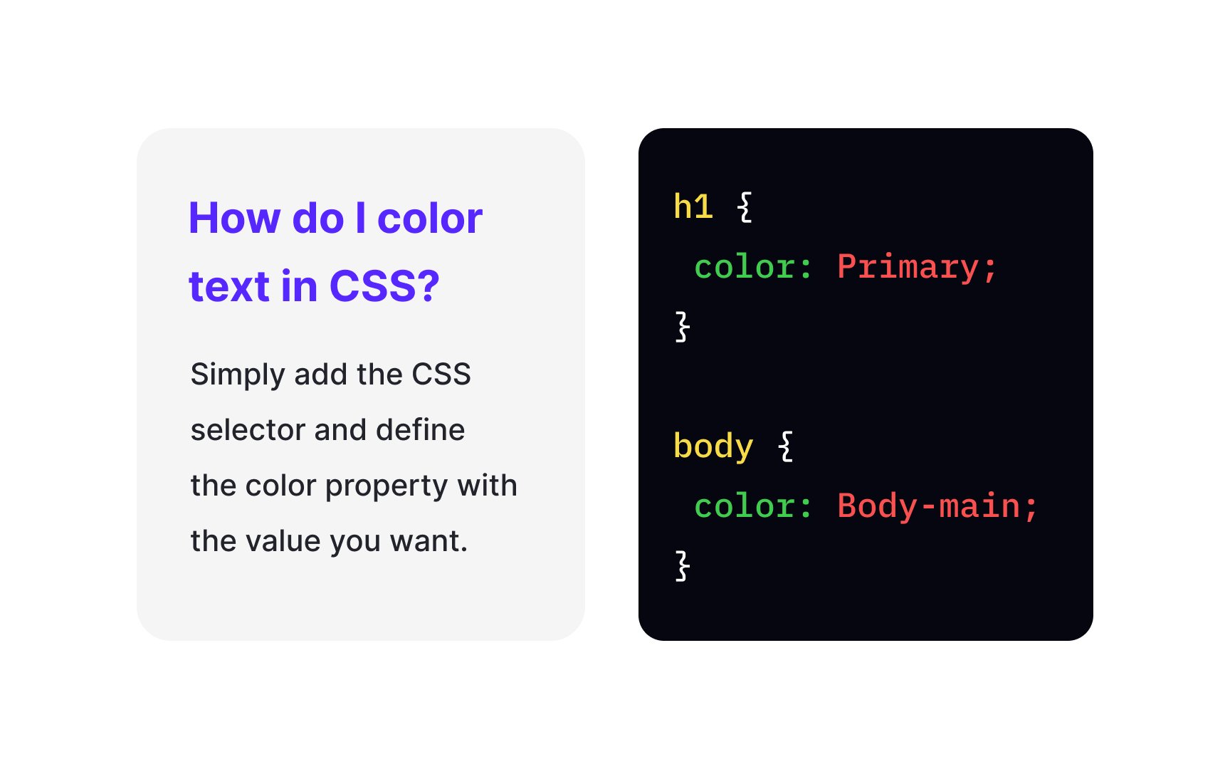
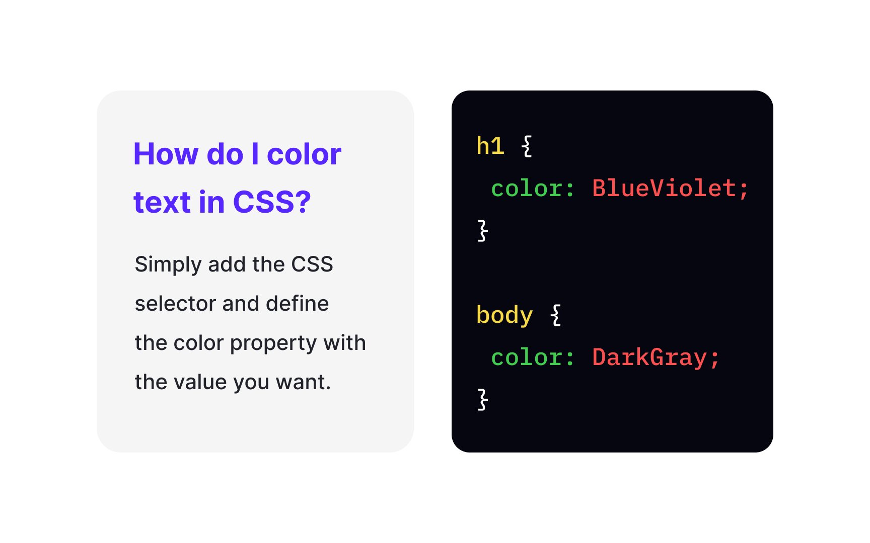
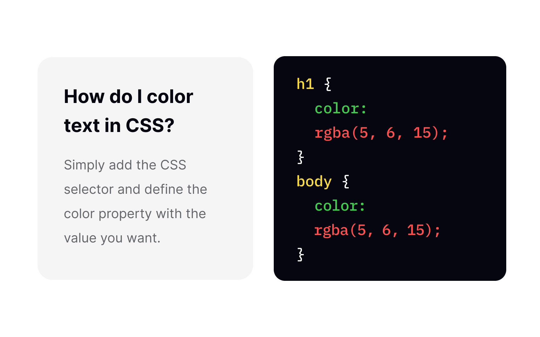
So how do you color property. For a value, you can specify color using

HEX
The first pair of symbols shows the intensity of red, the second stands for green, and the third represents blue. If the color value is higher than 9, instead of numbers, the HEX code uses letters: A=10, B=11, C=12, etc. Defining a HEX color, remember to use a hash (#) and close the declaration with a semicolon (;).
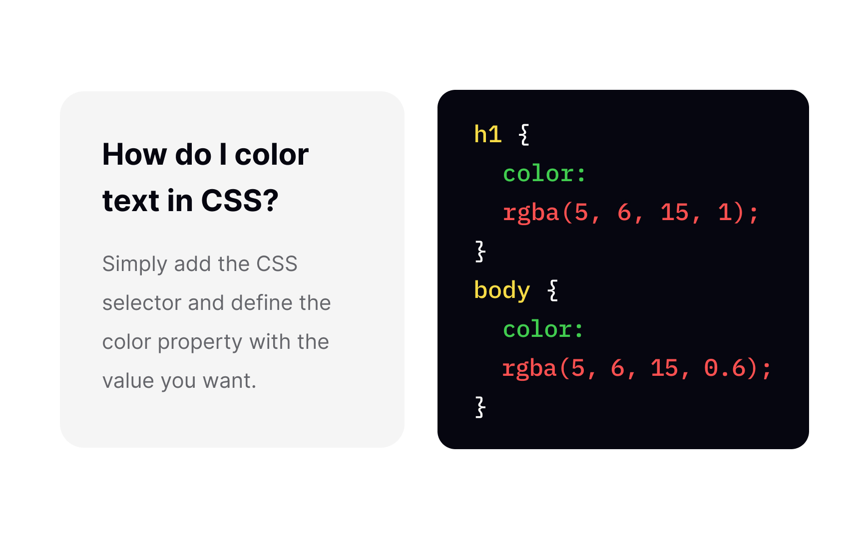
We're used to seeing the RGB
But what does the "A" stands for in the RGBA acronym? It refers to the alpha channel, which specifies the opacity for a color. The number 0.0 means the color is fully transparent and 1.0 — completely dense and opaque.
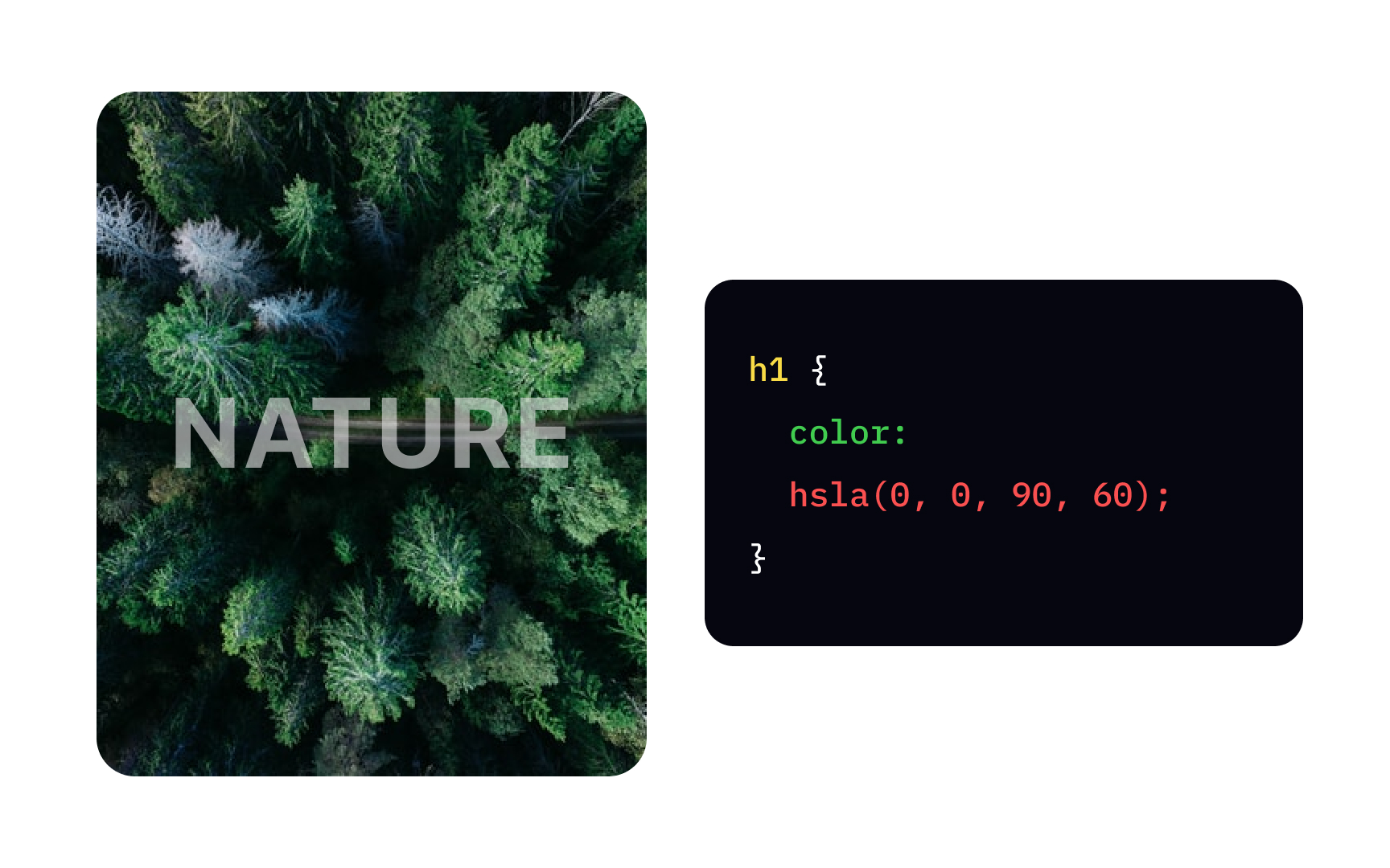
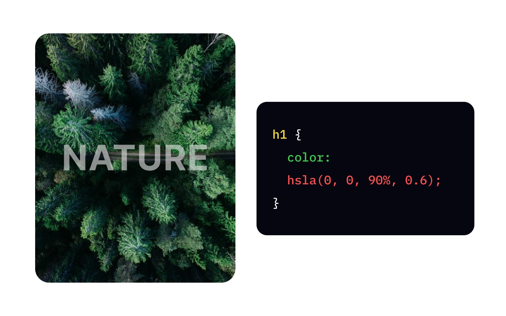
The HSL color model stands for Hue, Saturation, and Lightness:
- Hue defines the
color position on a color spectrum, and its value specifies the degree from 0 to 360. - Saturation defines the color intensity and how bright or pale the color looks. It's a percentage value, where 100% means the full color, and 0%, on the contrary, represents the grayish color.
- Lightness shows in percentage how much black or white mixed with the base color. 0% is dark (black), and 100% is white.
Like in RGBA colors, HSLA uses "A" for
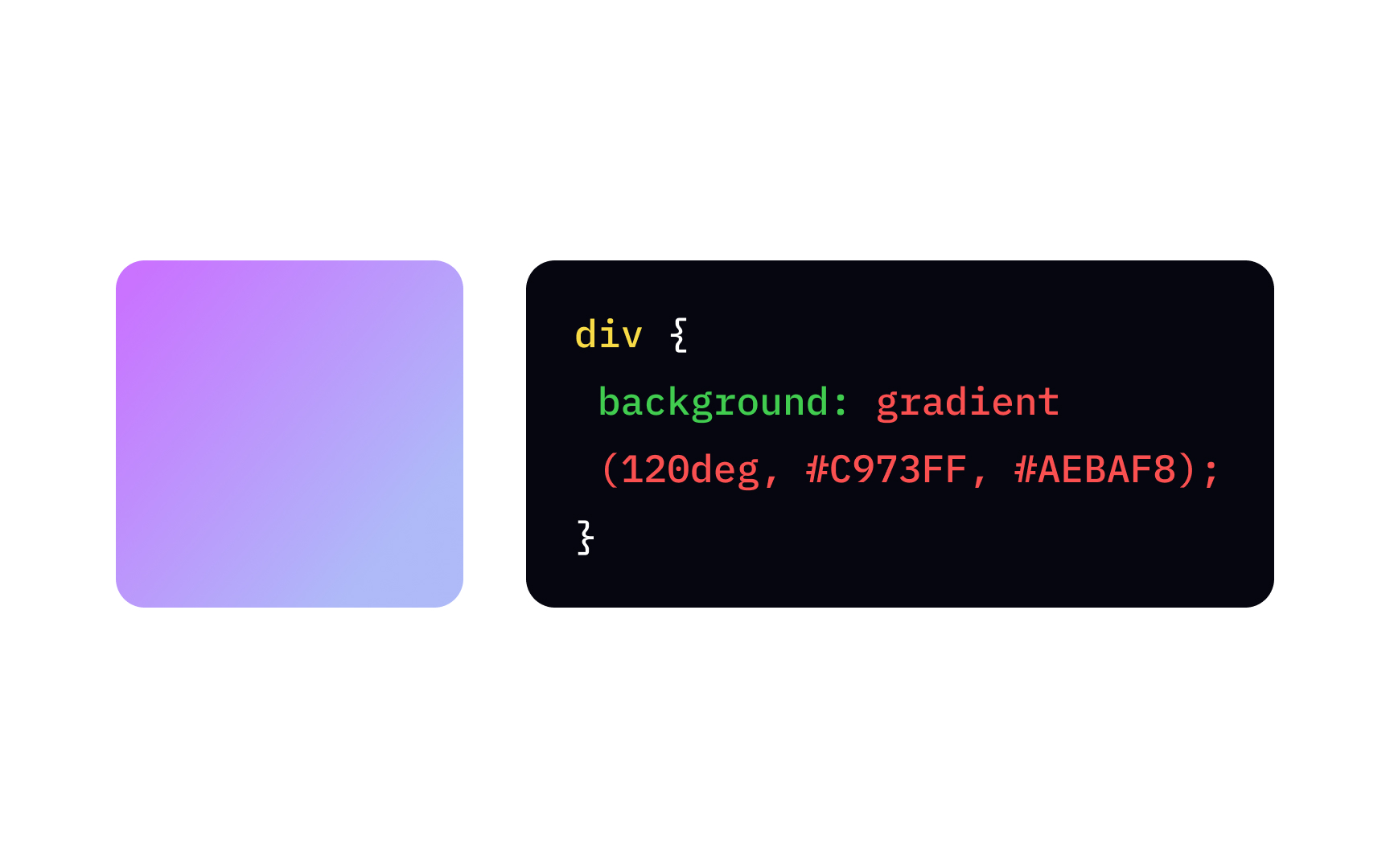
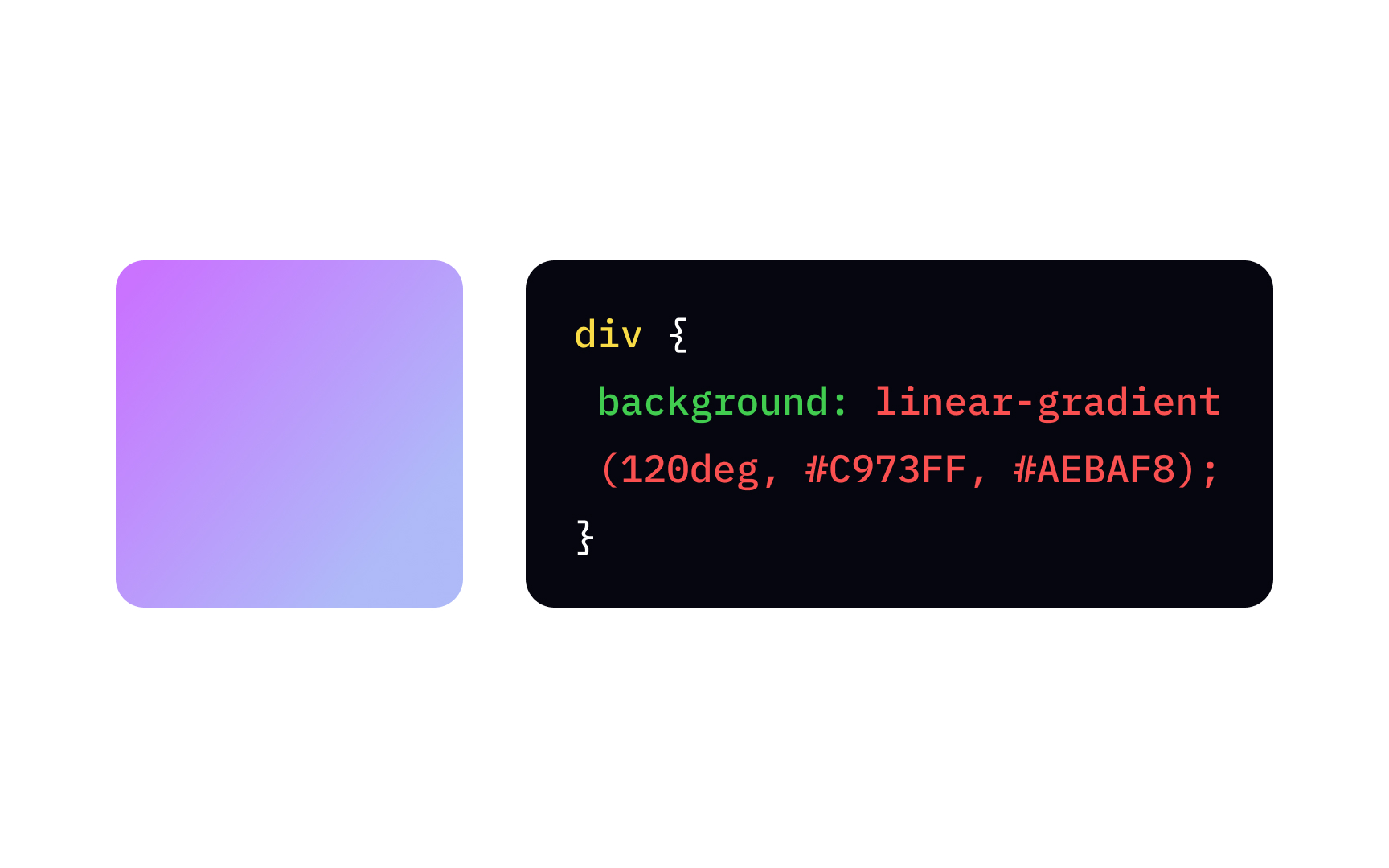
A linear-gradient function represents a progressive transition between 2 or more colors along a straight line. To create it, you need to specify at least two background or background-image
{
background: linear-gradient(direction, color-stop1, color-stop2, ...);
}
To specify the gradient direction, you can use predefined text values — to bottom, to top, to right, to left, to bottom right, etc. If you want to be more specific, you can set the angle. For example, a value of 0deg is equivalent to a bottom to top gradient, and as far as positive angles represent clockwise rotation, the angle 90deg will result in a left to right gradient.
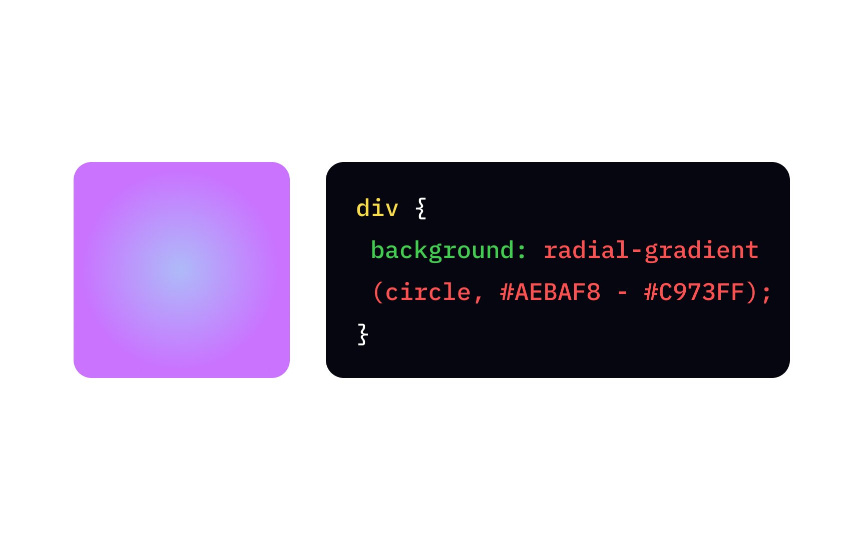
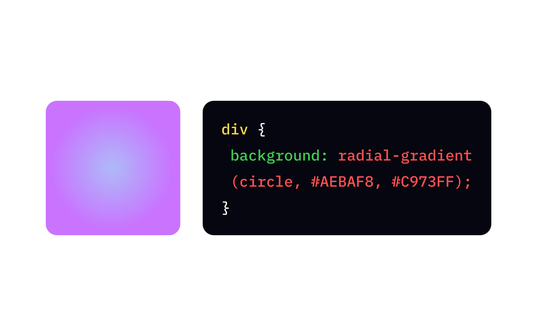
The radial-gradient function takes its start from a single point in the center and smoothly spreads outward in a circular or elliptical (by default) shape.
The basic syntax includes the radial-gradient function and the following arguments:
- Shape — circle or ellipse.
- Position, which you can define with length (
px,pt,cm), percentage (%), or predefined text values (left,bottom,right,top, etc.) - Size, which is set by default as
farthest-side, can also take values likeclosest-side,closest-corner, orfarthest-corner.
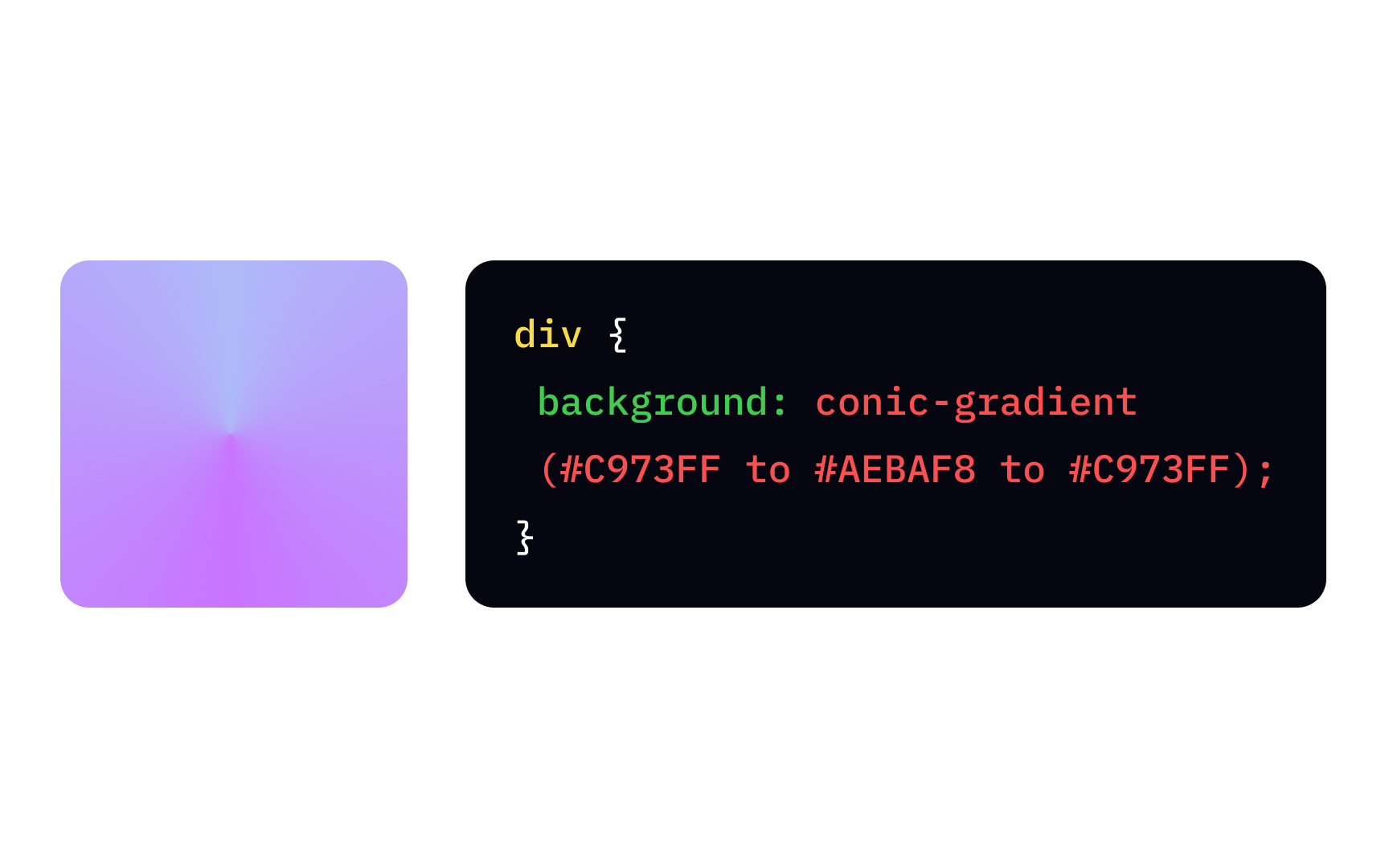
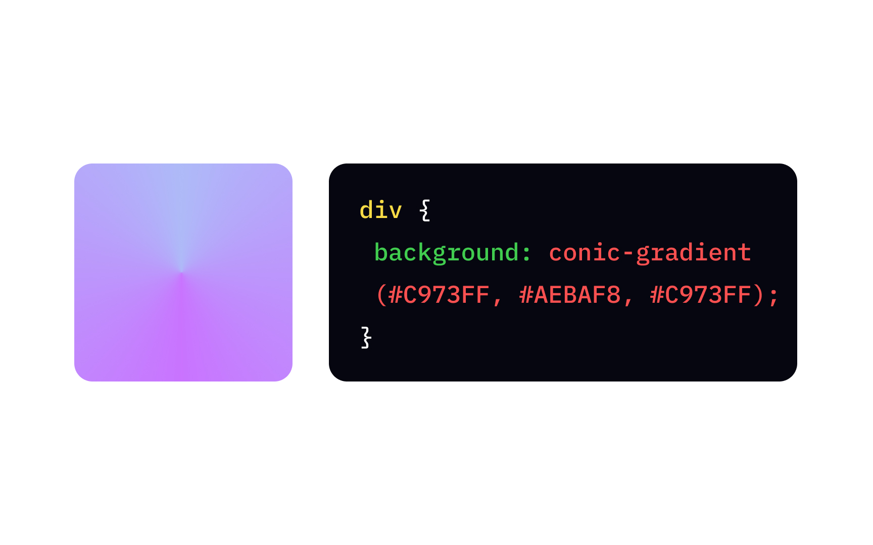
The conic-gradient function is relatively new and only appeared in
To create the simplest conic-gradient function, you need to specify the starting and ending colors. Adding the first color again as the last color will result in a smoother, more realistic gradient, like in the example.
It is possible to offset the gradient's start point using the "from" keyword and degrees (deg), e.g.:
{
background: conic-gradient(from -45deg, white, black, white);
}
Working on multicolored gradients, like a pie chart, you might certainly need a percentage value to specify how much space the color should take. For example:
{
background: conic-gradient(#444 0 25%, gold 0 70%, #0af 0 100%);
}
Here 0 equals "0 degrees," meaning all gradient colors start at the same point in the center.
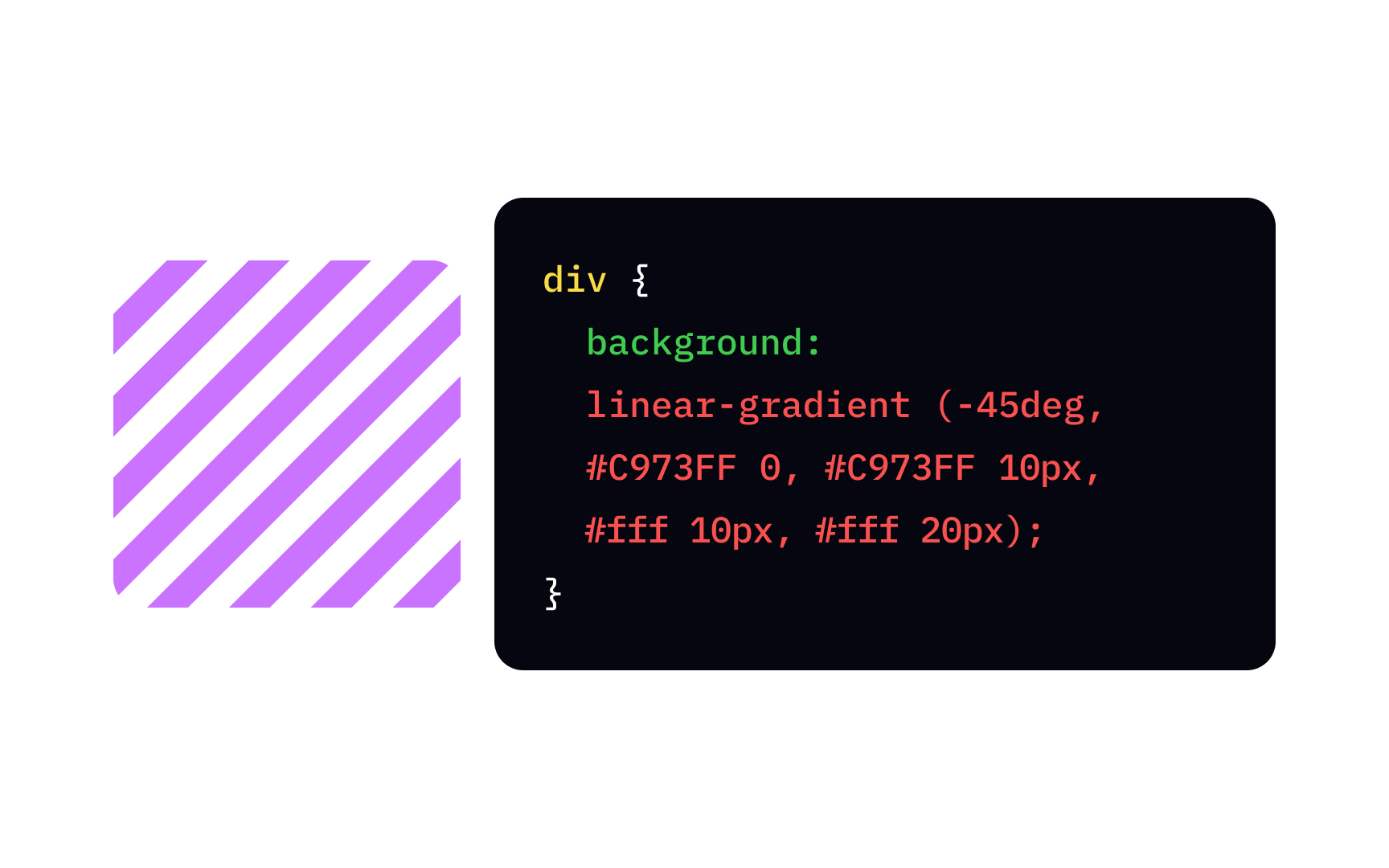
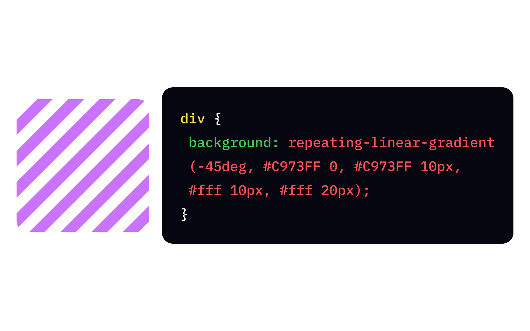
Gradients can form a pattern, and the repeating-linear-gradient function can save you from the pain of writing the same thing over and over again. The syntax doesn't differ from the average linear-gradient function and contains at least 2
The percentage values here define the color stops — the points where the line has a specific color. For example, the 0 point means the starting position for a purple line, and 10px refers to its ending point. The white line starts at 10px and ends at 20px — the function takes this rhythm to create a repeating
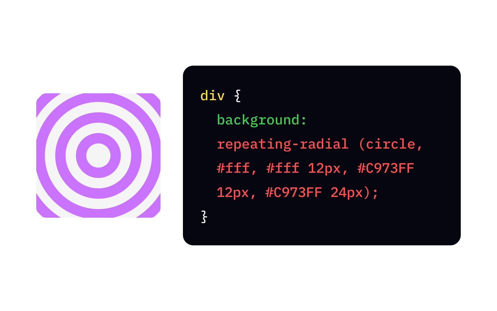
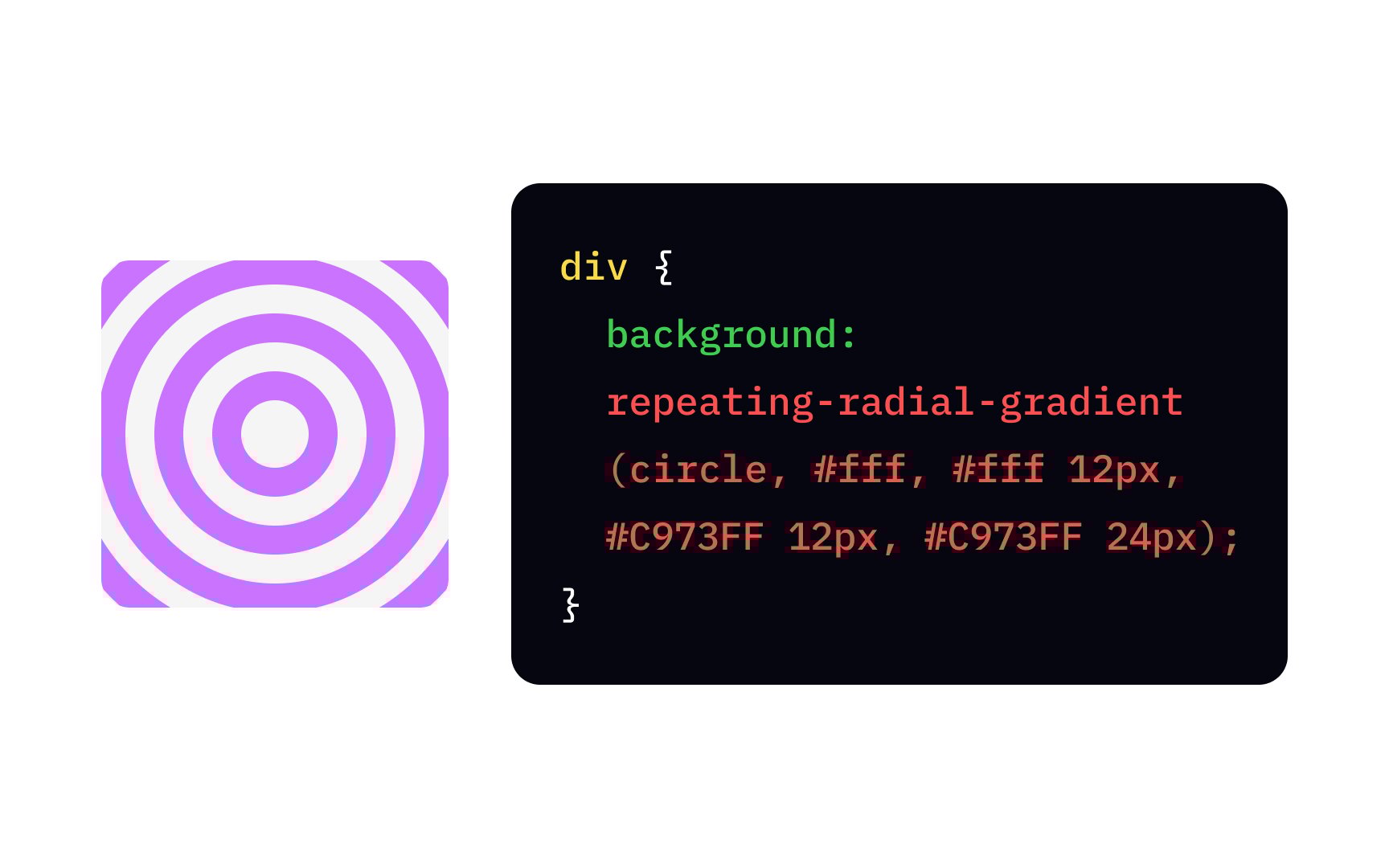
To repeat a radial repeating-radial-gradient function. For that matter, you define the shape (circle or ellipse), and
For example, the gradient starts with white at the center (the default position) and changes into purple in 12px. The purple, in turn, switches back to white in 24px. Then, the function repeats.
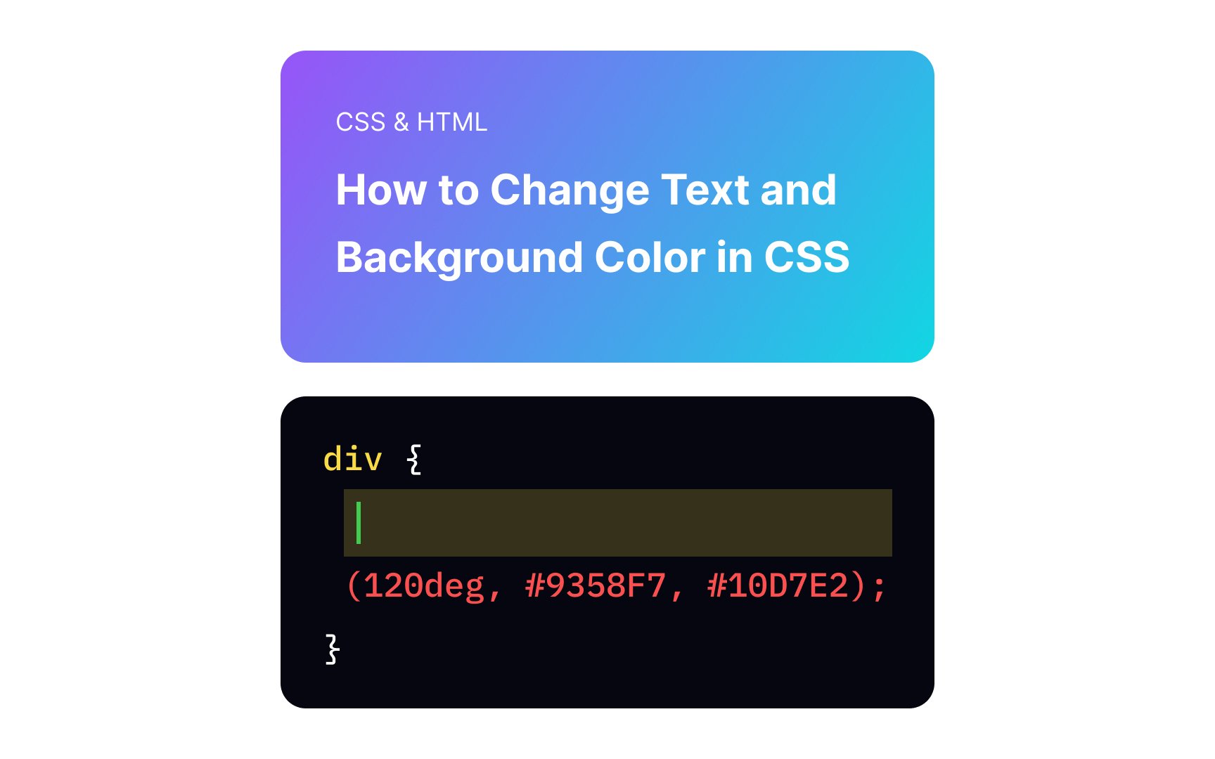
The correct linear-gradient, is with the shorthand background or background-image property. The 120deg sets the angle, and the ;)!
#) in front of them. Those 6 numbers and letters generally define a different way of representing RGB values. The first pair specifies the amount of red, the second stands for green, and the third refers to blue.
Take a note that web developers often use shorthands of HEX codes where both digits of the red, green, and blue values are the same, for example:
#000000 (black) — the short version is #000.
#ff0000 (red) — the short version is #f00.


Similar lessons

Intro to Color Theory

Color Properties
