Interactive feedback states
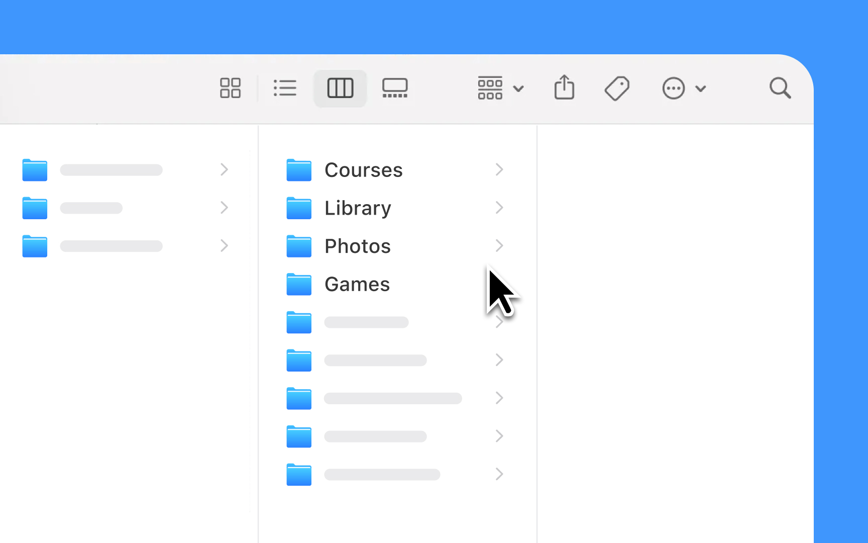
Lists and tables must respond clearly to every user action. Each interaction, from a simple tap to more complex gestures, needs immediate visual feedback that helps users understand what's happening and what they can do next.
Design principles for interactions:
- Touch feedback: Highlights rows or cells briefly when tapped, using system-default gray
- Selection states: Changes background color and adds checkmarks for selected items
- Swipe actions: Reveals contextual actions with smooth animations and clear hit areas
- Scroll indicators: Shows and hides scrollbars automatically while scrolling
- Loading states: Reduces row opacity and shows a spinner when refreshing content or loading more items
- Error states: Presents clear visual cues when actions fail or content can't load
Pro Tip: Always test interactive states with VoiceOver enabled. Every state change should be clear both visually and through audio feedback.
