The Making of xBridge

This project showcases the complete design journey behind xBridge, from its inception to its final form. The process involved creating a distinctive and modern logo, developing a cohesive style guide to define the platform’s visual identity, and designing the platform itself with a focus on functionality, user experience, and aesthetic appeal. Every aspect of the project was meticulously crafted to ensure a seamless and impactful digital presence.
xBridge Logo Design
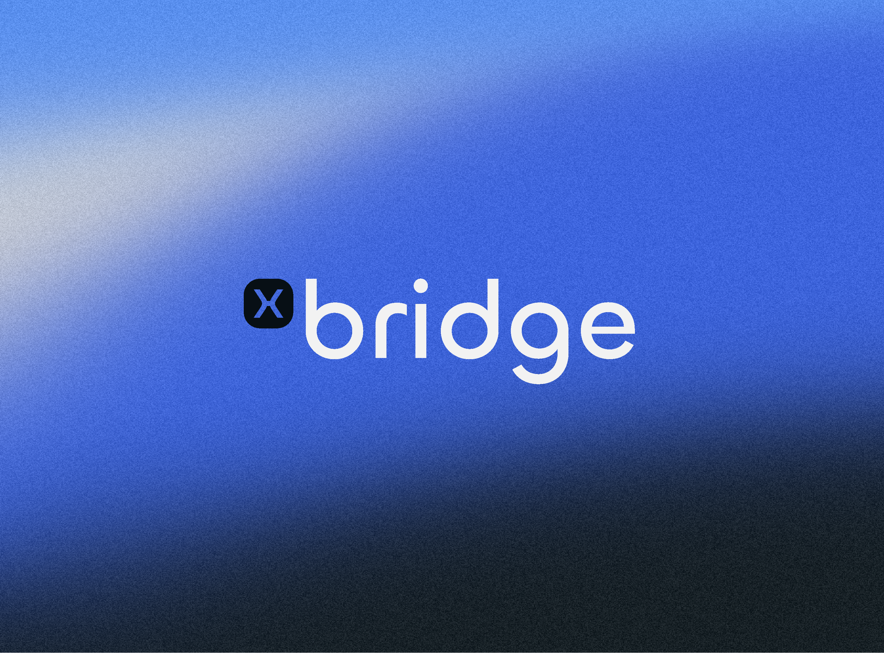
The xBridge logo embodies a modern and trustworthy brand that seamlessly connects technology with simplicity and reliability. Its minimalist and clean design ensures strong brand recognition while reflecting the core values of efficiency, innovation, and dependability.
Typography
The sleek, rounded typography conveys accessibility and openness, while maintaining a professional and sophisticated appearance.
Color Palette
The dominant blue symbolizes trust, stability, and progress, complemented by contrasting white and black elements for enhanced readability and visual balance.
The “x” Symbol
The “x” icon, enclosed within a circular shape, adds harmony and simplicity to the design. It also represents the idea of connection—bridging people, businesses, and technology.
The logo was created with versatility in mind, ensuring consistent application across digital and print media while maintaining a cohesive visual identity.
Style Guide for xBridge
The style guide for xBridge serves as the foundation of the platform’s visual identity and design consistency. It defines the key design principles, ensuring that every element contributes to a cohesive and user-friendly experience.
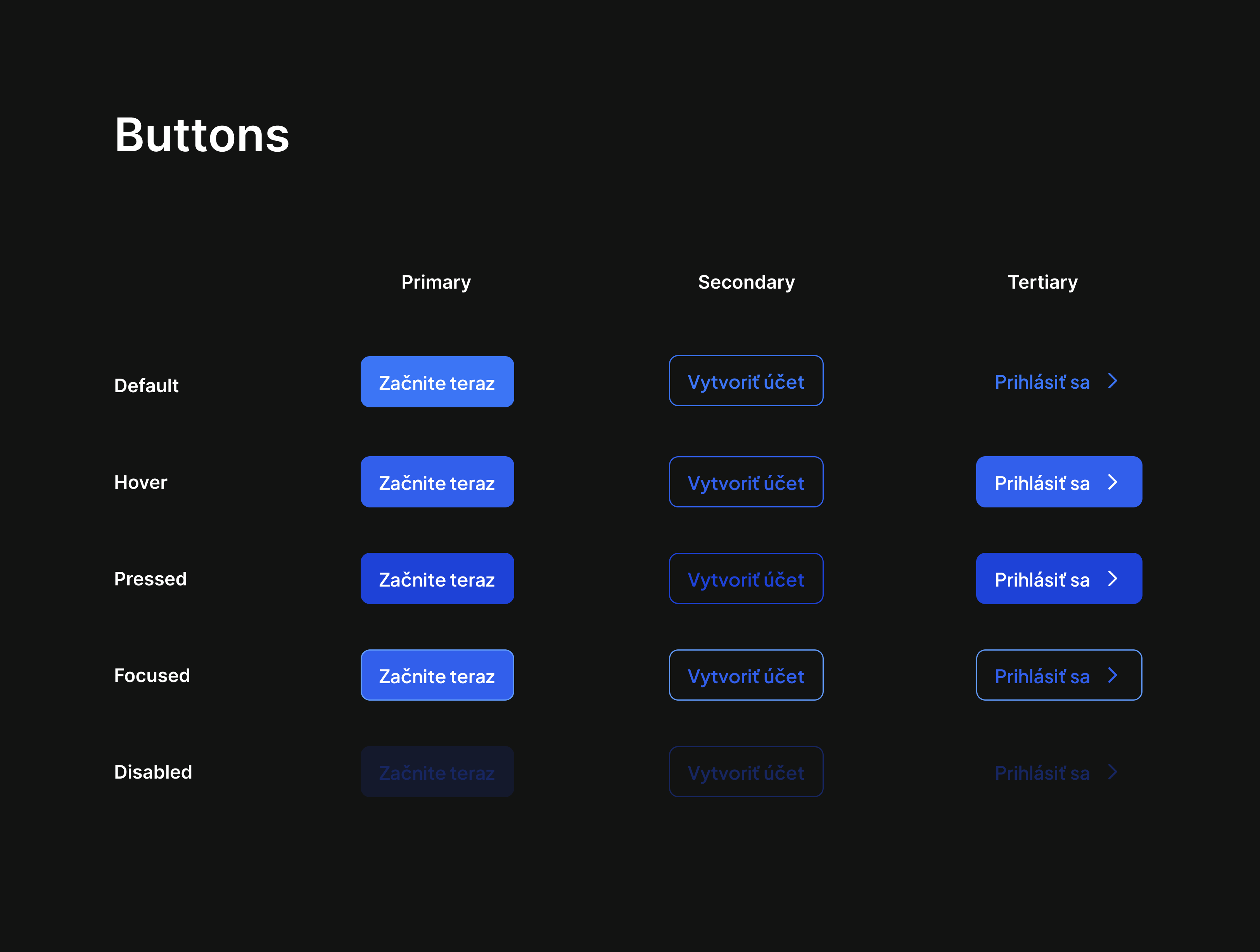
Buttons
The button system is designed to be versatile and intuitive, covering a wide range of states for different use cases:
Primary Buttons -Used for key actions, visually highlighted with the signature Royal Blue color.
Secondary Buttons -Provide alternative or secondary actions, outlined for a lighter visual impact.
Tertiary Buttons -Minimalistic, used for less prominent actions, often accompanied by an arrow to indicate forward motion.
States include default, hover, pressed, focused, and disabled, ensuring clear feedback for users.
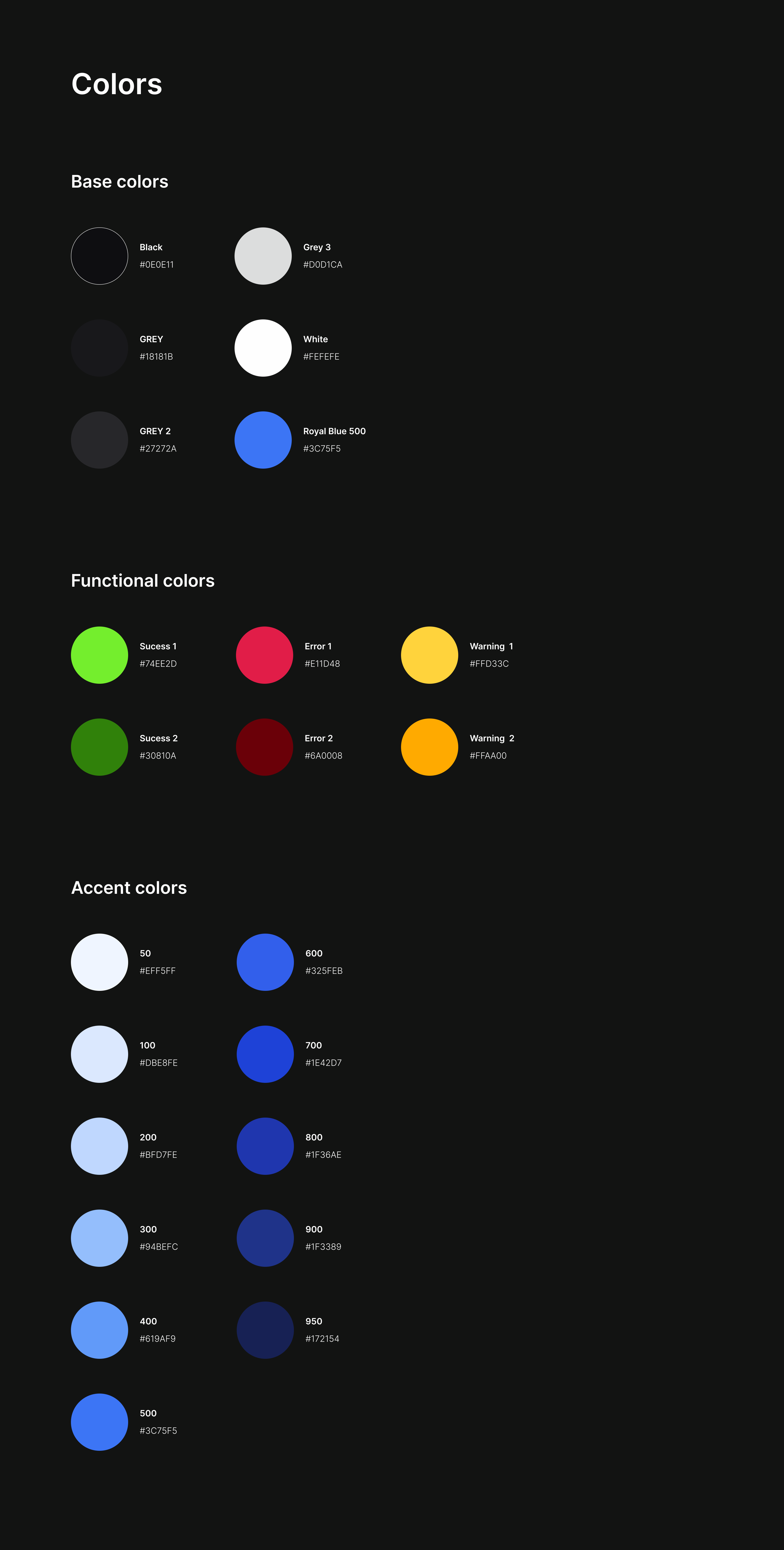
Color Palette
The color system establishes the brand’s tone and provides visual cues for functionality:
Base Colors -Neutral tones (black, white, grey) form the foundation of the platform, ensuring clean layouts and easy readability.
Functional Colors -Specific hues (green for success, red for errors, yellow for warnings) deliver clear feedback for system states.
Accent Colors -A comprehensive Royal Blue palette adds depth and flexibility for branding and UI elements.
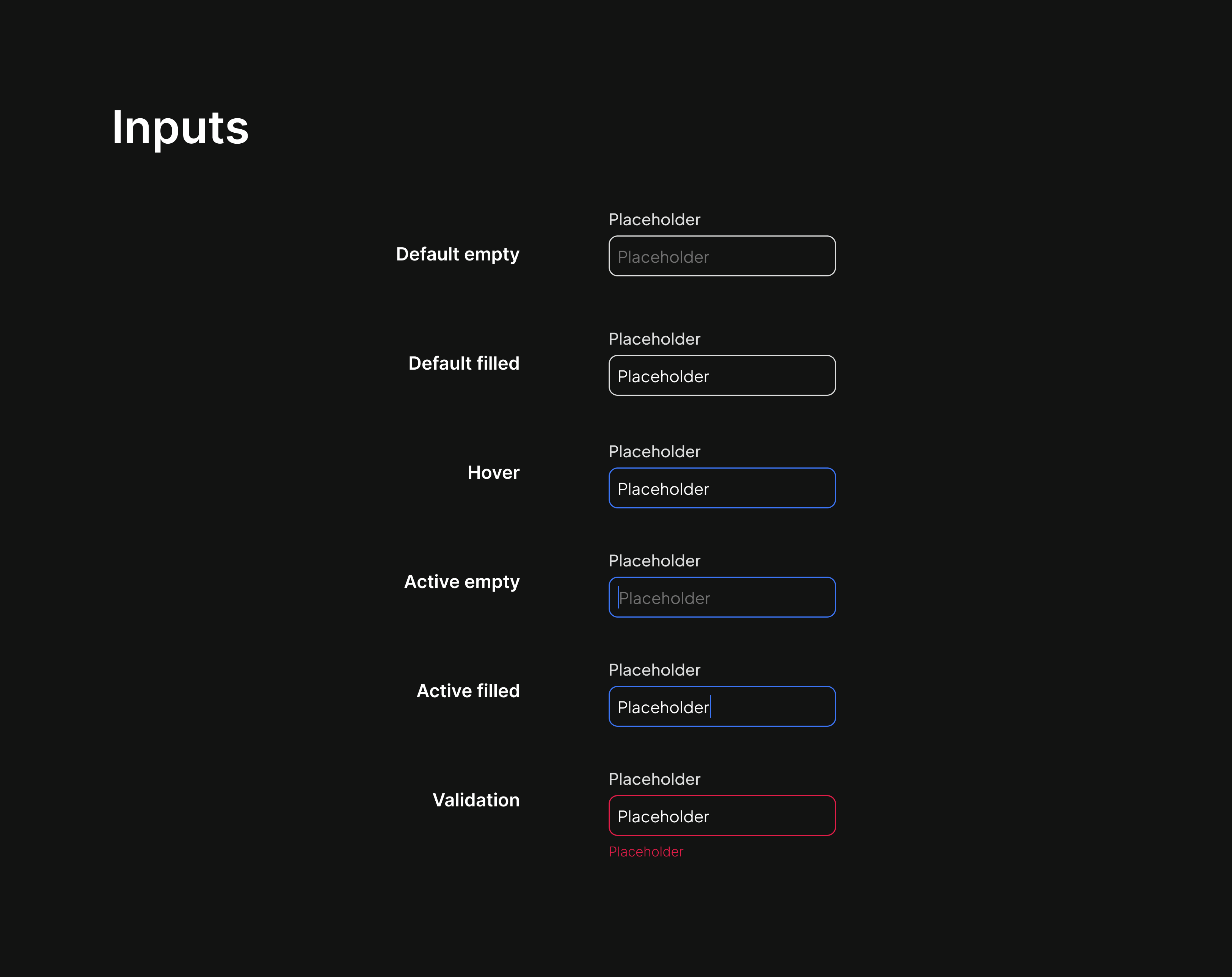
Inputs
Input fields are designed for clarity and usability across various interaction states:
Default State -Clearly defined placeholders and borders.
Hover State -Enhanced borders to indicate focusability.
Active State -Stronger visual indicators for user engagement.
Validation States -Distinct colors (red for errors) guide users in correcting inputs.
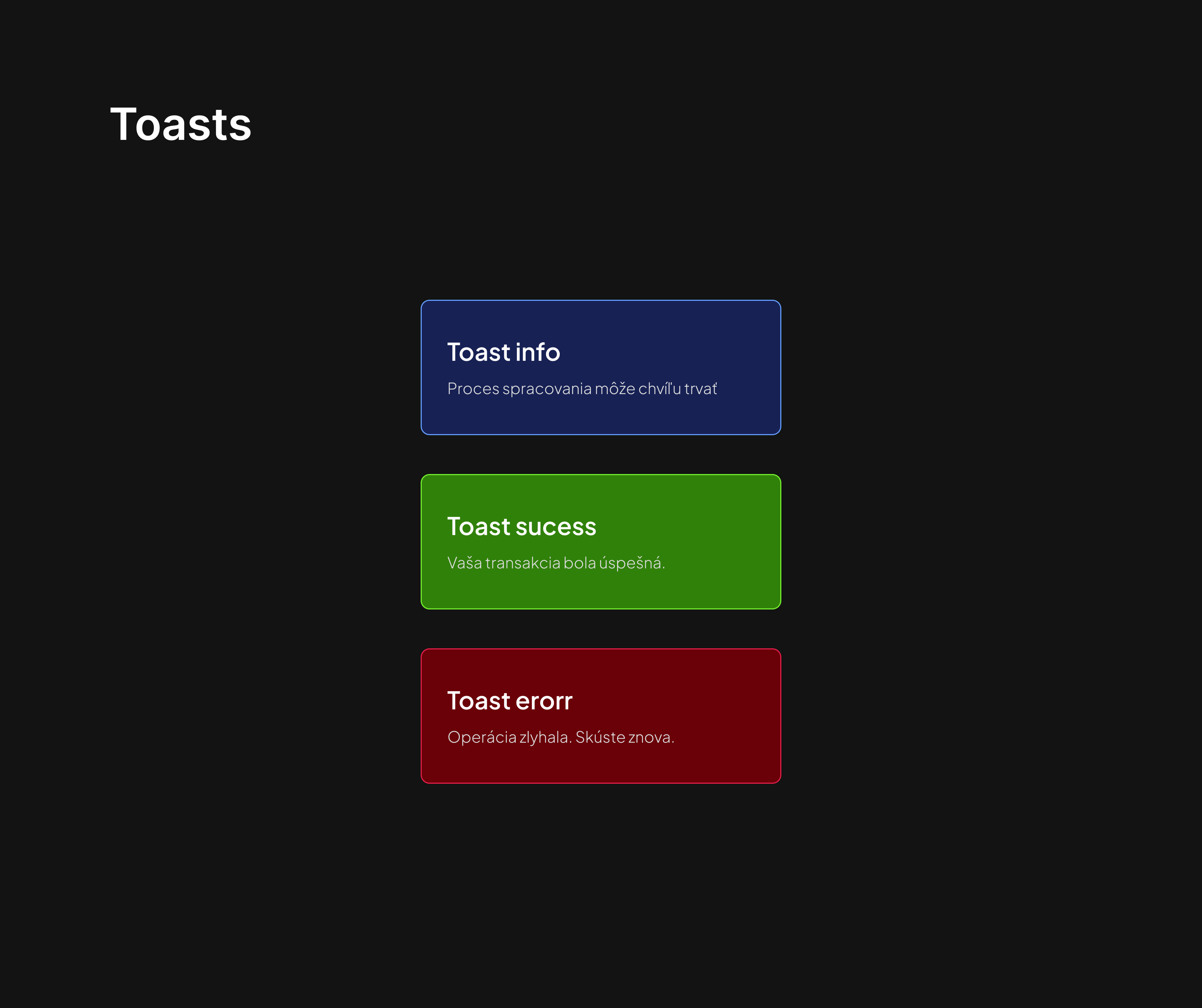
Toast notifications
Toast messages provide quick, at-a-glance feedback for users:
Info Toasts -Communicate neutral updates or ongoing processes.
Success Toasts -Highlight successful actions, using a vibrant green.
Error Toasts -Notify users of issues with a bold red, encouraging resolution.
This style guide ensures consistency, accessibility, and an engaging user experience, maintaining the xBridge brand identity across all touchpoints.
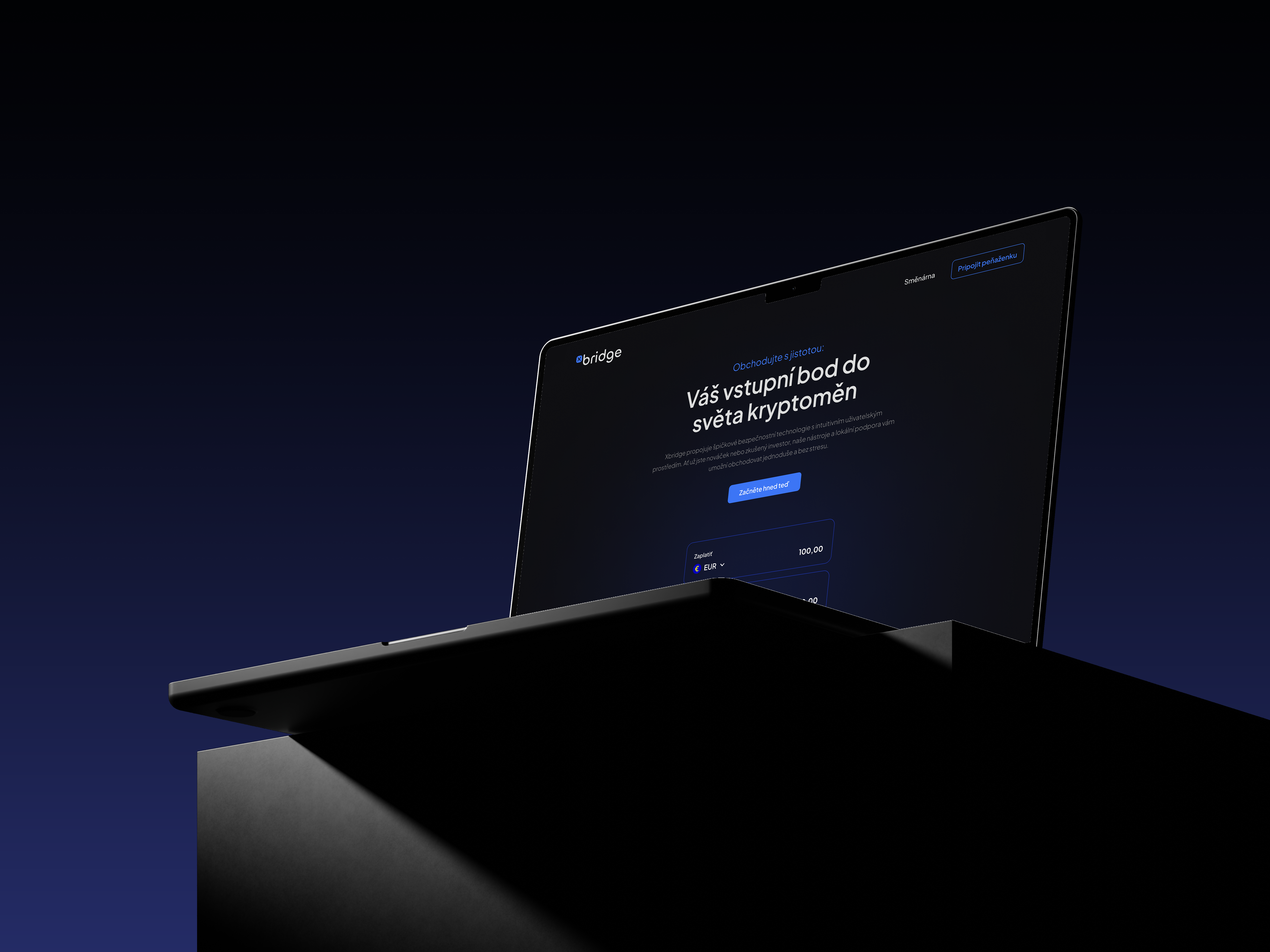
xBridge platform
The xBridge platform is designed with a user-centric approach, combining intuitive navigation, modern aesthetics, and functional usability to create a seamless and engaging experience for users. Each screen and feature has been thoughtfully crafted to ensure clarity, accessibility, and consistency throughout the platform.
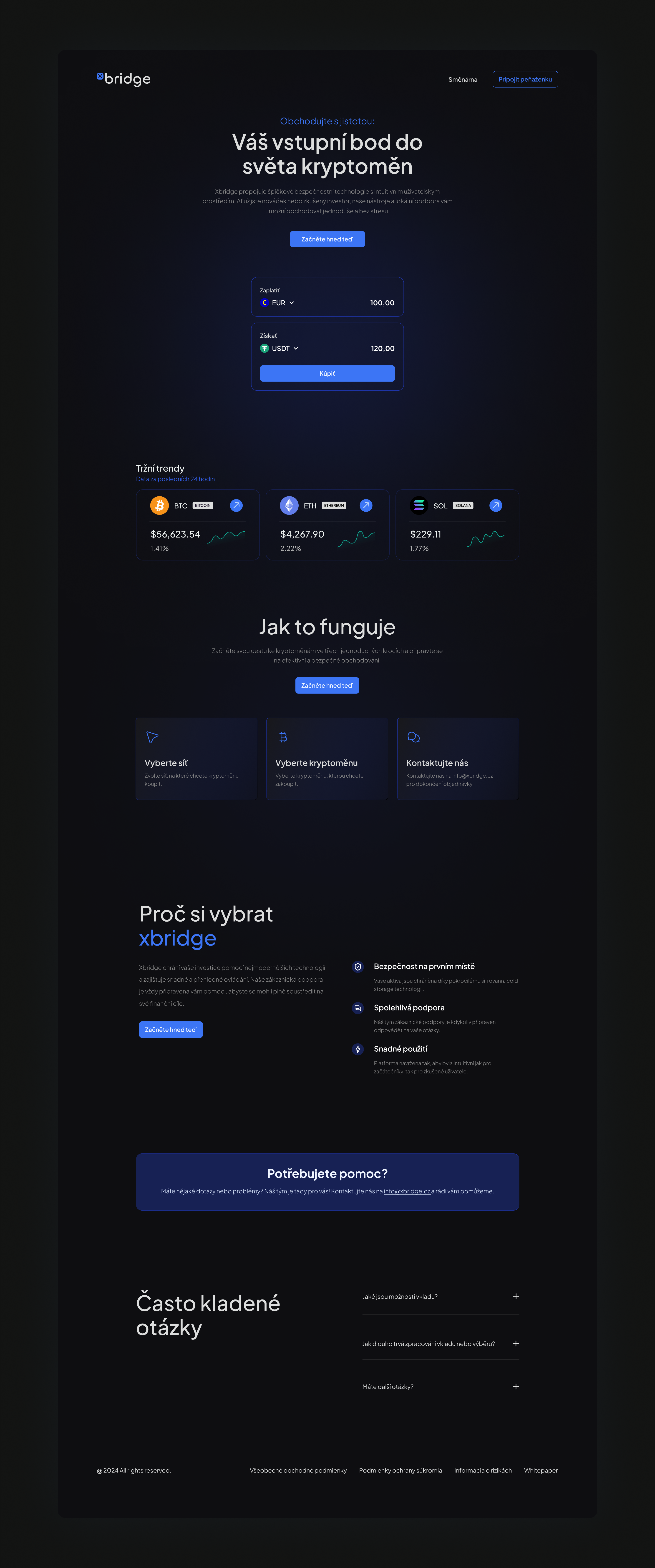
Landing page
Purpose -Serves as the primary entry point to the platform, introducing users to xBridge and its value proposition.
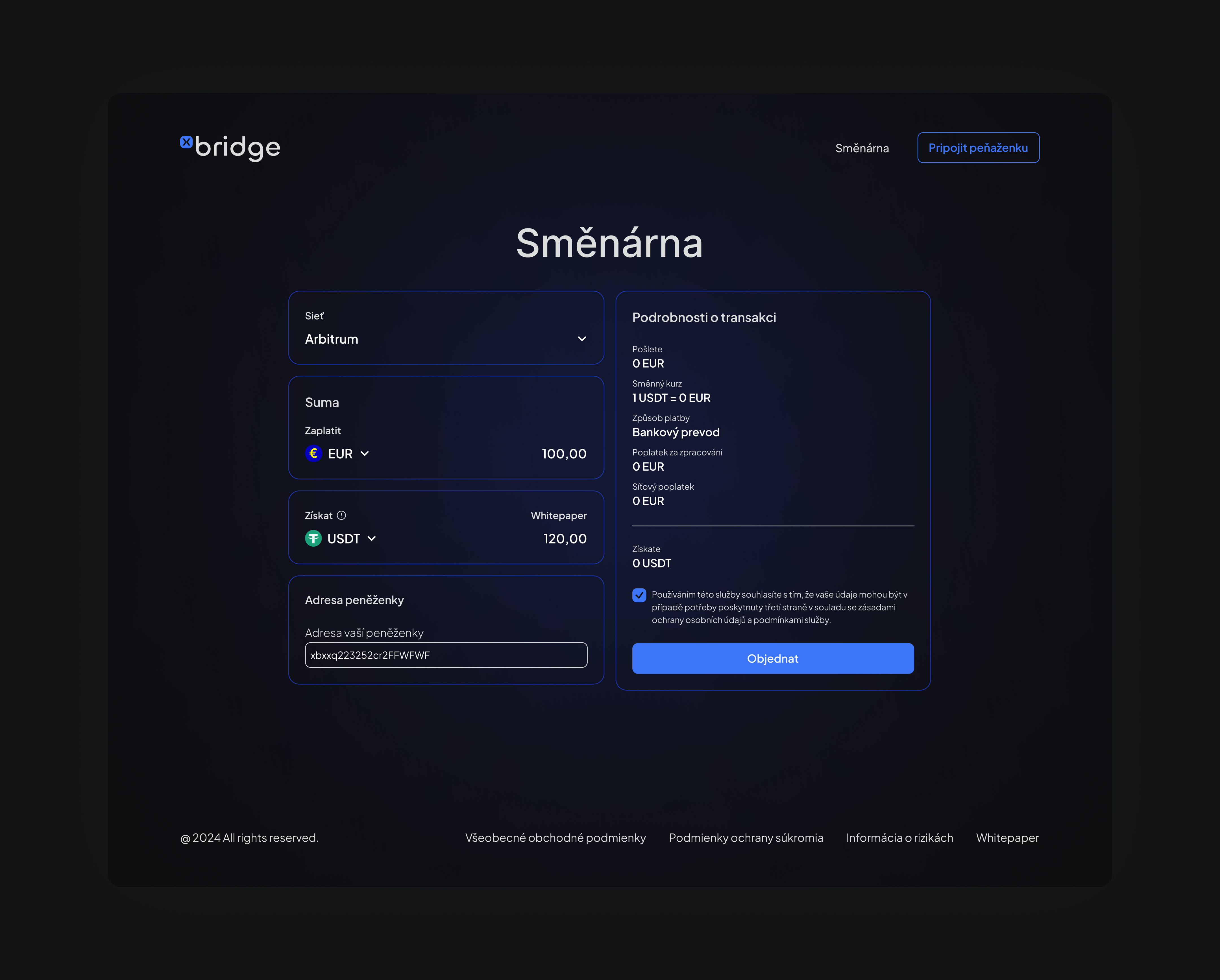
Currency Exchange
Purpose -To enable users to perform cryptocurrency transactions easily and securely.
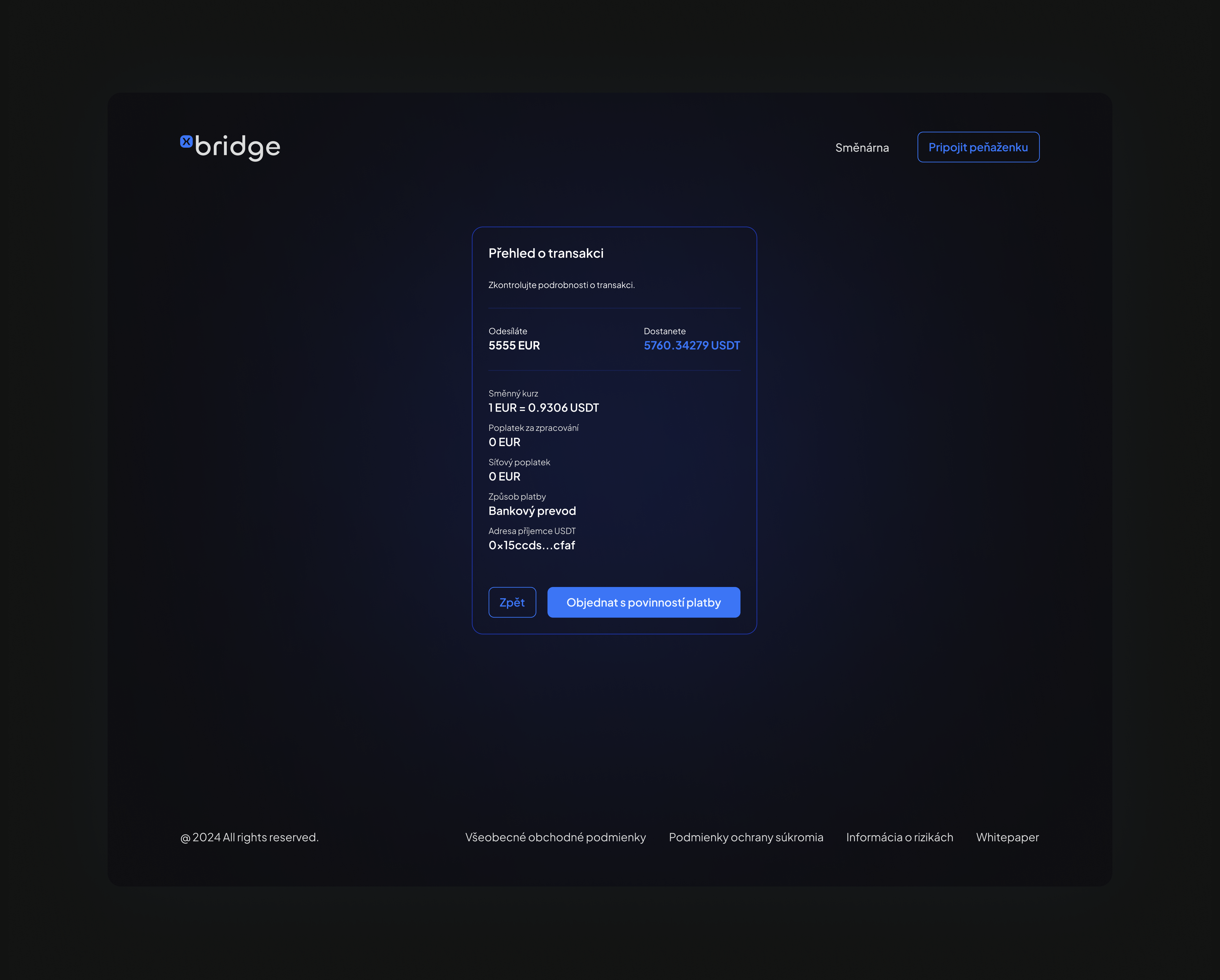
Transaction Recap
Purpose -To provide users with a comprehensive summary of their transaction before final confirmation.
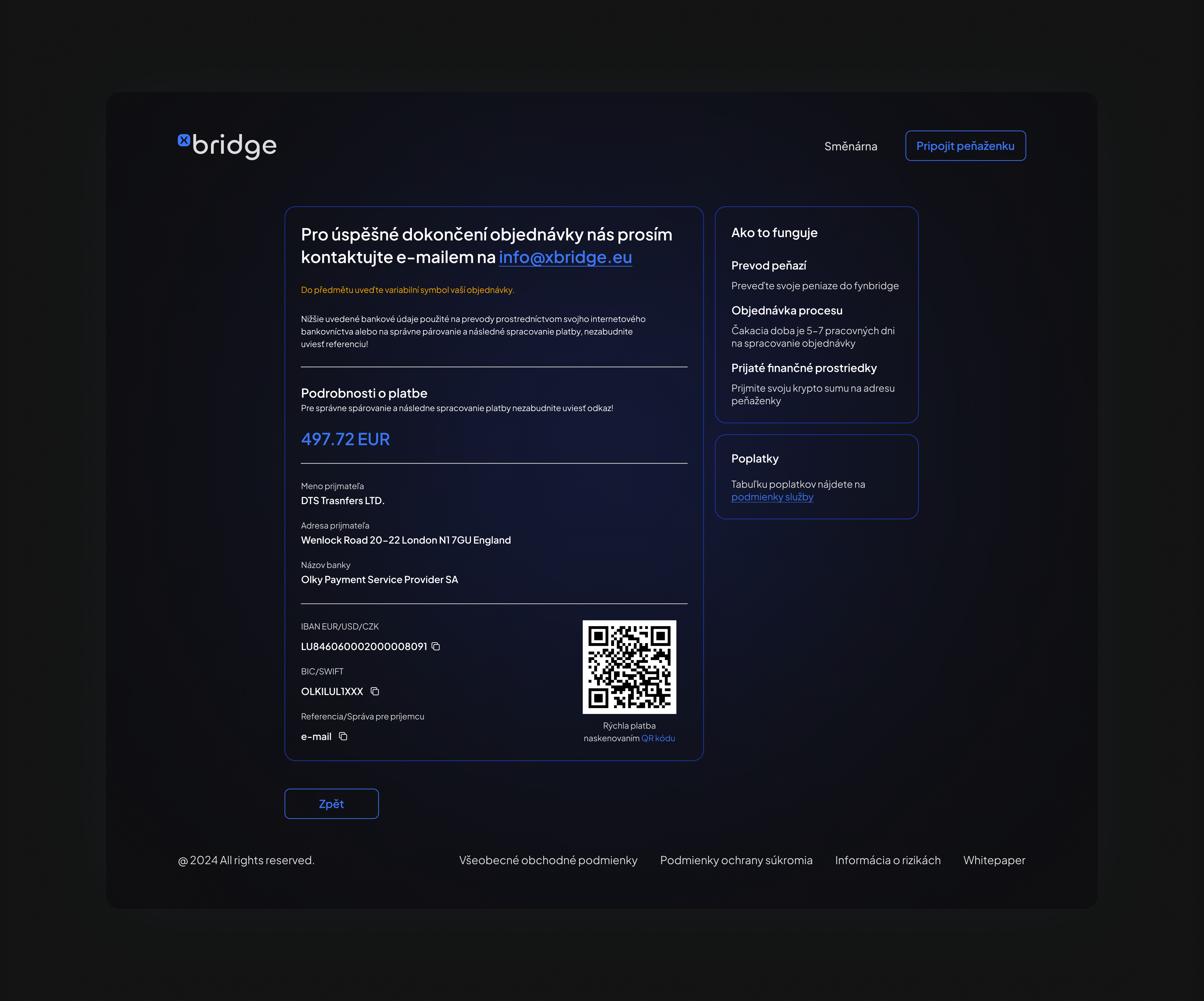
Successful Transaction Page
Purpose -To confirm the successful submission of a transaction and provide next steps for payment completion.
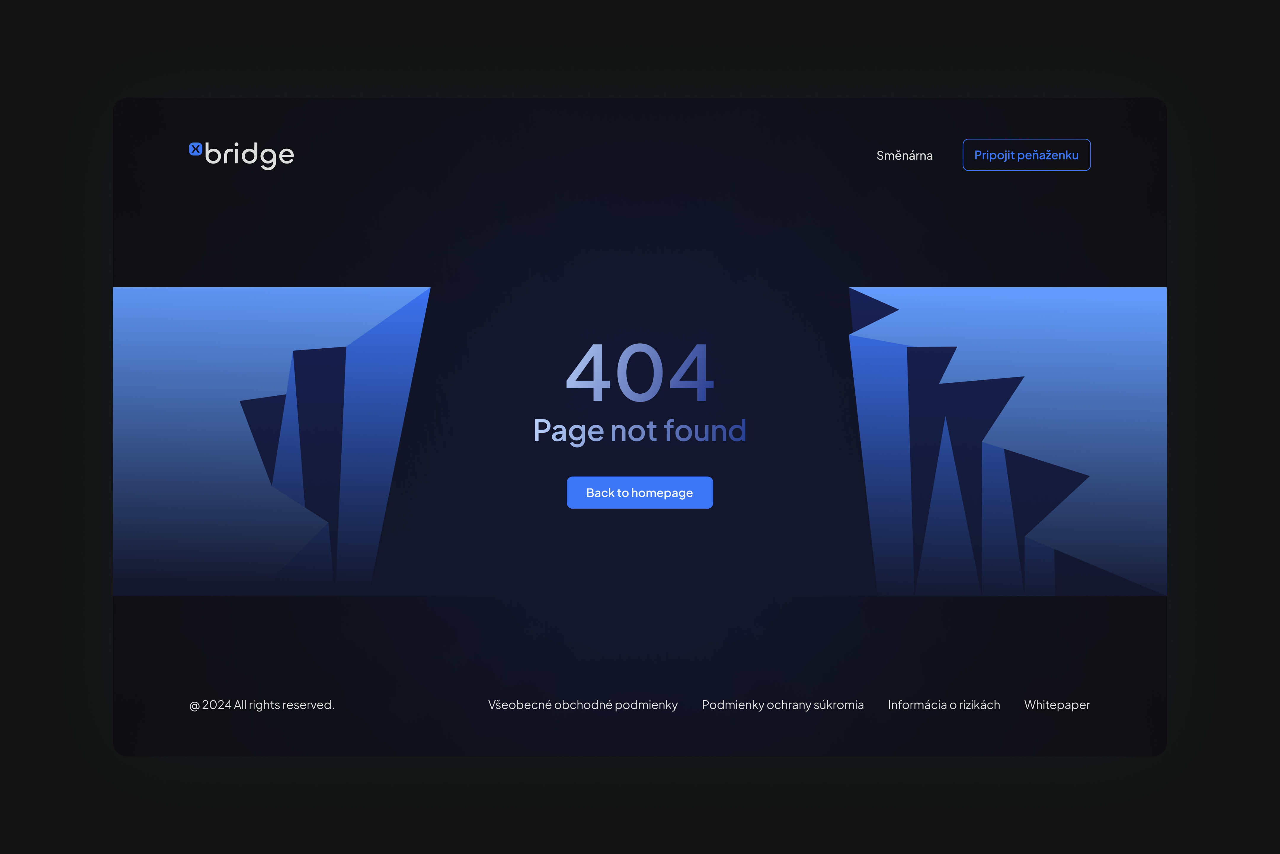
404 Error Page
Purpose -To guide users when they reach a non-existent page, minimizing frustration and providing a clear path forward.
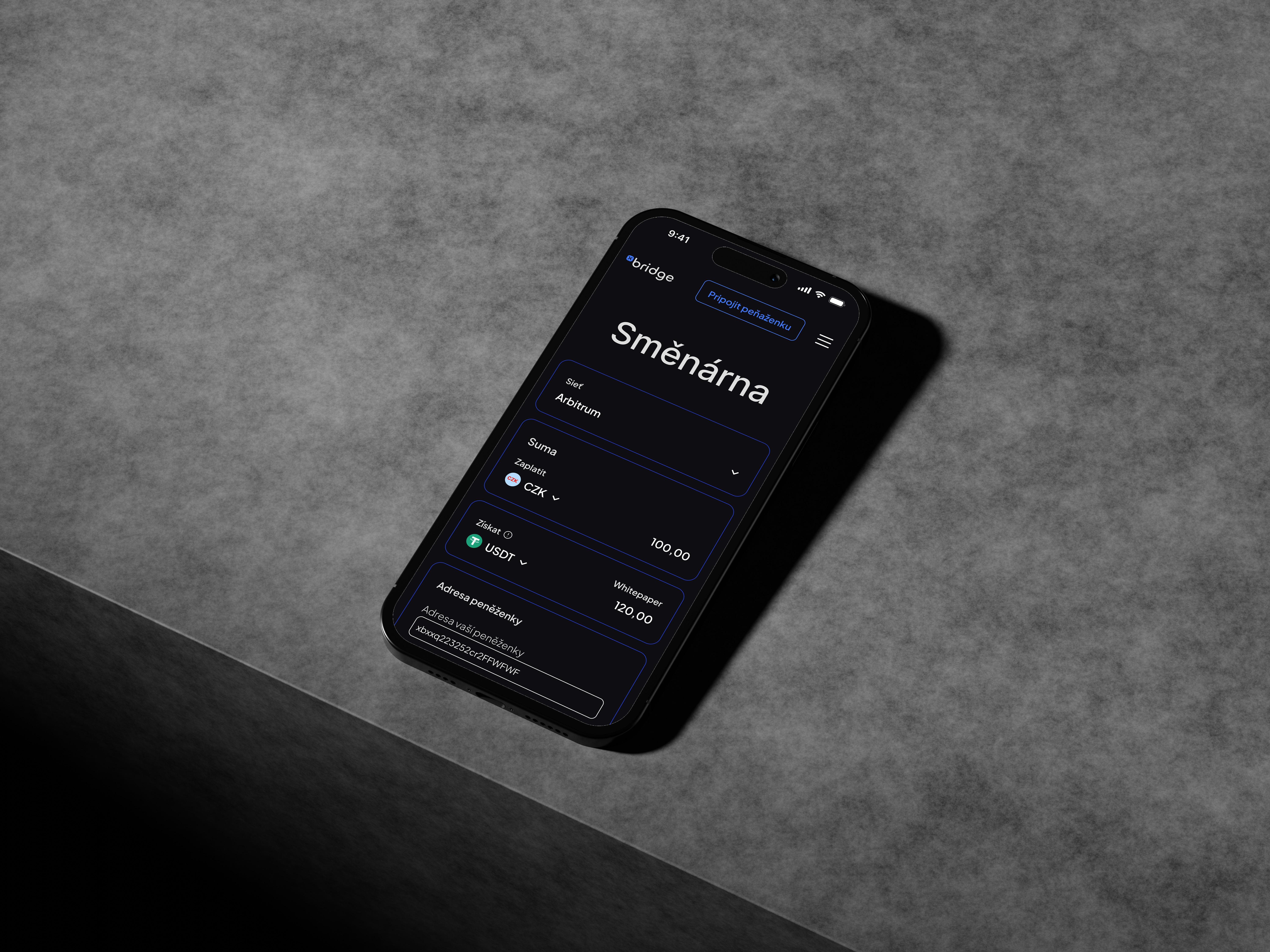
Mobile
The xBridge mobile design focuses on delivering the same seamless experience as the desktop version, optimized for smaller screens. By prioritizing clarity, accessibility, and responsiveness, the mobile interface ensures users can perform transactions and navigate the platform effortlessly on any device.
Overall UI/UX Approach
Consistency: A unified design language ensures that all screens feel part of the same ecosystem, with consistent use of colors, typography, and UI elements.
Accessibility: The platform’s interface is designed for clarity and ease of use, catering to both beginners and experienced users in the cryptocurrency space.
Brand Integration: The visual design leverages the xBridge branding elements (logo, colors, typography) to establish trust and reinforce identity.
xBridge exemplifies a platform where user needs and business goals intersect, delivering a seamless, secure, and engaging user experience.
Tools used
Topics
Share
Reviews
2 reviews

I really loved the logo treatment at the start of your project. It projects a powerful light, trustworthy and vibrant feeling.
Yet, when you applied that to the interfaces most of it was lost. Instead those emotions, what I'm seeing is a very dark interface without much emotion.
- There's some combinations that don't pass for color contrast (eg: the body text in the landing page), and others that barely pass (eg: the border color on secondary buttons or cards, overall the primary shade against the darkest shade used in the background of the app
- Using just a shade of the primary color on the borders does not make those cards stand out and be perceived perfectly. I'd suggest having a fill on them to make them stand out from the page background.
- Card outlines and secondary button outlines are visually too close to create some confusion
- It could benefit from adding a secondary color, otherwise you have to stretch that blue too far and there's just a very limited amount of ways to combine them with white/black. That probably contributes to the app interface looking, overall, bland and some UI elements not being emphasized enough
I think it's a good first try, but there's lots of potential from that amazing logo treatment to make something that really stands out! ✨ I would highly encourage you to try again and see how you can translate that into an app interface 🙂
Thanks for sharing!

Good job, Martin! You’ve done an impressive amount of work in just a day—well done! I hope you’re considering some improvements, as there’s definitely room to make your designs even better. Here are some of my suggestions:
- Add a description for typography: You didn’t mention the font you used, which leaves us wondering about the specific typography choice. Including this information would be helpful.
- Ensure consistent functional colors: The functional colors feel inconsistent, giving the impression they were randomly picked. In the first row, the green appears too bright, the red too dull, and the yellow too faded. In the second row, the green seems dark enough and the red aligns better, but the yellow appears much brighter than the others.
- Improve the display of accent colors: Currently, the accent colors don’t transition smoothly, which disrupts the flow. Consider displaying them horizontally rather than vertically for a more cohesive look.
Overall, it’s a solid start with great potential. Keep refining it, and it’ll shine even more! 🌟🤩
You might also like

Pulse — Music Streaming App with Accessible Light & Dark Mode


Islamic E-Learning Platfrom Dashboard

SiteScope - Progress Tracking App


Mobile Button System


FlexPay


CJM for Co-Working Space - WeWork

Popular Courses

Introduction to Figma


Design Terminology


Core UI Components
