Smartwatch Design

Smartwatch Design with Exercising Feature.
Tools used
Topics
Share
Reviews
3 reviews

Hey, Fahmidur, congratulations, it's a great project!
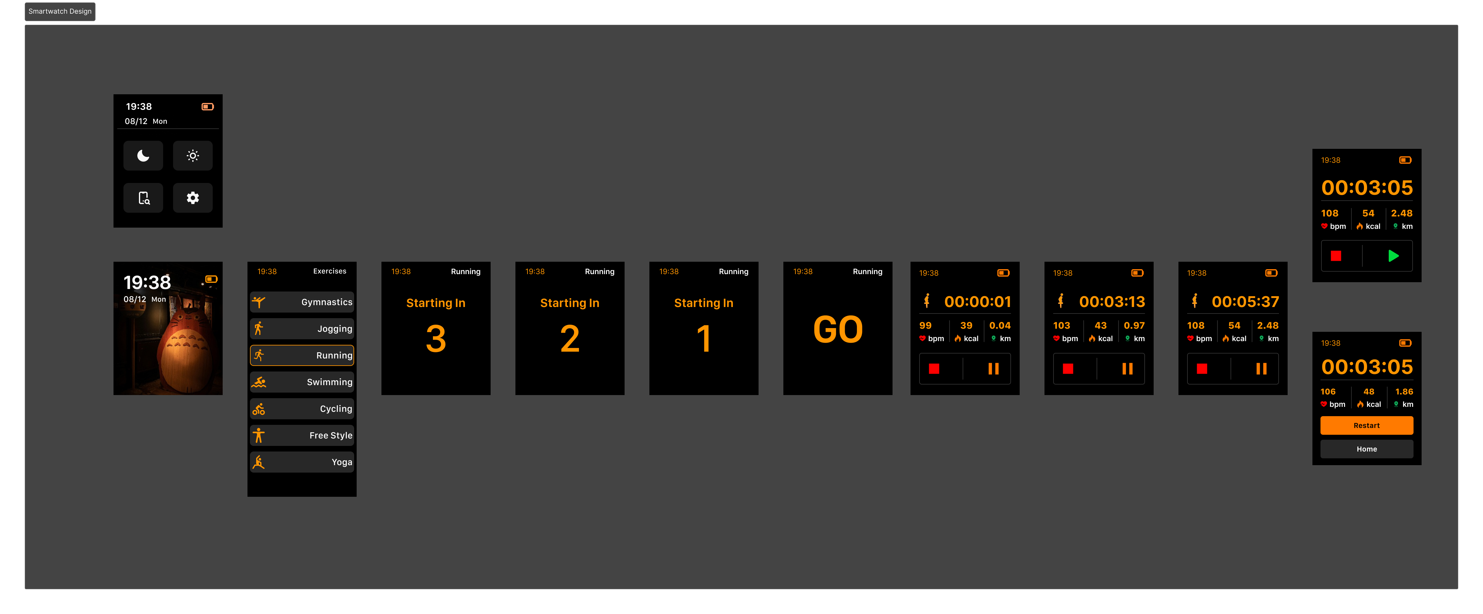
I'm a heavy user of the workout app on my smartwatch, so I liked that you created a clean interface showing the exercise, calories spent, and heart rate, with pause/play and stop easily tappable.
However, I missed information about the workout time and distance. Both are important, especially for runners. When I run, I always want to know how many minutes it takes to complete a kilometer.
I recommend reducing the icon that shows the running animation. You can put it in the top right corner, for example, and remove "running" because the icon already tells the user they are running. Make the animation orange and remove the background. Then, use the middle space to show time and distance.
Keep up the good work, you're in the right way!
Good work!
The "Running" flow is well-designed, easy to digest.
From visual design perspective, the color schemes are harmonic, screen layouts are easy to scan.
One little improvement idea: the running icon in the "Running" screen would be better to be the same as in "Exercise list" screen to avoid confusion for users. Or, do you have any intention why they are different?
All in all, your delivery is good.

The design is simple and easy to navigate, and the color scheme is consistent, which looks good. Apart from that, the exercise options and countdown timer make it easy to start a workout and important details like heart rate and calories are easy to see.
However, the dark background with orange text can be hard to read, especially outside. The design could use more interesting visuals for the exercise icons and it doesn’t show workout progress or what’s next, which could help keep users engaged.
You might also like

SONZ - Entertainment platform


Camp & Travel Explorer - App Design


Solar system Dashboard Utility

Uxcel Halloween Icon Pack


Signup page for a SaaS website


Color System

Popular Courses

UX Design Foundations


Introduction to Figma

Design Terminology
