
Reviews
1 review

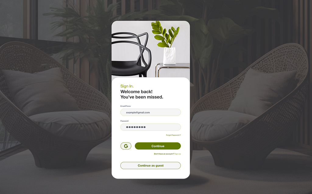
Hey Julian,
Nice job on this project! I really like your layout concept, and the color palette definitely gives off biophilic vibes—really well done. Also, great decision to allow users to skip login, as this helps them experience the product’s core value without the barrier of signing up.
One small note: a higher-resolution image of your design would do it more justice. Right now, there’s noticeable pixelation when opening it.
A few tips:
- Input Field Labels: These are too small—make sure they meet WCAG accessibility guidelines, along with the Forgot Password and Sign Up buttons.
- Google Button: The custom color makes it less recognizable—ensure it follows Google’s official usage requirements, which you can find in their public media kit.
- Input Field Padding & Alignment: The left-side padding inside the input field feels too large. Also, make sure hints and input text are vertically centered.
Keep up the great work! 🚀
3 Claps
Average 3.0 by 1 person
You might also like

Project
Events Managment App

🔹 Project OverviewEvent Management Tool (iOS) UX/UI concept for business community event managers This project focuses on designing functio

Project
Customer Journey Map — Offsite Co-Working Experience

Structure explanation: The journey map is organized horizontally by seven experience stages, moving left to right from Awareness & Discovery

Project
Mobile Onboarding: Casa di Pasta

🍝 Project Overview: Casa di PastaThis project is a mobile registration and login flow for a pasta workshop app. My goal was to create a fri

Project
Accessible Signup & Login Experience — Brainex

Accessible Signup & Login Experience — Brainex Brainex is a modern and accessible authentication experience designed for a SaaS platform. T

Project
Accessible Signup Form

Accessible Sign-up Form for Mobile Apps ✔️ State-based Form Validation Primary actions remain disabled until all required fields are comple

Project
Accessible Signup Form

This project is an app which helps users to consume content based on their mood and it explores the design of an accessible, inclusive signu
Popular Courses

Course
UX Design Foundations

Learn the essentials of UX design to build a strong foundation in core principles. Gain practical skills to support product development and create better user experiences.

Course
Introduction to Figma
Learn essential Figma tools like layers, styling, typography, and images. Master the basics to create clean, user-friendly designs

Course
Design Terminology

Learn UX terminology and key UX/UI terms that boost collaboration between designers, developers, and stakeholders for smoother, clearer communication.