Redesigning Bumble’s Onboarding for Better Connections
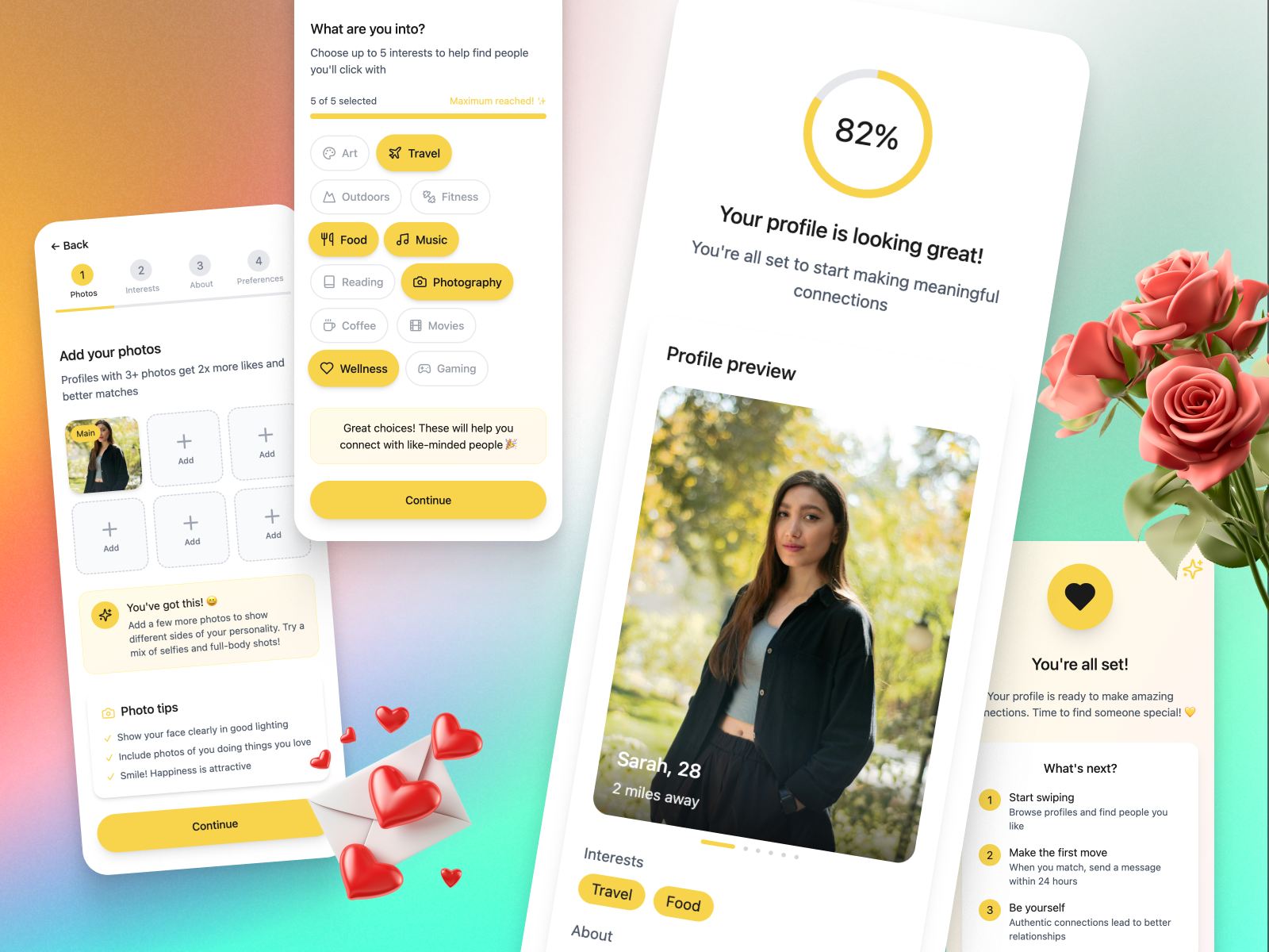
This project explores how Bumble’s onboarding flow can be redesigned to help new users create richer, more authentic profiles from the very start. The original experience contained multiple verification steps and early permission requests, creating friction before users saw any real value. By introducing a simplified, interactive flow—featuring guided photo uploads, interest selectors, personality prompts, and a clear progress indicator—the goal is to make profile creation feel intuitive, motivating, and genuinely fun.
The redesigned journey aims to increase profile completion, improve early engagement, and ultimately help users form more meaningful connections.
Tools used
From brief

Topics
Share
Reviews
6 reviews

*ahem*, as a Bumble alumni who used to graduate several times a year, lol, I feel like this is my calling.
I guess they had to put verification first to filter catfish, bad profiles, and ill intentioned people from the pool altogether. It creates some kind of safe environment for serious daters or BFFers, but it's not always easy. Like you mentioned here, phone numbers not being recognized, the verification call never coming, etc. Churn might be higher, but it aligns with the quality people expect.
Your hypothesis does make sense. What's up with all of these steps where users can't even see the value they're getting? Then again, does filling out the profile to some level of completion reflect the value they're about to have?
Aside from clearer visual cues like a progress indicator, I think you missed a big opportunity here: in the profile completion percentage page you could add a preview of matches users might get at an 82% profile completion rate. A visual that narrates, “with 82% profile completion you will meet other 82 percenters, want to see more? Go with 100%” similar to the blurry beehive visuals they already have.
There are lots of factors, I mean a freakin lot… that are also culture tied, depending on where users are using Bumble, and less about optimizing prompts, adding contextual tooltips, or refining photo guidance. Somehow they already have these too, last time I checked 🤔 but I'm happy to see your A/B test results, hope you'll share it with us!

I find this project complete and very easy to understand, bravo. I also worked on Bumble for the same project, and I really enjoyed seeing how you approached the problem from a different angle. It’s interesting to compare the two perspectives and see how the same product challenge can lead to different, yet valid, solutions.
I especially liked that you included screens to clearly illustrate the changes you’re proposing. That made the flow and the impact of Version B much more tangible and easier to follow. The testing section is also well thought through and clearly explained, which shows strong product thinking and attention to experimentation details.
Overall, this feels like a solid, end-to-end piece of work. You’re clearly thinking like a product manager already, keep going in this direction.

The flow is coherent and well thought out. The progress bar is clear, steps are logical, and users know where they are in the process. Guided photo upload with tooltips is a great idea that could genuinely improve photo quality and engagement.
The interest selector looks pleasant, though 5 of 5 selected with "maximum reached" might feel frustrating. Worth considering if the limit is too restrictive. Personality prompts are a good move toward authenticity, aligned with the brief's goal.
The final screen with 82% completion and profile preview provides satisfaction, but the section with a checklist might create pressure instead of motivation. Something to validate in testing.
I don't see how verification and permission requests from the original flow were addressed. The brief mentions simplifying them, but it's not visible in these screens. Perhaps that's outside the scope of these views.
Solid work, the project is clear, targets key onboarding problems, and has potential to improve completion rates. A/B testing will show whether the simplifications work in practice. 💪👍😊

Hey Kateryna.
You did a great job documenting your research plans and goals. It’s very well explained and easy to follow. On the UI side, I also like how clearly you outlined the steps users need to go through. Expectations are set well. The one element that confused me a bit is the age range slider. At first glance, it’s not immediately clear how I’m supposed to use it or what impact it has.
It feels like you replaced one type of onboarding (verification), with another (profile completion). Both serve a purpose, but they create very different experiences. Profile completion is generally less demanding and can feel more rewarding for users, which makes sense from an engagement point of view.
That said, I’m curious where you would place verification in this flow. Would you remove it entirely, or introduce it later? Even though verification can feel heavy, its purpose is still valid. It helps improve user trust and reduces the number of fake profiles, which directly affects safety.
I can see how your research could lead to increased user engagement, but I’m wondering how you would balance that with the security side of the experience. It feels like one problem was improved by shifting focus to another, and it would be interesting to explore how both goals could coexist.
I’d be really interested to see the research results and how you’d iterate further to balance engagement, trust, and safety.

Great work!

Improvement Tips
1. Add qualitative metrics to the Success Criteria
The study focuses heavily on quantitative metrics (10-15% increase, 95% confidence), but mentions "qualitative improvement" without defining how to measure it.
Suggestion: Additions to the success criteria:
- Mini-survey of 1-2 questions at the end of onboarding (e.g., "How was your experience? 😊😐😞")
- Quality analysis of photos (not just quantity) - avoid generic/low-quality photos
- Profile editing rate in the first 3 days (indicates if the user cares about what they created)
2. Better define "80% profile completion"
The document mentions "80% profile completion" as a main metric, but does not specify what this means.
Suggestion: Be explicit about what counts as a complete profile:
- Example: "80% = 3+ photos + completed bio + 2 prompts answered + selected interests"
- This avoids different interpretations between teams
- Facilitates the implementation of tracking
- Allows granular analysis of which components have the most impact
You might also like

Smartwatch Design for Messenger App


Bridge: UI/UX Rebrand of a Blockchain SCM Product


Pulse Music App - Light/Dark Mode


Monetization Strategy


Designing A Better Co-Working Experience Through CJM


Design a Settings Page for Mobile
User Research Courses

Ethical & Responsible Product Design


Product Management Foundations


The Product Development Lifecycle & Methodologies
