Entrant - Mobile Onboarding

Entrant is a professional networking and job-seeking platform built to help individuals enter the workforce with clarity and confidence. It allows users to create a structured profile that showcases their skills, experience, and ambitions, while connecting them with relevant opportunities and employers. By focusing on transparency, trust, and measurable growth, Entrant positions itself as a starting point for careers—not just a place to apply for jobs, but a space where progress, visibility, and potential are clearly reflected.
Tools used
From brief

Topics
Share
Reviews
4 reviews

Bravoo
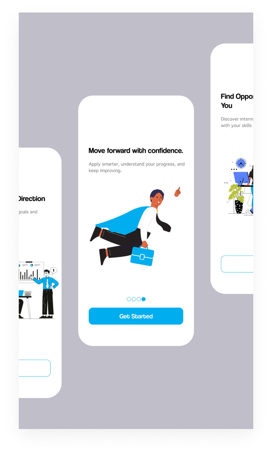
The onboarding flow feels positive and easy to follow, and the illustration adds energy without distraction.

Hey Ahmed,
I just wanted to let you know that your file is currently locked and requires access. If you’d like to get more feedback on the project, it would really help to either present the whole project or allow access so people can explore it.
From what I can see, you’re working on some kind of onboarding that combines illustrations and text. Since I only have a small snippet, take this with a grain of salt, but one thing that stood out is how your primary blue is used. You’re using the same blue in the illustrations and in the scroll indicator. Usually, the primary color works best when it’s reserved for actions. When it’s used too often, it starts to lose its meaning and impact.

Hi Ahmed!
This one feels smooth 📱✨ The onboarding screens look clean and focused, which is exactly what you want at the very first touchpoint.
I like that it doesn’t seem overloaded with information. The flow feels guided and intentional like you’re easing the user in instead of dumping everything at once. That’s good onboarding energy 👌🚀
If I’d refine it further, maybe make the value proposition a bit punchier in the first screen so users instantly get the “why.” But overall, simple, clear, and user-friendly. Nice direction!

You’ve got a nice starting point here. The onboarding screen feels clean and friendly, and the illustration works well for an early-career, confidence-building product. The CTA is clear and the overall tone matches the idea of helping users move forward.
Based on the project description, it would be really interesting to see more of how this vision translates into actual screens. At the moment we only get a glimpse through a single onboarding screen, so parts like profiles, progress, and opportunities are left to the imagination. Showing a few more key screens directly in the preview would help the concept come through more clearly, without needing to rely on an external (and currently closed) Figma link.
Overall, a good visual direction, but showing more of the product and refining the fundamentals would make the project much stronger and easier to evaluate.
You might also like

Smartwatch Design for Messenger App


Bridge: UI/UX Rebrand of a Blockchain SCM Product


Pulse Music App - Light/Dark Mode


Monetization Strategy


Designing A Better Co-Working Experience Through CJM


Design a Settings Page for Mobile
Interaction Design Courses

UX Design Foundations


Introduction to Figma

Design Terminology
