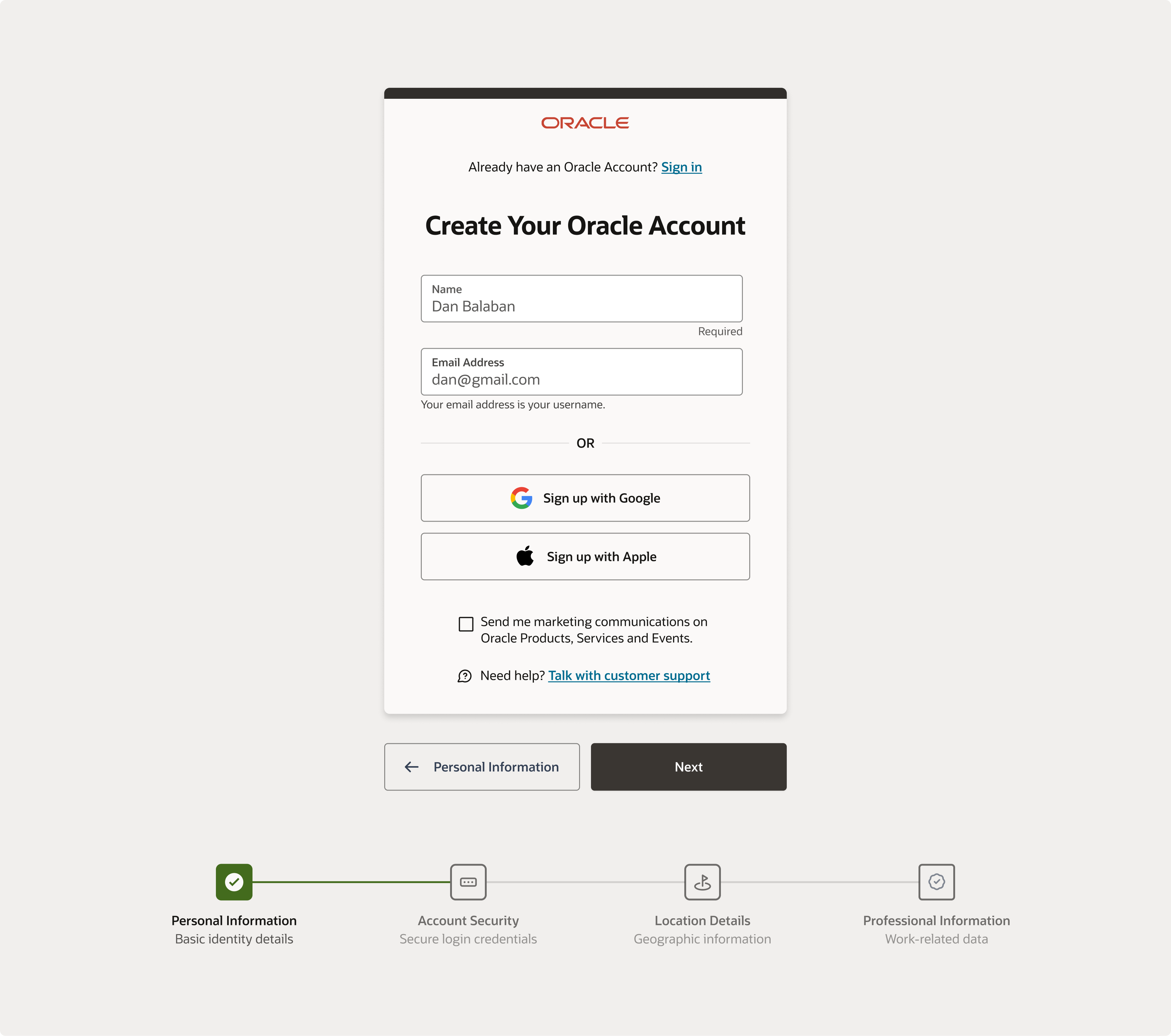
Oracle - Signup Page

EDIT: i uploaded the updated version of the form based off received comments. Thanks you guys for the reviews!
Project Overview
I challenged myself to reorganize Oracle's signup page, focusing on creating a guided signup experience that demands less cognitive load from users. Their Redwood Design System was instrumental because it enabled a seamless experience that is inclusive of individuals with disabilities while remaining on brand.
Design Choices and Rationale
Meeting WCAG Standards through Uxcel Courses
- Use of Design Accessibility: I ensured that all form elements included accessibility features, guaranteeing that components like form fields, buttons, and error messages meet both accessibility standards and brand consistency.
- Clear Labeling and Success State Feedback: I emphasized clear, easy-to-understand labeling for input fields and provided immediate, helpful success state feedback. This helps guide users through form completion without overwhelming them with information.
- Contrast and Typography: I opted for high-contrast color schemes and readable fonts to aid users with visual impairments, ensuring these choices were also in line with the brand's identity.
Evaluation and Impact
- WCAG Compliance: By applying what I learned from the design accessibility course, the design inherently meets WCAG requirements.
- Intuitive User Experience: The design prioritizes intuitiveness and ease of use, making the signup process straightforward for all users.
- Clear and Logical Design Rationale: Each design decision is rooted in the goal of maximizing accessibility and enhancing user experience, directly addressing the needs of users with disabilities.
Conclusion
The reorganization of Oracle's signup page has resulted in a more organized and guided signup process, creating an inclusive digital environment that reduces cognitive load. This approach not only meets WCAG standards but also enhances the overall user experience, underscoring the value of accessibility in design.
From brief

Topics
Share
Reviews
2 reviews

I love the overall design presented here, but from a UX perspective, we're missing a crucial CTA button to allow users to proceed and create their account using email. By fixing this small mistake (you can always edit your shot), your design will be nearly perfect.

Fal
- Form Fields: Every form field should have a clear and descriptive label. The purpose of the first field is unclear—it’s possible the label has been placed as a placeholder text inside the field, which becomes invisible once the user starts typing. It appears that only the first field is required.
- There is no clear CTA. How does one proceed to the next step after filling out the two fields?
- Marketing consent placement: The marketing consent checkbox is located outside the main form container. It’s better to include in the same context to maintain coherence of the form-filling process.
- The step indicator at the bottom may not be visible on mobile devices. How would this stepper be displayed on smaller screens?
- The phrase "Talk with customer support" suggests an actionable item, but it doesn't look interactive. To improve clarity, it could be underlined or use the link style of the site.
You might also like
EntertainHub App (Dark / Light Mode)

Rappi is always present at the best events

UX Rationale for Sign Up & Log In Flow

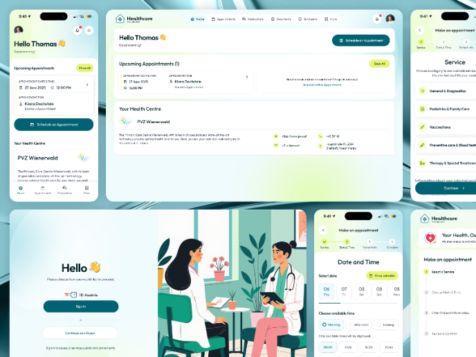
💊 Healthcare Desktop & Mobile App UX/UI Design

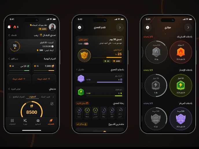
Fitness Challenges App

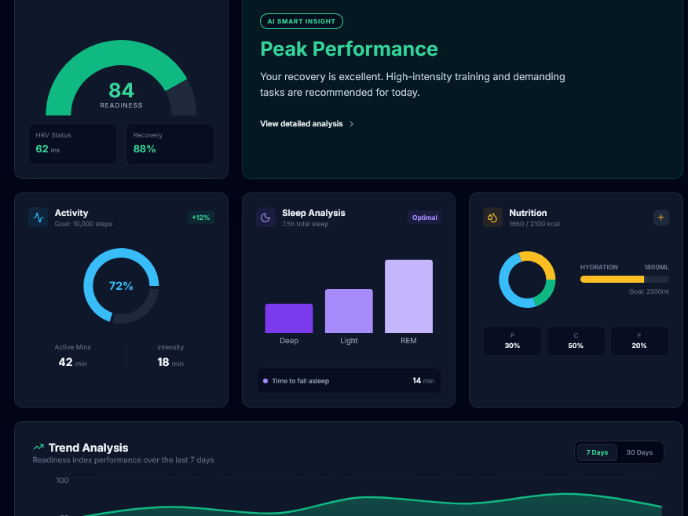
Personal Wellness Dashboard

Visual Design Courses

UX Design Foundations


Introduction to Figma

Design Terminology
