Onboarding flow -Food app
The onboarding process for the food delivery app introduces users to its core features in just three simple screens, focusing on favorite dishes, secure payments, and fast orders.
Screen 1: Discover Favorite Dishes
- Visual: A clean interface with images of popular dishes.
- Message: "Save your favorite meals for faster reorders and personalized recommendations."
Screen 2: Secure Payments
- Visual: Icons for credit cards, digital wallets, and cash.
- Message: "Enjoy fast and secure payments with your preferred method."
Screen 3: Fast Orders, Every Time
- Visual: A delivery rider on the move and a live order tracking map.
- Message: "Order in just a few taps and track your food in real time!"
This concise onboarding flow provides a quick and engaging introduction, ensuring users are ready to explore and place their first order effortlessly.
Reviews
2 reviews
Hi Doha,
Your onboarding flow design for the food delivery app is clean, concise, and effectively introduces the app’s core features in just three screens. The visuals are engaging, and the layout ensures that users can grasp the value of the app quickly.
However, there are a couple of areas for improvement:
1. Button Text Visibility: The text on the buttons could be made more prominent by increasing its font size and weight. This would help draw attention to calls-to-action, making the navigation experience smoother and more user-friendly.
2. Contrast on Screen 2: The yellow button with white text, as shown in the second screen’s illustration, presents readability issues. If this is reflective of the button’s actual design on the screen, it would be beneficial to enhance the contrast. Using darker text or a different background color can ensure compliance with WCAG standards, improving accessibility for all users.
These refinements will ensure the design is not only visually appealing but also fully functional and accessible. Great job on creating an engaging and user-focused onboardinge xperience!
Cute illustrations. I agree with the comment to make the buttons bigger with larger text and I think the copy could be stronger. Actually I'm not a fan of splash screens, as I feel they get in the way of actual use. So I'd challenge needing three screens, perhaps this could have just been one or none.
You might also like
Accessible Signup Form
Auction
Entrant - Analytical Dashboard
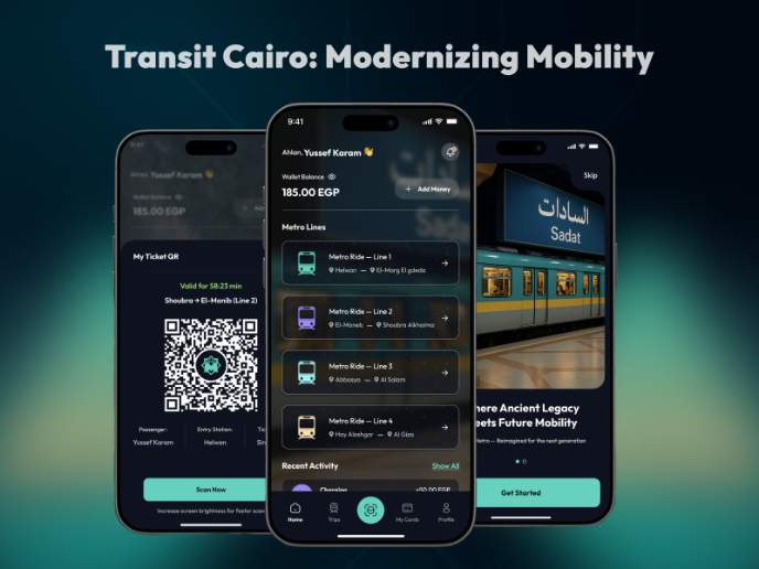
Transit Cairo — Digital Mobility Redefined
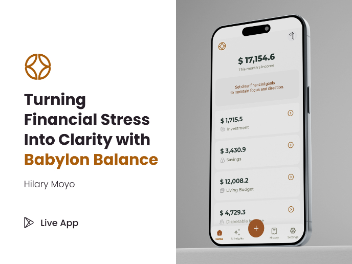
Babylon Balance - Designing Financial Clarity Through Constraint
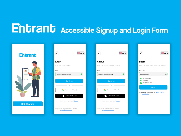
Entrant Accessible Signup and Login Forms
Popular Courses

UX Design Foundations

Introduction to Figma


