Halloween Versions of Common Icons
Instead of focusing on a specific app I chose to make scary versions of icons found on most apps. I wanted to make the icons have a very cute/ hand drawn feel to them. Some of the icons I included multiple states to show what they would look like when interacted with/ or when something on the app changed. Can you guess them all? Feel free to leave your feedback!
My process was to first find inspiration for my icons and think up Halloween versions of common icons. I then sketched out my initial versions and then made vector versions in Adobe Illustrator.
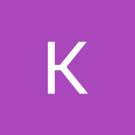
The candy corns represent up and down drawer opening icons (since it matches the shape). The pumpkin basket is like the cart icon where you can collect your candy. The spider web is the web icon (a play on words). The cats are volume changing icons. The bones are the "x" icon due to the shape. The haunted house is the home icon. The finger is the pencil icon. The ghost is the profile icon (like looking in a mirror). The lollipop is a search icon again due to the shape. The bats are heart icons. The eyes are visibility icons.
Tools used
From brief
Topics
Share
Reviews
2 reviews

Hi, Khiara!
Great job on the spooky icon set design! The icons are lovely and fun, and I especially loved the eye design—it’s so cool! 👍 However, I think they might need some simplification to be more effective as icons. I found it challenging to figure out what some of them represent.
I would love to see a detailed presentation since there isn’t one currently available. It would really help in understanding the design process and the concepts behind each icon, as well as how they can be used effectively in a design.
Keep up the great work!

This’s the cutest spooky icons! I like your art style and love the idea that you tried to create them based on the original shape of icons. It’s easy to understand what they are, except the web one. At first glance, I thought it was a setting icon due to its shape. After reading your description, I however see your idea. Maybe you might need to adjust its shape and corners to get rounder like a circular earth. Here is my another suggestion: your icons are well-detailed but it’s not suitable for a small size when applied on mobile devices. You might have to design another set for a smaller size version.
Thank you for sharing the cuteness on the scary day. Good Luck, Khiara!
You might also like

Islamic E-Learning Platfrom Dashboard


Pulse — Music Streaming App with Accessible Light & Dark Mode

SiteScope - Progress Tracking App


Mobile Button System


FlexPay


May.Da.Ma Candles & more

Visual Design Courses

UX Design Foundations


Introduction to Figma

Design Terminology
