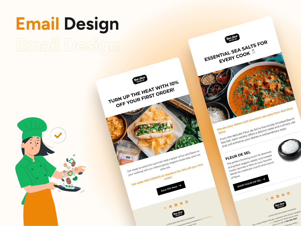
Email UI Design for Red Stick Spice Co.
I designed a series of vibrant and engaging email templates for Red Stick Spice Co., focusing on promoting their premium spice products. The goal was to create visually appealing, user-friendly designs that effectively communicate the brand's message and drive customer engagement
Key Features:
Hero Images and Headlines:
Each email features a striking hero image that captures attention immediately. Bold, clear headlines highlight key promotions and product features.
Product Highlights:
Detailed sections for each featured product, including high-quality images and compelling descriptions.
Products such as Fleur de Sel, Sel Gris, Himalayan Pink Salt, Smoked Bacon Sea Salt, and Sriracha Salt are showcased, with clear calls to action for each.
Call-to-Action Buttons:
Prominently placed buttons encourage recipients to explore the product collections.
Designed with contrasting colors to stand out and drive click-through rates.
Consistent Visual Language:
Maintained a cohesive design language across all templates with consistent typography, color schemes, and spacing.
Ensured readability and visual appeal across various devices by creating responsive designs.
User Engagement:
Emphasized user engagement through interactive elements and visually appealing layouts.
Included sections like recipes, tips, and special offers to keep the audience interested and engaged.
This project highlights my ability to create functional and visually compelling email designs that not only align with the brand’s identity but also effectively communicate with the target audience. The design process involved understanding the brand’s goals, iterating on feedback, and ensuring that the final product was both aesthetically pleasing and user-friendly.
Reviews
3 reviews
Great job on the vibrant and engaging email design! Eye-catching visuals, clear product highlights, and strong calls to action make it both appealing and user-friendly.
Firstly, the call-to-action (CTA) button in Layout 3 should have spacing equivalent to that above it to create consistency and enhance visibility. Next, check the contrast of the address text in the footer; this will help the information stand out more and be more readable for users. Finally, enhancing the visibility of text links such as Unsubscribe and Privacy Policy could be very beneficial; a simple underline would draw more attention to them. I hope these suggestions contribute to making the product even better!
Love the design. I only have some small feedback to give. Keep the CTA label styling consistent between all emails, check the contrast of the address text in the footer, and style the text links to be more noticeable (Unsubscribe / Privacy policy) simple underline should do the job.
Other then these small tweak, amazing job 👏
You might also like
eWallet App Development Project
🖥 Desktop Checkout Flow Design
Website CRM Dashboard
Helpful 404 Error Page for a Fintech Mobile App
Pebble Accessible SAAS Signup Flow
Music Player UI - Light & Dark Mode
Popular Courses

UX Design Foundations

Introduction to Figma

