E-commerce Store Homepage
The focus of this project was to design a simple yet captivating homepage that enhances user engagement without overwhelming visitors with irrelevant details. Key highlights:
- Clean and Minimalistic Design: A clutter-free layout to ensure seamless navigation.
- Engaging Visuals: Strategically placed banners and product highlights to draw user attention.
- Intuitive User Experience: Easy access to product categories and key features.
- Responsive Design: Optimized for all devices, delivering a consistent experience.
- Fast Loading Speed: Prioritized performance to keep users engaged.
This project reflects my commitment to blending simplicity with functionality in modern UX/UI design.
Reviews
4 reviews
I really like the clean and minimal design of your homepage, as it creates a visually appealing and user-friendly experience. The responsive layout is another strong point, ensuring consistency across devices.
However, the navigation could be more intuitive with a more prominent menu, and adding stronger call-to-action buttons would help guide users more effectively.
Enhancing color contrast can improve readability, and including brief descriptions or pricing under product highlights would provide more context and usability.
Great effort overall—this is a solid foundation
This e-commerce homepage effectively balances aesthetics and usability. The clean layout, ample whitespace, and clear visual hierarchy guide users seamlessly. Product grids and feature icons communicate trust and value effectively, while the responsive design ensures adaptability across devices.
Strengths:
- Minimalistic Layout: Focuses user attention on key elements.
- Product Presentation: Organized and visually appealing.
- Trust Elements: Icons and supporting content build confidence.
Opportunities:
- CTAs: Add more actionable touchpoints to boost engagement.
- Typography: A distinct font pairing could add personality.
- Footer: Organize links better for clarity and interaction.
Hi Umer,
Your design is clean, minimalistic, and visually appealing. The use of white space ensures that the content feels uncluttered, while the pastel accent colors provide a friendly and modern look.
The hero section is attention-grabbing and effectively introduces the brand’s key product (croptop sweater). However, the call-to-action (CTA) "Shop Now" could be slightly more prominent by increasing its size or adding a subtle hover effect to encourage user interaction.
The "Trending Products" section is well-organized with a clean grid layout, making it easy for users to browse. The price text could be slightly bolder to make it more noticeable. Including a quick "Add to Cart" button directly on product thumbnails would enhance the shopping experience.
Overall, this design is an excellent starting point for an e-commerce platform. Its clean and user-friendly layout sets the stage for a positive shopping experience. By making minor adjustments to enhance usability and accessibility, this design could be further refined to cater to a broader audience and encourage higher user engagement.
Hello Umer,
Loved the minimalistic and clean approach in here. But considering the provided product brief, I must say, it does not match with the requirements. Even keeping the brand out of consideration, it doesn't provide the ethical and sustainability concerns that the project has.
I believe that your efforts would be much better suited if you were really putting them into leveling up the skill and not just submitting for getting a certificate.
You might also like
Loginino
Notification microcopy - Project
El Mandoub-GovTech App
MalishaEdu Counselor Workspace
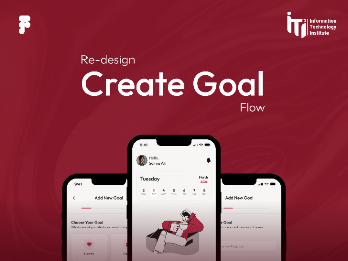
Goal Creation Flow
Portfolio website
Design Leadership Courses

UX Design Foundations

Introduction to Figma


