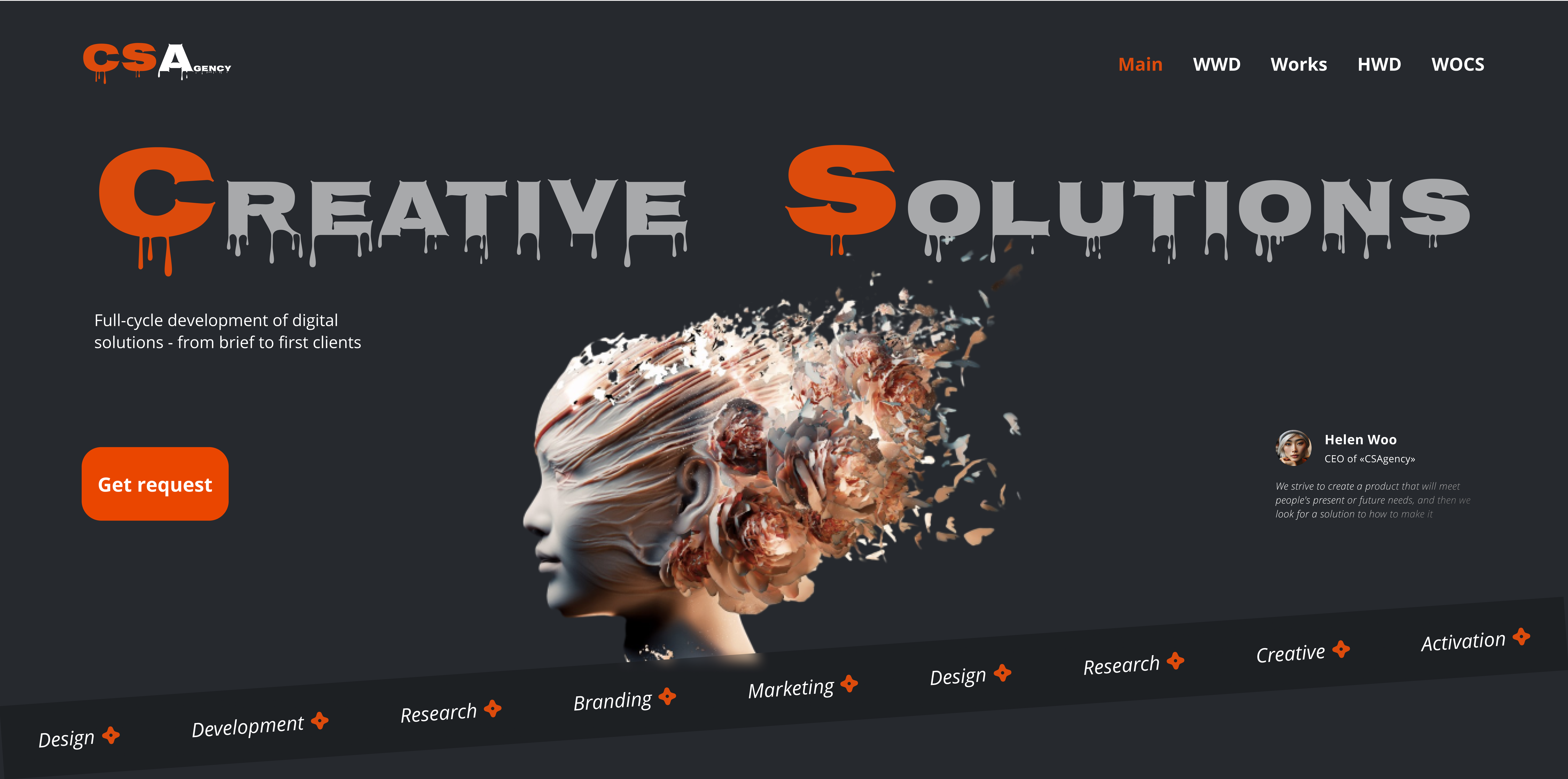
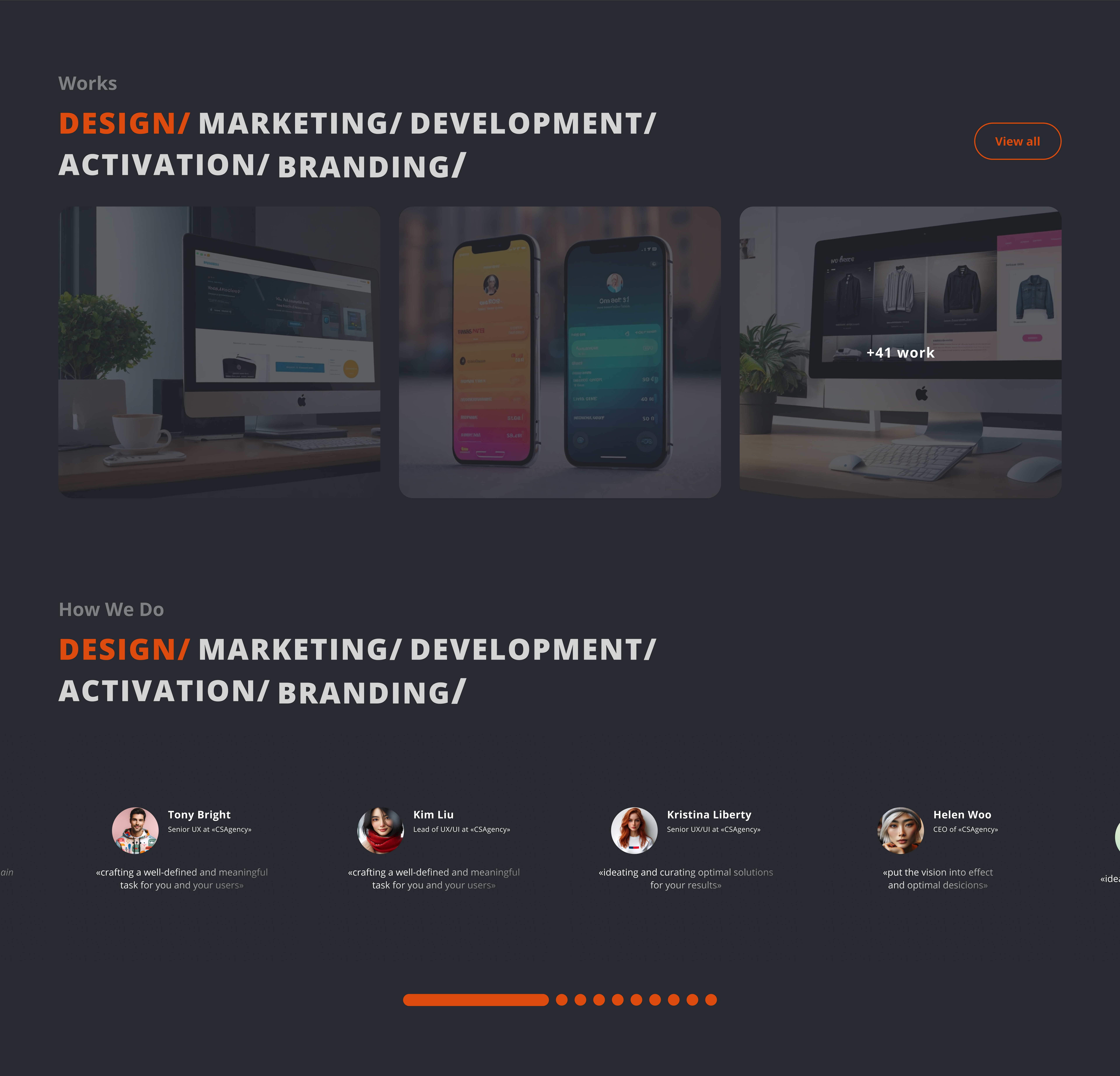
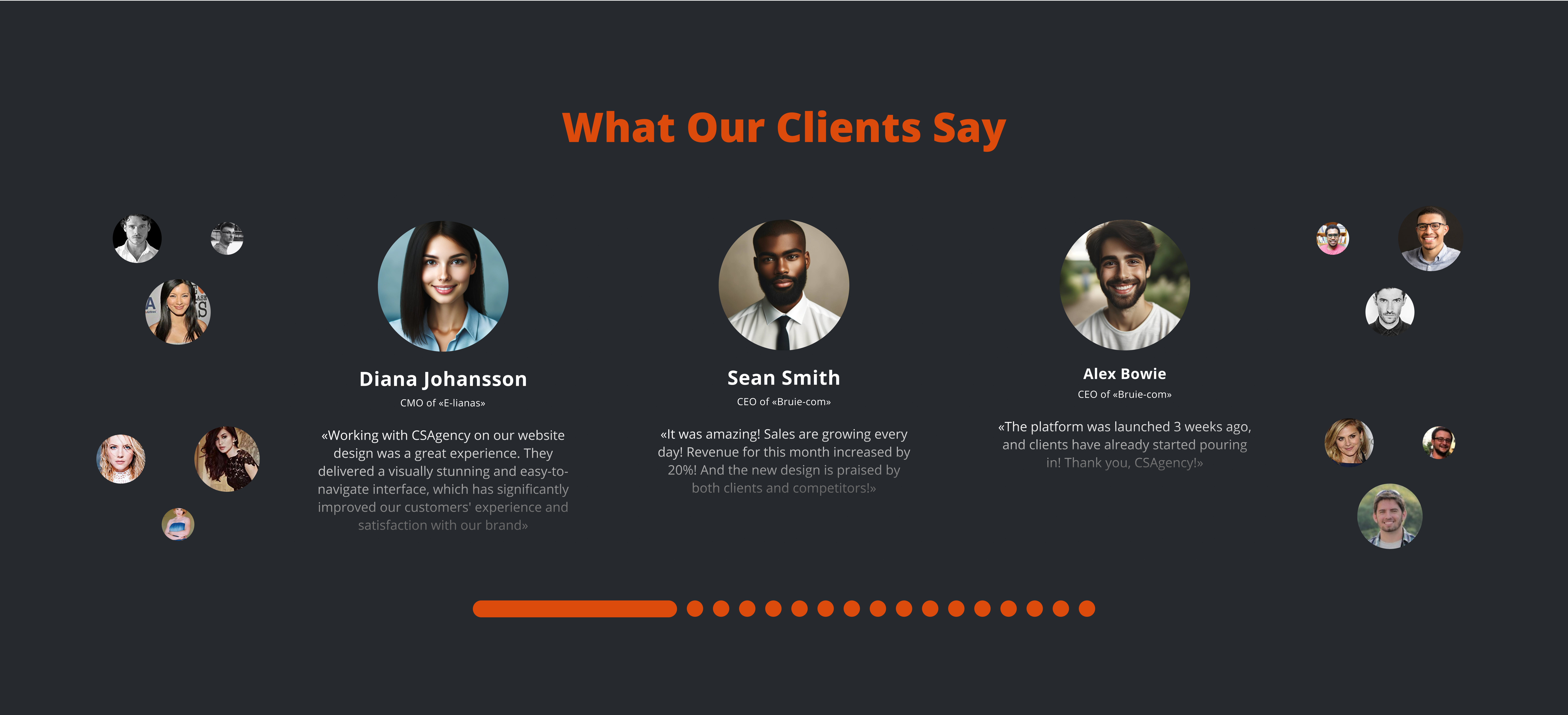
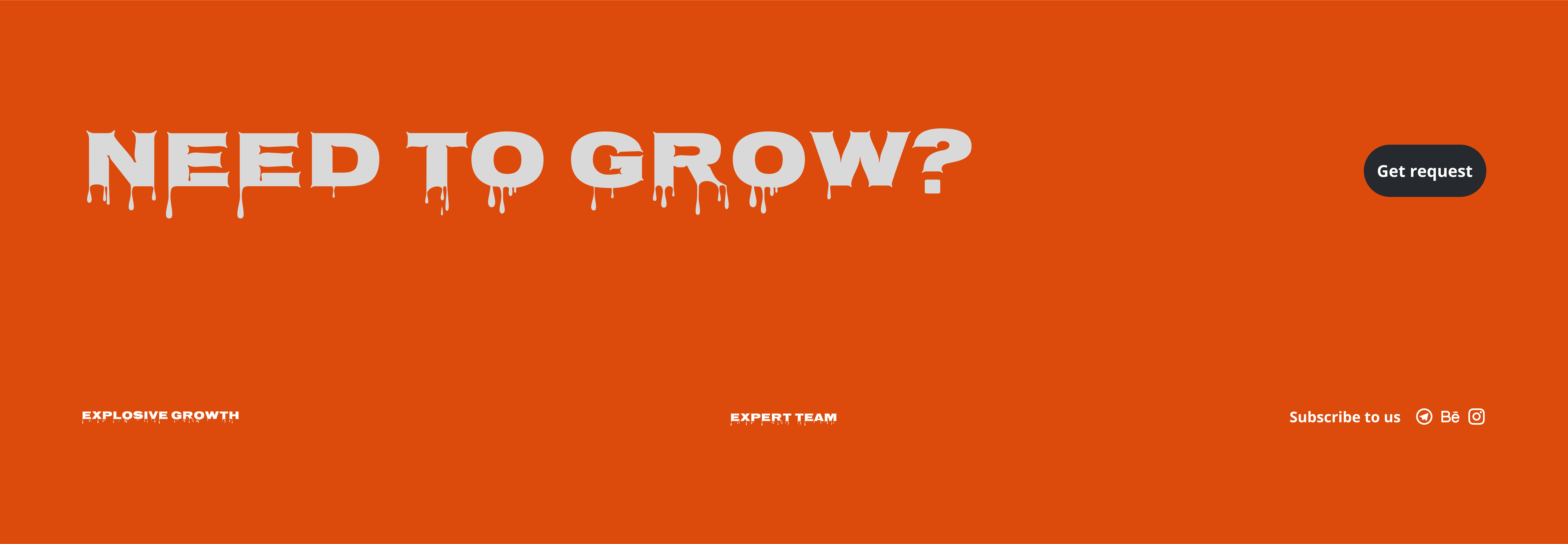
Concept of design agency landing page

Thanks for your time:)
Reviews
1 review

Would just invest in another color for the main CTA to be more attractive in contrast with the rest of the elements. Great job overall
Hello, Adrienne! Thanks for the feedback - it's much appreciated for me! I'm considering changing the CTA to a more classic look since the current one feels more like a label than a button.
Hi Vlad, changing the CTA to a classic one is a great idea! it would reduce cognitive load since the users are already familiar with the pattern (https://app.uxcel.com/courses/ux-design-psychology/minimizing-cognitive-load-834#stick-to-common-design-patterns-0405).
Also, don't forget to set the CTA with a more vibrant color that catches the eye against the dark background and the primary orange.
60-30-10 rule should do the trick there. Good Luck!
Thanks for the recommendations! I've redesigned some of the pages - made the CTAs more user friendly. White is the most contrasting color to black, I think.
5 Claps
Average 5.0 by 1 person
You might also like
Project
SiteScope - Progress Tracking App

🧩 Project OverviewThis project showcases the design of a mobile login and sign up experience for a construction progress tracking app. The

Project
FlexPay

The onboarding was designed to reduce financial anxiety, create a sense of instant reward, and encourage early action. Instead of overwhelmi

Project
Mobile Button System

As my first ever ux design attempt, I tried to go with a simplified approach with only a few button types and states. I kept the color palle

Project
CJM for Co-Working Space - WeWork

This project presents a customer journey map for WeWork, created to understand the end-to-end experience of a remote professional using a co

Project
Ubani Design System

Ubani Design System Includes consistent, accessible, and scalable product foundation across neighborhood social experiences. It includes: a

Project
Accessible Signup Form for SaaS Platform
🧩 Project OverviewFor the Accessible Signup Form for SaaS Platform challenge, I designed a desktop signup experience for TaskFlow, a projec
Popular Courses

Course
UX Design Foundations

Learn UX design fundamentals and principles that create better products. Build foundational knowledge in design concepts, visual fundamentals, and workflows.

Course
Introduction to Figma
Learn essential Figma tools like layers, styling, typography, and images. Master the basics to create clean, user-friendly designs

Course
Design Terminology

Learn UX terminology and key UX/UI terms that boost collaboration between designers, developers, and stakeholders for smoother, clearer communication.