Accessible Signup Form for SaaS Platform

Hi everyone! This is my first project on Uxcel, where I designed a sign-up form focused on meeting accessibility best practices.
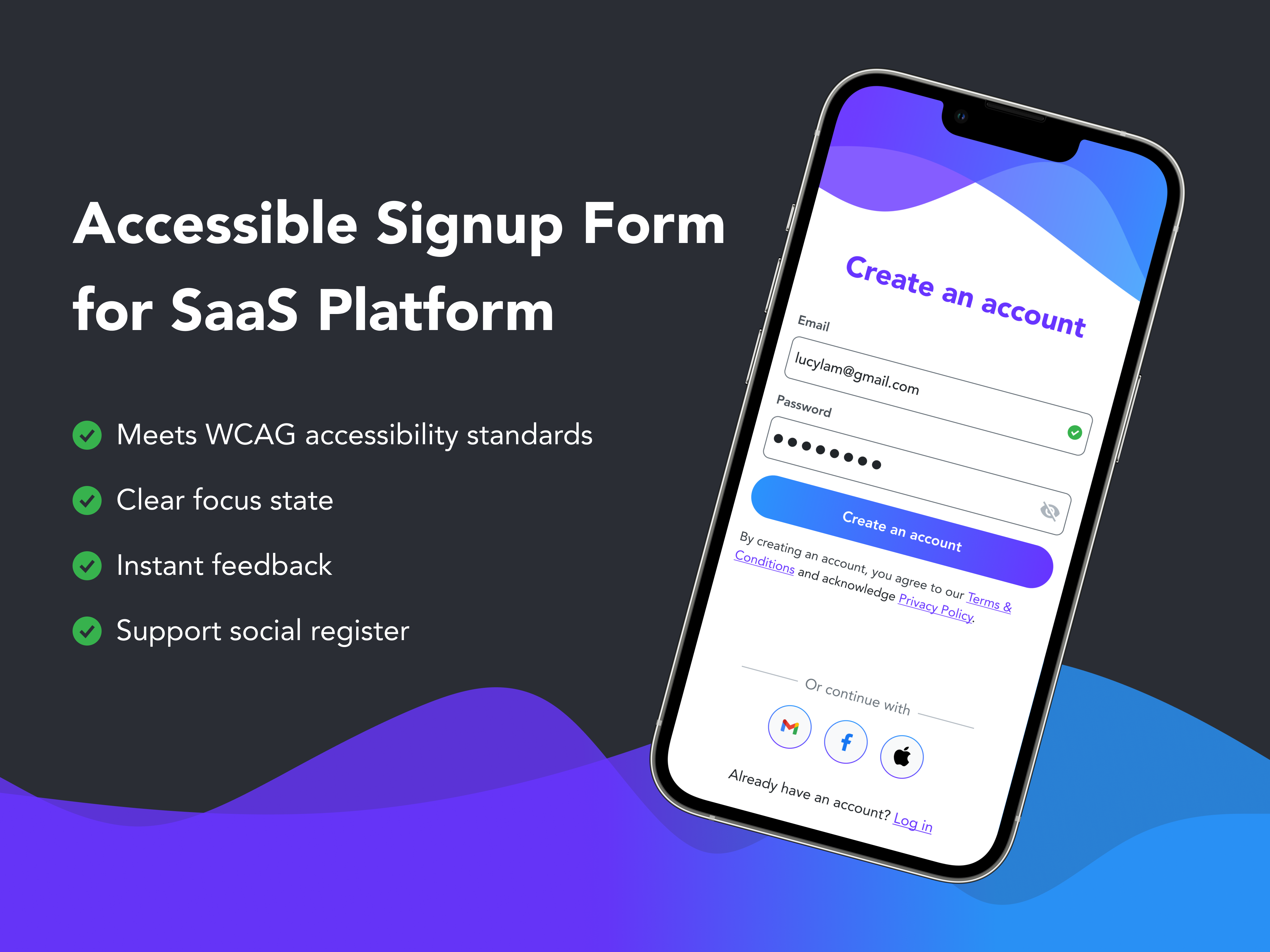
1. WCAG Contrast Ratio Compliance
I followed WCAG guidelines to ensure sufficient contrast ratios:
- For text < 24px (or < 18.5px in bold): Contrast ratio ≥ 4.5:1
- For text ≥ 24px (or ≥ 18.5px in bold): Contrast ratio ≥ 3:1
2. Touch Target Size
Interactive elements (buttons, text fields, social media buttons) maintain a touch target size of at least 44x44px or 48x48px to ensure usability.
3. Spacing Between Elements
To help users interact accurately with touch targets, I ensured a spacing of 8px or 16px between elements.
4. Error and Text Field States
- Error State: Added both color and icons to ensure people with color blindness can easily recognize errors.
- Text Field States: Designed distinct visual cues (e.g., color, stroke thickness, icons) for various states such as:
- Not focused
- Focused
- Inputted
- Missing
- Valid/Invalid
5. Password Best Practices
- Provided guidance on creating strong passwords.
- Displayed real-time feedback on password criteria as users meet them.
6. Clear and Concise Wording
Used simple, clear labels, placeholders, error messages, and button text to make the design intuitive and easy to understand.
Included a prominent title, “Create an Account” to clarify the purpose of the flow.
7. Information Hierarchy
- Key information (title of the screen, text fields, and primary button) is placed at the top with a dominant design to draw user attention.
- Alternative actions (e.g., social sign-up) are positioned at the bottom with subtle styling to reduce visual noise and keep the focus on the primary task.
Thank you for reading!
Tools used
From brief

Topics
Share
Reviews
2 reviews

Great job, this project looks really good. I appreciate the consistency and nice visual illustration on the very top with the matching gradient on the button.
If I were to give some advice, it would mainly be three points:
- There is no information regarding password requirements. If there are any, which is true for almost all platforms, then it's best to showcase the requirements which indicate to the users if they've been met. An example are small checkboxes which turn green when the condition is met (eg. "1 special character") or a caption describing all conditions in one sentence, which turns green with a checkmark when the requirements are met.
- The text links to the terms and privacy policy are very close together, making it highly likely that a user might misclick on mobile. Examples of good practices here would be to either make the line height taller or include both information on one page with just one link button, among a few solutions.
- Lastly, if this is the main page the user sees when first opening the app, then the "log in" option should be more visible at first glance. However, if this page is what the user sees after clicking "sign up" on an initial welcome page, then it would be ok :)
Keep it up!

Hey Lucy!
I would like to compliment this design — it looks clean, professional, and user-friendly. The color palette and gradients add a nice touch of visual appeal without compromising clarity. It's also evident that accessibility was well-considered, as the contrasts seem to follow WCAG guidelines, ensuring a positive experience for a wide range of users.
One suggestion I have is to slightly increase the spacing between the "Create an account" button and the two input fields above it. This would help clarify the visual hierarchy and emphasize the proximity principle, making it more apparent that the fields belong to the same group, while the button is a separate actionable element. This adjustment could strengthen the structure of the layout and improve the overall clarity.
Additionally, moving the "Create an account" button slightly lower on mobile devices could enhance usability by making it easier for users to reach with their thumb, which is especially important for mobile ergonomics.
Overall, this is a well-executed design that balances aesthetics and functionality effectively. Great job!
You might also like

PLANTIST


Lumen

NORTHSIDE - Coworking space Customer Journey Map


Accessible Signup Form for Monkey Survey


Crave Corner - Bakery App Design


Wealthsimple 404 Page

Visual Design Courses

UX Design Foundations


Introduction to Figma

Design Terminology
