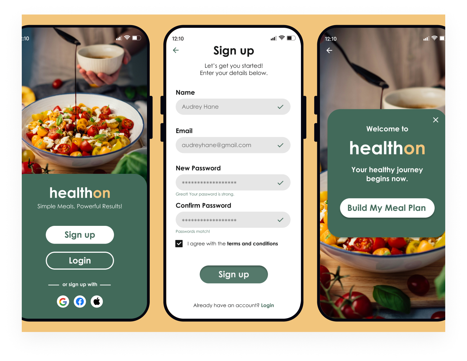
Accessible Signup Form for mobile app

Introduction
The "Healthon" signup form was designed with WCAG (Web Content Accessibility Guidelines) compliance as a priority, ensuring that all users, including those with disabilities, can access and complete the signup process seamlessly. Every design decision was made to enhance usability, readability, and accessibility, following WCAG 2.1 AA standards.
Key Accessibility Features
1. Clear Focus State & Keyboard Navigation
- A strong visual focus indicator ensures users navigating via keyboard can easily identify the active element.
- Full keyboard accessibility allows users to complete the form using Tab, Shift+Tab, and Enter, ensuring inclusivity for users who rely on keyboard navigation.
2. AA WCAG Standards Compliance
- The design meets AA contrast requirements
- Typography and touch targets are optimized for readability and ease of interaction, meeting minimum target size guidelines.
3. Sufficient Color Contrast
- Text and background colors maintain a high contrast ratio, making content readable for users with visual impairments.
4. No Time Limits
- Users can complete the signup process at their own pace, without timeouts or automatic session expirations, ensuring a stress-free experience.
5. Clear Labels & Instructions
- Every form field has a clear, descriptive label, helping users understand what information is required.
- Placeholder text is not used as a replacement for labels to ensure accessibility for screen reader users.
6. Error Identification & Suggestions
- Error messages are clear and specific, highlighting issues such as missing fields or incorrect formats.
- Users receive helpful suggestions for correction (e.g., "Please enter a valid email address (e.g., [email protected])"), improving form completion rates.
Decision-Making Process & Design Rationale
1. User-Centered Design
The signup form was built with a diverse range of users in mind, including individuals with visual, motor, and cognitive impairments. Ensuring ease of use for everyone was a priority.
2. Mobile Optimization
Since HealthOn is a mobile-first platform, the form prioritizes touch-friendly interactions, ensuring accessibility on mobile devices without compromising usability.
3. Error Prevention & Guidance
To minimize frustration and enhance user experience, inline validation was implemented, allowing users to correct mistakes in real time before submitting the form.
4. Consistency & Readability
A consistent color scheme, readable typography, and accessible contrast ratios were used to enhance usability and reduce cognitive load.
5. Compliance with Standards
By adhering to WCAG 2.1 AA guidelines, the signup form is legally compliant and provides an inclusive experience for all users.
Conclusion
The HealthOn signup form was designed with accessibility at its core, ensuring that users of all abilities can complete the signup process smoothly. By incorporating clear focus states, keyboard navigation, error handling, and strong contrast, the form creates an inclusive, seamless experience for everyone. This approach aligns with WCAG guidelines and reinforces HealthOn’s commitment to accessibility and user-centered design.
Tools used
From brief

Topics
Share
Reviews
2 reviews

It’s a great practice to keep forms as minimal as possible to enhance the UX. I have a few thoughts that might help refine it further:
- Simple form: Are there any fields that could be removed or combined to streamline the experience? Reducing the number of inputs can help users complete the form more quickly and with less effort.
- Email & age groups: Is it necessary to collect an email address for all users, especially across different age groups? Depending on the audience, some users might find other options more convenient.
- Phone number & OTP: Since this is a mobile app, using a phone number with an OTP could provide a seamless, password-free signup experience. This might reduce friction and make it easier for users to get started.
- Lower interaction cost: Minimizing the need for typing can lower interaction costs, making the process more accessible to users with varying abilities(eg: motor limitations) and reducing cognitive load.

Hey Andri, your HealthOn signup form is a fantastic example of accessible design! The color scheme looks great and enhances the overall user experience. However, one area that could use a bit more attention is the spacing and padding between input fields and their titles. Adding extra space would make the form even more readable and user-friendly. Overall, it's clear that you've put a lot of thought into ensuring this form is accessible to all users, and with these small tweaks, it will be even better. Great job!
You might also like
Blip - Esport app design (Light & Dark UI)


Reimagining Asana's Color System


Customer Journey Map for a Co-Working Space

Responsive Main Screen


Latios - Free Portfolio Template for UX/UI Designers

Workspace Booking Flow - UI/UX Design

Visual Design Courses

UX Design Foundations


Introduction to Figma

Design Terminology
