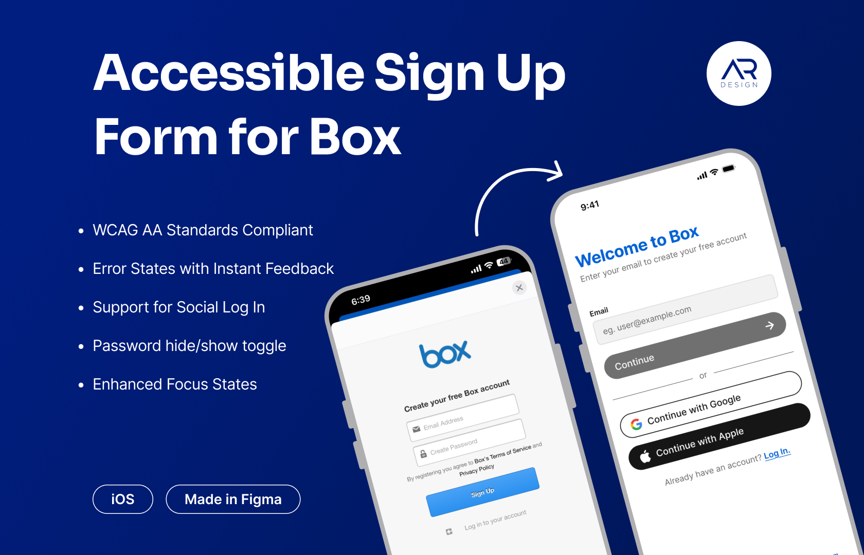
Accessible Sign Up Form for Box
1. Introduction
In this project, I reimagined the Log In and Sign Up flows for Box — a SaaS application — to create a modern, accessible, and user-friendly experience. The redesign focuses on enhancing usability, improving visual hierarchy, and incorporating accessibility best practices.
2. Problem Statement
The existing interface presented several challenges:
- Outdated UI: The design did not reflect current aesthetics.
- Inefficient Use of Space: UI elements were too small and underutilized the available screen space.
- Cluttered Layout: Insufficient negative space led to a crowded experience.
- Low Contrast: The ‘Log In’ button lacked the necessary contrast for visibility.
- Missing Persistent Labels: Input fields lost their labels once data was entered, confusing users.
- Weak Focus States: Input fields did not provide clear visual cues when active.
- Lack of Real-Time Validation: There was no instant feedback on data input errors.
- Missing Social Login: The absence of social login options limited user choices.
- No Password Visibility Toggle: Users couldn’t easily verify their password entries.
3. Defining the Design Goals
The primary objectives for the redesign were to:
- Modernize the Interface: Update the visual style to align with contemporary design trends.
- Enhance Usability: Optimize screen space by enlarging touch targets and incorporating clear labels and focus states.
- Boost Accessibility: Increase contrast, introduce instant feedback for data input, and add features such as password visibility toggles and social login support.
- Streamline the User Journey: Reduce friction by ensuring intuitive navigation and immediate error validation.
4. Key Design Improvements
Modernized UI
- Adopted a clean, minimalist design with updated typography and iconography to boost legibility and modern appeal.
Enhanced Layout & Space Utilization
- Increased the size of interactive elements and leveraged negative space to create a balanced and uncluttered interface.
- Redesigned form layouts to improve readability and overall interaction.
Accessibility Considerations
- Color Contrast: Ensured that all text and interactive elements meet WCAG AA standards, facilitating easier reading. All contrast ratios were tested with the Stark plugin for Figma.
- Revised Font Sizes: All text elements have font sizes above 12px, ensuring an easy reading experience.
Improved Button Contrast & Visual Hierarchy
- Adjusted the color palette to make the ‘Sign Up’ and ‘Log In’ buttons stand out, ensuring they were immediately recognizable as the primary CTAs.
Persistent Input Labels & Emphasized Focus States
- Implemented floating labels that remain visible during data entry, ensuring clarity.
- Enhanced focus states on input fields to provide clear guidance during interaction.
Real-Time Validation & Additional Features
- Integrated instant input validation to provide immediate user feedback on errors, thereby reducing form submission frustration.
- Added support for social log in options and a password visibility toggle to streamline authentication and enhance user confidence.
Thank you for reading till here, please share your thoughts and feedback in the comments below.
Tools used
From brief

Topics
Share
Reviews
1 review

You're making great improvements! The refinements you've made are definitely enhancing the usability of the login/signup page, but there are still a few areas where simplification could improve clarity and user focus.
Some of the screens still feel a bit too busy, especially with more than three buttons competing for attention. Simplifying these elements is one of the trickiest but most impactful adjustments you can make. One way to do this is by visually deprioritizing secondary actions. For example, making the "Login with Google" and "Login with Apple" buttons more tertiary - using just borders or subtle outlines instead of solid fills, can help reduce visual clutter. Right now, the black background of the Apple login button is too dominant, unintentionally drawing focus away from the primary action.
Another refinement to consider is the disabled "Continue" button. Instead of using a dark shade of gray, try a lighter one. This helps communicate that the button is inactive while maintaining contrast for accessibility. A dark disabled button can sometimes create unnecessary visual weight, making it harder for users to distinguish between an inactive and active state.
One small but excellent detail I noticed - using "Tap here" instead of "Click here" is a thoughtful UX writing choice for a mobile app. It's a great example of considering the user's context. Keep up the great work, and I’m excited to see how this evolves!
You might also like

Solar system Dashboard Utility


Signup page for a SaaS website


ASOS - Push Notifications


PLANTIST


Pulse - Inventory Management System Design


Lumen
Visual Design Courses

UX Design Foundations


Introduction to Figma

Design Terminology
