Intro to UX Copy
Learn the basics of writing helpful and effective UX copy for users
UX microcopy or UX copy includes all the little texts accompanying UI elements that help users navigate apps and websites. Some examples are button labels that tell users what will happen when they press it or error messages that explain what's gone wrong and how users can solve it. Writing great microcopy is trickier than it seems. It should be concise and straight to the point, explain what is needed and why, and, of course, respect users.
Big companies like Google and Spotify have specific UX writing positions. In smaller teams, this job usually falls on designers or developers. This can sometimes lead to confusing writing, like in the case of the infamous "Task failed successfully" Windows XP error message. Whether you're a UX writer, a designer, or a developer struggling to find the right words, this lesson will help you understand and improve your microcopy and, in turn, your user experience.
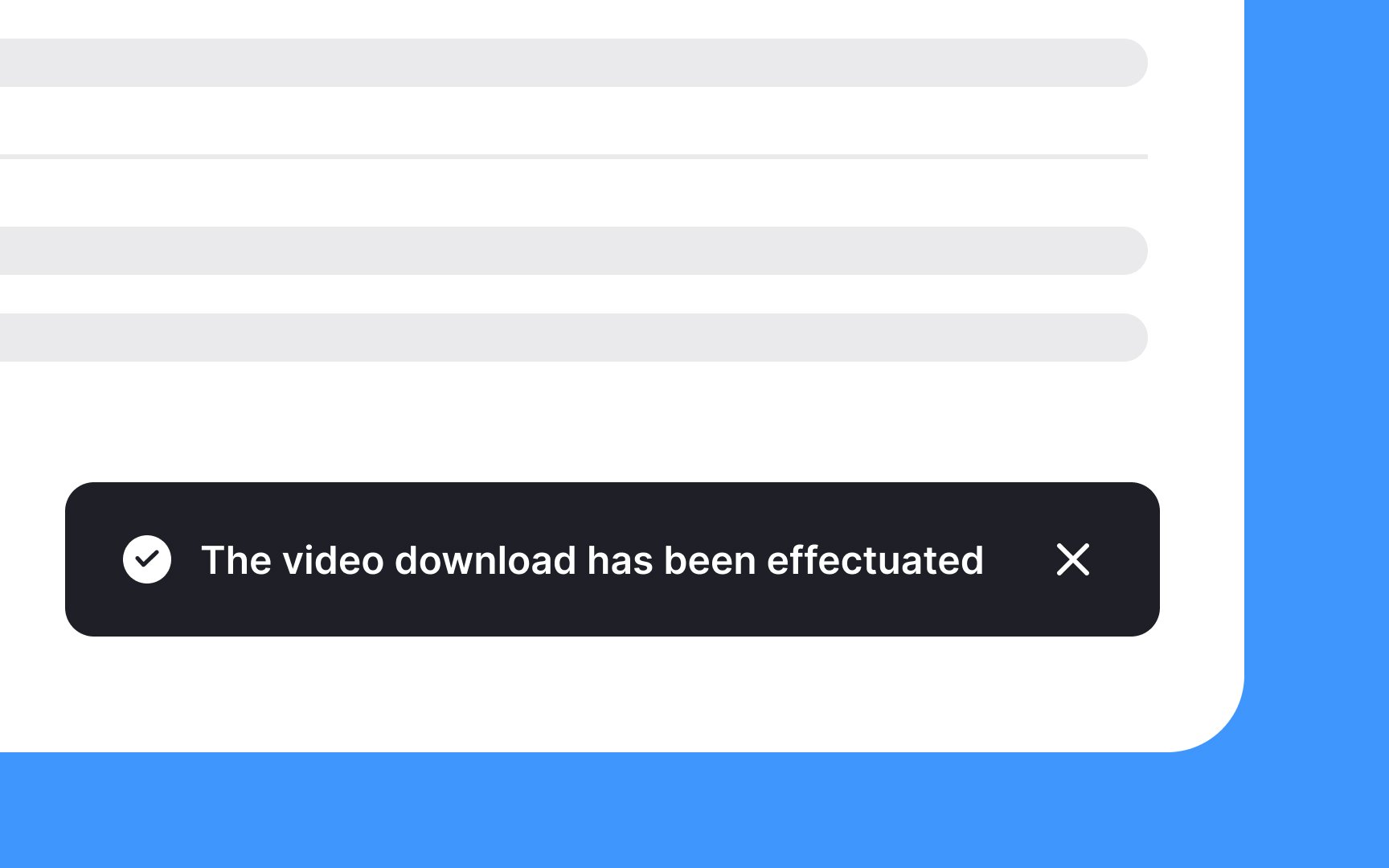
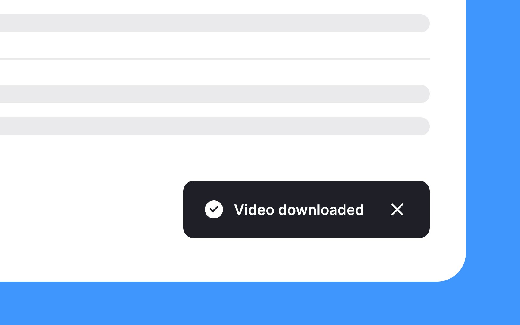
These small phrases are more critical than they may appear. They guide users and can even create a more pleasant experience. If done well, microcopy speaks to users in a conversational tone, making them feel comfortable and understood. It helps to remove confusion and encourages them to take the desired action, whether that's signing up for a newsletter, making a purchase, or sharing information.

The clarity of commands is vital in guiding users effectively. When users encounter vague or confusing language, they are often deterred from taking action. Complex words, technical jargon, or niche slang can mystify, especially for non-native speakers, leading them to abandon their task.
The goal is to communicate what users should do in transparent, unambiguous language. Avoid words that might have unclear meanings or that might require extra effort to understand. A helpful trick to ensure clarity is to read the command out loud. If it doesn't sound natural or rolls off the tongue awkwardly, it's a sign that it might need simplification.

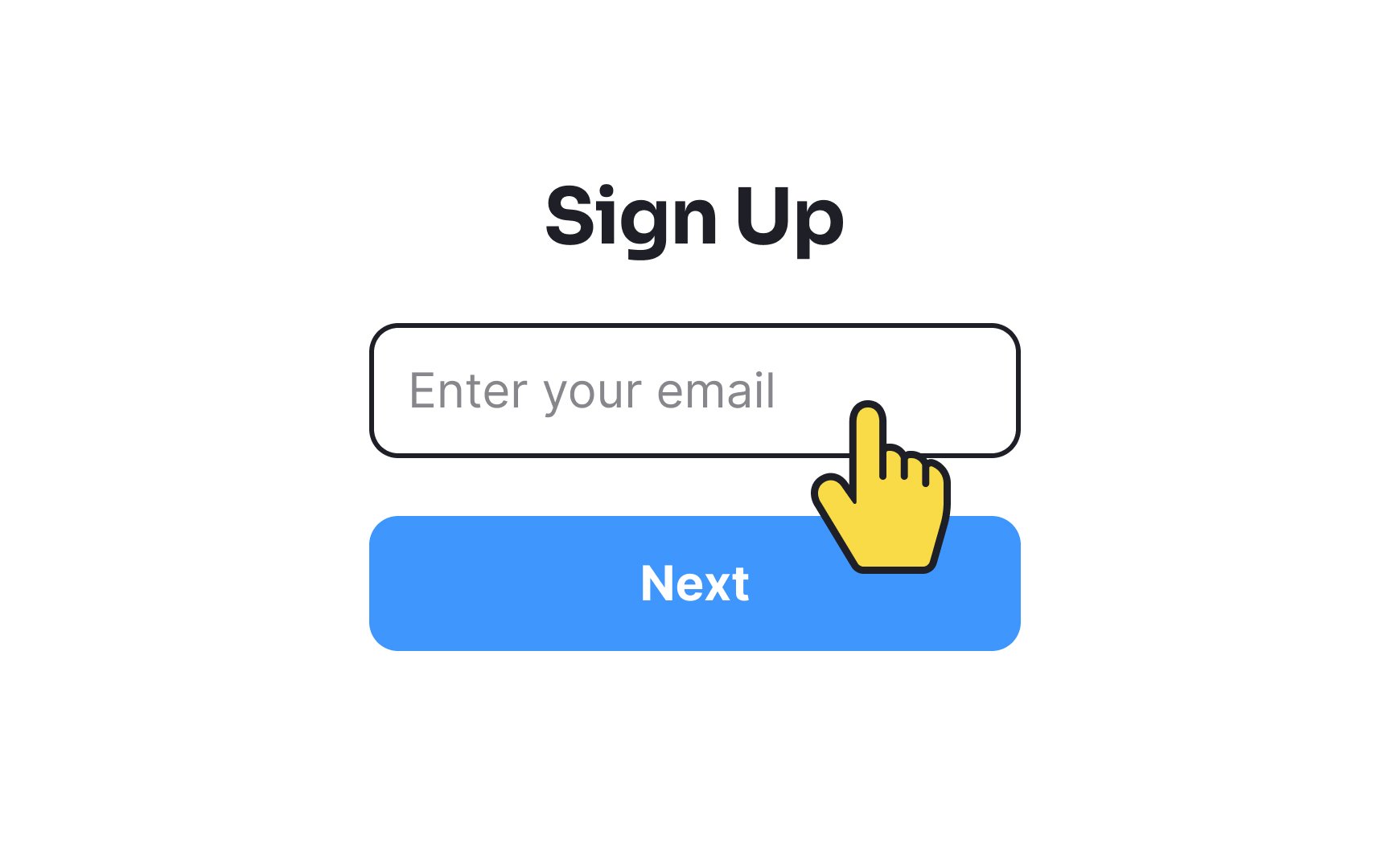
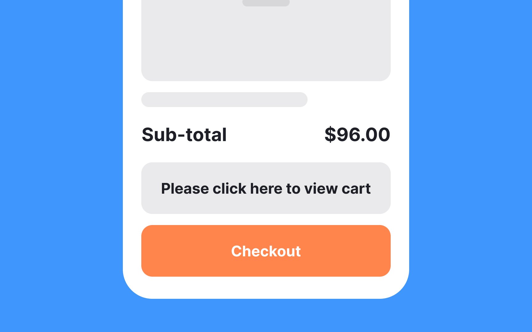
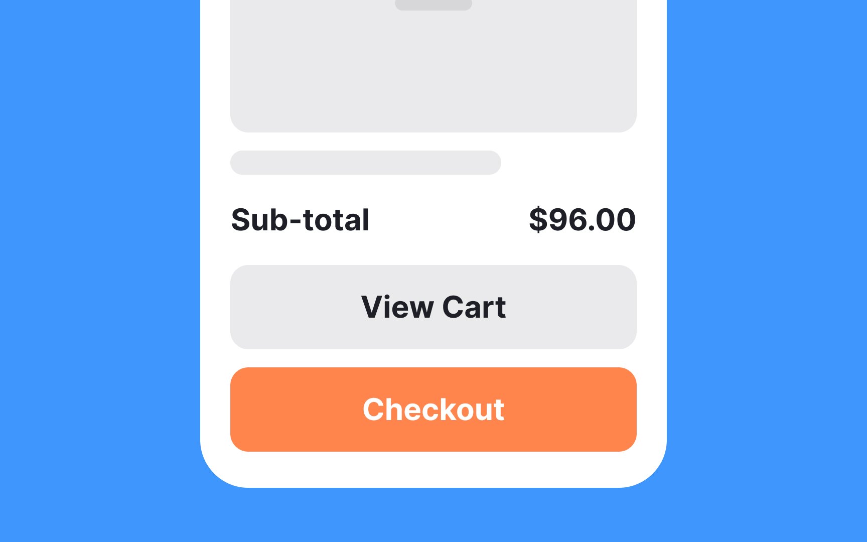
Generic commands such as "OK," "Yes," "Cancel," "Submit," and the like can often leave users in the dark about the action they're about to take. While these terms may seem straightforward, they lack context and specificity, leading to potential confusion.
Consider whether users would understand the
To enhance user understanding, focus on making commands as descriptive and context-specific as possible. Instead of just "Submit," a

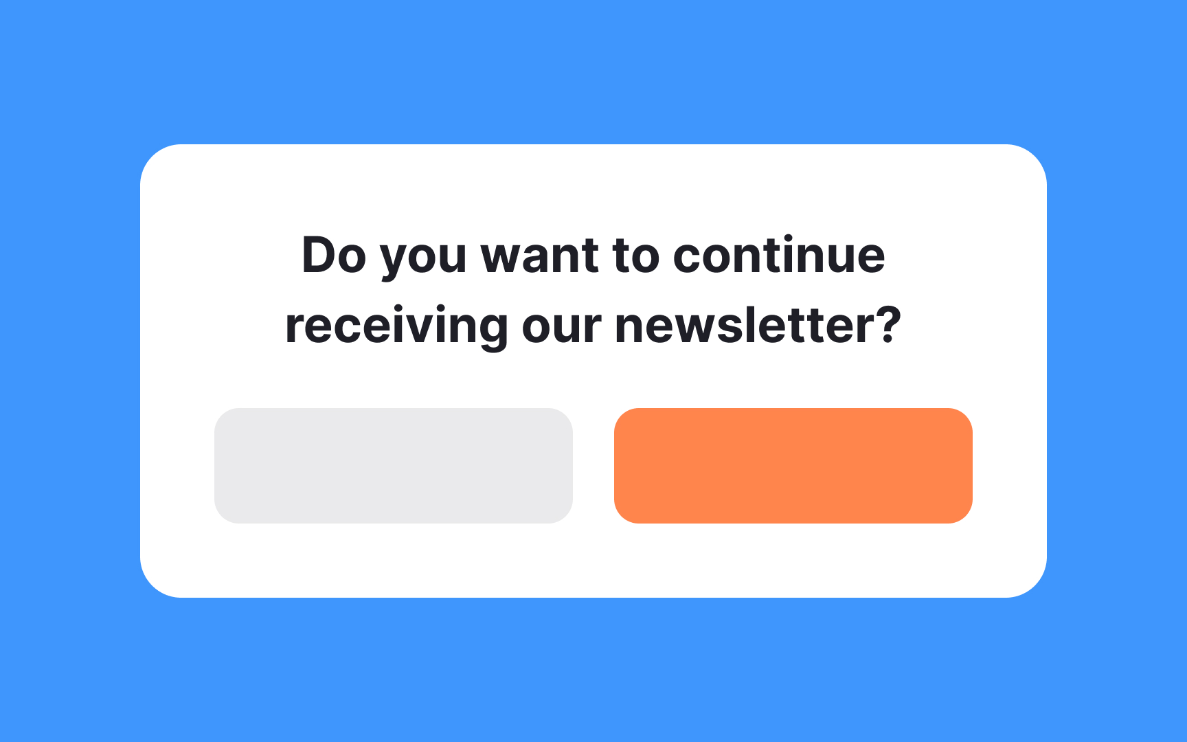
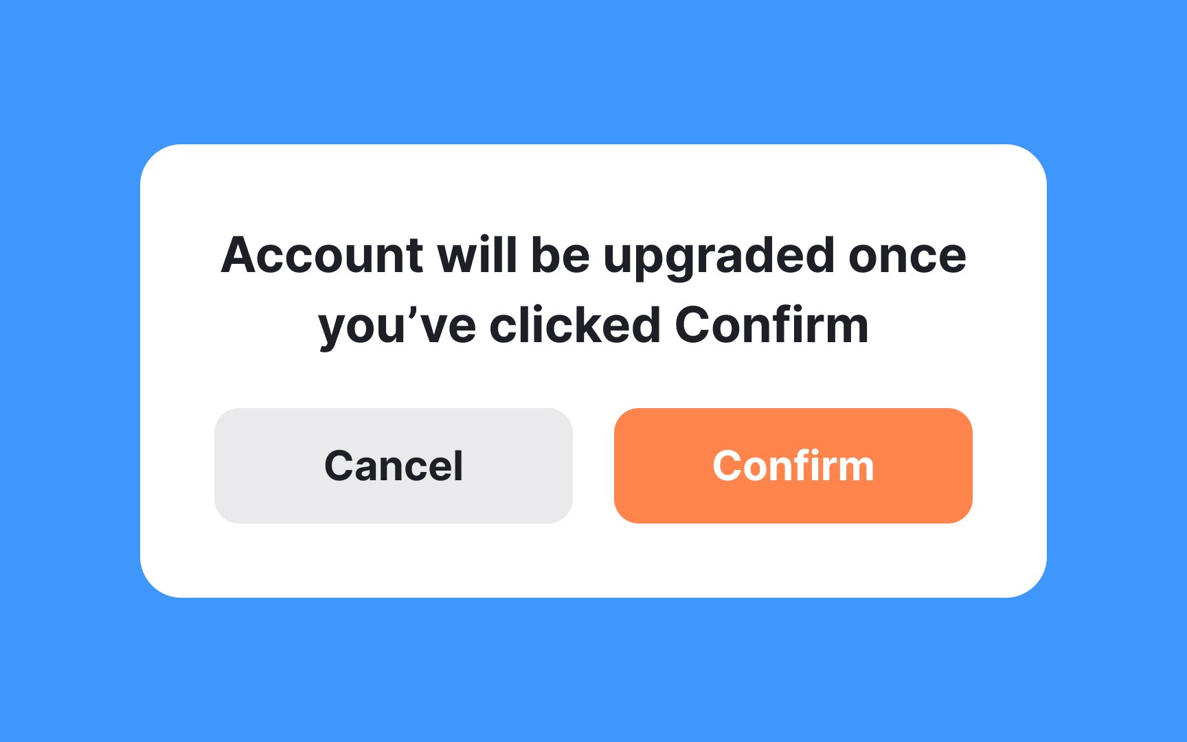
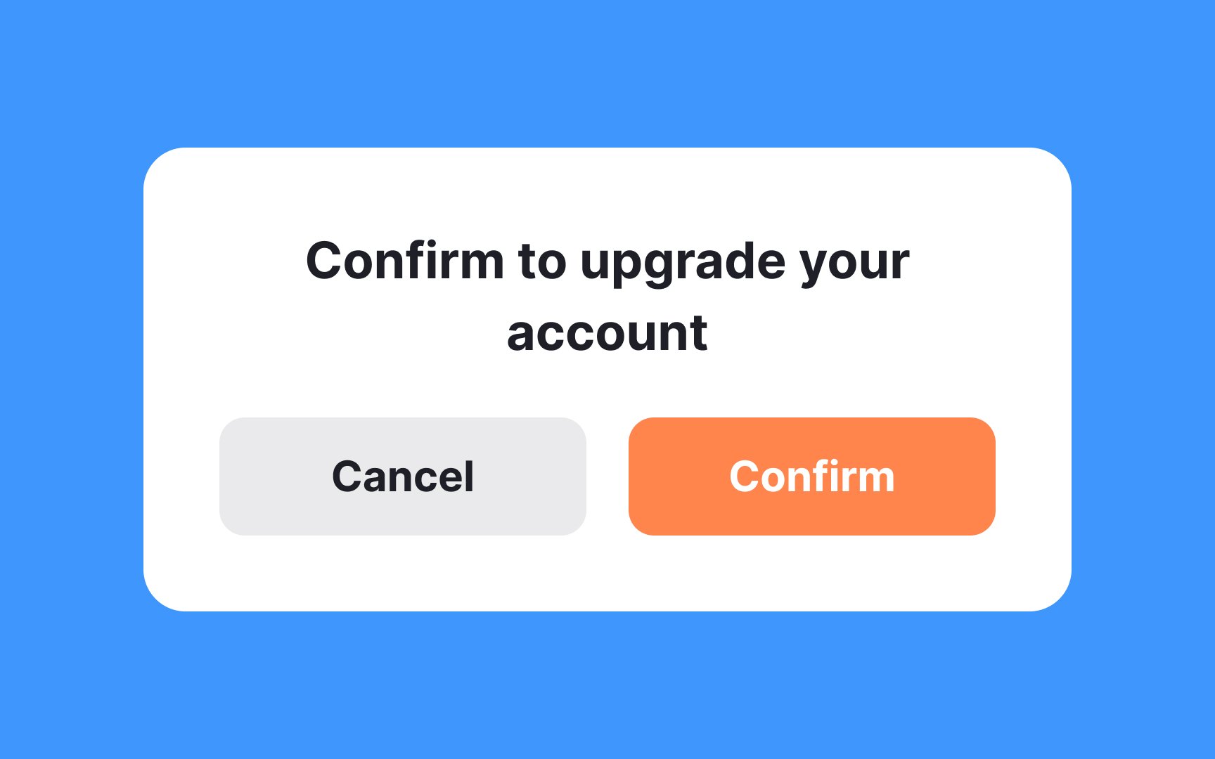
Double negatives occur when two negative words appear in the same sentence. Using them in
To foster transparency and trust, it's essential to use clear, positive language. Instead of employing double negatives, frame your statements or questions in a direct, straightforward manner. A question like "Do you want to continue receiving our newsletter?" is much clearer and encourages a more transparent interaction with users.
In the world of
Consider a
Remember, every word in


In the context of UX design, it's crucial to prioritize user understanding and comfort. While branding is an essential part of marketing, its overuse in
Imagine users navigating a mobile app. If every
The users are usually aware of the product they're using; they don't need constant reminders. Instead, clear and concise language without the distraction of branding helps them focus on the task at hand.
While branding has its place in marketing materials,
While passive voice has its place in language, active voice often creates a more direct and engaging connection with the reader. Consider the two statements: “You did a great job,” and “A great job was done by you.” Both convey the same message, but the first, written in active voice, is much more natural and easier to read.
Active voice places the subject at the beginning of the sentence, leading the action, whereas passive voice emphasizes the object or the result of the action. In
When you craft instructions, notifications, or any other user-facing text, try to frame them in active voice. It fosters clearer communication and reflects a more conversational tone that resonates with users.
While flowery or poetic language may have its place in literature, it can lead to confusion and frustration in a
Compare these two instructions: “Please click on the
Users are often navigating interfaces quickly, seeking information or trying to complete a task. Long paragraphs and complex sentences can overwhelm them, leading to disengagement.
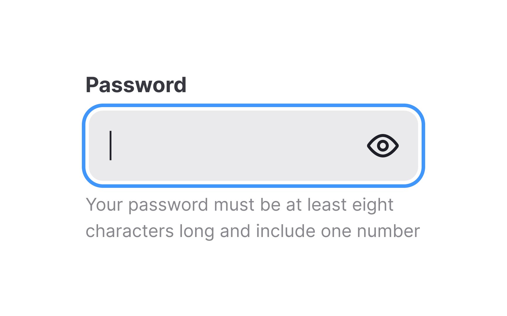
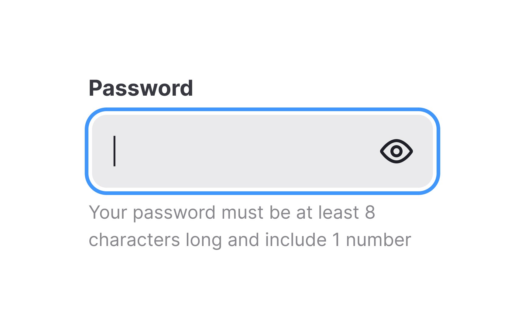
Numbers often play a vital role in
- Numerals are more scannable. They stand out in a block of text, grabbing the reader's attention, and allowing for quick and easy comprehension.
- Numerals save space. That’s true both in terms of characters and visual layout, which can be especially valuable in confined
UI elements or mobile interfaces. - Numerals reduce the chance of typos. They can even save time during the development phase of your project. Developers and translators may find it simpler to work with standardized numerical representations.
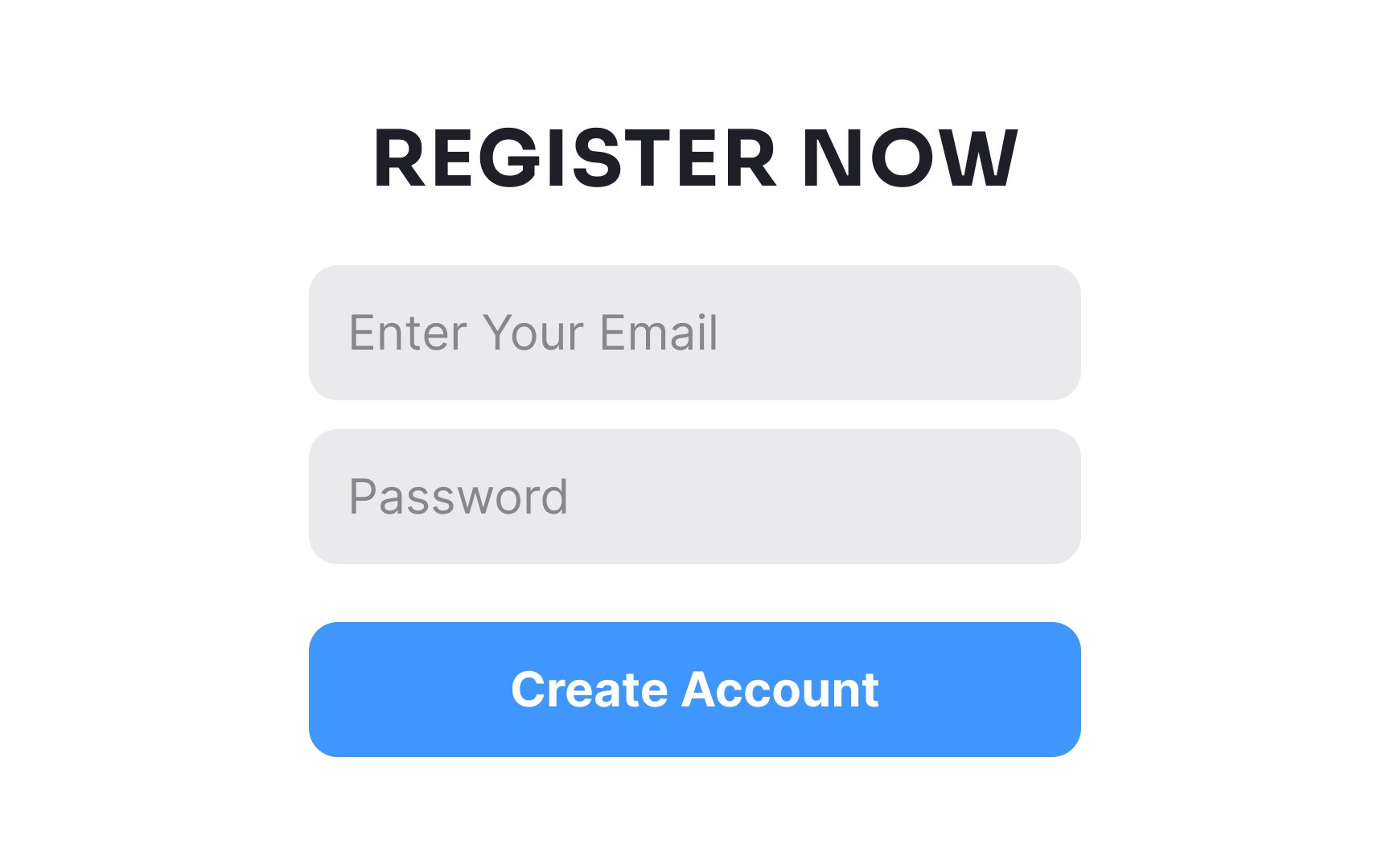
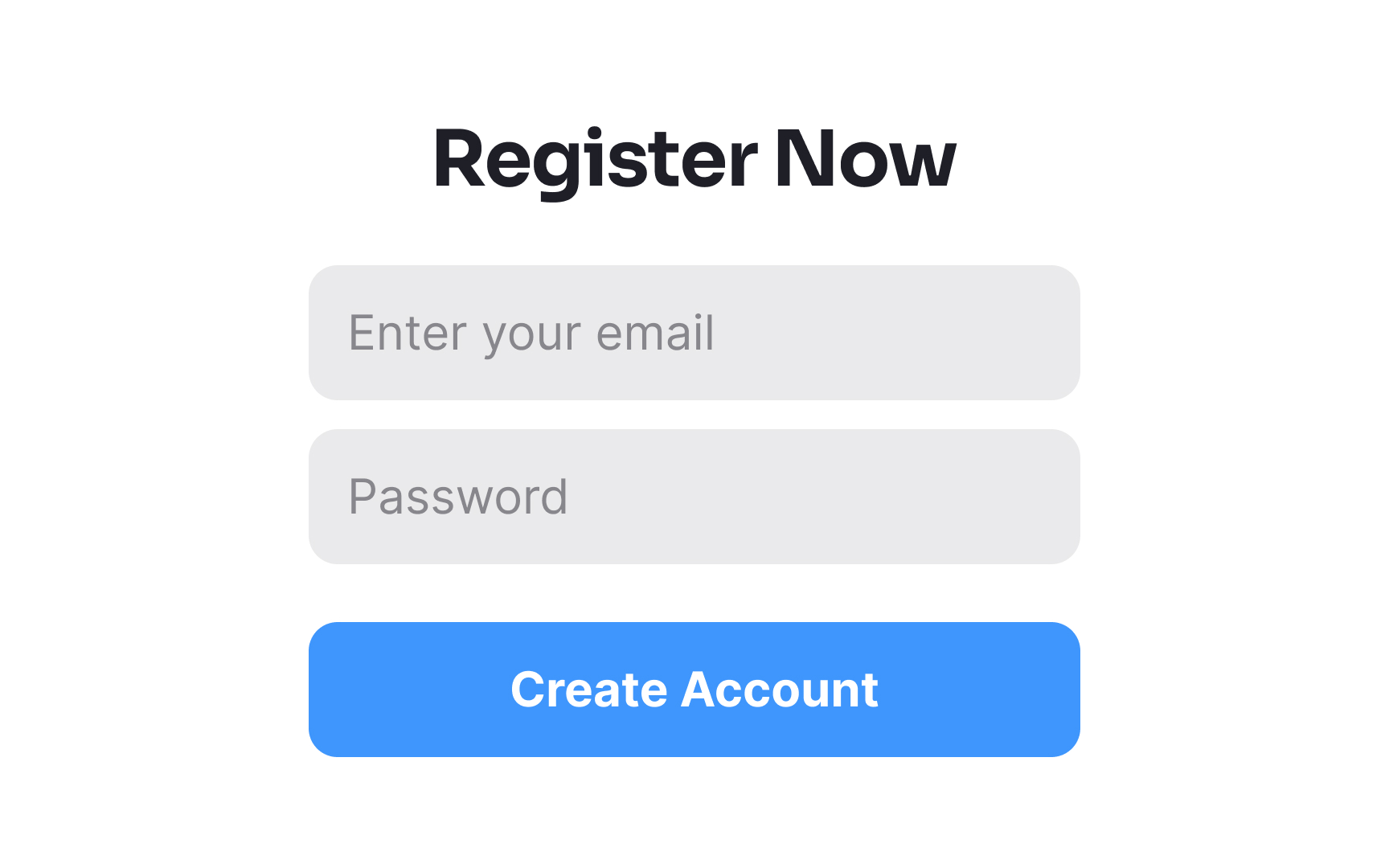
Attention to detail can enhance
- Title case: Commonly used for main call-to-action
buttons or key interactive elements that guide users, like "Add to Cart" or "View Profile." - Sentence case: Suitable for subheadings within forms, tooltips, secondary buttons, or instructional text, e.g., "Sign in with your
email ." - All caps: Might appear in image captions or certain specialized contexts where text needs to stand out. Use sparingly.
- Lowercase: Rarely used in microcopy but may be part of specific
branding or design themes.
By selecting a text case and applying it consistently across all similar microcopy elements, you prevent a disjointed appearance and contribute to a seamless user experience.
Top contributors


Topics
From Course

Share


Similar lessons

What is UX Writing?

Psychology of UX Writing
