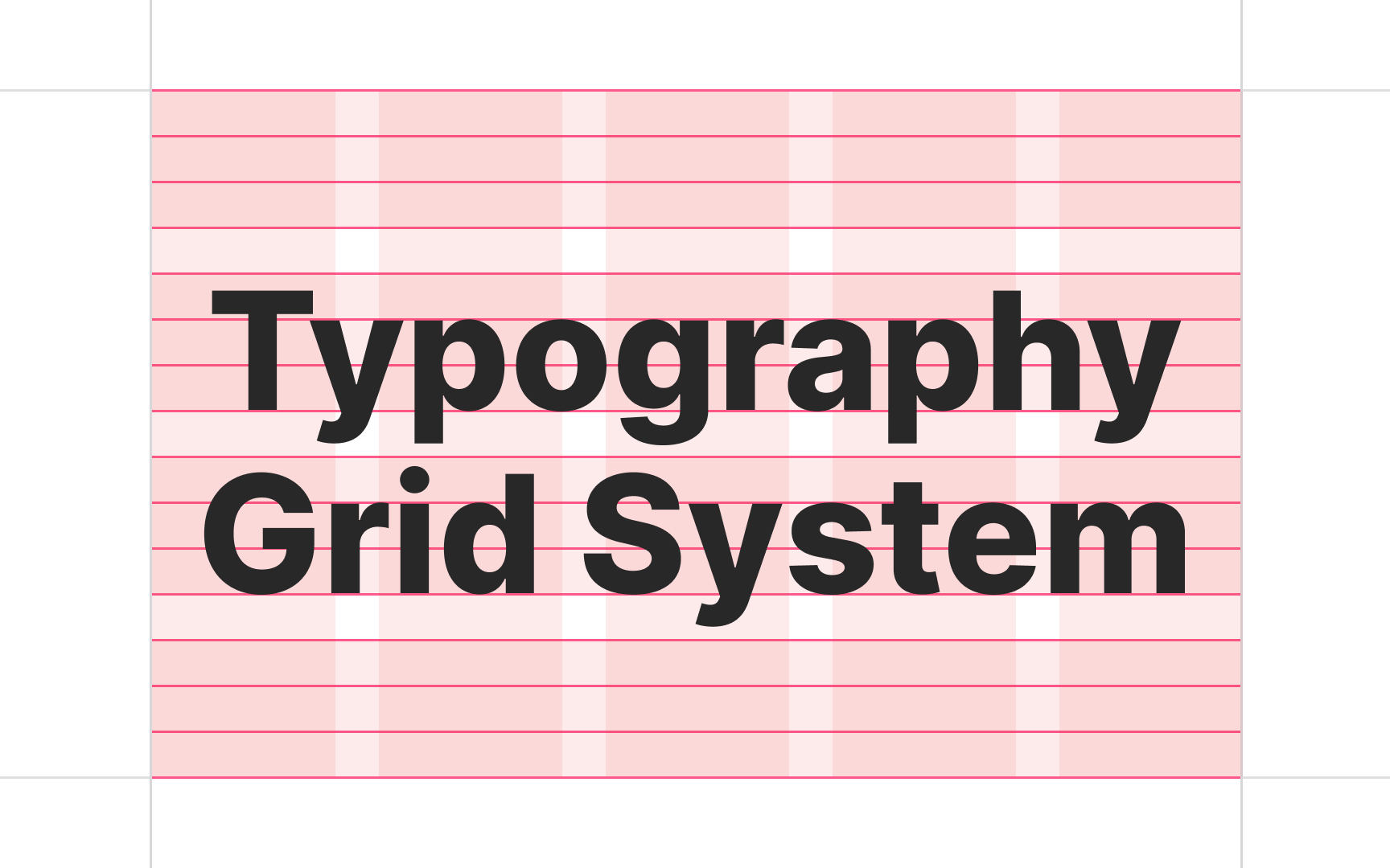
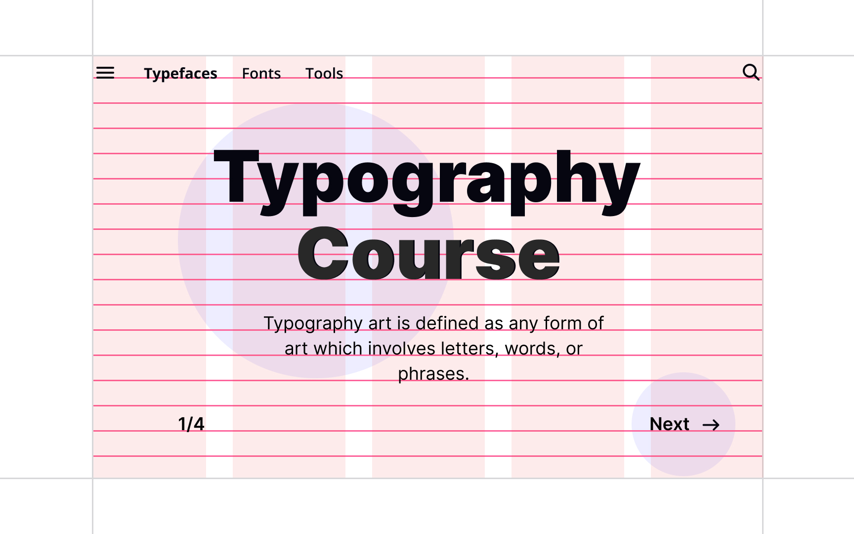
Typographic Grid
Understand how to establish a grid system that guides the placement and alignment of text elements within your design
You may have the wrong impression that the most challenging task is done once you find the right combination of typefaces. However, correctly placing text so that users can scan it and easily find the necessary information is as vital a step as selecting typefaces. Logical organization of content improves readability and reinforces the brand's credibility.
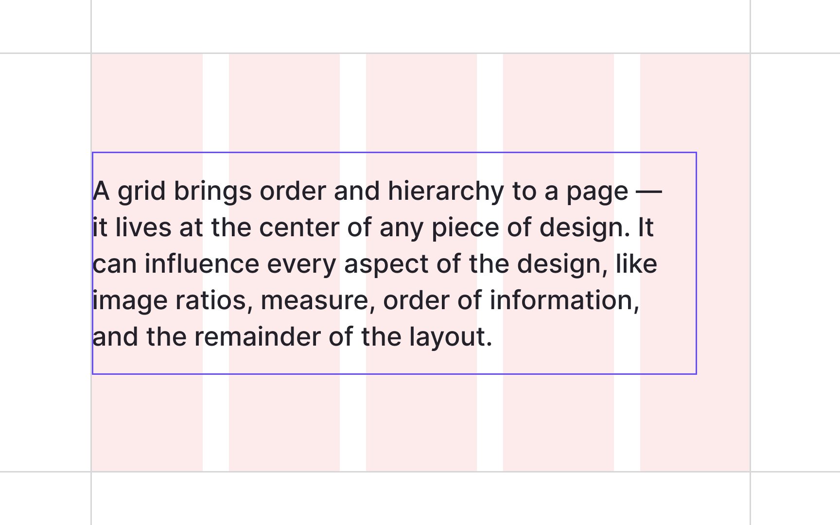
Grids help designers set the pace and plan what content they want to place and in what order they want users to see it. You may take the path of the least resistance and select a predefined grid that most design software like Figma or Sketch offers. Alternatively, you can create your own grid that fits your project needs.
To create a grid, you may ask yourself the following questions:
- How many columns do I want the body text to span?
- How do I set a vertical and horizontal rhythm (it implies the application of gutters and margins)?
- What devices am I designing for, or how flexible should the grid be?[1]
Figuring out the answers to these questions will help you figure out the right grid for your project.
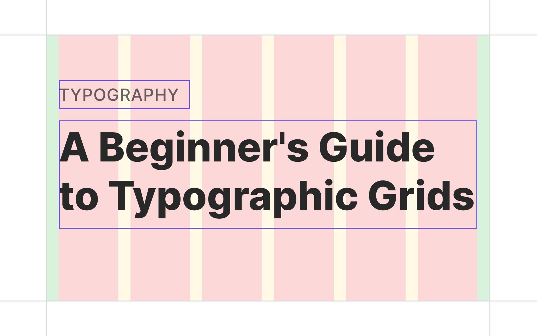
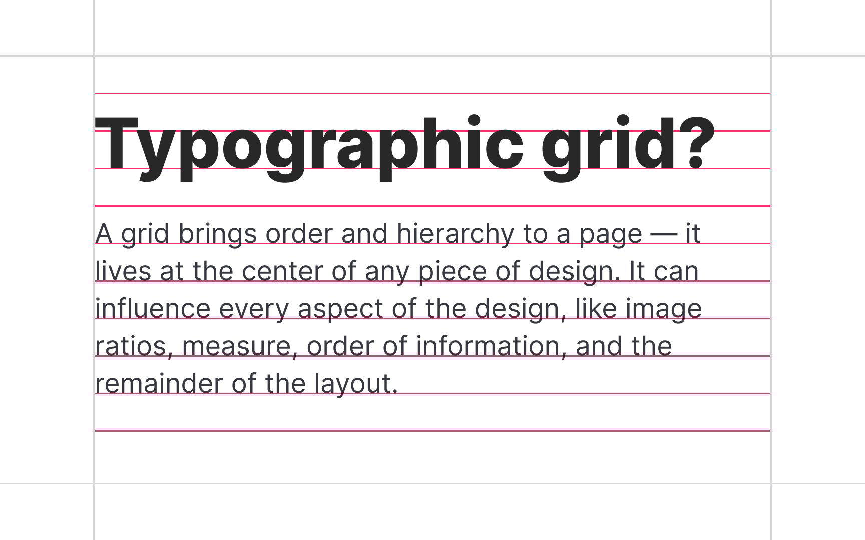
Grids refer to a combination of invisible lines, vertical or horizontal, that divide a page into sections and help organize
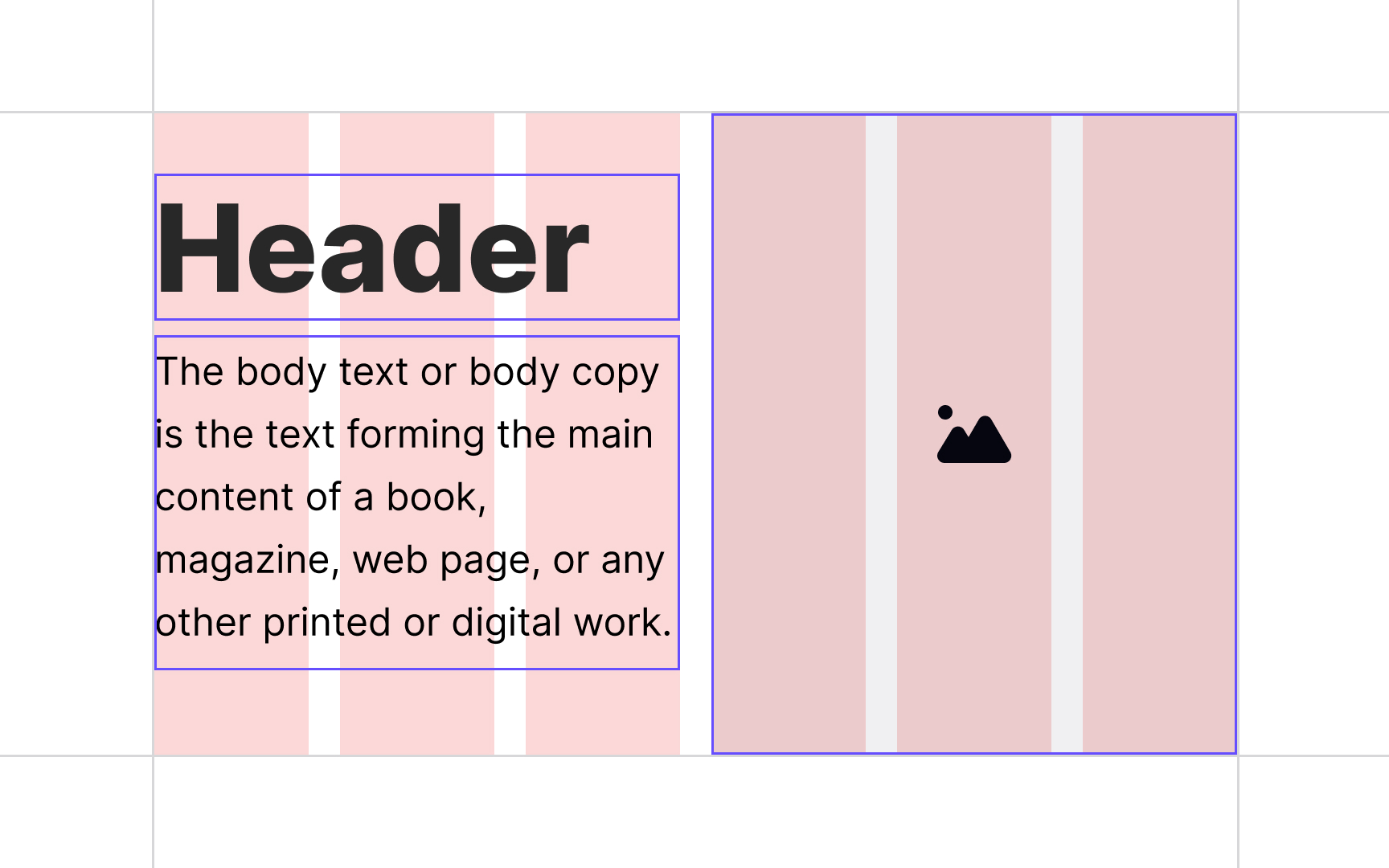
Clear and logical organization of headings, subheads,
Grids are falsely considered to be necessarily rigid and symmetrical. It's more important to maintain the principles of balance and harmony when setting up grids. After all, the most beautiful things in nature aren't precisely symmetrical.
Essentially, a grid's anatomy is made of two basic vertical components —
The bigger the number of columns, the more flexible the layout becomes. On the other hand, it gets harder to manage. You can let your content dictate the number of columns or stick to traditional numbers — 12 on desktop, 8 on tablet, and 4 on mobile.
To achieve a nice balance between elements both horizontally and vertically, it's recommended to keep the gutter width the same size as the baseline height (for desktop and tablet) or at half of the line-height (for mobile).[2]
Essentially, grids are just a tool, and this should be kept in mind while designing. Grids should be built around the
To make content-oriented grids:
- Establish your goals: Think of your brand personality, emotions you want to evoke, and user needs that you assume your product will cover.
- Select and combine typefaces: Based on the previous steps, you pick
typefaces that will convey the right mood and help your users navigate the product effortlessly. - Prioritize your content: Depending on content groups and their priority, set up your
grid : select the number ofcolumns and define vertical and horizontal rhythms.
Baseline grids are horizontal lines (baselines) evenly spaced across your design that you can use for aligning
While baseline grids may be a good solution for static websites, they aren't always helpful with dynamic user interfaces where users constantly add new media or content. The best approach here is to concentrate on keeping a clear, consistent vertical rhythm (line spacing and spacing between text boxes) on the
Multi-column layouts refer to one or more vertical blocks of
However, multi-column layouts aren't the best when breaking up text content. A single article split into multiple columns requires a lot of scrolling up and down, making it hard for users to follow the topic.
A much better solution is to use a one-column
While the column
Modular grids provide much more flexibility than baseline grids, allowing designers to anchor
Willem Hendrik Crouwel, a Dutch graphic designer, type designer, and typographer, once said: "The
When designing a product, you shouldn't be restricted by the grid. Always keep the principle of proximity in mind, and be free to break from a grid if you need to separate unrelated items or reduce space between related groups. You can also use unconventional text alignment or a hero image that does not span over all
References
- Harmonious Typography and Grids | Medium
- Free Web Typography Course | Better Web Type
- Material Design | Material Design
Top contributors


Topics
From Course

Share


