Testing UX Copy
Explore popular testing methods that can be used to evaluate the effectiveness of your UX copy
Testing is essential in development, proving your work’s value while boosting user engagement, brand loyalty, and conversion rates. It also pinpoints areas for improvement. Many UX microcopy testing methods overlap with design testing, offering a chance to assess both simultaneously. However, copy is trickier to test than design — design patterns are consistent, while words can vary in interpretation, influenced by users' cultural and regional backgrounds.
Most users skim text, and their test behavior may not reflect real interactions. To accurately test microcopy, approach it in ways that bypass users' conscious biases.
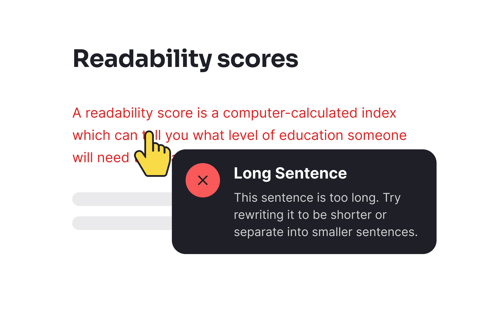
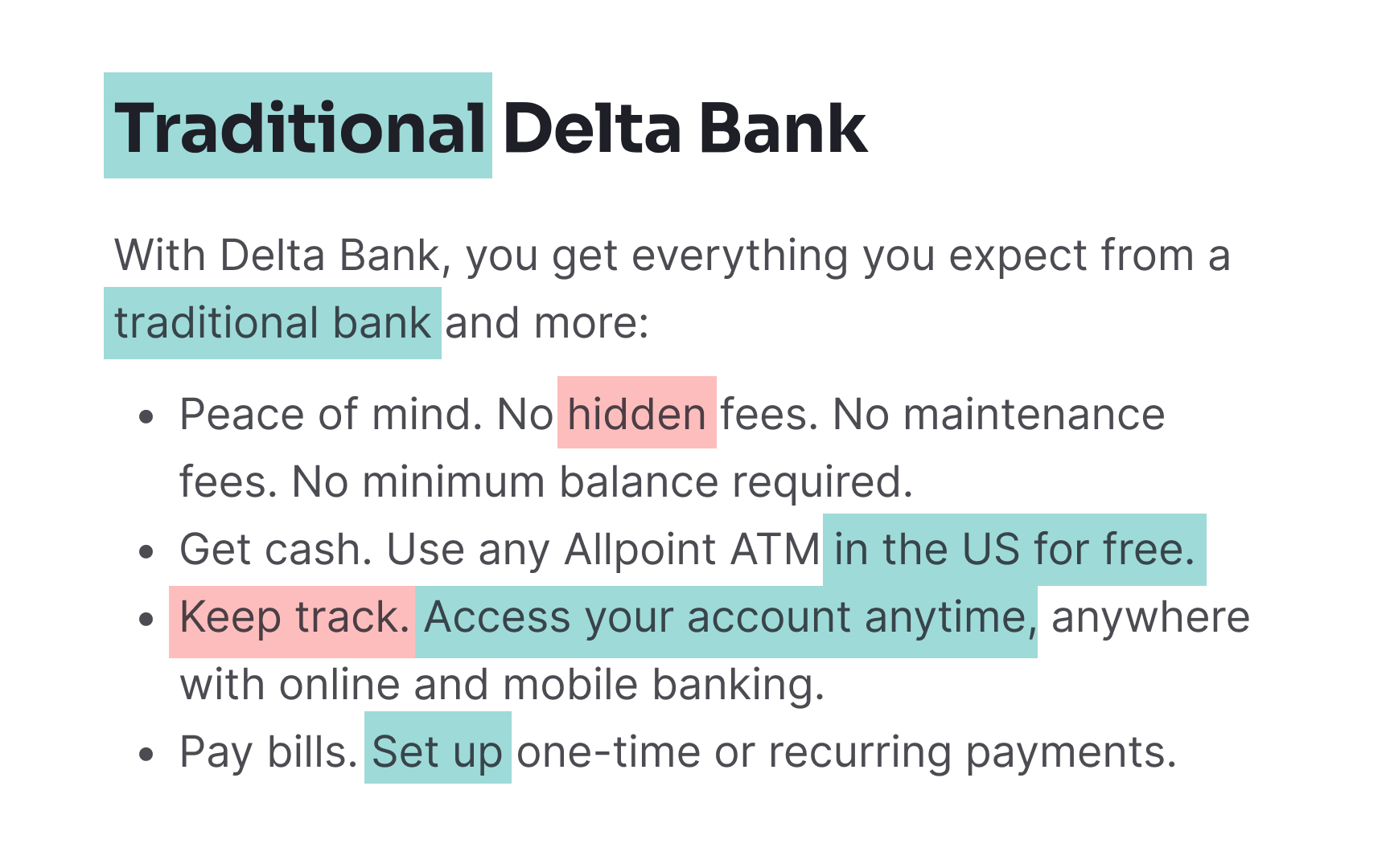
A readability score measures the complexity of words and the sentence structure in a piece of content.[1] What are the main criteria for readable content?
- Plain, short words: Simple vocabulary ensures familiarity and avoids unnecessary searches for definitions.
- Short sentences: Brief sentences (5-8 words) reduce cognitive load, aiding comprehension.
- Active voice: Direct and clear, active voice specifies who performs an action. Use passive voice only when focusing on results or impacts.
- 8th-grade reading level: Writing at this level broadens accessibility.
Online tools, like Readable.com, Writer app, Readability Formulas, and Hemingway app allow measuring the readability score using readability formulas such as Flesch Reading Ease score, Flesch-Kincaid Grade Level, Gunning Fog, The Coleman-Liau Index, the SMOG Index, etc. Mainly, they all focus on the length of the words and sentences and their complexity, highlighting problematic areas.
While readability scores evaluate text complexity by word and sentence length, they don’t ensure users understand the
Cloze testing assesses whether users can grasp the intended message and take correct actions based on the text. This is essential for
A comprehension survey checks if users understand the
When designing the questionnaire:
- Limit questions, focusing on open-ended ones.
- For multiple-choice questions, avoid negatives, provide only one clear answer, and ensure mutually exclusive choices. Avoid hints, “all/none of the above,” and absolutes like “never” or “always.”
Comprehension surveys require time, effort, and budget but offer valuable insights to validate content. If resources are limited, consider an unmoderated test via online platforms like SurveyMonkey or Google Forms.
Pro Tip: Some questions can include an “I don’t know” option to reduce attempts of lucky guessing.
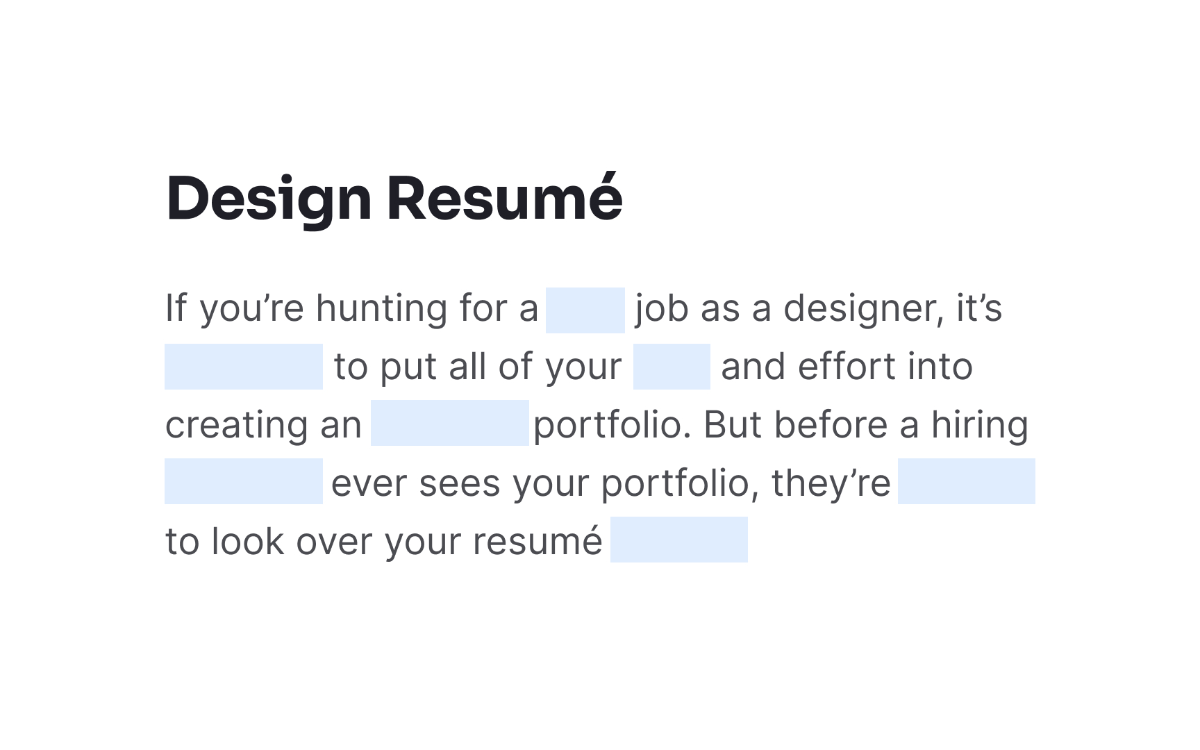
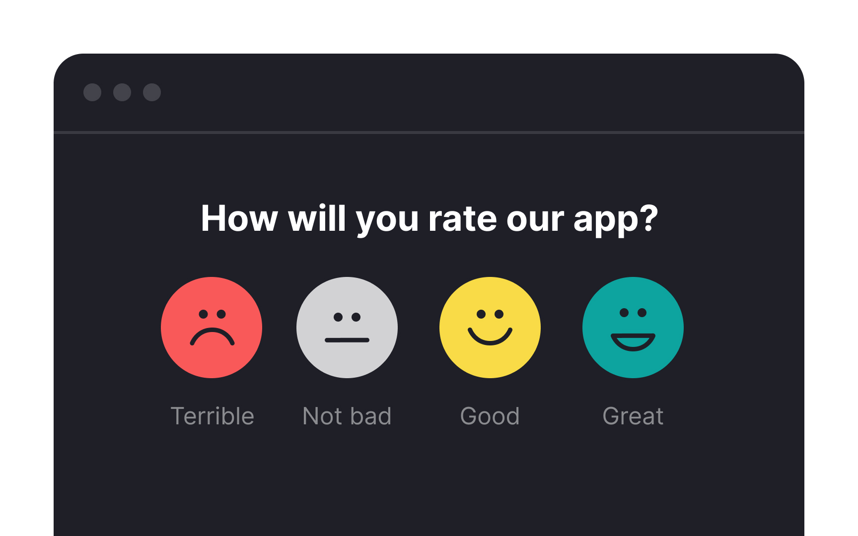
A highlighter test lets users highlight words in different colors based on how they feel about them. For instance, they may mark words that evoke confidence in green and those that cause anxiety in red. This test, often used early in design, helps assess assumptions and the tone of the copy.[3]
The results allow you to gauge if the writing aligns with

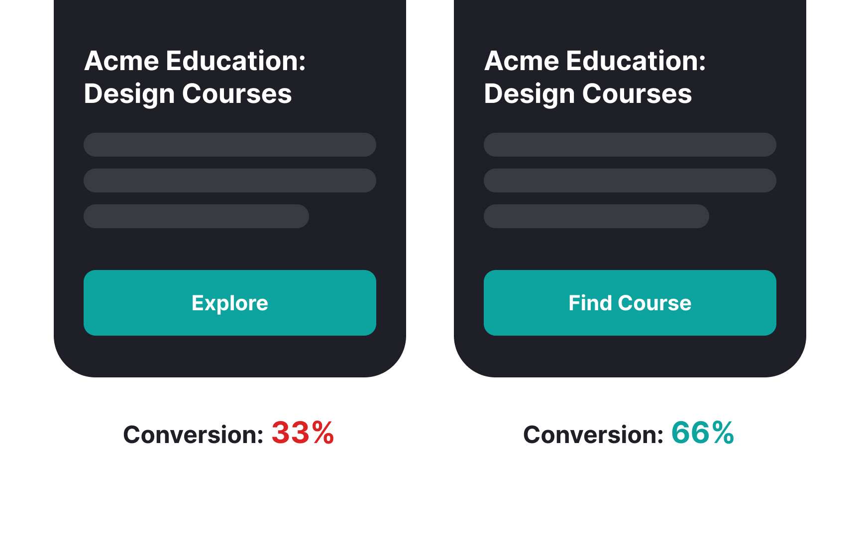
A/B testing compares two versions of a page by making them live short-term, evaluating metrics to choose the more successful option. This test is most effective for copy related to CTAs.
To conduct an A/B test:
- Identify issues and suggest an alternative. For instance, changing a vague "Continue" button to "Create account" may improve clarity.
- Define objectives with measurable outcomes, like increased registrations.
Before testing, address any
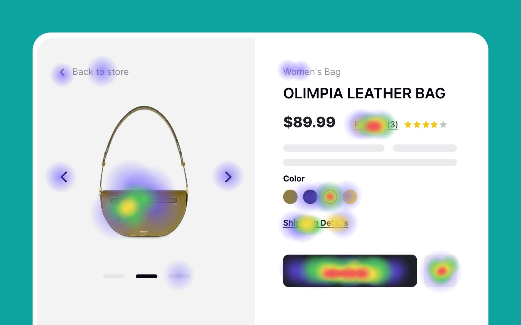
A click test is a quantitative testing method that records where users click to complete a task on the prototype. From the
Why are the results of the click testing so important? According to studies, users who click down the right path on the first click complete their task successfully 87% of the time.[4] Click testing is cost-effective, as it can use prototypes or sketches instead of a full website.
The downside of click testing is that it shows where users click but doesn't explain if they understand the outcome of this action. Besides, during the test, users aren't in their natural environment, and their behavior may differ.[5] Combining click tests with interviews — asking questions like “What do you think will happen if you click this?” — can provide deeper insights.
During quick exposure testing, participants see a screen only for a very brief moment. When the screen disappears, they're asked a list of questions to reveal if they understand the
Since participants can see an interface only for a couple of seconds, the test allows revealing the honest first impression of a page and shows what sticks to users' memory and what goes unnoticed. The downside of this method is that human memory can be too unreliable a source of truth in a stressful environment. However, it's a quick and cheap way to gain some interesting insights.
The online Five second test allows you to discover how users perceive your designs after a short exposure (literally, 5 seconds!).
Never test for the sake of testing. Before you dive into this process, spend some time planning and figuring out the testing objectives and metrics. Essentially, metrics measure your success and show what you did well and what needs to be improved.
Key
- Comprehension: Ensures users understand the
content to achieve primary goals. - Conversion: Measures success by tracking intended actions, like clicking "Subscribe."
- Time on page: Assessed alongside metrics like comprehension, as lengthy time might indicate confusing or overly detailed copy.
- Drop-off rates: Tracks users who leave without completing tasks, signaling potential copy issues.
- Brand perception: Gauged through feedback, reflecting how users view the
brand .
Comprehension indicates whether users can understand the
To achieve a good content comprehension level, stick to these guidelines:
- Use language your audience can relate to.
- Include specialized terminology if your target audience comprises experts in this field.
- Be brief. Users multitask all the time, and their attention is often split between several tabs, apps, and devices.
- Minimize the
cognitive load . Avoid reinventing the wheel and focus on writing patterns that users are used to and don't need to learn all over again.[6]
Comprehension can be tested using cloze tests, comprehension surveys, or quick exposure tests, ensuring users can complete tasks based on the copy.
Pro Tip: Always evaluate comprehension with representatives from your target audience.
Microconversions track secondary actions, such as clicking a link or scrolling, which contribute to engagement. The measurement period should align with the product’s update cycle, as monthly changes in copy or design can affect metrics.[7]
High conversion rates and good comprehension reflect effective, user-centric content. Tools like click tests and

Time spent on a
To better understand user behavior, combine time-on-page data with other metrics like comprehension and
Drop-off (or abandonment) rates measure the percentage of users who start but don’t complete a conversion process, like leaving a shopping cart unpurchased. High drop-off rates can indicate issues such as poor design, unclear navigation, or unconvincing copy, all of which may harm users' trust in the
Identifying
Methods to measure brand perception include:
- Brand focus groups and forums: Gather loyal users for feedback on improvements. Remote forums work well for even end users that are hard to reach.
- Brand perception surveys: Online surveys with targeted, open-ended questions can provide honest user insights.
- Social media monitoring: Track mentions and reactions on platforms like Facebook, X, and Instagram to gauge sentiment and engage users directly.[8]
Pro Tip: Use brand focus groups, forums, social media comments, and reviews as a source of user vocabulary for your microcopy.
References
- Legibility, Readability, and Comprehension: Making Users Read Your Words | Nielsen Norman Group
- Cloze Test for Reading Comprehension | Nielsen Norman Group
- More research methods for UX writing | GEL Website
- How research is different for UX writing | GEL Website
- Legibility, Readability, and Comprehension: Making Users Read Your Words | Nielsen Norman Group
- Conversion Rate: Definition as used in UX and web analytics | Nielsen Norman Group
Top contributors


Topics
From Course

Share


Similar lessons

Intro to UX Copy

What is UX Writing?
