Submitting a Form
Ensure a seamless user experience by learning how to optimize your form design
Forms exist to help users achieve anything from creating an account to subscribing to a newsletter. They are often the last step before users achieve their goal, so they should be quick and easy to complete. When forms consume too much time, use complicated language, or ask too personal questions, users tend to leave.
Multiple factors like alignment, structure, spacing, the design of buttons and inputs, and typography can make or break the overall experience your users have when trying to complete a form. If you want to convert more leads and create a good impression as a user-friendly product, consider form design with great attention and respect.

The primary action
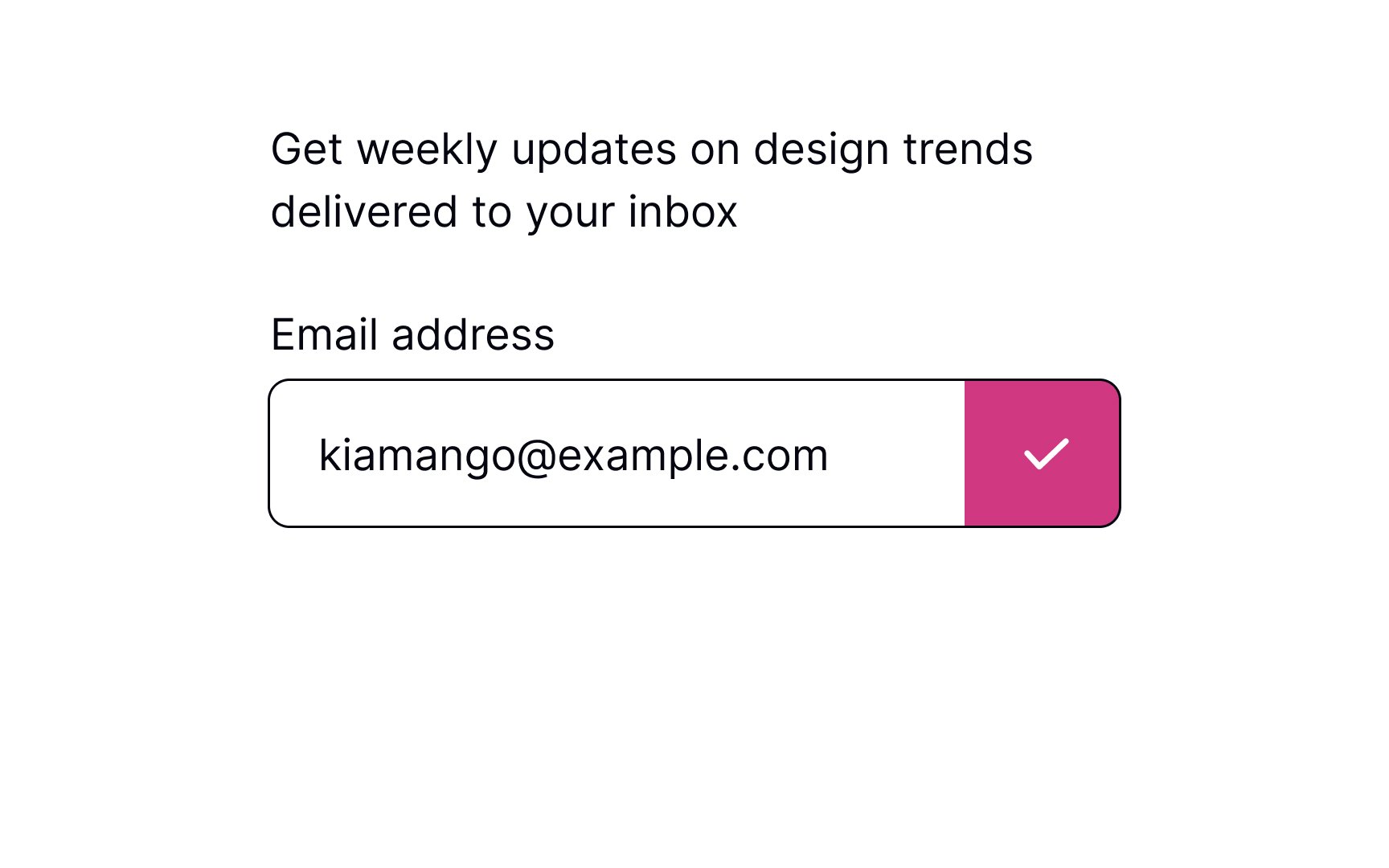
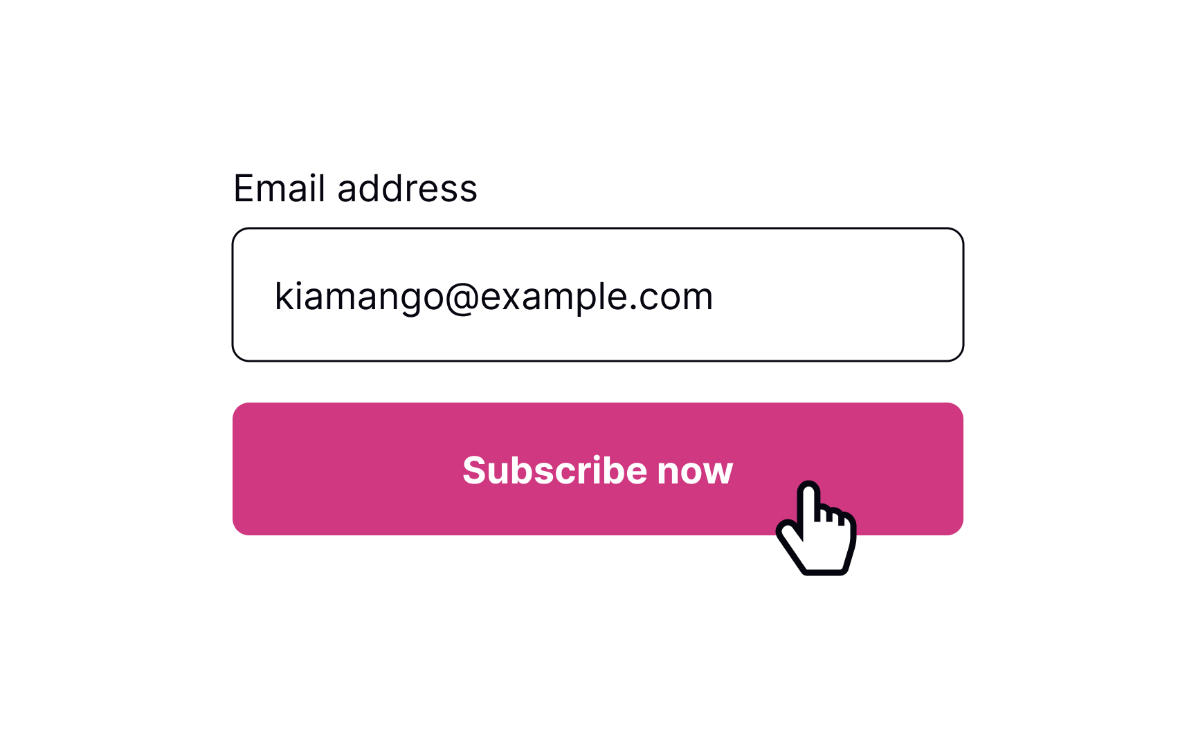
The button's label should be straightforward and on-point. Users should immediately understand what happens after they press it. You can change the copy to fit the form, e.g., the button can say "Subscribe" if someone is providing their email address to receive emails.
The loading state helps users see the form is in the process of being submitted. According to the first of Jakob Nielsen's 10 Heuristics, visibility of system status is crucial — the system should always keep users informed about what is happening right now and provide clear and on-time feedback. This makes users feel in control of the system, so they know how to act to reach their goal. Showing the button's state also increases user trust in the brand.[1]
Pro Tip: Make sure you also added a hover state that arises when users are about to press the button.
Once the form is submitted, communicate that back to users with a clear success message. First, showing a success message follows Nielsen's Heuristics about the visibility of the system status. Second, it increases user satisfaction when they achieve one of their goals.
Pro Tip: Don't overdo it. Show success messages only when necessary and make them disappear automatically after a while.
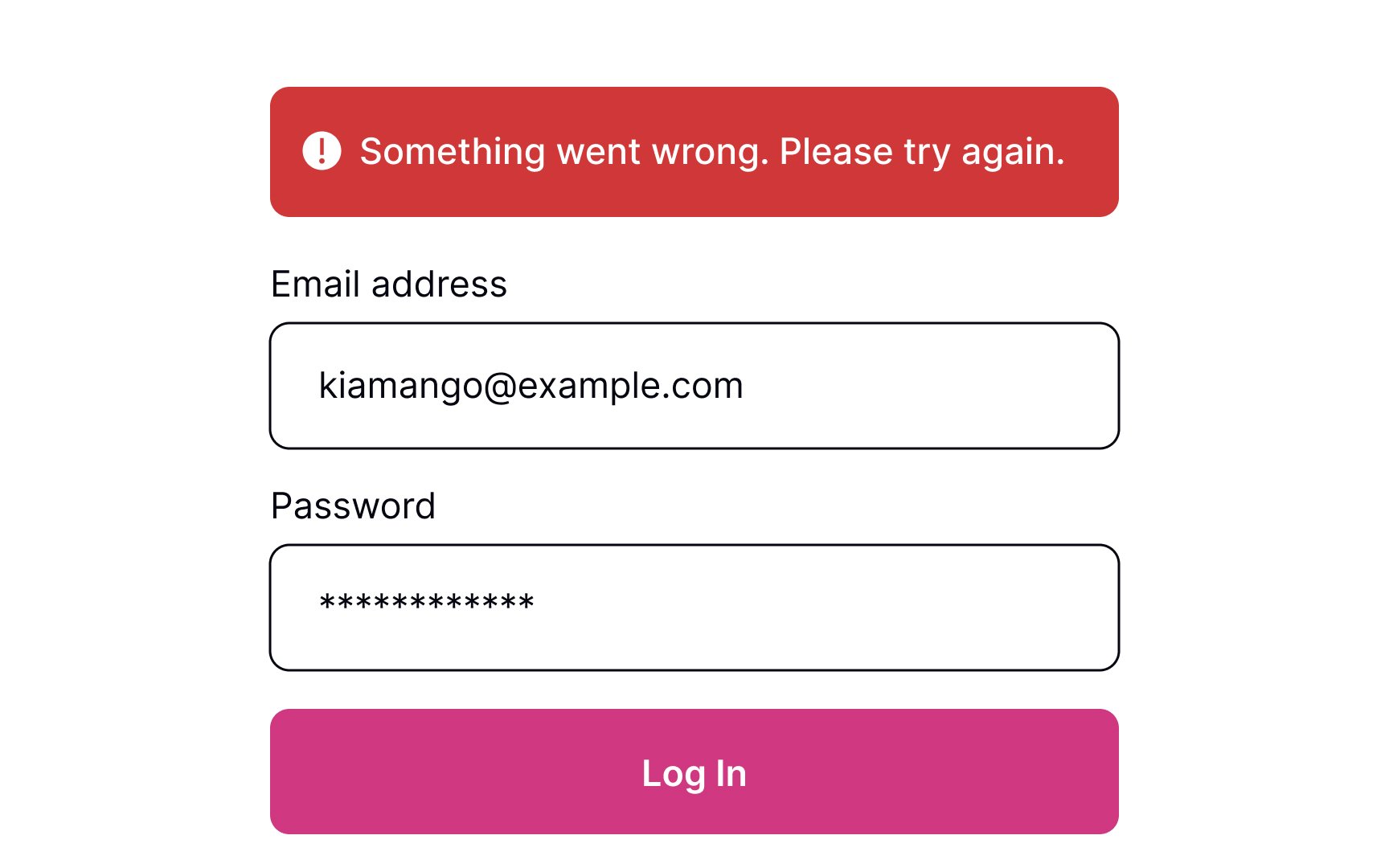
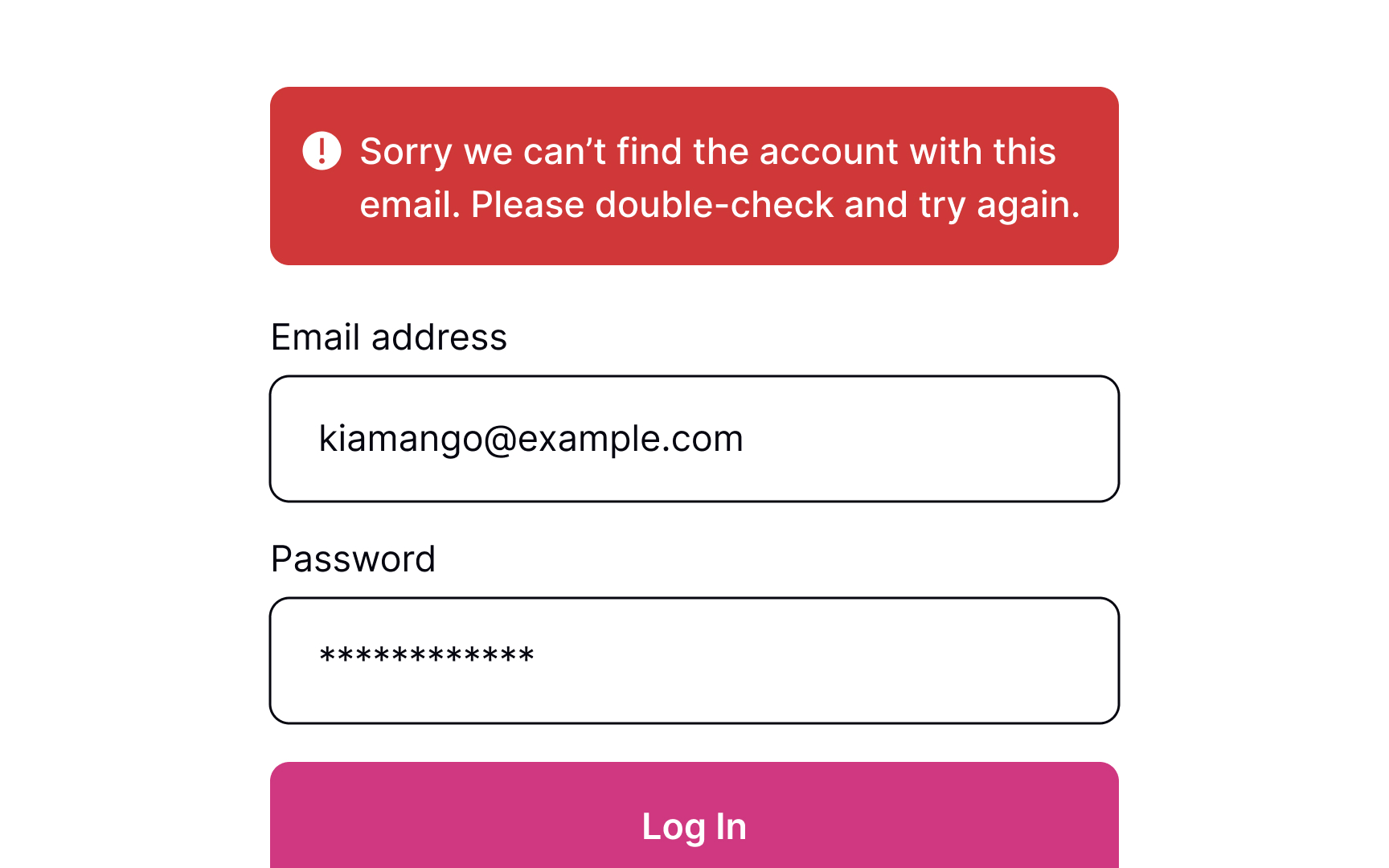
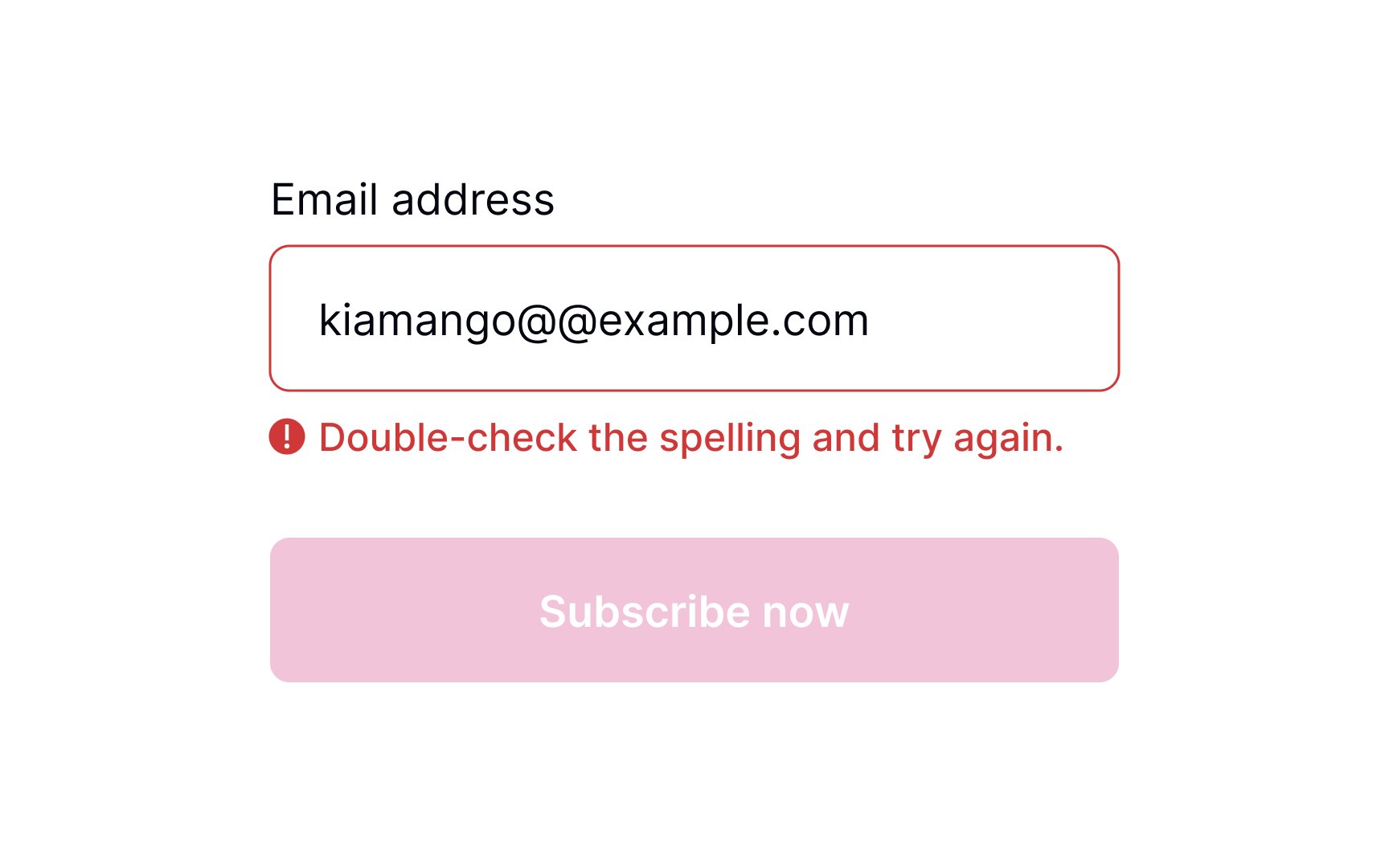
Sometimes, things don't work out. If the form can't be submitted due to invalid information or another error, let users know about it.
When users see that something went wrong, they may feel disappointed, irritated, and stressed. A formal, ambiguous, robotic message is the last thing they need to see. Good error messages should be polite, clear, and informative. Clearly explain to users what happened and provide advice on what they should do next.[2]
However, providing specific error details (e.g., whether the username or password is incorrect) can be a security risk. Display error messages like "Invalid username or password" to prevent revealing information that could aid attackers.
Pro Tip: Avoid using technical terms to explain what caused an error. Act like a human and use simple words that users can relate to.
As humans, we all make mistakes, and sometimes, users provide incorrect data that doesn't meet
To provide effective feedback, the error message should be concise yet precise, clearly indicating what went wrong and how users can fix the problem to continue with their task.
Pro Tip: Avoid validating each input while users are typing. It annoys people and creates mistrust of the product.
References
- Visibility of System Status | Nielsen Norman Group
- Error Message Guidelines | Nielsen Norman Group
Top contributors


Topics
From Course

Share


Similar lessons

Login & Signup Flows

User Onboarding
