Selecting Typefaces
Learn how to choose the most appropriate typeface for your intended message and audience
Choosing a typeface can be tricky as there are too many options and factors to consider. Luckily, there are principles you can apply to make an appropriate typeface choice.
The most important thing is to have a goal in mind. Ask yourself, "How do I want the audience to react to the text?" and let it guide the process. The right font for a task has a combination of legibility and readability and is appropriate for the audience and the message. Having a content hierarchy will help you create a proper type hierarchy.
But also, don't be afraid to break the rules. Knowing the basics gives you the power to express yourself more creatively with it.
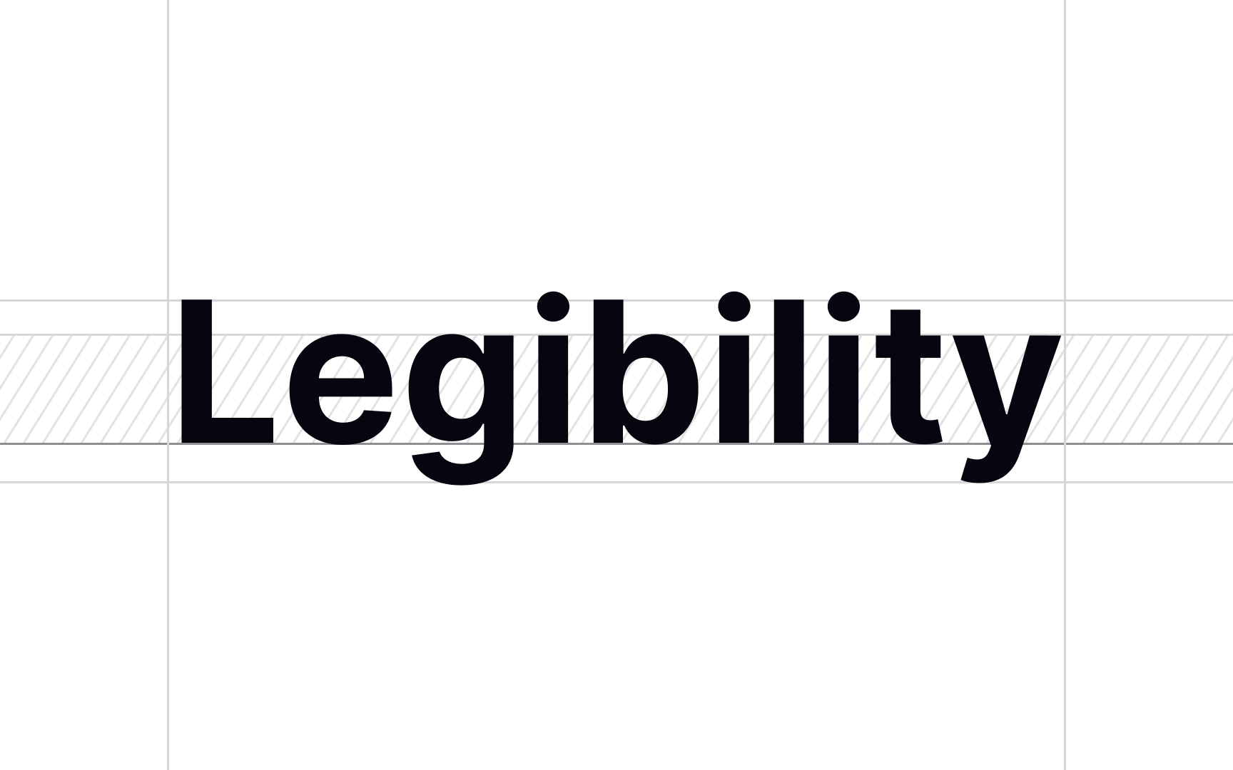
To choose the correct legibility level, think of the text function. For example, the
To achieve high legibility, choose typefaces with:
- Conventional letterforms: Readers are used to them and will easily recognize them.
- Generous spacing: Tight tracking makes it more difficult to make out individual letters, which slows readers.
- A tall x-height: It makes the difference between certain letters like c and e more clear.[1]
Pro Tip: Too high of an x-height can hurt the recognition of characters with descenders and diacritical marks. To avoid that, make sure to choose the right size, weight, and width for the chosen x-height.
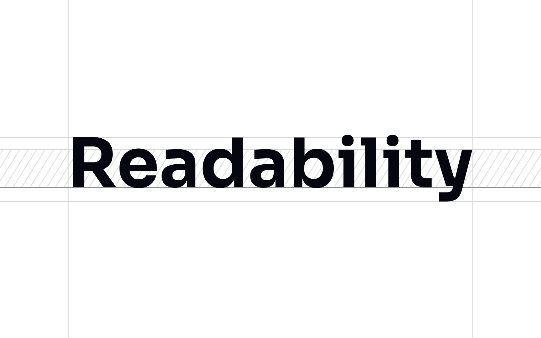
Readability measures how easy the text is to read. It depends on several factors: type style, size, tracking, leading, color, and other properties all combined. High
To choose a font with suitable readability, think of your text purpose and message. If your message is complicated, it makes sense to use a high readability font to not hinder the audience's understanding.
However, research shows a correlation between the effort it took to read the text and the ability to remember that information for later.[1] In short, it's all about balance. If the text becomes too difficult to read, readers may give up or become more confused. But if it's too easy, they may become bored.
To improve readability:
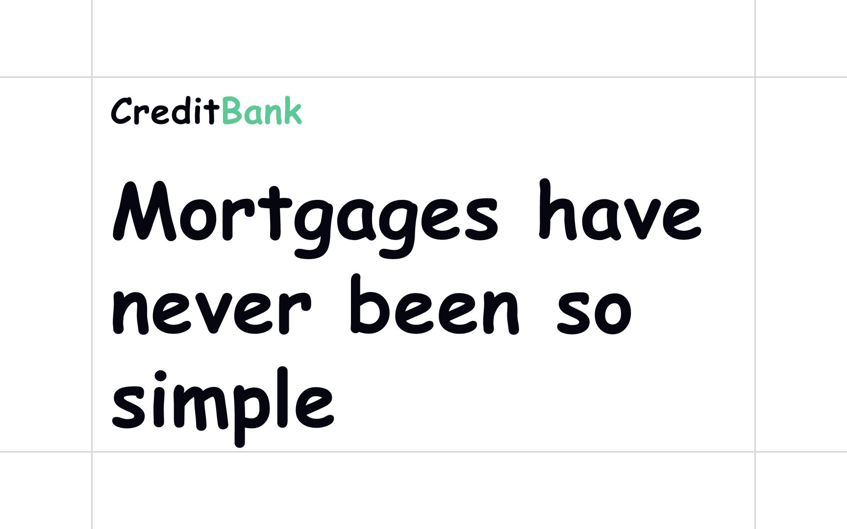
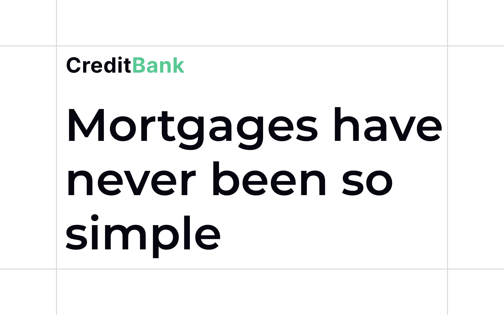
- Choose typefaces designed for your purpose. Use display
fonts for headlines,body copy typefaces for body copy, etc. - Apply left alignment (with ragged right edges) instead of justified. This makes it easy to follow the natural flow of the text.[2]
- Make sure your line height is at least 1.5 times greater than the point size of your typeface for multi-line texts. If the lines are too close, it's difficult for the eye to stay on track.
Appropriateness refers to how suitable a
Experience of working with a typeface and learning about its history and original purpose can help assess how appropriate it is.
The attributes to consider when deciding if a font is right for the task are:
- Design intent
- Expected aesthetics
- Mood
- The designer's personal choice
When choosing a
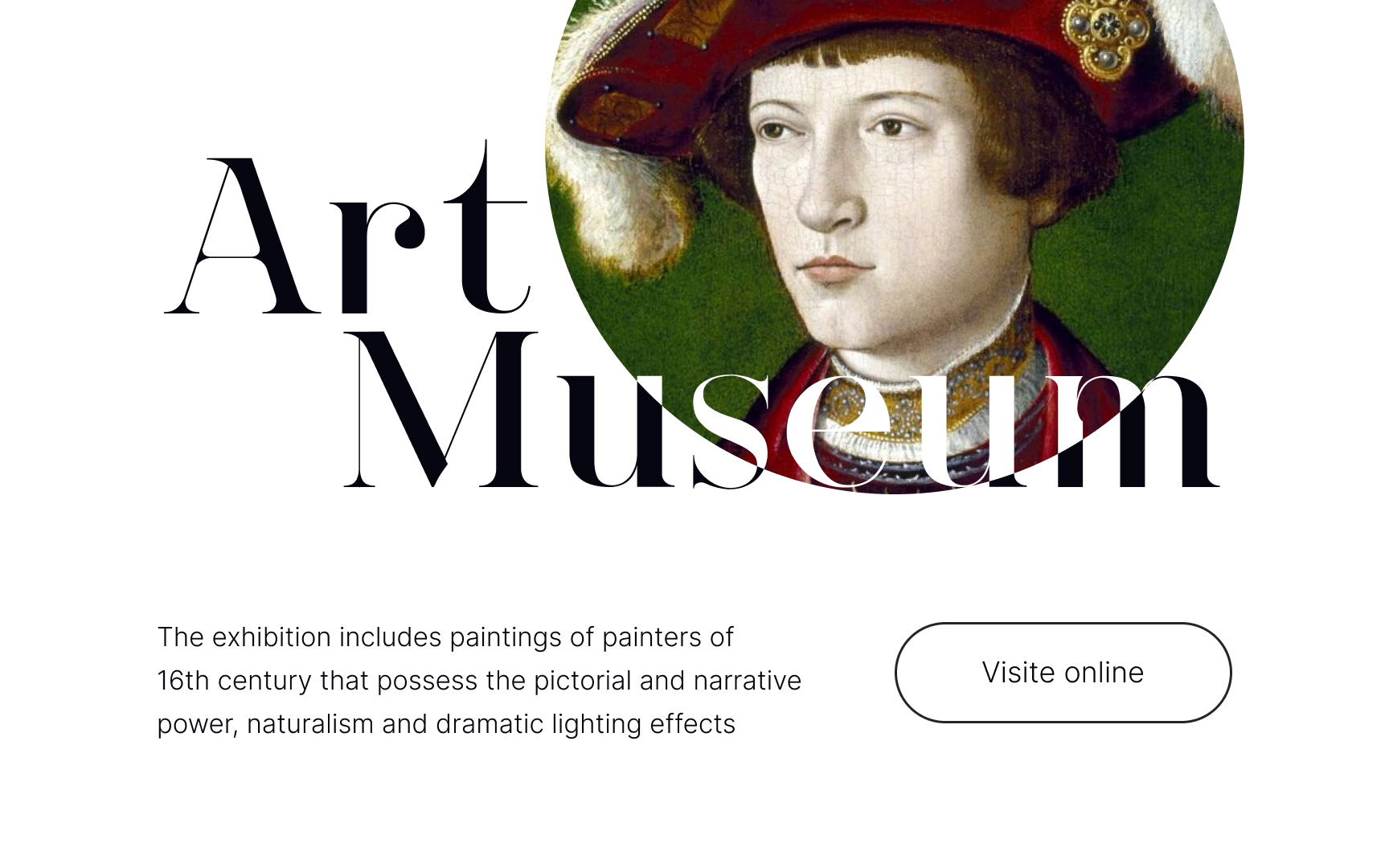
For example, the Beware typeface was made for art and fashion projects.[3] With its elegant aesthetic, it's a good fit for an art website heading. For the
Many popular typefaces have detailed write-ups and reviews, so look up the information before making a choice.
When choosing a
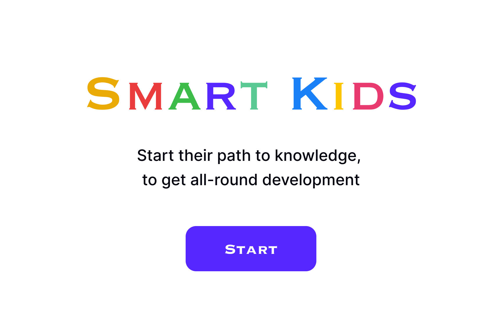
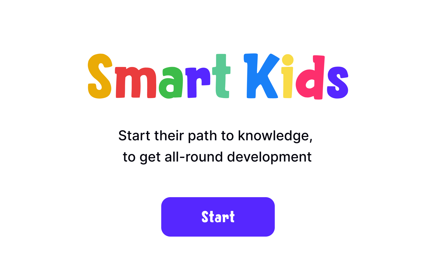
Imagine you are designing a website targeted at children. Think about what kind of impression it's supposed to make. Probably something light-hearted, energetic, and free-spirited.
Now look at typefaces that you are considering and try to describe them with a few words. Hoops! is a whimsical and playful typeface, while Copperplate looks serious and elegant. In this case, Hoops! would make a more appropriate typeface for the product.
The mood you want to create is another subjective attribute you need to consider when choosing a
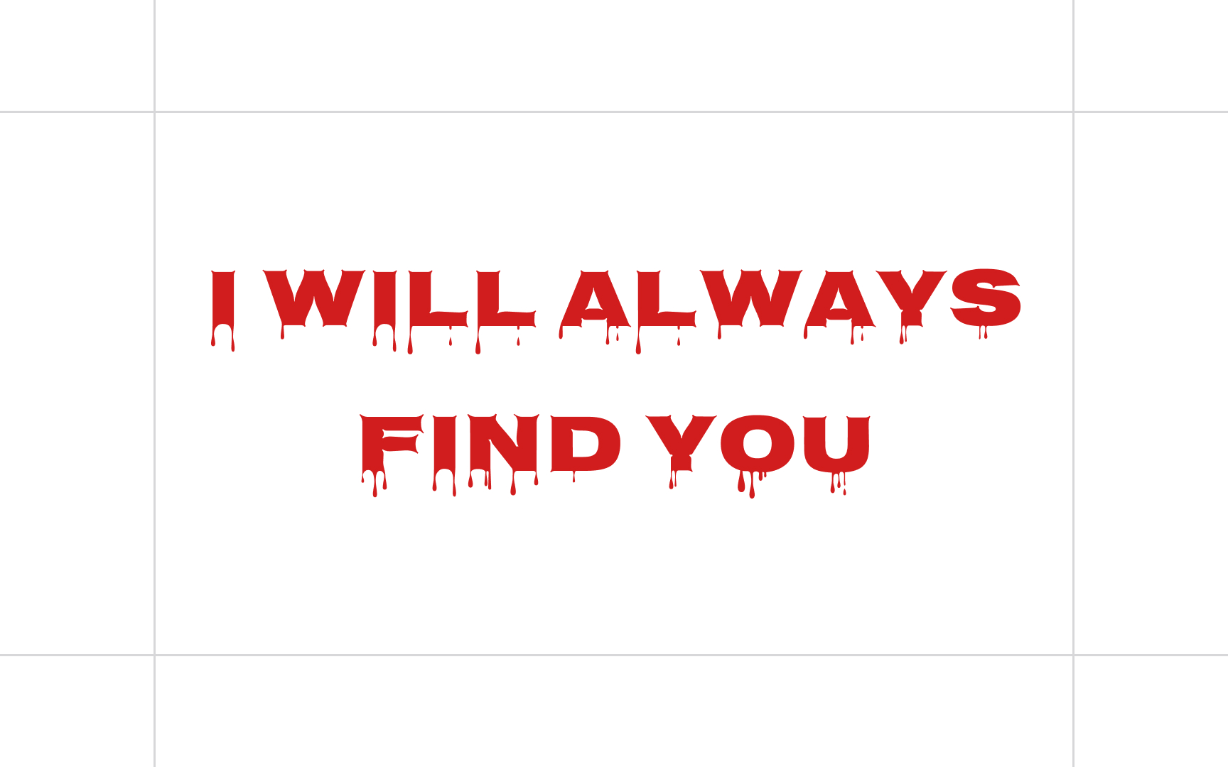
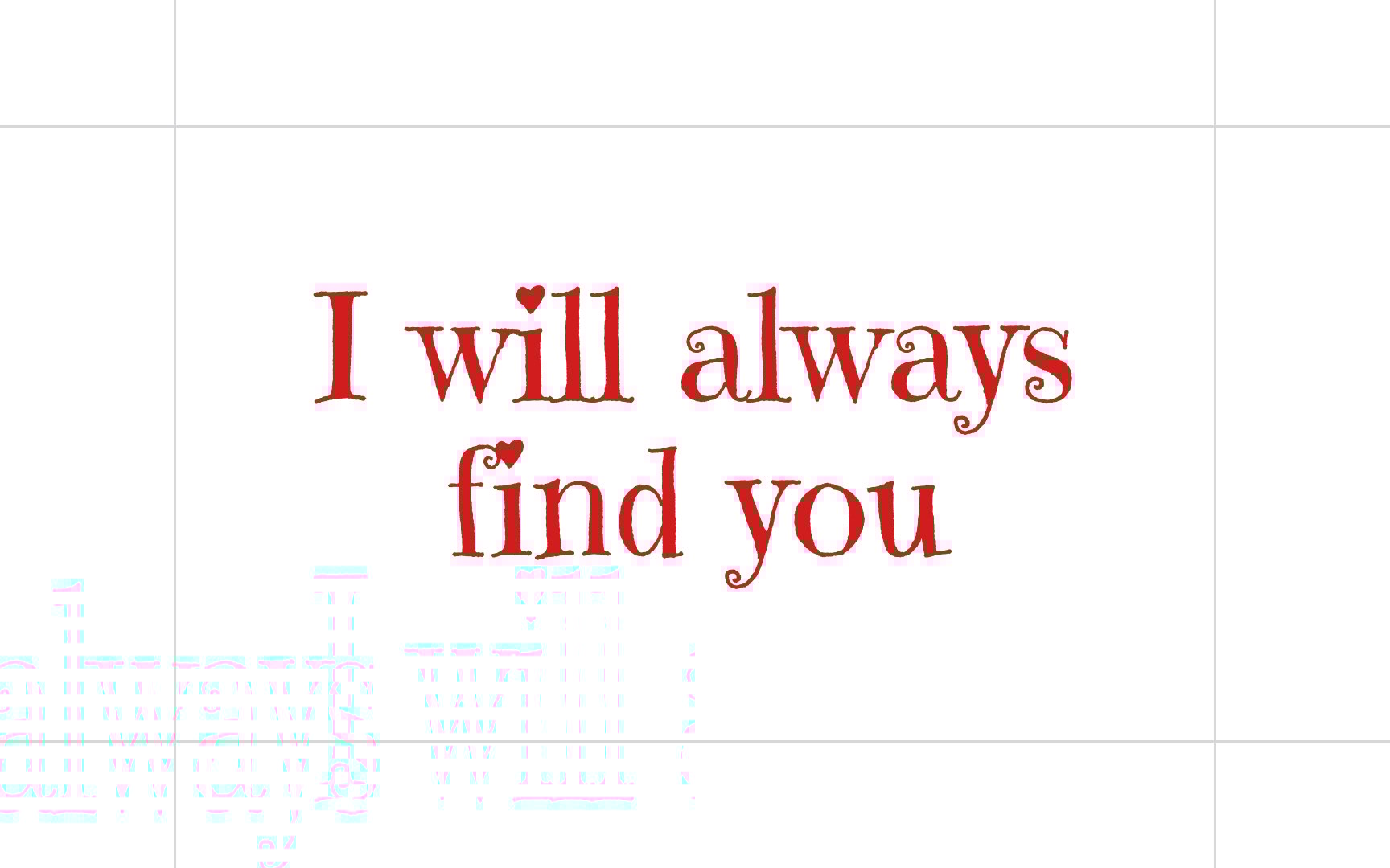
For example, choosing a high readability "cute" font can make the message look romantic. In the TV show Once Upon a Time, Snow White and Prince Charming often say to each other, "I will always find you."[4] What they mean is, "No matter what obstacles life throws my way, I won't give up on you." A romantic font can help convey this mood.
At the same time, if you pair the message with a "scary" font, the same line will look creepy and menacing.
Pro Tip: To pinpoint the mood, look at your design and think of the exact opposite of the mood you want to create. If you can’t come up with an opposite mood, it could mean you haven't created a strong impression of the right mood.
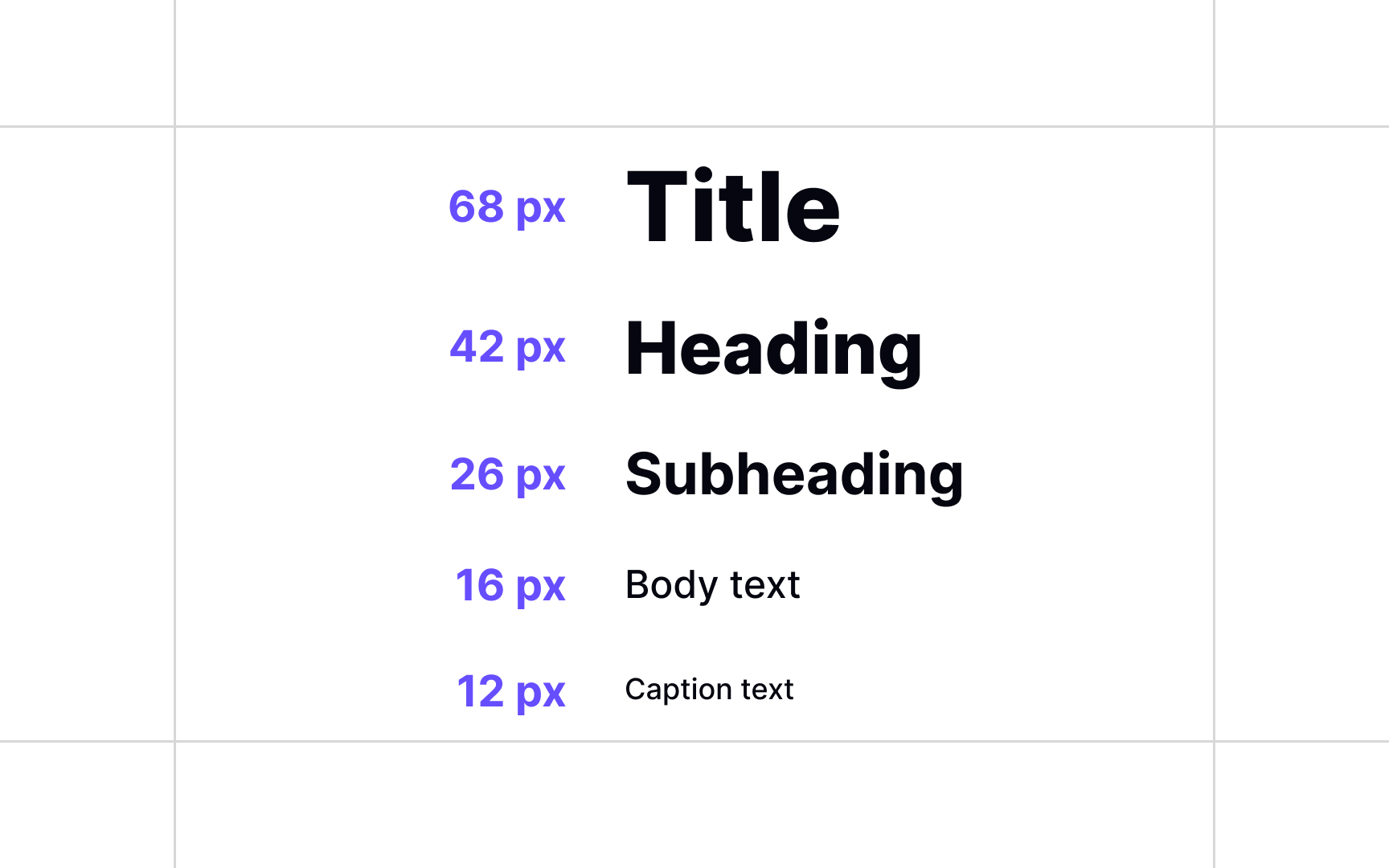
When choosing
To create hierarchy, ask yourself the following questions:
- What types of text content will be used in this product?
- How many fonts do I need to cover all these types of text?
- Can one
typeface provide enough variation with bolds, italics, and small caps? - Do I need more than one typeface to create more distinction in the hierarchy?
You can use a mind-mapping tool or make a traditional outline to see as much as you can before you start choosing typefaces.
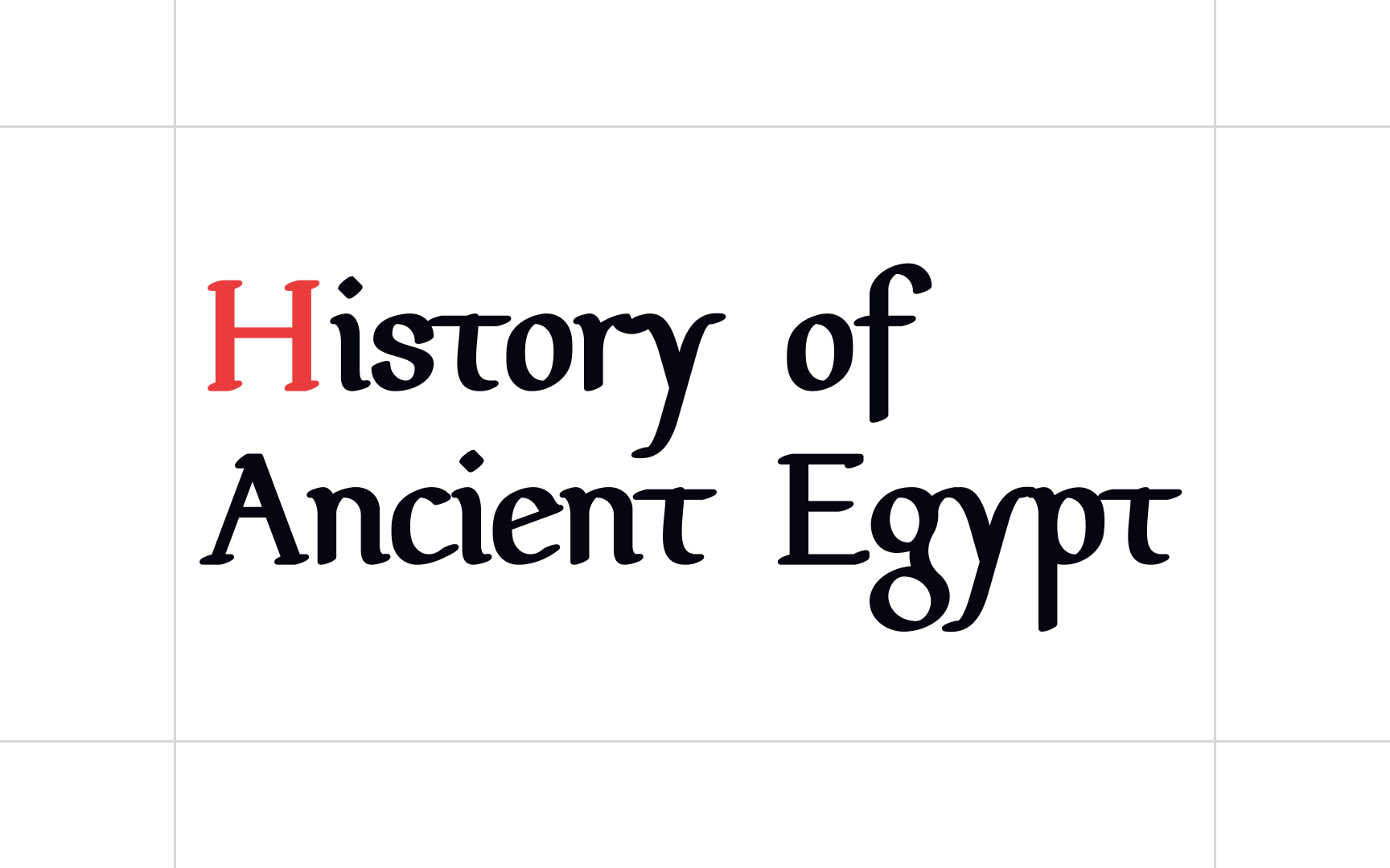
Anachronisms refer to chronological inconsistencies. In typography, it means using a
For instance, using a typeface inspired by Medieval Europe for a text about Ancient Egypt would feel anachronistic. Even though both are “old,” their cultural and visual references come from completely different eras.
To avoid anachronisms, match your type choices to the visual culture or time period your
Pro Tip: Keep in mind that you don't need to find a period-appropriate font for every topic — it can actually stir you into cliché territory. A great option is to use neutral typefaces instead, for example, Arno.
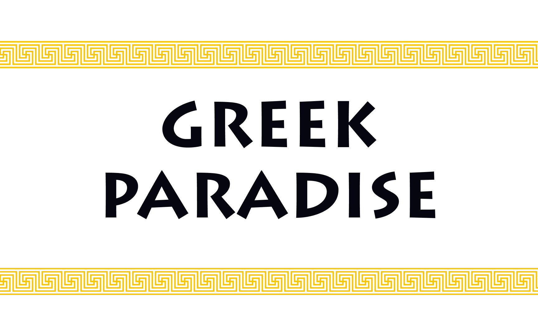
Typographic clichés involve
How can you steer clear of these clichés? Take time to explore less obvious font options. If you instantly pick Lithos for a Greek restaurant, you’re likely falling into the cliché trap. Instead, look for
Extended type families are made up of several type families. They consist of
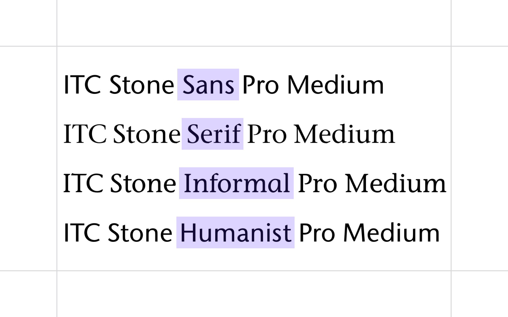
For example, the ITC Stone type family consists of several subfamilies containing both Roman and italic in medium, semi-bold, and bold. All designs share the same cap height, lowercase x-height, stem weight, and general proportions.[5]
The benefit of choosing an extended type family is having


When deciding on the font, it's important to consider the context in which the font will be used. Where will it appear? What message will it communicate? What kind of impression does it need to produce? Look for
Let's take as an example a
While both typefaces are stylish and highly legible, their aesthetics are quite different. Playfair Display is a classical
References
- Ragged-right or justified alignment? | Kai's Tech Writing Blog
- Beware Font › Fontesk | Fontesk
- Once Upon A Time: The 10 Most Memorable Quotes | ScreenRant
- About Typeface Families | Fonts.com | Fonts.com
Top contributors


Topics
From Course

Share


