Designing for Epilepsy
Learn how to design accessibly, keeping in mind the triggers of those suffering from epilepsy
Epilepsy affects millions of people worldwide, with diverse triggers ranging from photosensitivity and stress to cognitive overload. The digital environment presents unique challenges through combinations of animations, layouts, content organization, and interaction patterns that may trigger seizures or heighten stress levels. Modern interfaces require careful consideration of motion, contrast, information architecture, and recovery mechanisms.
Creating epilepsy-safe products involves understanding multiple triggers and implementing comprehensive safety measures — from controlled animations and balanced contrast ratios to clear navigation paths and stress-reducing interaction patterns. This approach ensures digital spaces remain both accessible and engaging for all users.
Epilepsy is a neurological disorder characterized by recurring seizures that can affect anyone, regardless of age, gender, or ethnicity. These seizures occur when groups of neurons in the brain produce sudden, uncontrolled electrical signals that temporarily disrupt normal brain function.
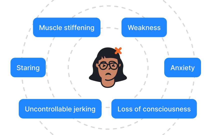
Seizures can manifest in various ways, from brief moments of confusion to physical movements like muscle spasms. While some people experience visible convulsions, others might have subtle symptoms like momentary lapses in awareness or unusual sensations. Digital interactions can trigger seizures through multiple mechanisms, including visual stimuli like flashing lights, cognitive overload, and stress-inducing patterns.
Products must account for various trigger types beyond just photosensitivity, as different people may have different seizure triggers and experiences.
Photosensitive epilepsy occurs when flashing or flickering light triggers seizures. In digital interfaces, these triggers can come from various sources like video
Understanding flash thresholds helps create safer digital experiences. A problematic flash occurs when there are rapid shifts in brightness (relative luminance) that exceed specific measurements.
Two key factors determine if a flash is dangerous:
- The brightness change must be 10% or greater between frames
- The darker frame must have a relative luminance below 0.80 (where 1.0 represents white)
For example, imagine a white background (luminance = 1.0) that quickly switches to a dark gray (luminance = 0.75). This 25% change in brightness, combined with the dark gray being below 0.80, would qualify as a problematic flash pattern. Common culprits include auto-playing videos, carousel transitions, and hover effects with dramatic
The safest approach is avoiding flash patterns entirely. When
Pattern-induced seizures can occur without any flashing elements, particularly from designs that alternate between light and dark areas. High-contrast patterns create strong visual signals that may overwhelm sensitive neural pathways, potentially triggering seizures in susceptible individuals. Striped patterns require careful consideration in digital interfaces.
The safety threshold depends on the pattern's behavior:
- For dynamic stripes (changing direction, oscillating, or reversing
contrast ), limit to 5 light-dark pairs - For static or uniformly moving stripes, using a maximum of 8 light-dark pairs is considered safe
- These same principles apply to checkered patterns and similar geometric designs with strong contrast alternation
Pattern size and screen position also influence risk levels. Large patterns covering significant portions of the screen pose higher risks than smaller, localized patterns. This applies to both decorative elements and functional components like data visualizations or
Certain color combinations can trigger seizures or cause severe discomfort in people with photosensitive epilepsy. The most problematic combinations are saturated reds paired with other colors, especially when they flash or create strong visual vibrations.
Color safety extends beyond just avoiding red. Highly saturated complementary colors (like blue-orange or purple-yellow) placed adjacent to each other can create a visual vibration effect that strains the nervous system. This effect becomes more pronounced when these colors appear in patterns or when users scroll past them quickly.
Rapid animations pose significant risks in digital interfaces, extending beyond just flash concerns. Fast movements, sudden transitions, and quick directional changes can overwhelm the visual processing system. While
Many common interface elements can inadvertently create potentially dangerous rapid
Other examples of problematic elements include:
- Progress indicators that pulse or strobe
- Quick-updating status counters
- Auto-playing
carousels with rapid transitions - Notification badges that flash for attention
- Menu items that bounce or shake
- Background videos that loop quickly
Parallax scrolling creates an illusion of depth by moving background elements slower than foreground
Beyond accessibility concerns, parallax scrolling presents several technical challenges. The effect requires complex JavaScript implementations that can impact page performance and
Try to avoid the parallax effect, if not limit the effect to small, contained sections rather than full-page implementations. Also, provide clear controls to disable the effect.
Autoplay
Media components should never autoplay by default. Instead, implement a clear play button that gives users control over when content begins.
This control should be:
- Prominently visible before any motion starts
- Large enough to click easily
- Clearly labeled with its purpose
- Accessible via keyboard
navigation - Positioned where users expect to find it
For platforms requiring autoplay features, create system-wide settings that let users disable autoplay across all content. Email clients, social media feeds, and content platforms should remember user preferences and apply them consistently across all media elements.
Top contributors
Topics
From Course
Share
Similar lessons

Intro to Accessibility

Inclusive Design Basics


