13 Core Visual Design Principles
Explore the tried-and-tested guidelines of design used to ensure exceptional user experience
The principles of design are fundamental pieces of advice for creating appealing, functional, and exceptionally usable products. They usually work in collaboration to create the desired effect or reinforce the impact. For example, designers rely on the principles of unity and negative space to group related items and separate them from other content.
The principles of design form a solid ground for a good design. In alliance with UX design principles, like usability, usefulness, accessibility, etc., they help create design that guides users' attention, keeping them engaged and helping them achieve their goals.
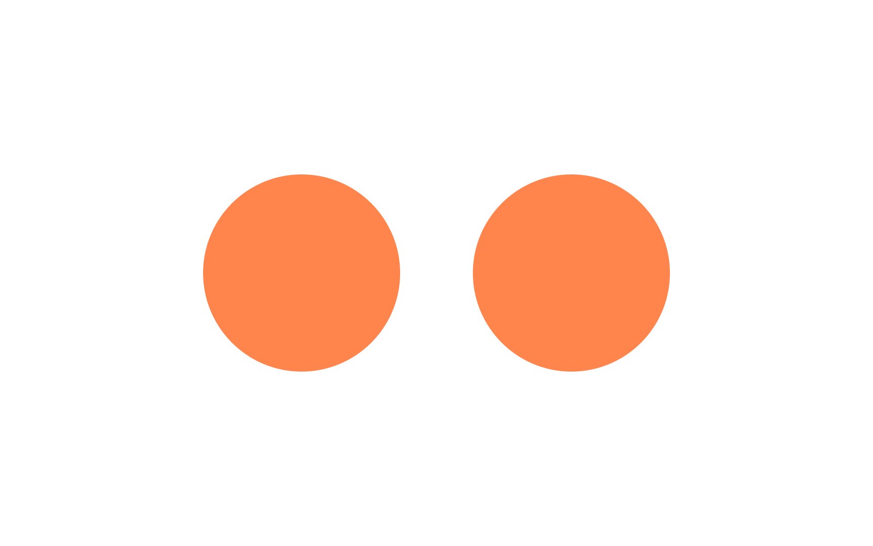
To create unity and harmony, visual elements should naturally complement or complete each other’s shape, proportion, color, and alignment.
Unity makes
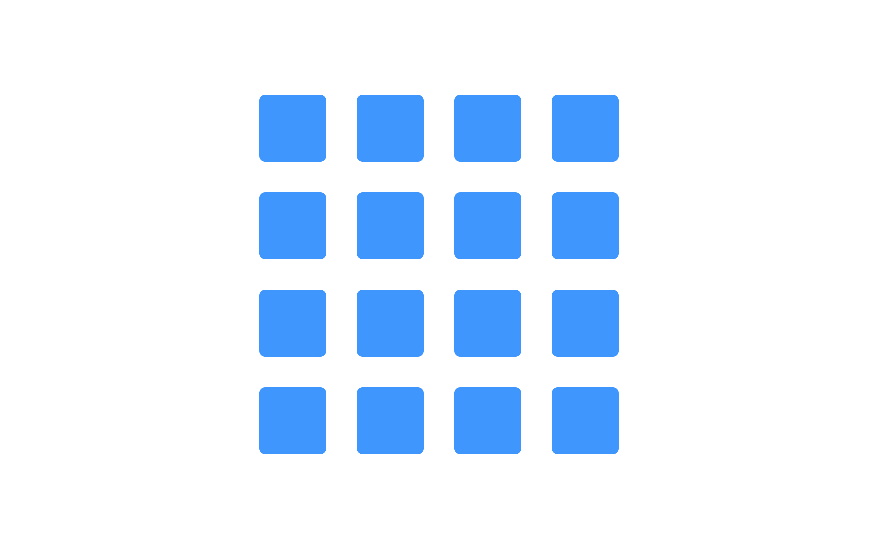
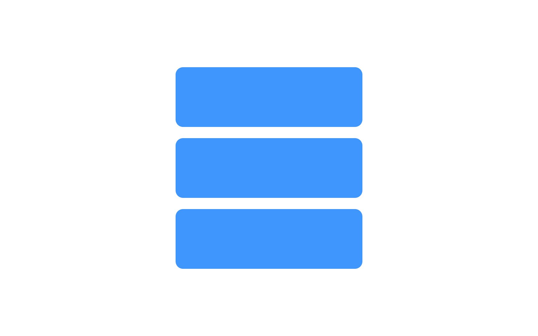
Elements of design should be placed along a common axis according to the alignment principle. There are two main kinds of alignment: edge (top/bottom or left/right) and center. Alignment creates a balanced, structured, professional-looking product design and minimizes visual chaos.
While strict alignment creates an ordered look, breaking free of alignment can be used to create a dynamic, organic, or purposefully-chaotic design. Just keep in mind that these effects can harm
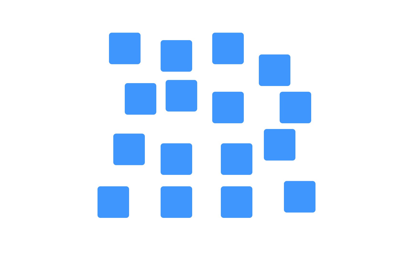
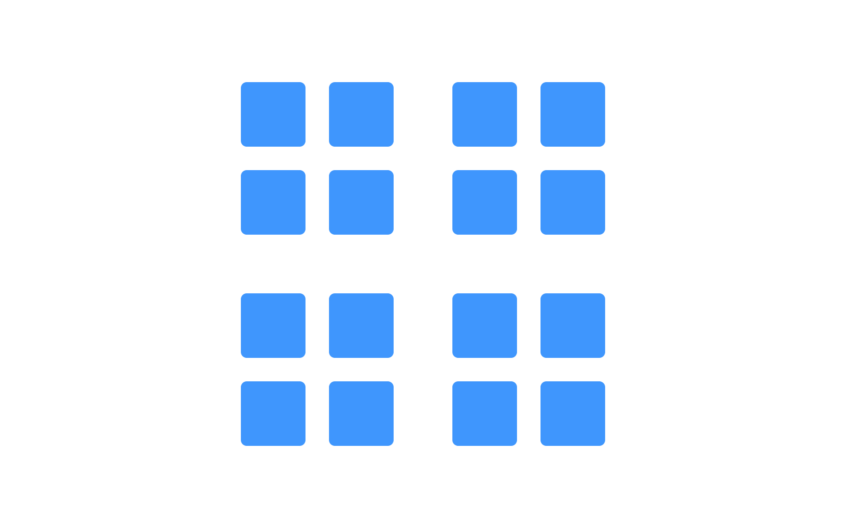
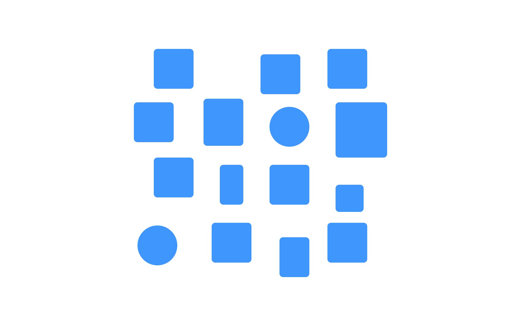
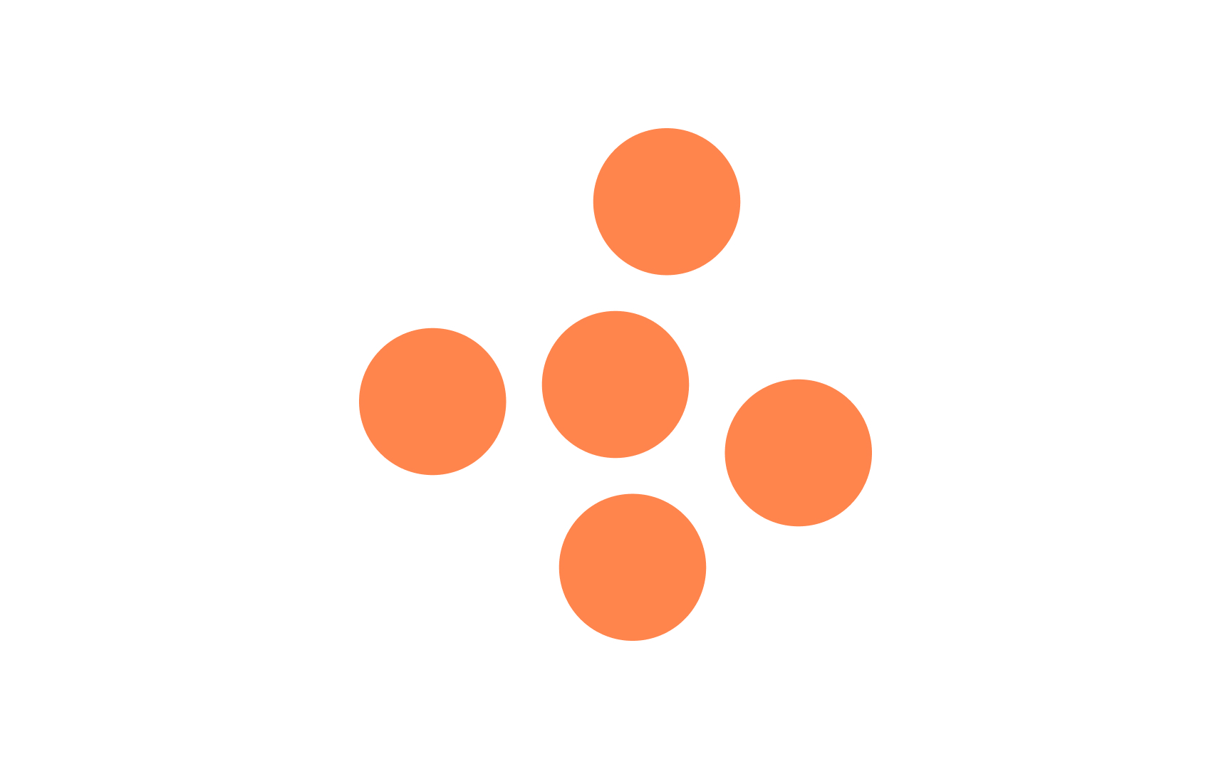
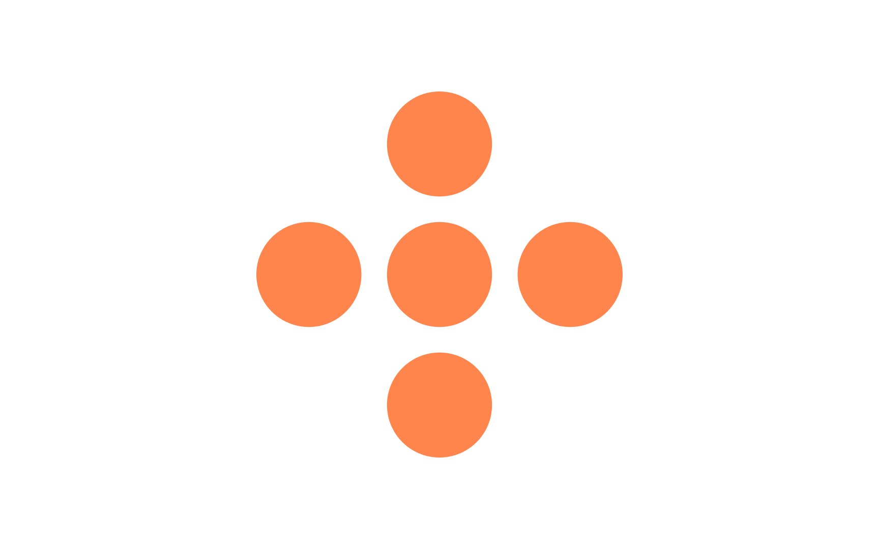
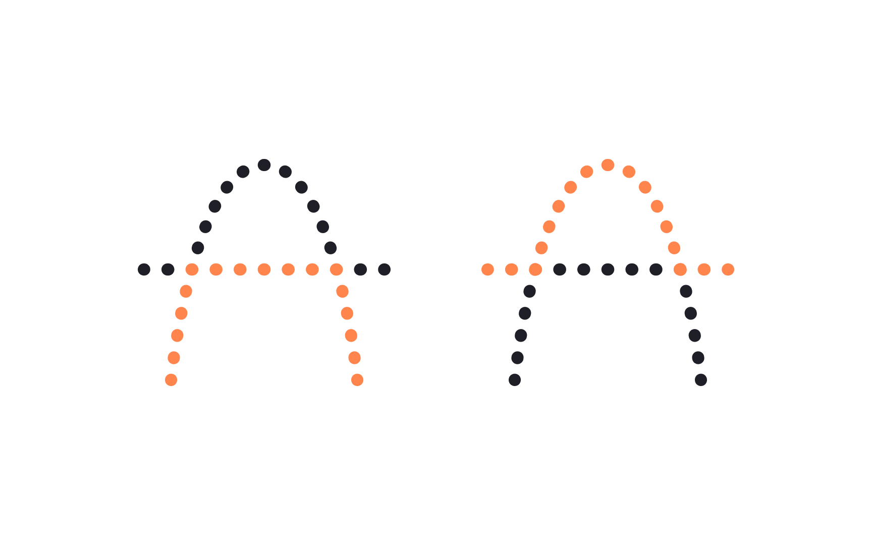
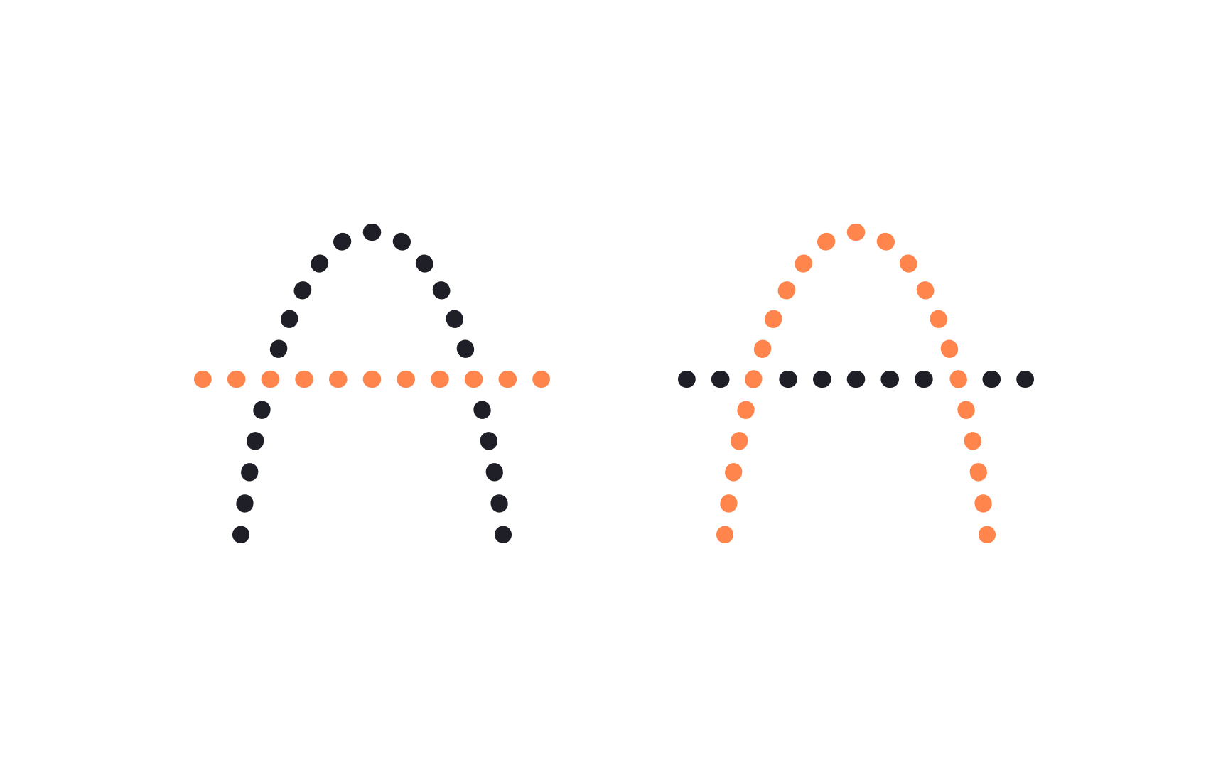
The proximity principle is a part of the Gestalt theory — a school of psychology based on the idea that the human mind perceives individual elements as a whole and always tries to make order out of chaos.[1]
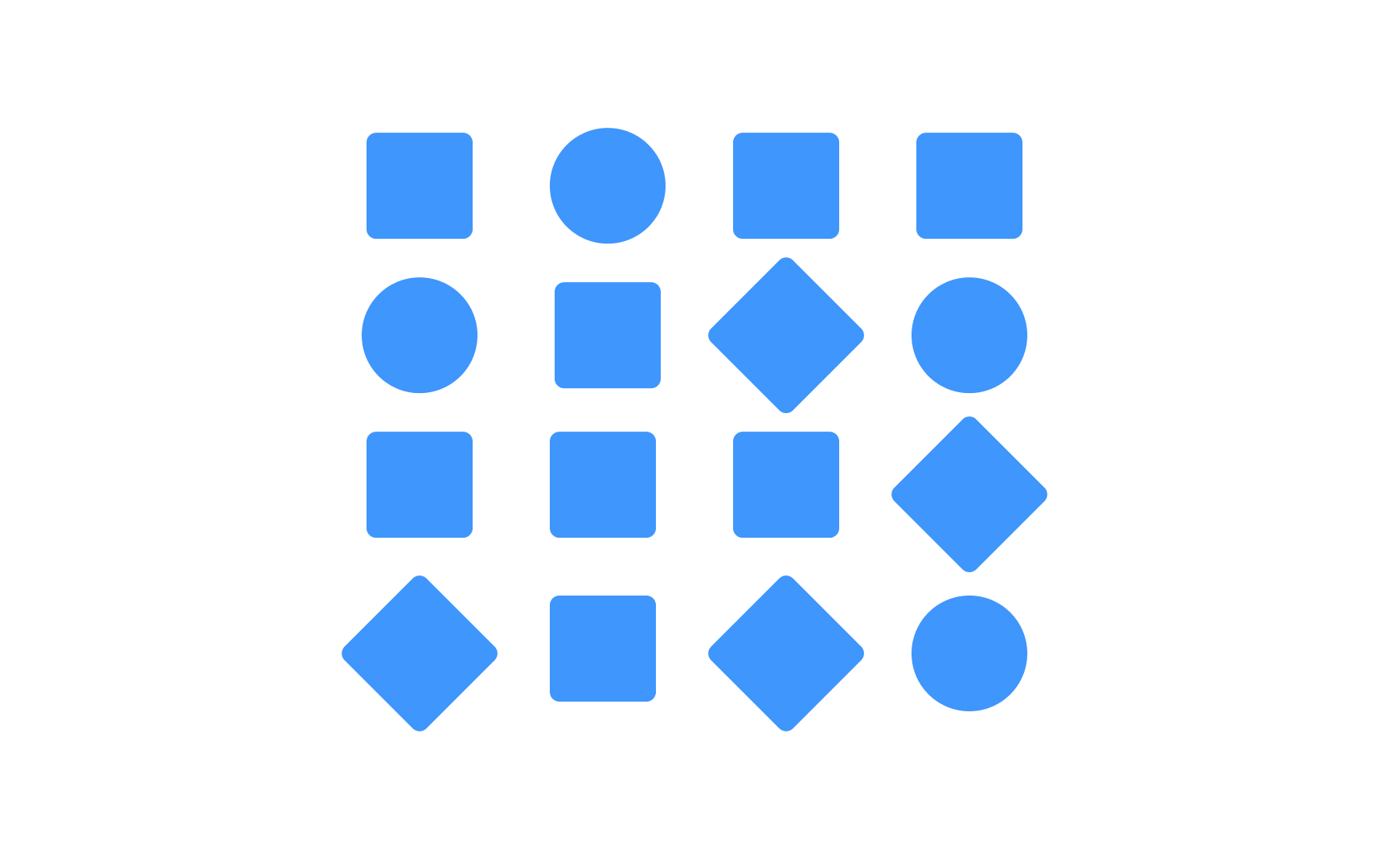
The proximity principle refers to the closeness between elements. The general idea of this principle is that the human brain perceives items that sit close to each other as related and similar. Thus, designers should place related items closer to each other. Unrelated items, on the other hand, should be visually separated.
Proximity brings organization to designs and helps indicate relationships between
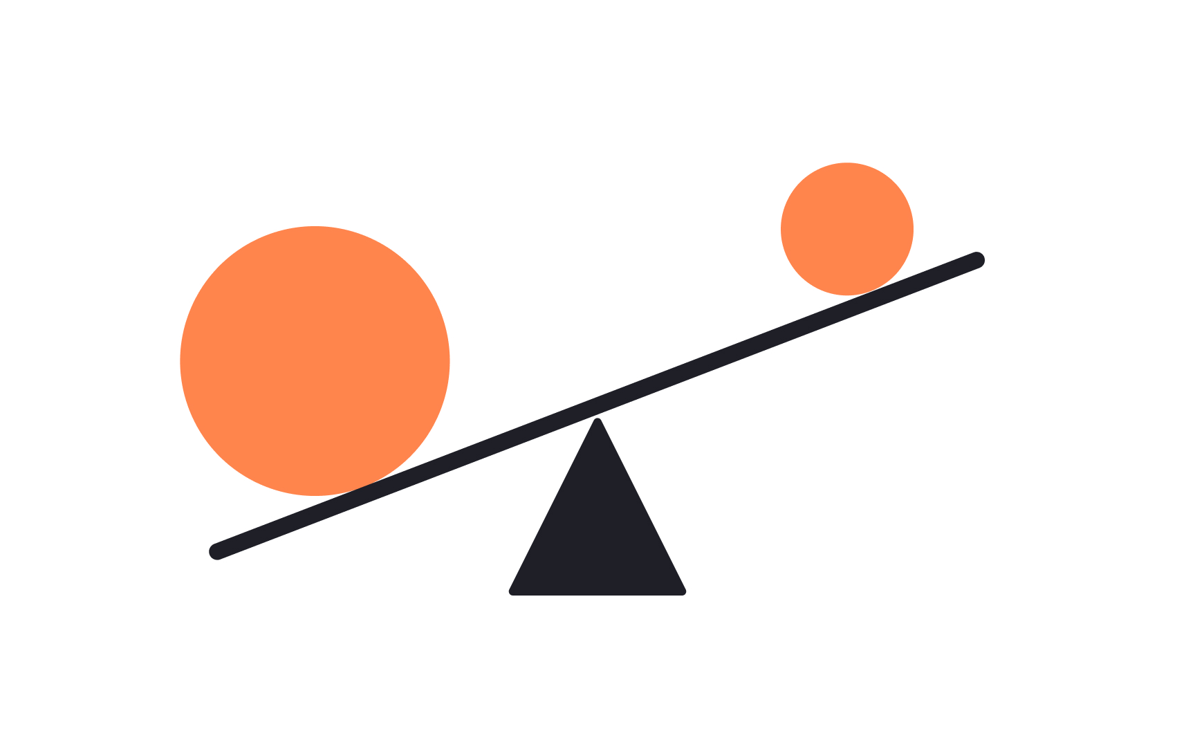
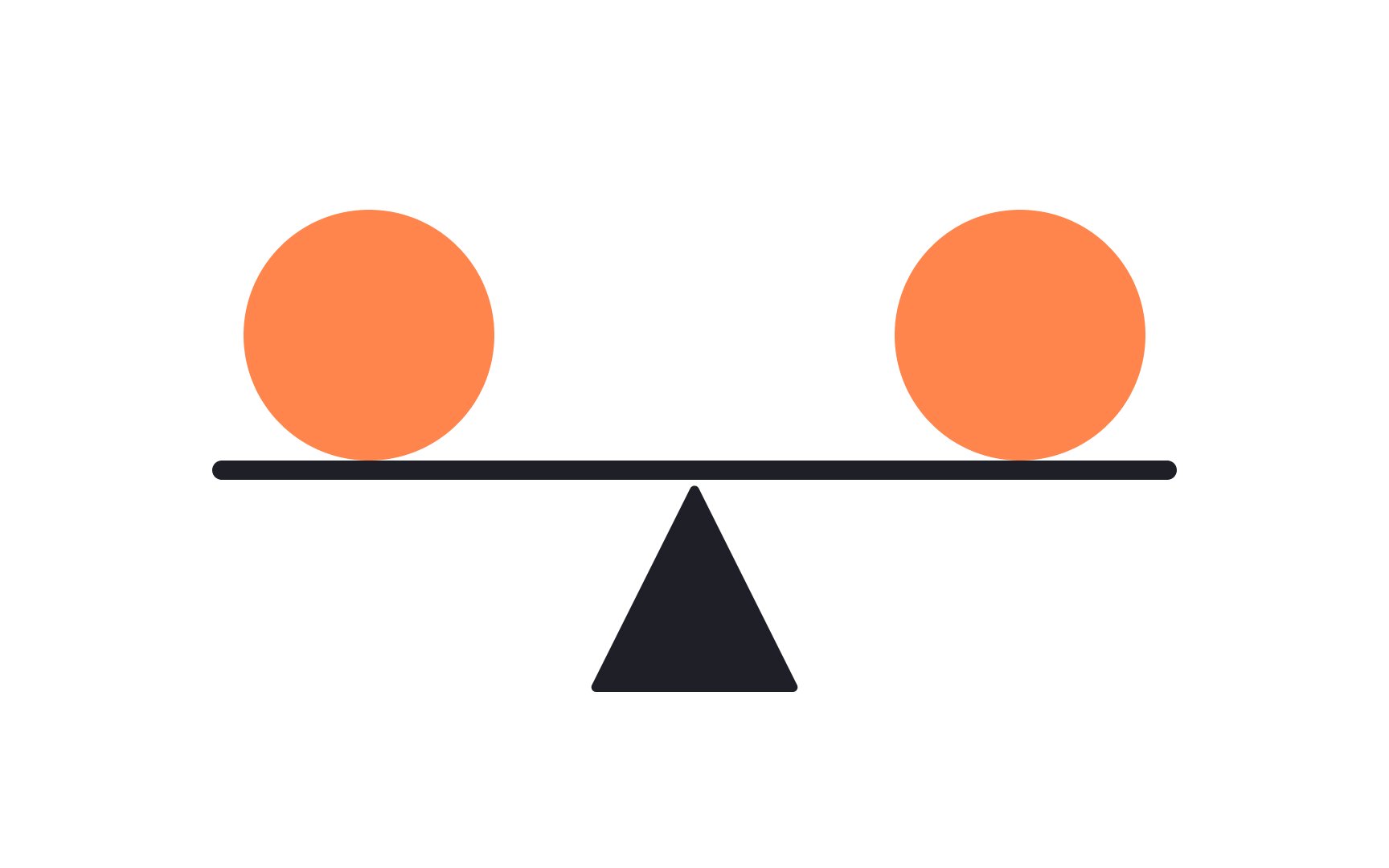
In the design world, balance is the distribution of
Balance is achieved by combining elements, such as images, shapes,
- Symmetrical layouts distribute items with equal weight on both sides of an imaginary central axis.
- Asymmetrical designs do the opposite and are often perceived as more dynamic.
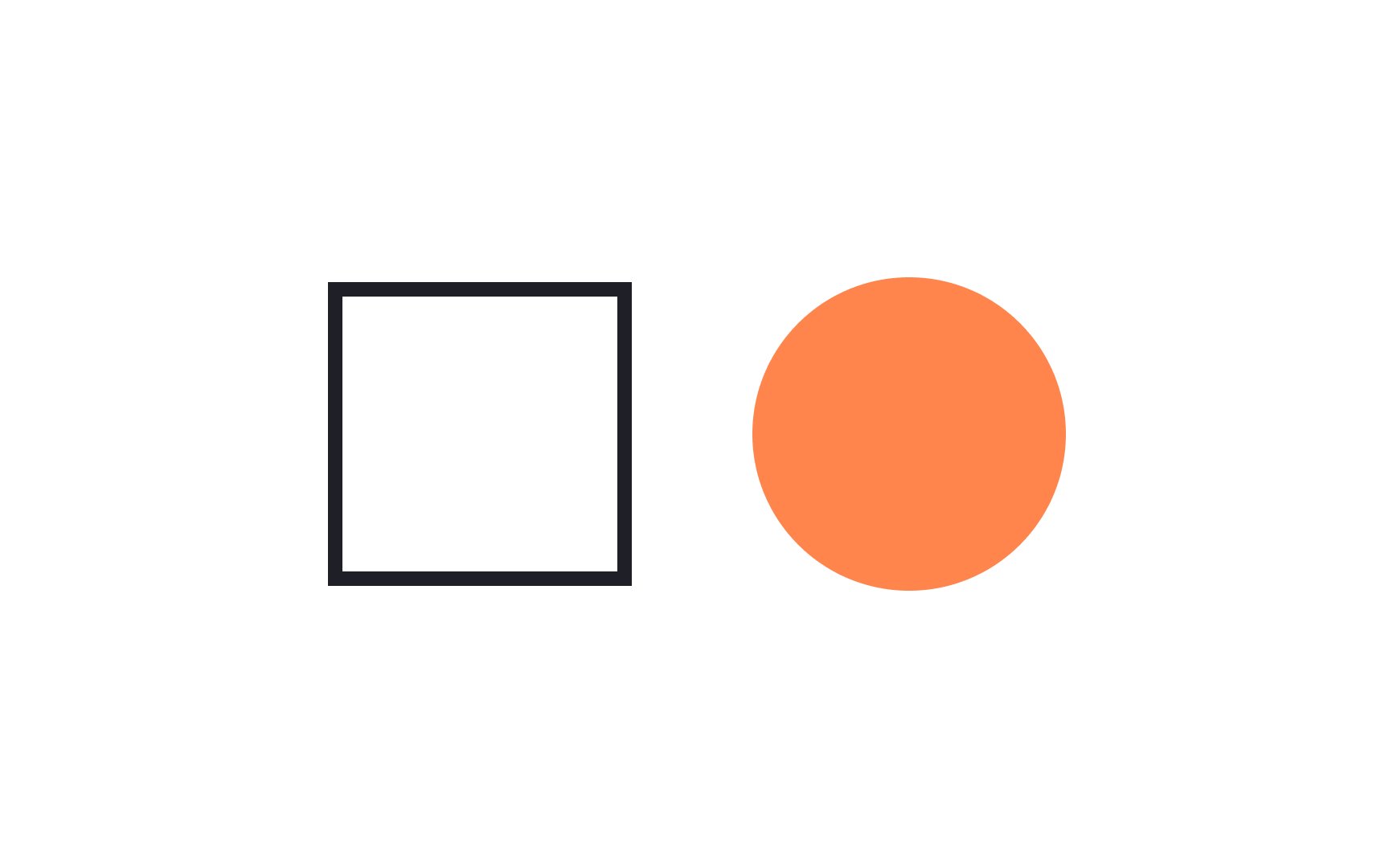
Contrast refers to the distinct difference between two elements that are put together or closely associated. Contrast makes elements stand out on the page. It can be achieved through the use of
Always aim for more than one point of contrast between elements. Experiment with size, shape, color, typography, and other visual aspects to guide users to the most important information on the page.
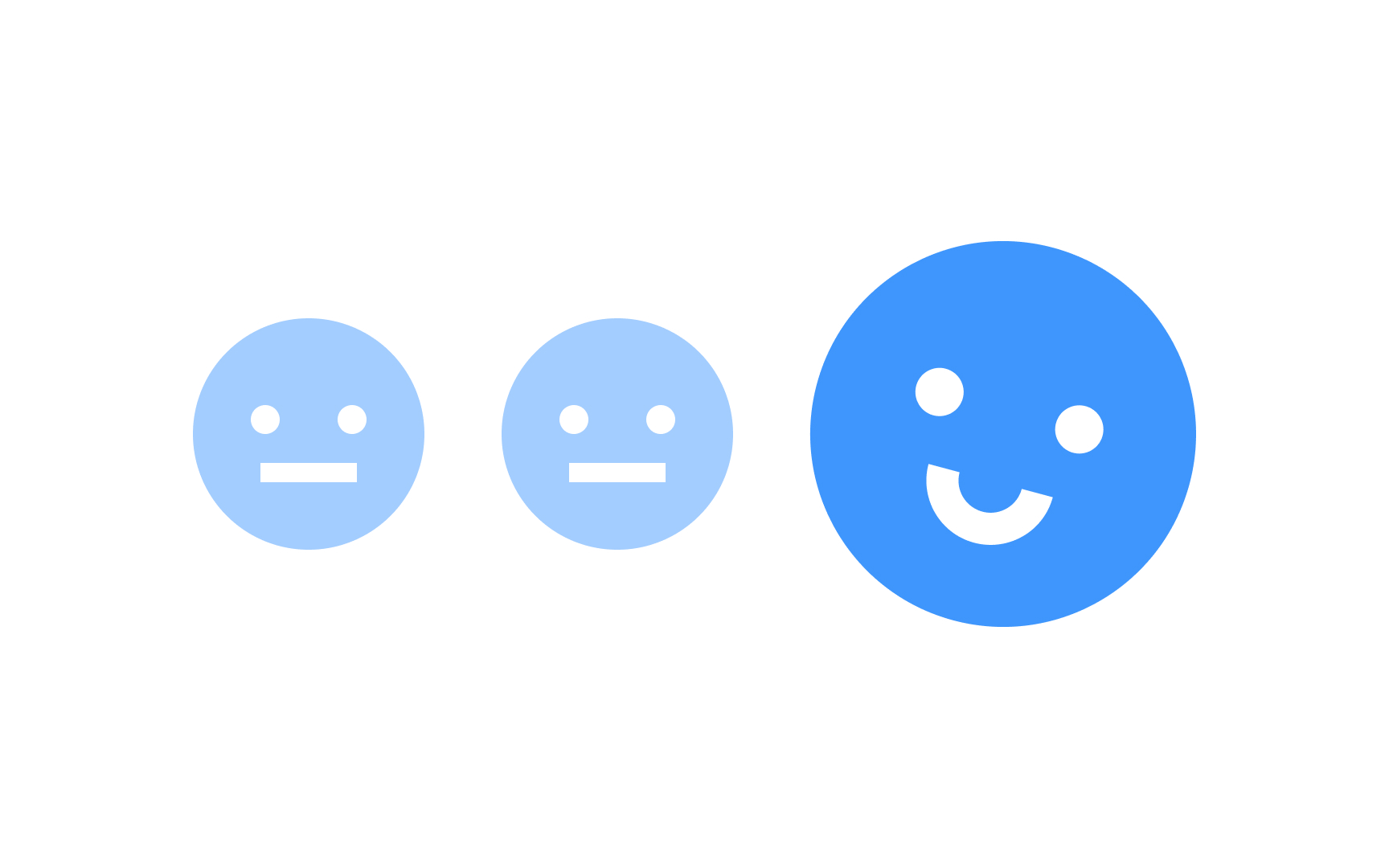
Emphasis is the special importance, value, or prominence given to an element. It can be achieved with size, weight, position,
Why is emphasis important? According to the Von Restorff effect, or Isolation effect, people most likely remember an object that differs from the rest when multiple similar objects are present.[2]
Designers use emphasis to create a
Pro Tip: Don't rely on color only when emphasizing elements so that users with disabilities can also perceive the difference.
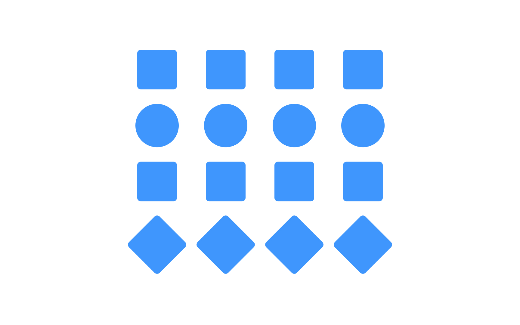
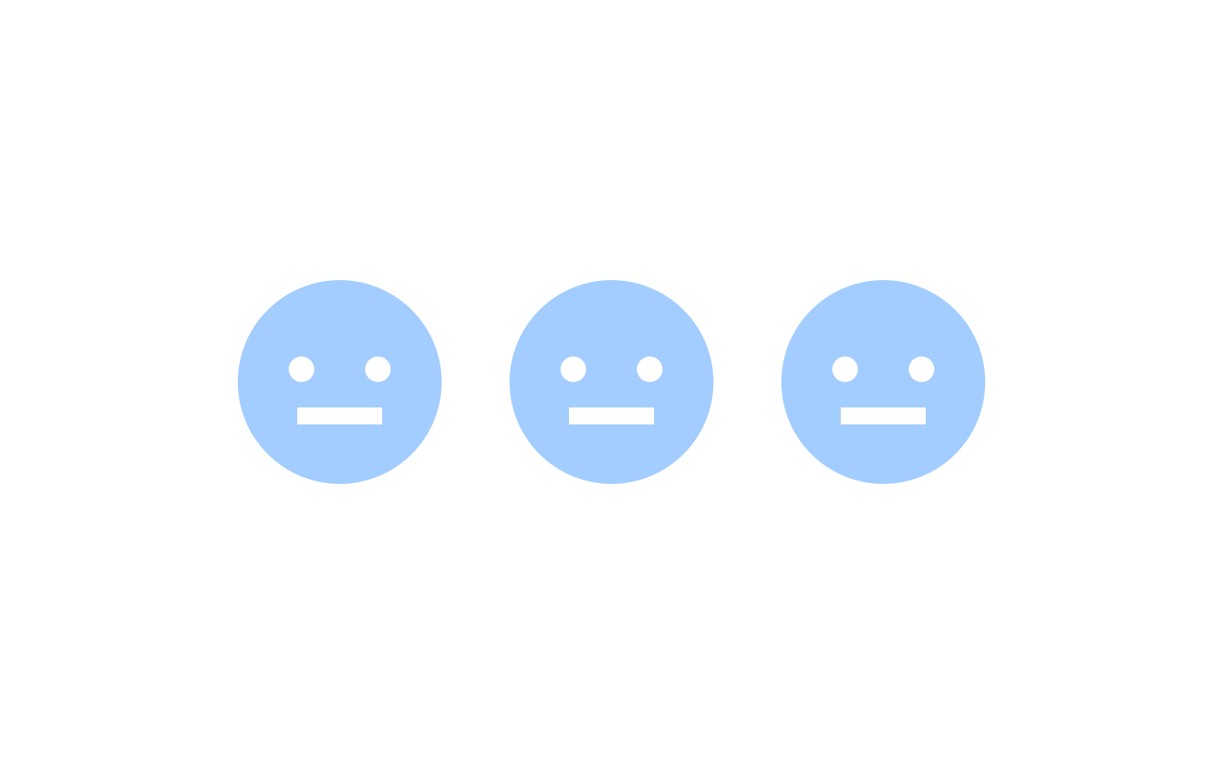
Repetition is the practice of using the same or similar elements multiple times to reinforce ideas and organize
The Gestalt principle of similarity supports the principle of repetition — elements that have visual similarities, like
Repetition can also provide harmony and unity in designs and is vital for typographic styles and color palettes that are used in many instances throughout a design.
Movement refers to the way the human eye travels over a design. It’s possible to influence this movement through hierarchy and specific visual elements.
Designers can guide users' journey through the product by using:
- Particular colors: brighter
colors are noticed first. - Shapes: bolder or larger shapes stand out.
- Alignment: when the rest of the text is left-flushed, a right-flushed or centered headline catches the eye.
- Fonts: bigger, bolder
fonts will draw the eye first, regardless of their placement on thepage .
Take advantage of the movement principle to guide users’ attention through a design. When combined with other design principles, movement helps users complete tasks faster and improves overall
The empty area around
Negative space makes text elements more readable, improves scannability, and makes it easier to find vital elements within a

Hierarchy is used to guide users through a design, making
Hierarchy can be achieved through a number of other
Pro Tip: Use contrast and emphasis mindfully — if everything is calling for attention, then nothing will stand out.


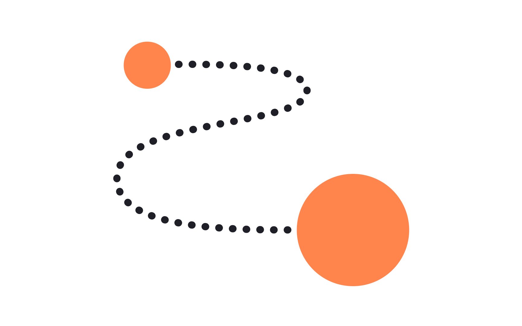
The relationship between the sizes or quantity of various elements is referred to as proportion. Larger elements are given more visual importance than smaller elements. In this case, size matters.
Proportion needs to remain balanced to create a harmonious design. Equally sized elements may create monotony, while the too obvious difference lacks harmony.
When designing interfaces, it's important to consider the context in which they will be used. Different devices and screen sizes may require different proportions to ensure the interface is clear and easy to use.
Pro Tip: Make sure the font proportions are not too extreme. When the body copy is 16px, headings in 32px or slightly larger feel more harmonious than when they are 96px.
The Gestalt principle of continuation states that the human brain tends to perceive elements aligned in straight lines or curves as related. Rather than trying to connect elements placed at different distances, our minds prefer to follow elements placed along a line.
In design, we use continuation to guide users' eye, direct their attention to the most important
Continuation is often aided by similarity and proximity to form a relationship between a group of objects.[3]
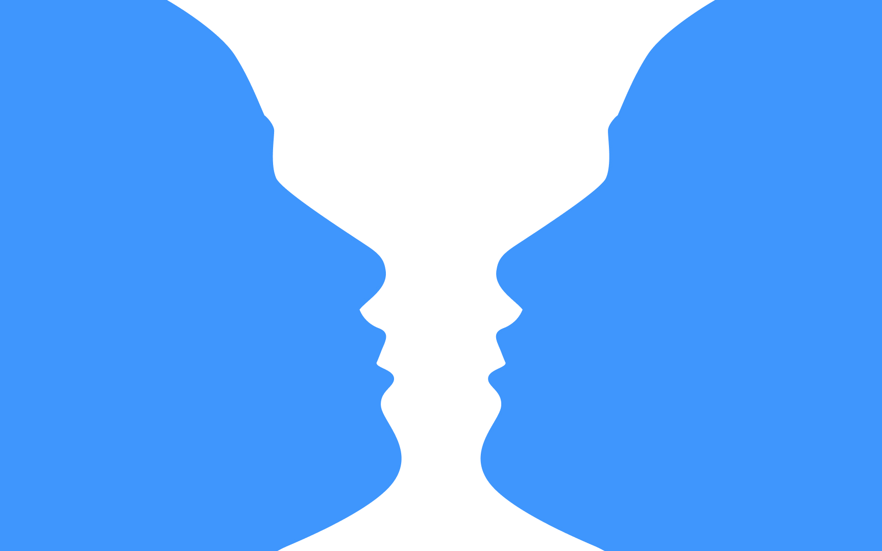
The Gestalt figure-ground
Things get interesting when the relationship between the background and foreground becomes ambiguous and leads to various interpretations of an
The figure-ground principle helps users understand information hierarchy and guide users' attention to the specific


Similar lessons

Common UI Component Definitions I

Image Terminology
