<?xml version="1.0" encoding="utf-8"?>

Color is one of the most powerful tools that UX designers have at their disposal. It can be used to draw attention to an element and emphasize its importance. But it can also be used to strongly influence user emotions and behavior.

Keep in mind that colors may elicit different reactions and emotions based on cultural differences and personal associations, but there are certain universal meanings associated with various hues. Designers should learn the ins and outs of associative composition in order to send users the right message and encourage them to take the desired action.

Exercise #1

Color

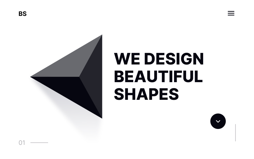
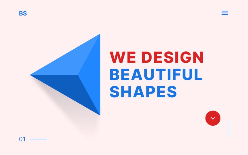
Color Bad Practice
Color Best Practice

Color fulfills several essential functions in design. For example, we use color to communicate states, highlight crucial components, and alert users when something goes wrong.

More importantly, though, color profoundly affects us on a psychological level — it can set the mood, create an atmosphere, and evoke deep emotions.

Exercise #2

Color сomposition

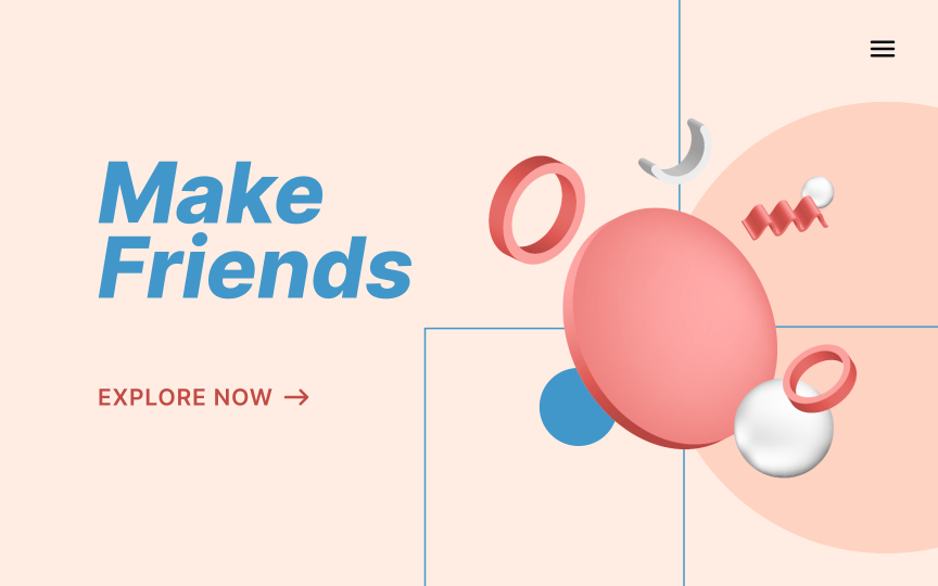
Color сomposition Bad Practice
Color сomposition Best Practice

Color composition refers to utilizing colors in a way that produces a specific impression. Color preferences are somewhat subjective — culture, prior association, or even personal taste can influence our reaction to various colors.

While individual users may have a specific association with a particular color, there are some fairly universal associations you should learn. By utilizing color in a way that most people will perceive in a certain way, you can influence the emotions and even behaviors of your users.

Exercise #3

Chromatic colors

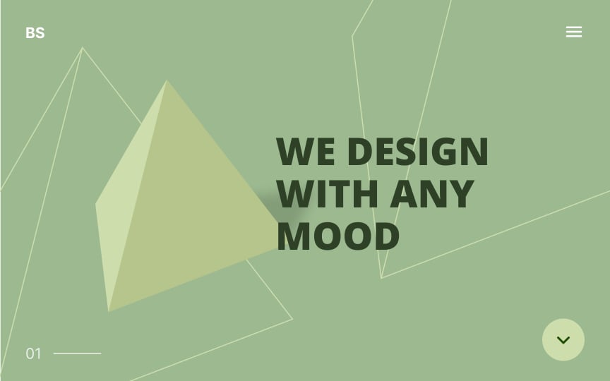
Chromatic colors Bad Practice
Chromatic colors Best Practice

An object's color depends on its ability to filter out the light of a particular wavelength. For example, a red apple's surface absorbs blue-green wavelengths and reflects the red one.

Colors with a dominating wavelength or hue are called chromatic. They include colors like red, orange, yellow, green, blue, indigo, and violet, as well as their shades and tints. Black, white, and gray are not chromatic, as they include an equal distribution of wavelengths.

Exercise #4

Achromatic colors

Achromatic colors Bad Practice
Achromatic colors Best Practice

Achromatic colors possess no dominant hue — they absorb or reflect all light wavelengths equally. White, black, and all shades of gray are achromatic colors. 

White reflects all light and absorbs none, while black is the opposite (gray reflects all light wavelengths equally, to varying degrees). They lack hue and temperature and have only one property — value, which is the relative lightness or darkness of a color.

Exercise #5

Monochromatic colors

Monochromatic colors Bad Practice
Monochromatic colors Best Practice

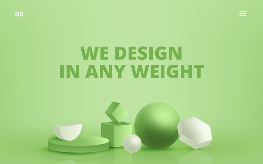
If you start with a single base hue and extend it through its tints, shades, and tones, you'll get a monochromatic color palette. To create a tint, you need to lighten a color by mixing it with white. Creating shades is the opposite — mix a color with black to obtain darker colors. To produce a tone, you mix the initial color with gray.

Monochromatic compositions feel visually cohesive, easy on the eyes, and often minimalist. Just be sure to add texture and experiment with tint, shade, and tone variations to avoid monotony.

Exercise #6

Neutral colors

Neutral colors Bad Practice
Neutral colors Best Practice

Neutral colors include beige, brown, ivory, cream, and achromatic colors like white, black, and gray. Beige and brown tones create a warm, welcoming atmosphere. Ivory and cream are sophisticated, with some of the warmth of brown mixed with the coolness of white — they can lend a sense of elegance and calm. Off-white shades of ivory or gray can lighten the overall composition without the stark contrast of white.

Exercise #7

Calm colors

Calm colors Bad Practice
Calm colors Best Practice

Blue has long been the most popular color in the world — as early as the 1940s it was a clear winner as the most preferred hue.[1] Blue is used widely in marketing, partly for this reason and partly for the emotional impression it makes.

Blue has a strong association with being calm, orderly, secure, and reliable. It’s a passive color, often associated with loyalty and humility.

Exercise #8

Energetic colors

Energetic colors Bad Practice
Energetic colors Best Practice

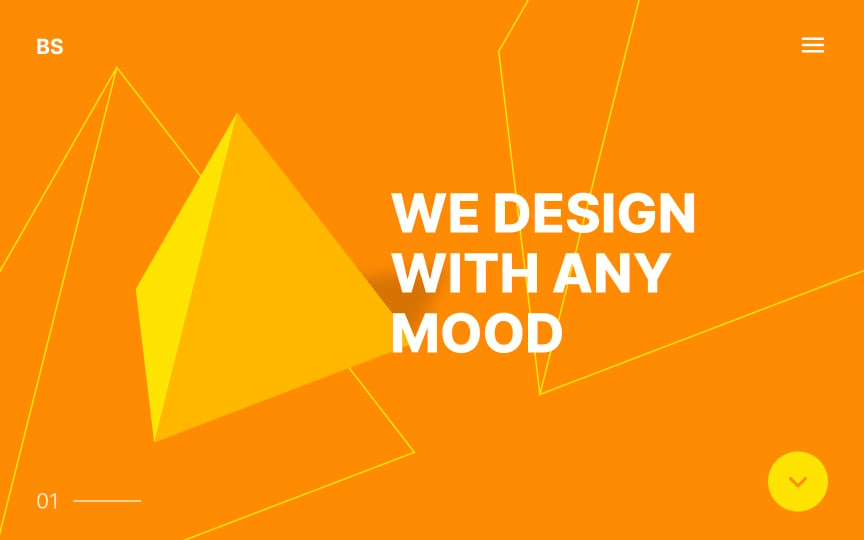
Orange is the mix of the two warm primary colors — yellow and red. It reminds us of fire and sunlight. We associate it with energy, happiness, and vitality. Yellow has similar connotations, bringing up images of the bright morning sun shining over a field of wheat. Both hues lend energy to your compositions, evoking feelings of excitement.

Exercise #9

Mysterious colors

Mysterious colors Bad Practice
Mysterious colors Best Practice

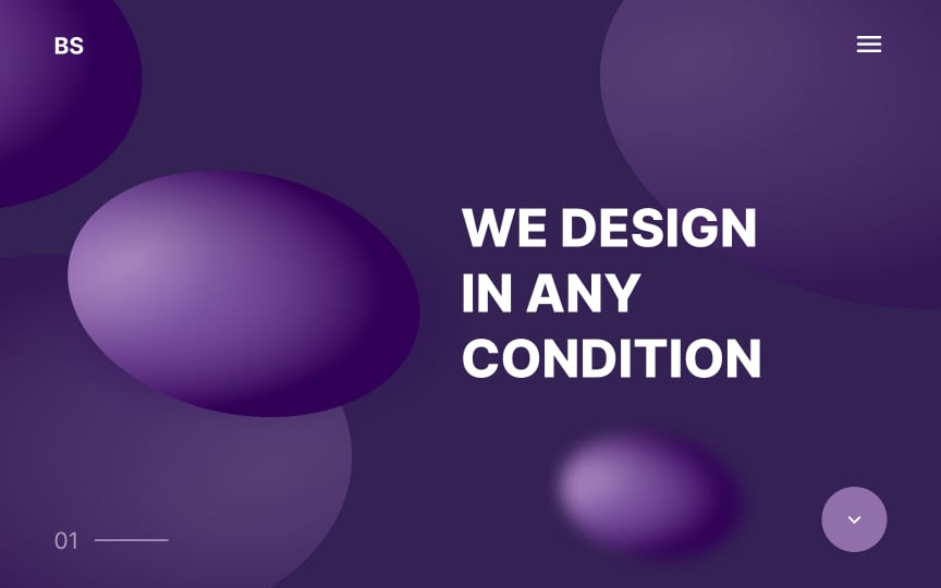
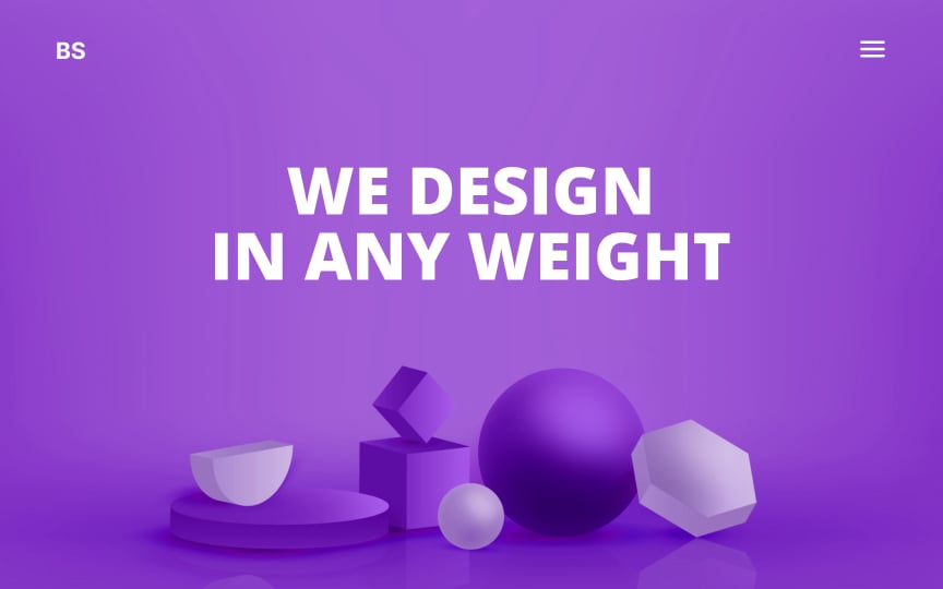
Purple and violet refer to colors that fall between red and blue on the color wheel. They’re relatively rare in nature, and before the invention of synthetic dyes, they were costly to produce.[2] That’s one reason they’re often associated with wealth, royalty, intelligence, and achievement. They’re also associated with spirituality, mystery, and the unconscious. Purple and violet can even evoke feelings of individuality, creativity, and inventiveness.

Exercise #10

Hot colors

Hot colors Bad Practice
Hot colors Best Practice

Warm colors — red, orange, yellow, and their variations — are engaging, energetic, and playful. Many cultures associate them with physical energy, health, vitality, and fire. Colors that lean more toward red feel hotter than those that favor yellow.

Exercise #11

Cool colors

Cool colors Bad Practice
Cool colors Best Practice

Blue is the only primary color within the cool spectrum. It reminds us of cold winter nights and forests covered with snow. Lighter tints of blue can give the coldest impressions, as they’re heavily associated with ice. 

In general, blue is reserved and loyal but also calming and relaxing. Other cold colors include green and purple, secondary colors that mix blue with yellow or red, respectively. 

Exercise #12

Light colors

Light colors Bad Practice
Light colors Best Practice

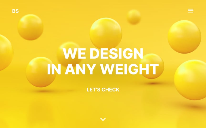
Compositions using lighter colors like white, yellow, or soft tints of blue and green, feel bright and airy, like a breezy room with lots of natural light. Lighter colors have less visual weight, although there’s no scientific consensus about why.[3] It may be related to being used to darker colors closer to the ground, like the earth under our feet, with lighter ones above, like the sky and clouds.

Exercise #13

Heavy colors

Heavy colors Bad Practice
Heavy colors Best Practice

Darker colors like black, blue, violet have more visual weight than their paler counterparts. Red, though, is perceived to be the heaviest of all colors.[4]

Keep in mind that we subconsciously expect to see heavier objects at the bottom — otherwise, the composition looks top-heavy and makes us feel uncomfortable.

Exercise #14

Vibrant colors

Vibrant colors Bad Practice
Vibrant colors Best Practice

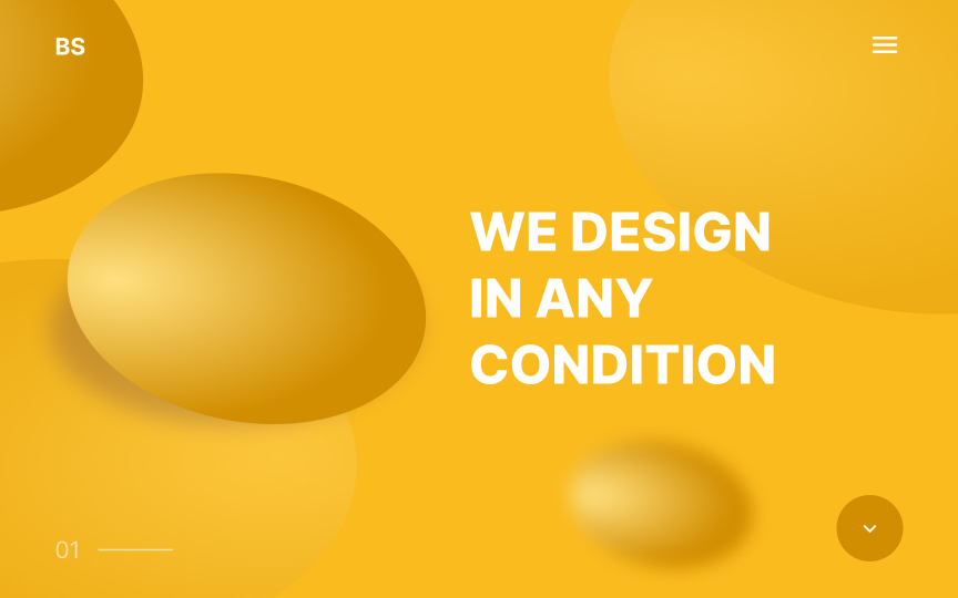
The color yellow is the brightest and most energizing of all warm colors, while red is considered the most powerful. Vibrant combinations of yellow and red create an impression of radiant energy like a halogen heater in winter. These colors can easily overwhelm users, so keep that in mind when using them in your compositions.

Exercise #15

Sweet colors

Sweet colors Bad Practice
Sweet colors Best Practice

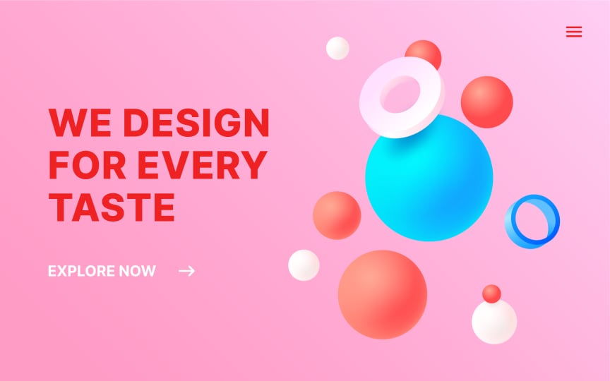
When Walter Diemer invented the first bubble gum and made it pink (because it was the only food coloring he had available), he had no idea how much impact it would have on society’s perception of the color.[5] We associate tones and shades of red, pink, and purple with strawberry, blueberry, and raspberry sweets. Using any combination of these colors in a composition will make it look delicious and appealing.

Exercise #16

Sour colors

Sour colors Bad Practice
Sour colors Best Practice

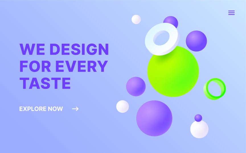
Lemon and lime are some of the first foods that come to mind when we think of a sour taste. Sour is an intense taste that is only evoked by a few foods. So like the taste itself, sour color schemes utilizing greens and yellows also appear intense and vibrant, often leave a lasting impression.

Complete this lesson and move one step closer to your course certificate