CSS Text & Typeface
Learn what goes into customizing how text looks on a webpage
The choice of text style and typeface affects how users perceive your design as it is intended— that's why designers usually choose these things carefully. It would be a shame if a browser just... didn't display your text correctly.
To ensure that your designs look great across all platforms, it's crucial to know what CSS properties control text style and formatting. In this lesson, we're lifting up the lid about customizing how the text looks on a webpage.
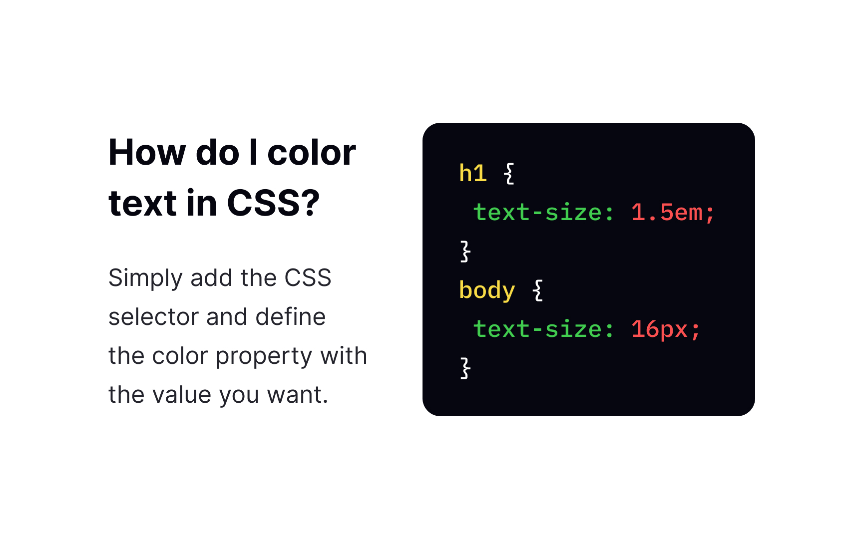
The color
- Color names — for example,
red - HEX values — for example,
#800080 - RGB values — for example,
rgb(128,0,128)
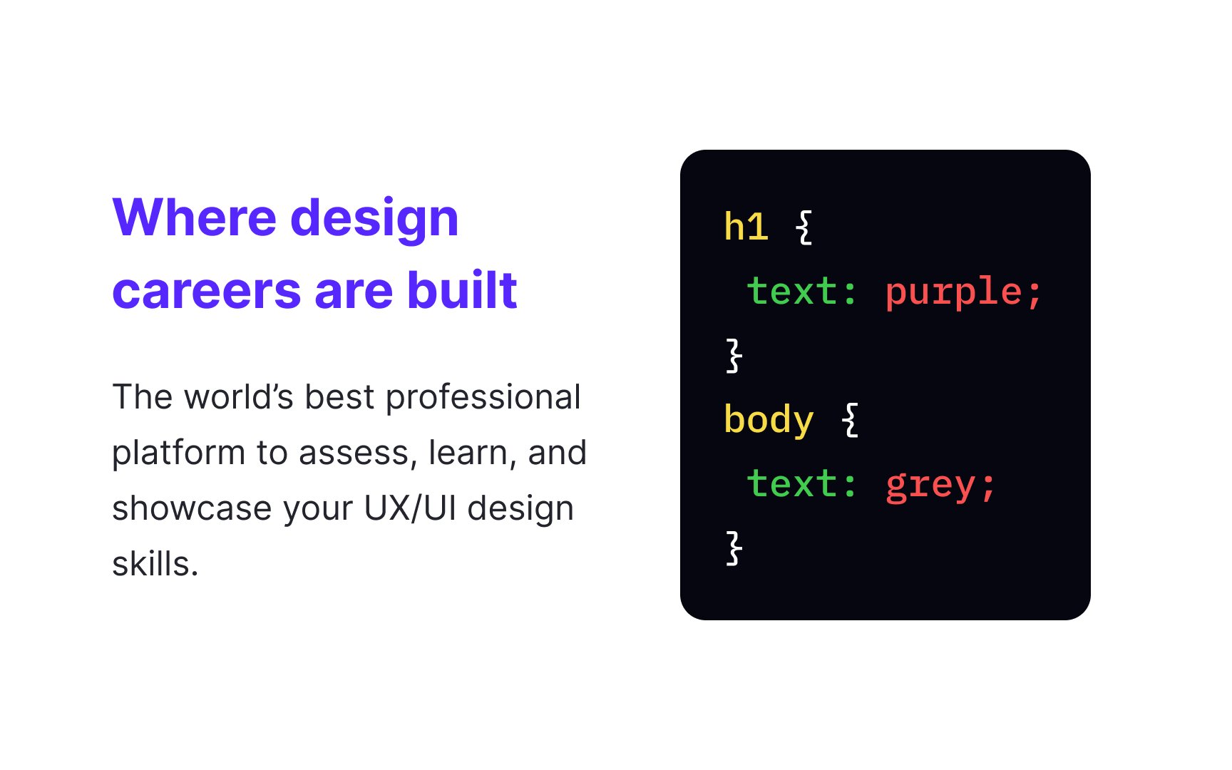
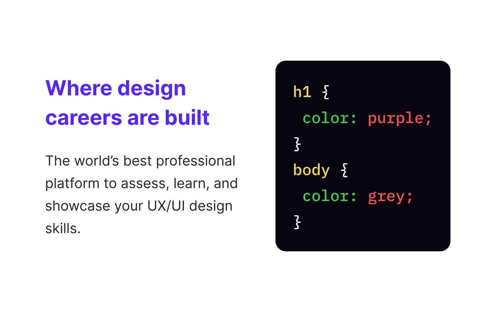
To define the default text color for a page, add the declaration for the body selector. For example:
body {
color: grey;
}
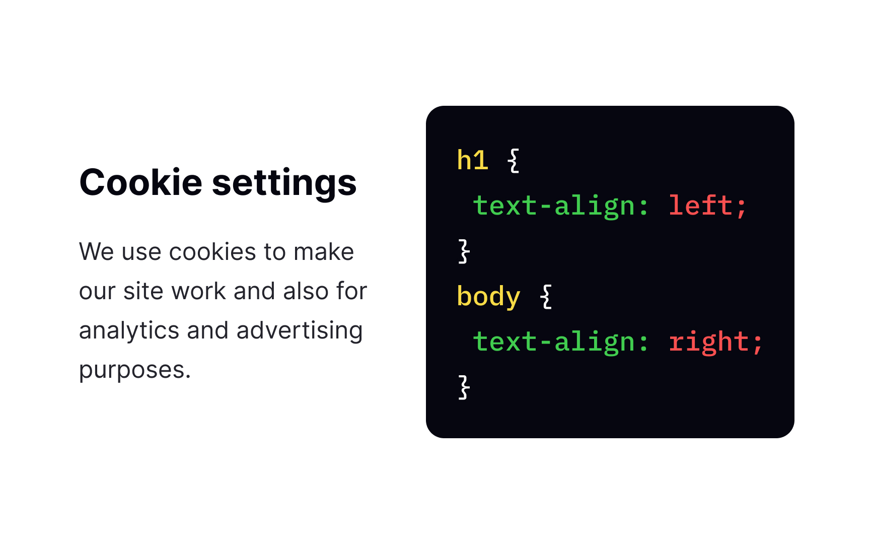
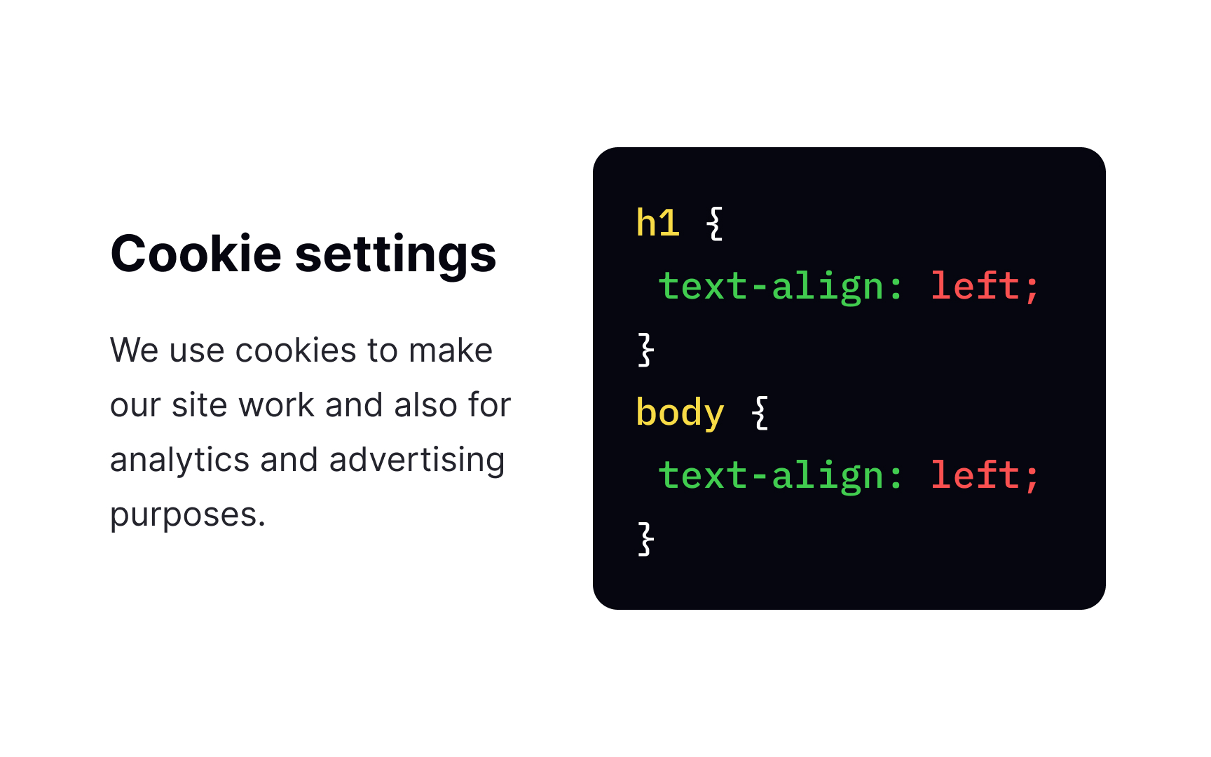
There are several text-align left, right, center, or justify. Using justify will stretch each line to have equal width, like in magazines and newspapers.
To set the vertical alignment of an element, use the vertical-align property. The values it can take are top, middle, and bottom, which are pretty self-explanatory.
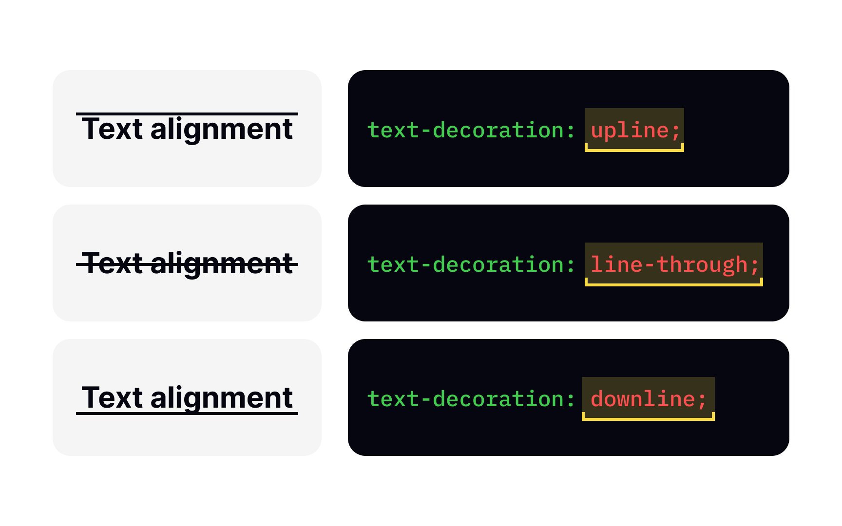
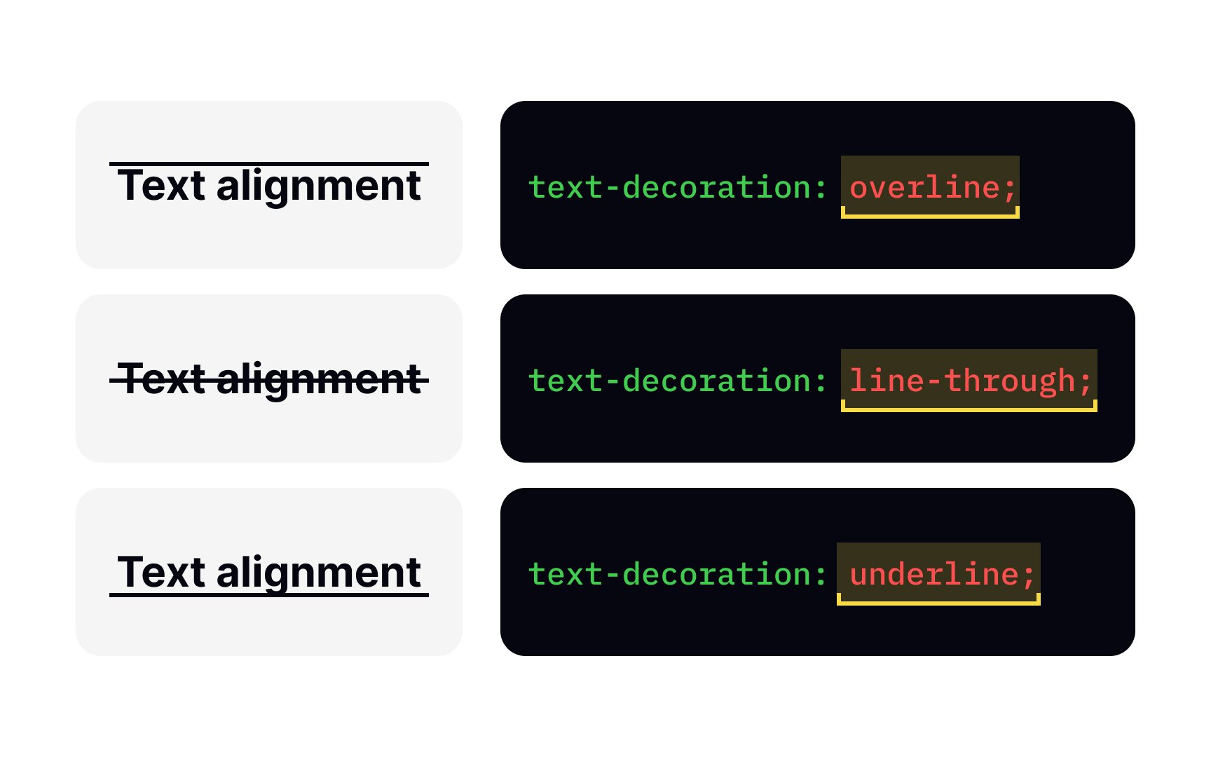
Decoration in text-decoration property allows you to add a line under the text with the value underline, over the text (overline), or through it (line-through). You can also remove underlines from links with the following rule:
a {
text-decoration: none;
}
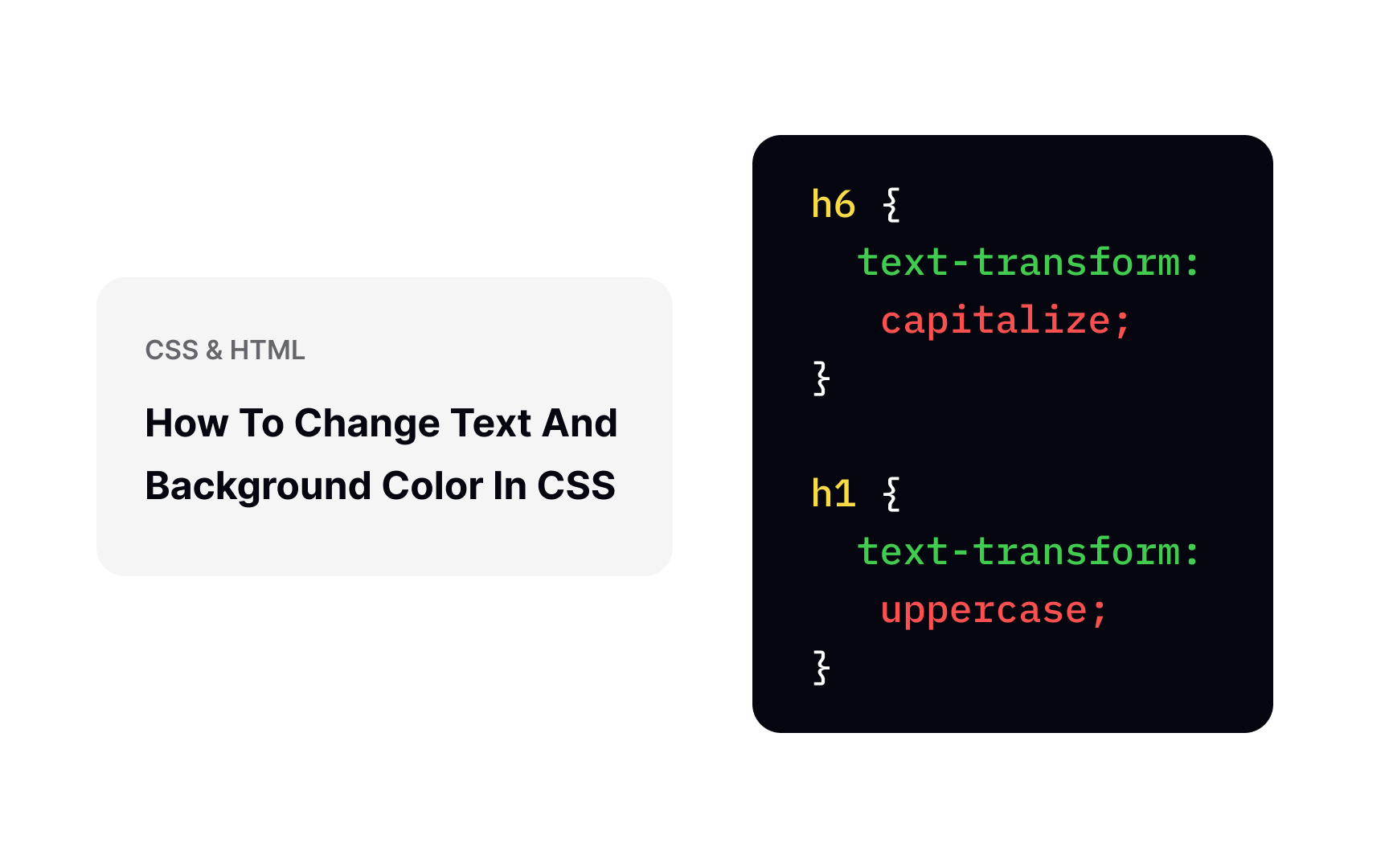
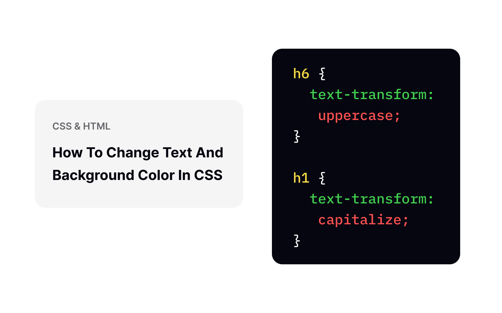
The text-transform
h1 {
text-transform: capitalize;
}
Other values this property can take are lowercase and uppercase — to set all text to be displayed in lowercase and uppercase, respectively.
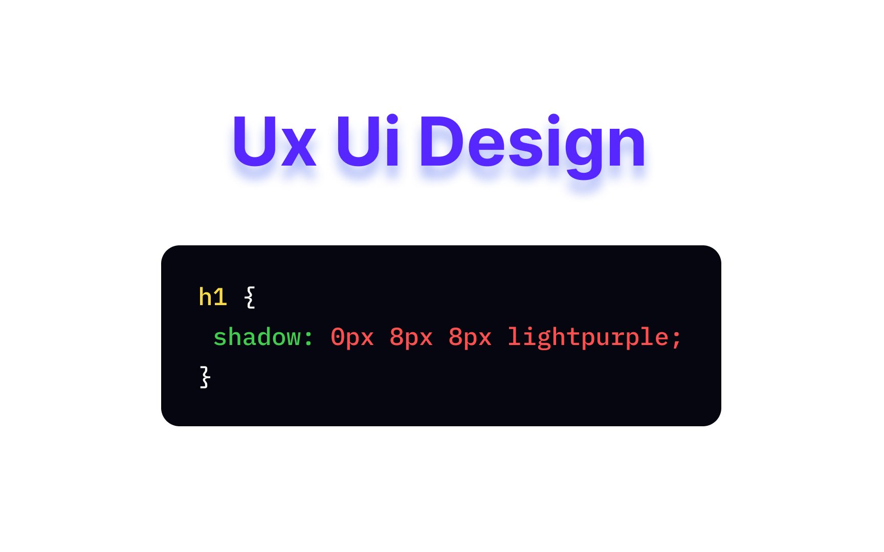
text-shadow
Each shadow can have up to 4 values:
- Horizontal offset (required)
- Vertical offset (required)
- Blur radius
Color
In the example above, the heading has a light purple shadow with an 8px radius, an 8px vertical offset, and a 0px horizontal offset.
As an American architect Frank Lloyd Wright once said, "Space is the breath of art." In design, spacing can make or break the user experience.
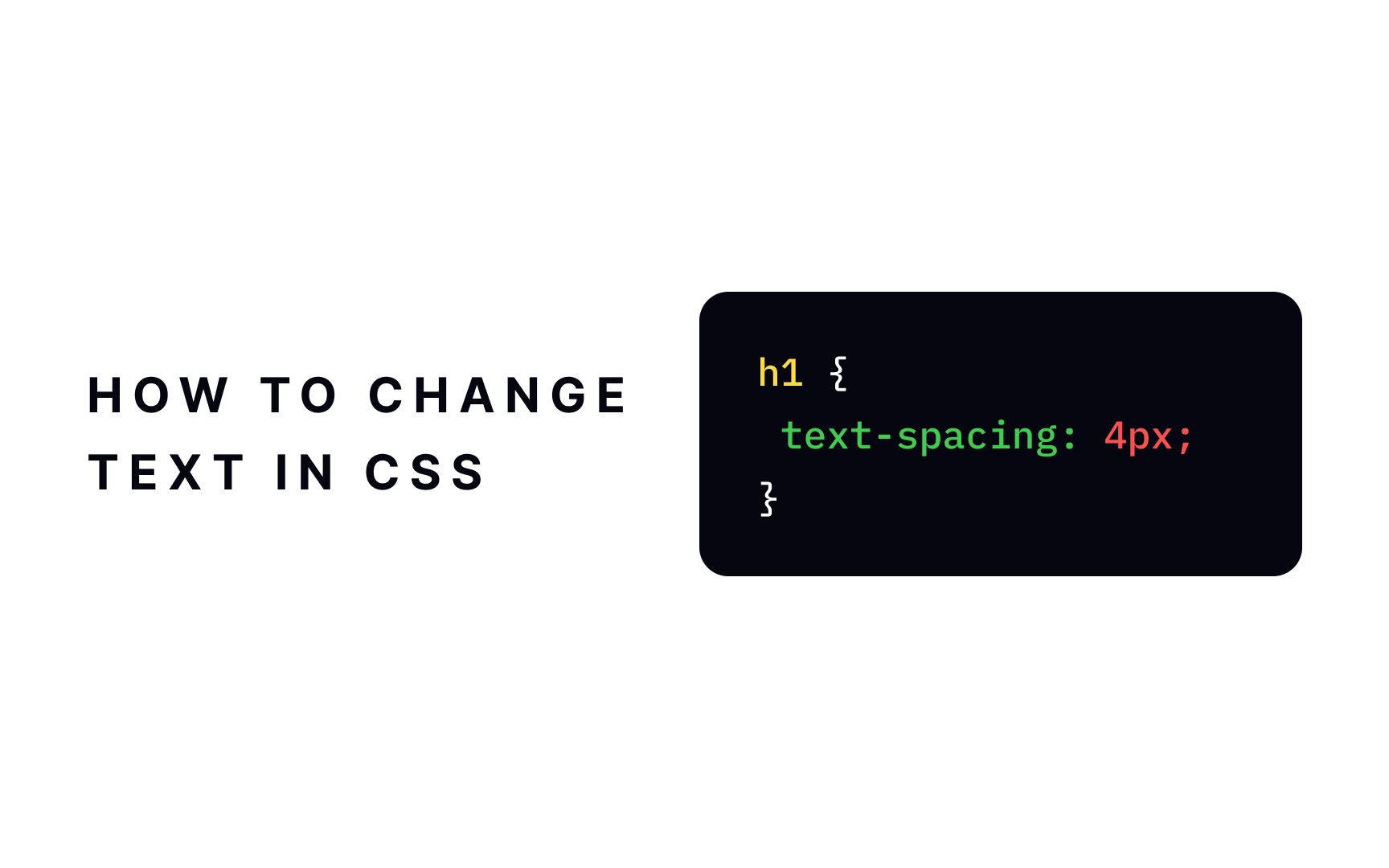
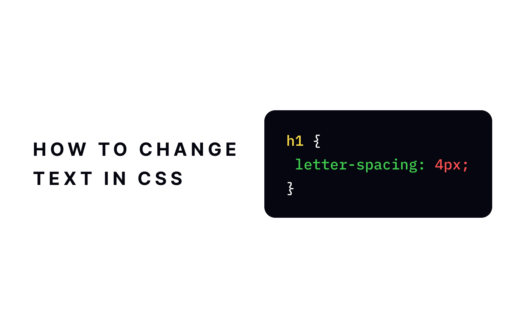
Here are some of those text spacing properties:
letter-spacingspecifies the space between characterstext-indentsets the indentation of the first line of a textline-heightsets the space between linesword-spacingdefines the space between words
Length values in px are most commonly used with these properties.
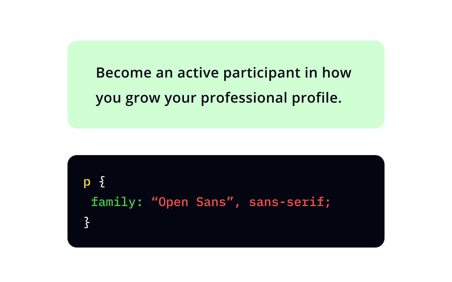
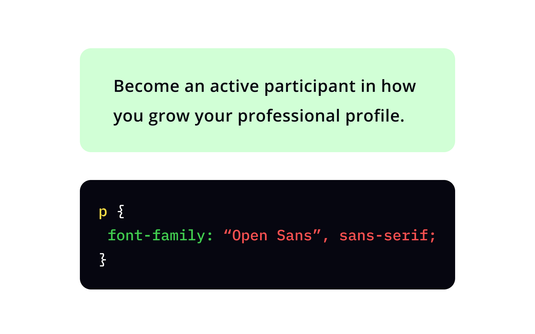
The font-family
Start with your preferred typeface — for example, "Open Sans". If the typeface is more than one word, you must use quotation marks. Then enter your second, third, etc., choices, separated by commas. The browser will choose the first available font. At the end, include at least one generic family name[1] — serif, sans-serif, monospace, cursive, or fantasy — in case none of your preferred fonts are available.
There's a number of
If you want your design to look good on all devices, it's vital to provide browsers with several fallback font options so that if the first font does not work, the browser will try the next one.
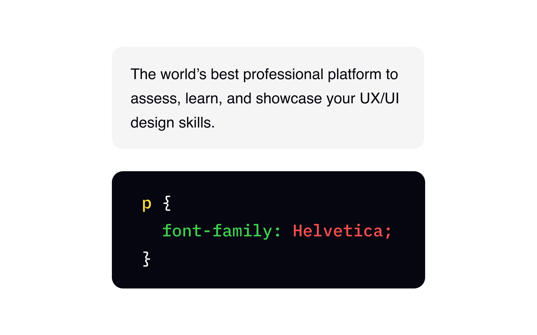
Some of the best web-safe fonts are:
- Garamond (serif)
- Georgia (serif)
- Times New Roman (serif)
- Arial (sans-serif)
- Helvetica (sans-serif)
- Tahoma (sans-serif)
- Trebuchet MS (sans-serif)
- Verdana (sans-serif)
- Courier New (monospace)
- Brush Script MT (cursive)

The font-style normal, Italic, and oblique.
Both Italic and oblique

The font-weight normal, bold, lighter, and bolder — or numeric values between 1 and 1000, with 1 being the thinnest.
Keep in mind that available weights depend on the font-family set. For example, not all
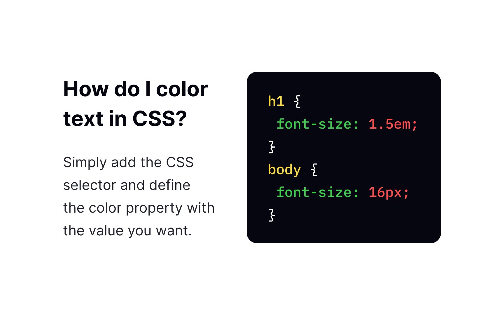
The font-size px and relative length values in em and rem. The property also accepts percentage values.[2]
Pro Tip: Use the font-size property for styling purposes only. To create headings, use the <h1>-<h6> tags.
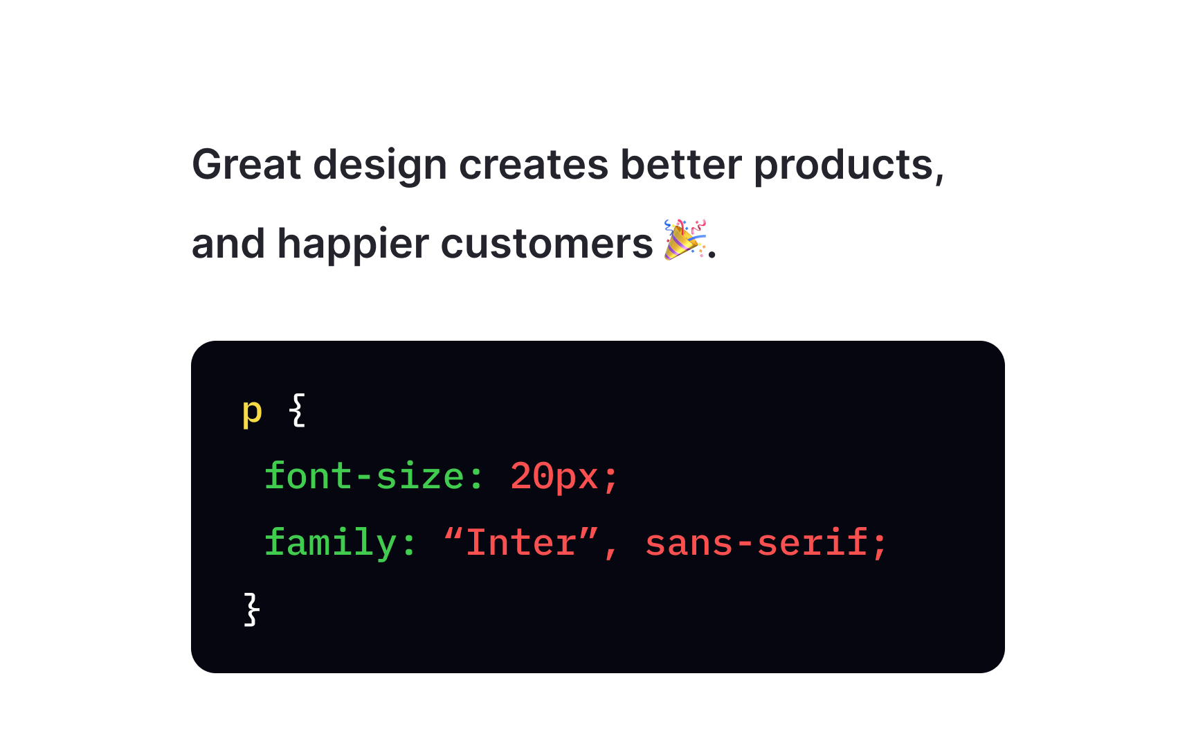
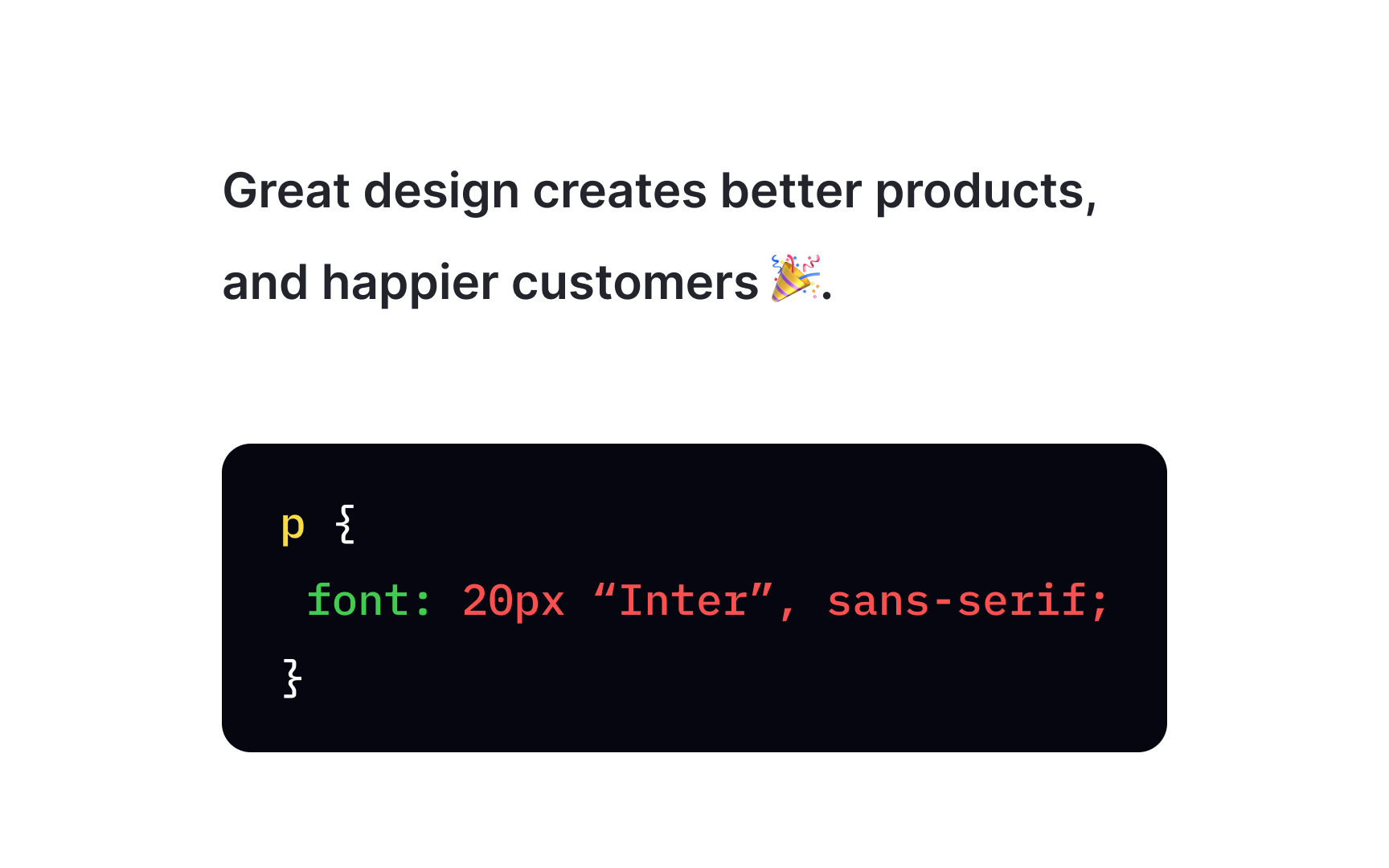
To shorten the code, you can actually specify all individual font
font-size- and
font-family
Optionally, it may also include values for:
font-stylefont-variantfont-weightfont-stretch- and
line-height
If one of the non-required values is missing, the browser will use the initial value. For example, if you don't specify the font-style property like in the example above, the browser uses the initial value normal, and the font is regular and not Italic.
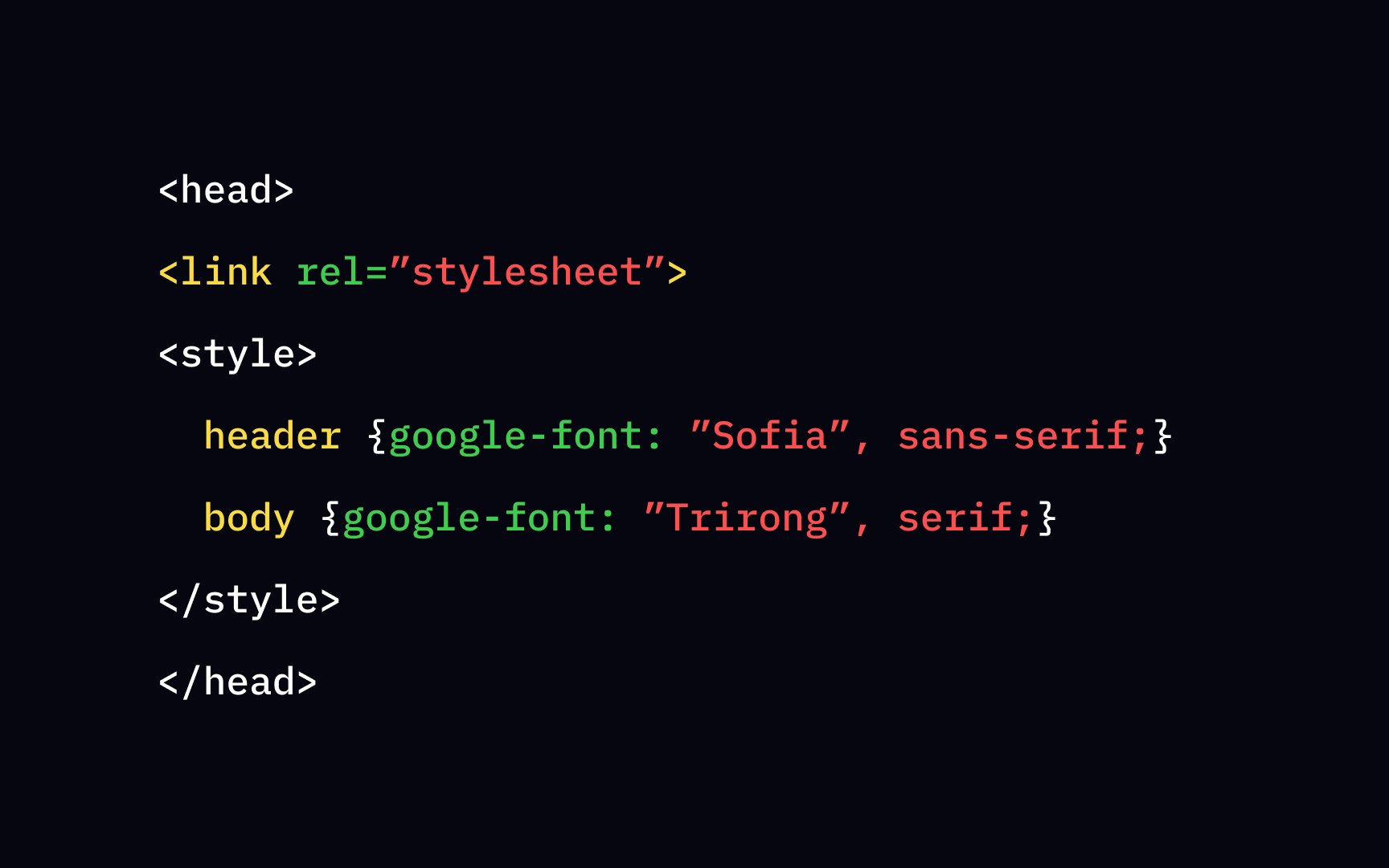
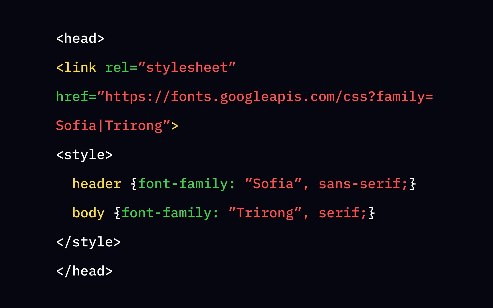
If you do not want to use any of the standard
Adding Google Fonts to your web page requires 2 steps:
- Add a special stylesheet link to your HTML document in the
<head>tag - Refer to the font in the
font-familyproperty
Done! Enjoy your
References
Top contributors


Topics
From Course

Share


