Intro to UI Cursors
Learn about the different types of cursors and how to effectively incorporate the right kind into your UI
Cursors are visual cues that show users not only the position of their mouse but also how they can interact with specific elements, including things like selecting text, clicking, dragging, or scrolling.
Understanding which cursors indicate which types of interactions and using them appropriately makes your interface more intuitive for your users. While it can be tempting to use custom cursors, they can interfere with those intuitive interactions.
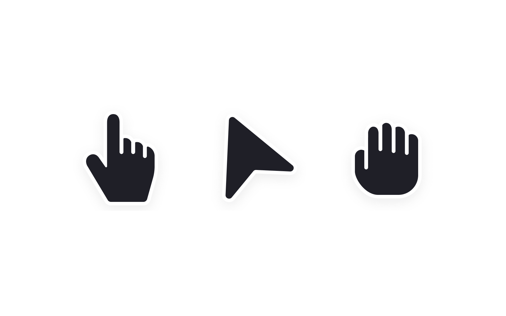
Arrow
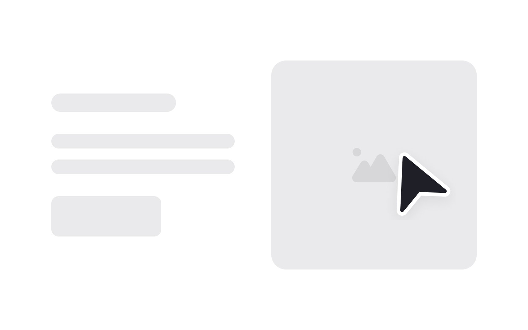
This unassuming cursor shape is your users' home base, setting the stage for all other cursor styles that provide specific context or actions. Employing the arrow cursor as the default helps maintain a clean, user-friendly environment, reducing visual noise and streamlining user
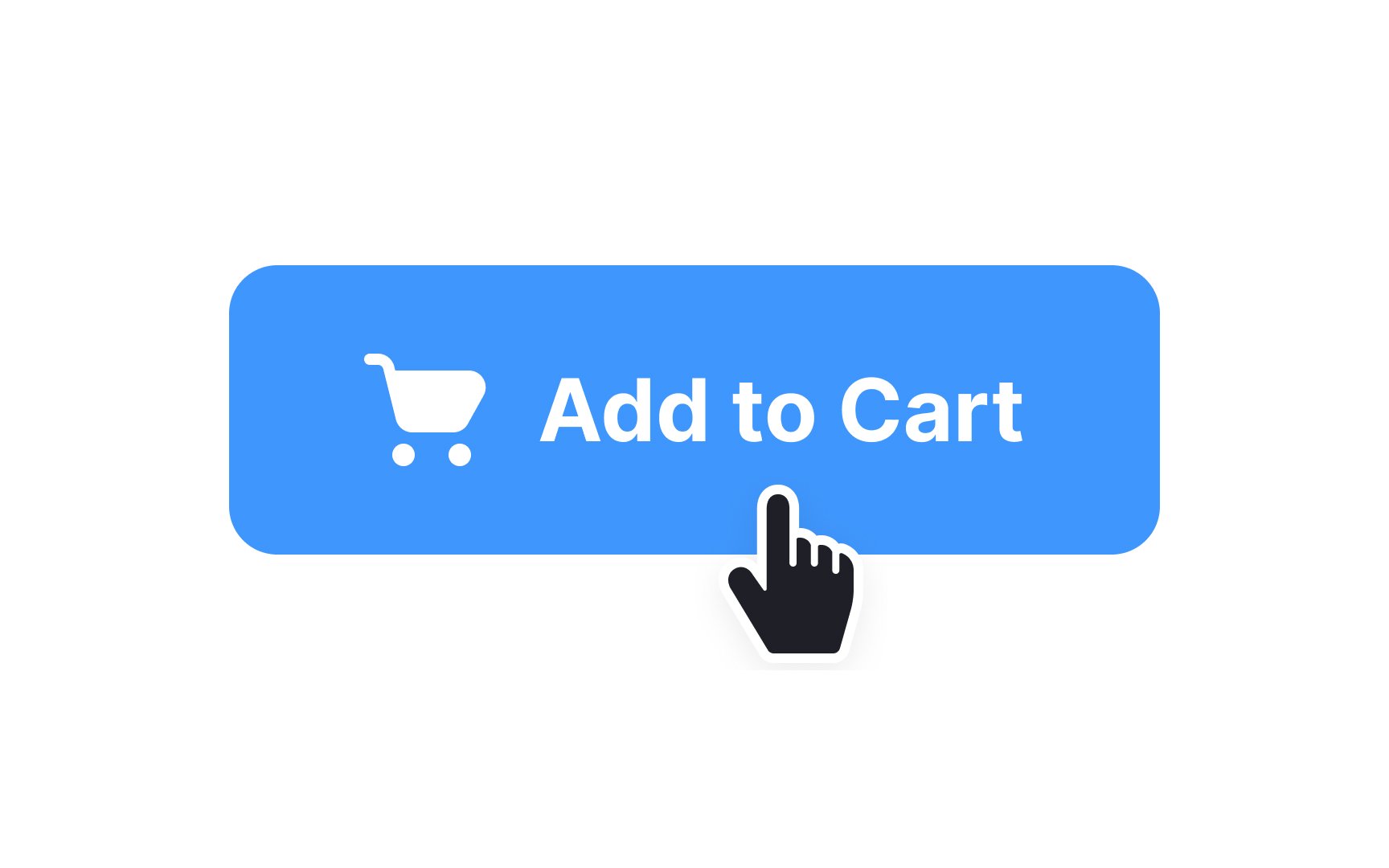
A pointer cursor looks like a hand with the index finger extended (pointing). It was historically only used when hovering over
Pointer
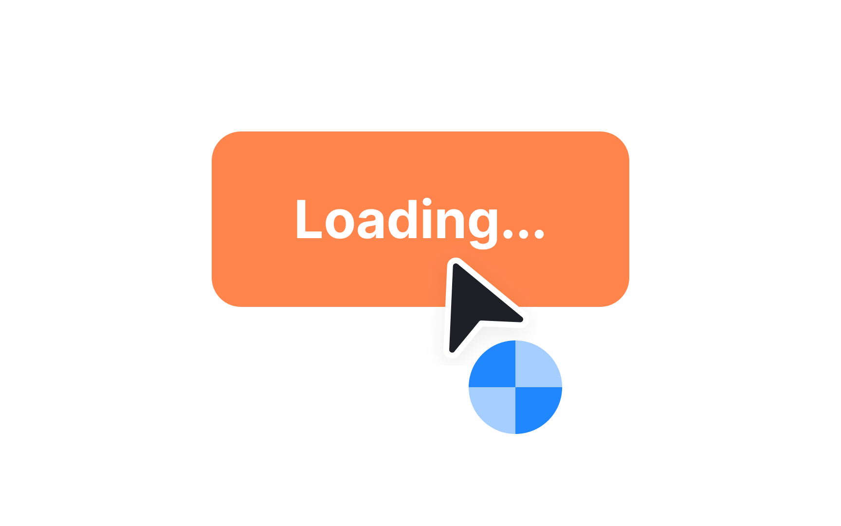
Indicating to users that something is happening when they interact with an element is essential. Not knowing what’s happening is frustrating and can result in users abandoning the action they were earlier trying to take.
One way to prevent this is by using a progress
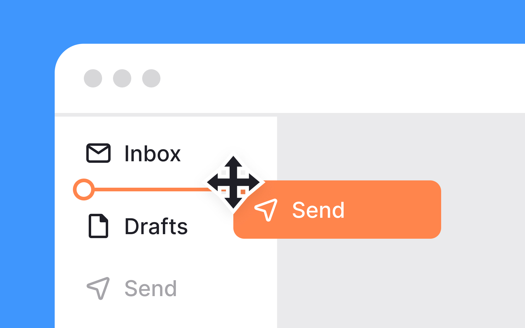
The move
The grab
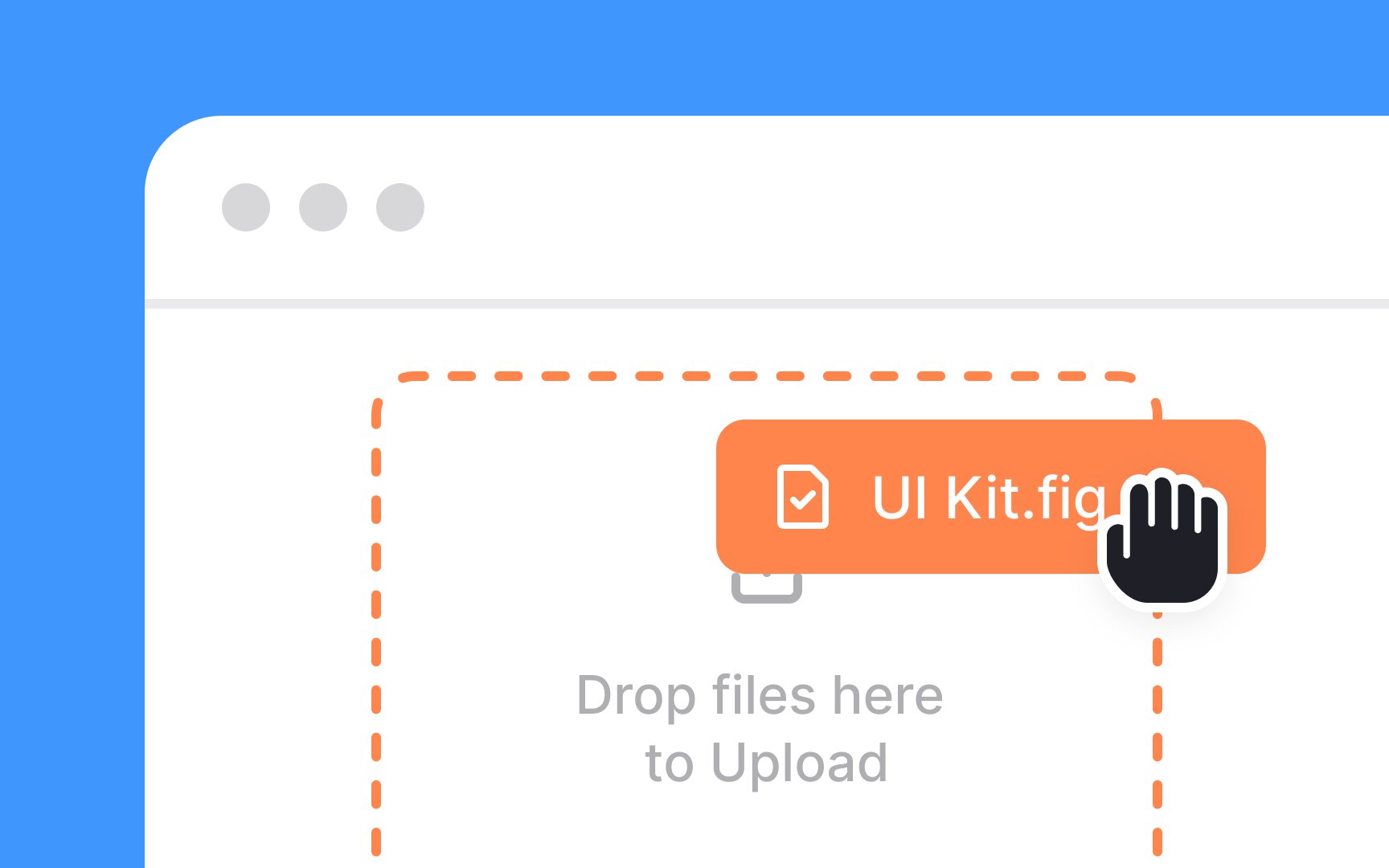
For instance, when you drag a file over a designated drop zone for uploading, or pull an object into a toolbar to create a shortcut, the grab cursor usually appears. It clues users into the fact that dragging the item won't just move it; it will also trigger additional actions or property changes. So when the task involves more than mere repositioning, opt for the grab cursor to provide a clearer hint to your users.
The crosshair
The crosshair cursor signals to users that a high level of accuracy is needed for the task at hand. It eliminates guesswork and elevates precision, guiding users to focus on alignment and exact positioning.
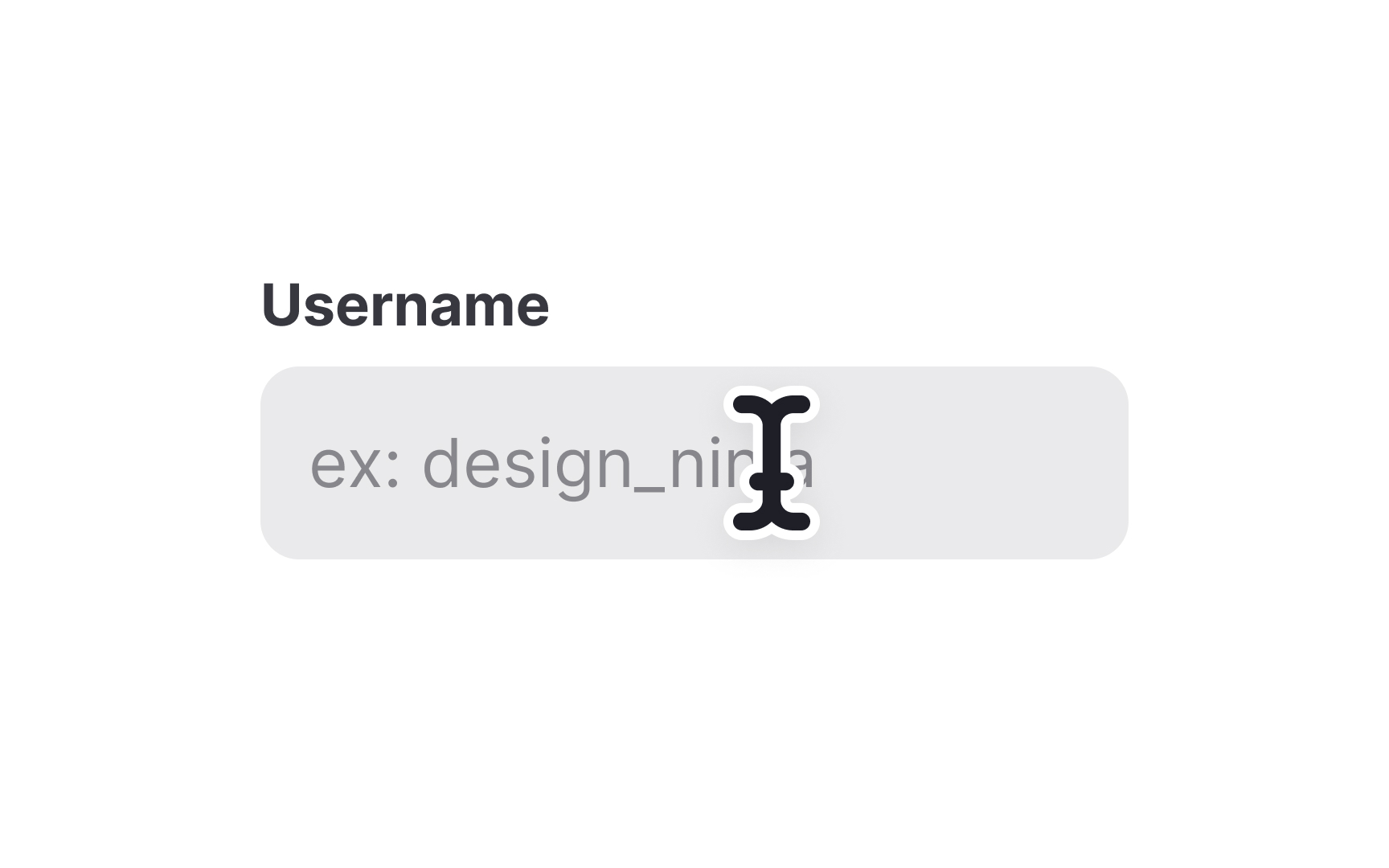
When you're dealing with text elements that need editing or selecting, the text
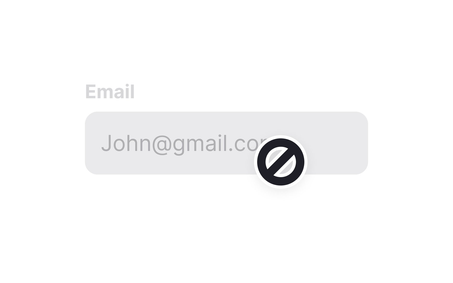
The not-allowed
Top contributors


Topics
From Course

Share


Similar lessons

Common UI Component Definitions I

Image Terminology
