Intro to Typography
Discover the power of typefaces and fonts to enhance readability and evoke emotional impact
We interact with typefaces and fonts on a near-continuous basis—you’re interacting with both right now. Understanding the terminology around typography is an important part of communicating about UX design.
It’s useful to have a thorough understanding of how typographic concepts work in relation to UX design. Choosing the right typefaces and fonts and implementing them properly can have a huge impact on readability and emotional impact. The wrong typographic choices have a detrimental effect on user experience.
People often use the terms "
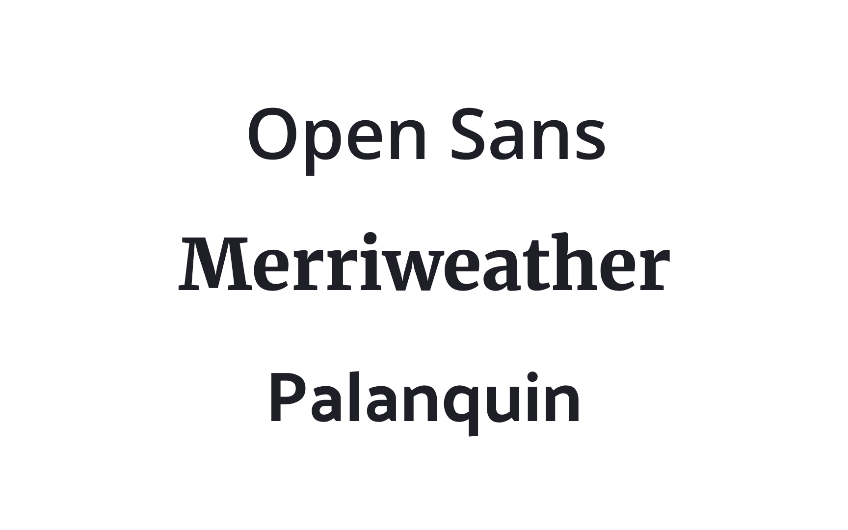
Understanding the varieties of typefaces available, the moods they can create, and what they’re each suitable for is key to using type effectively to create exceptional user experiences.
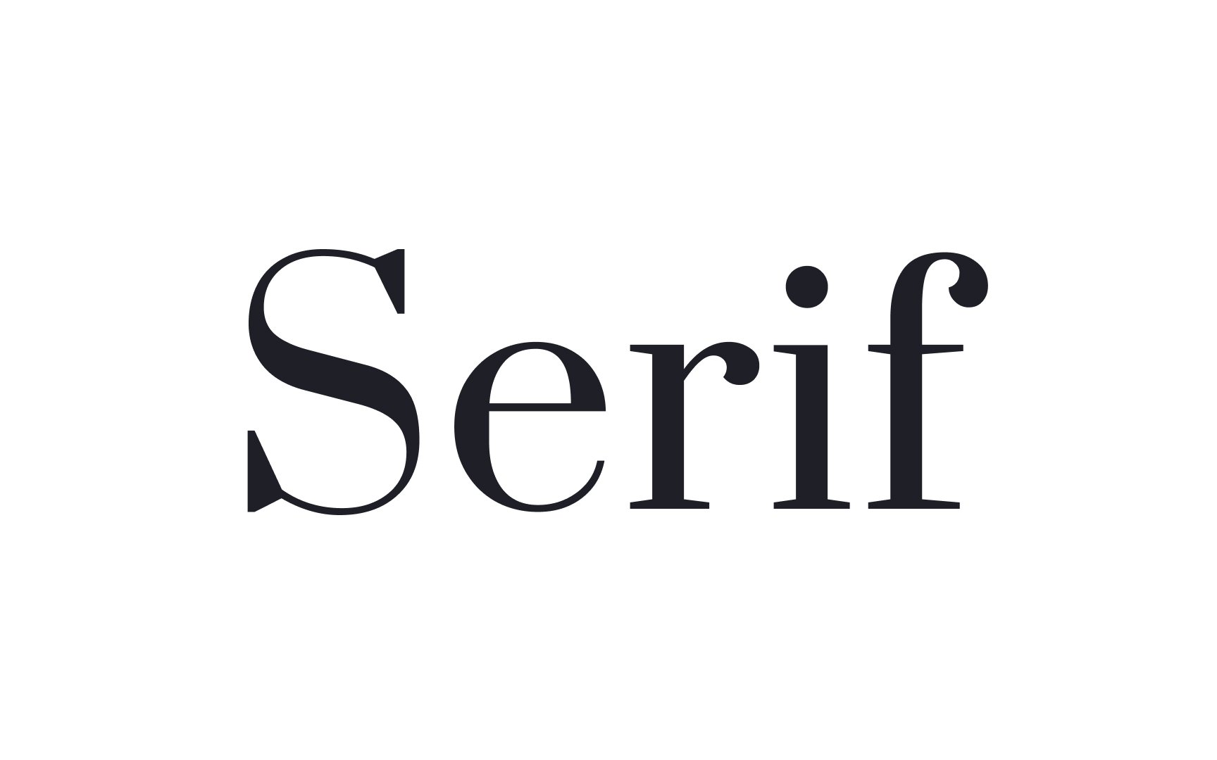
Serif
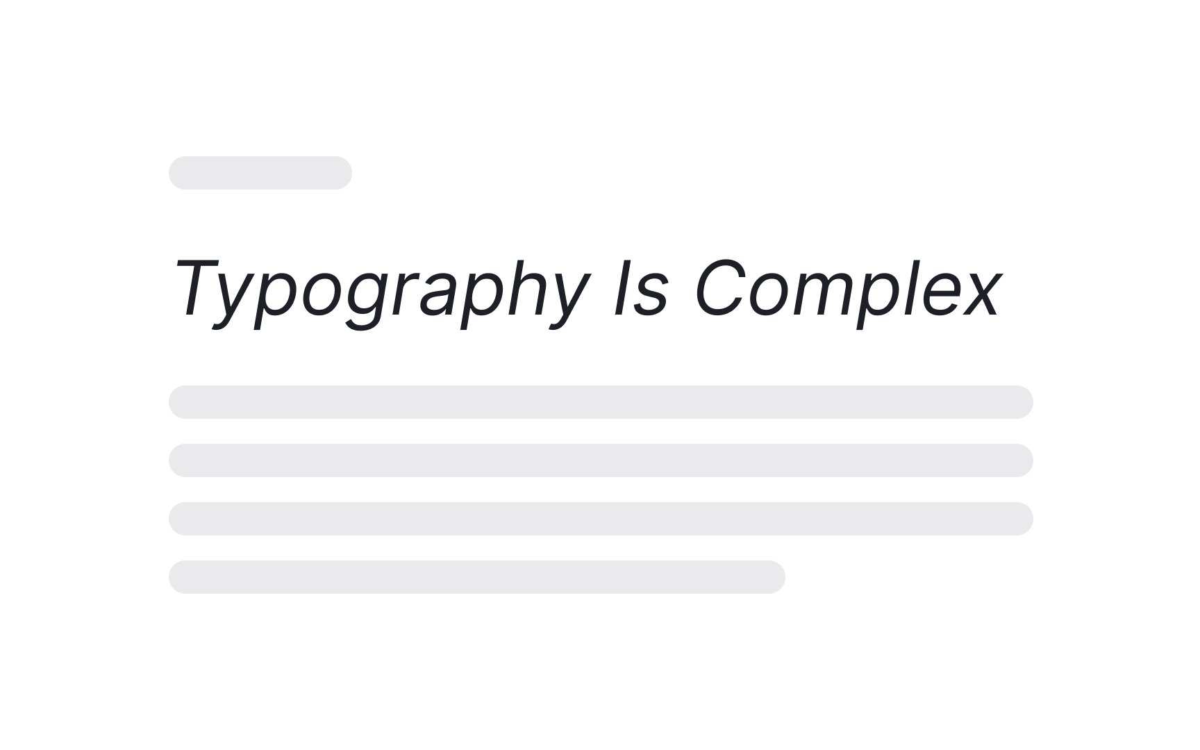
Serifs are very traditional and were originally popularized by early print magazines. Because of their rich history and long-standing usage, they can give users a feeling of class, romance, and sophistication. They’re excellent for a product or brand that wants to create a trustworthy, reliable, and even formal image.
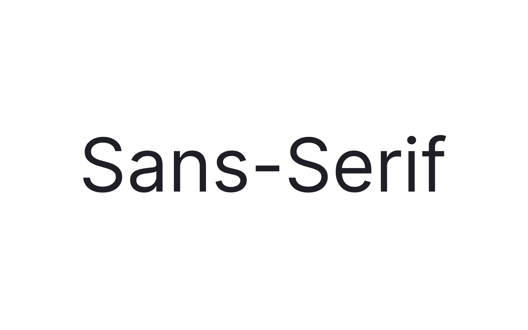
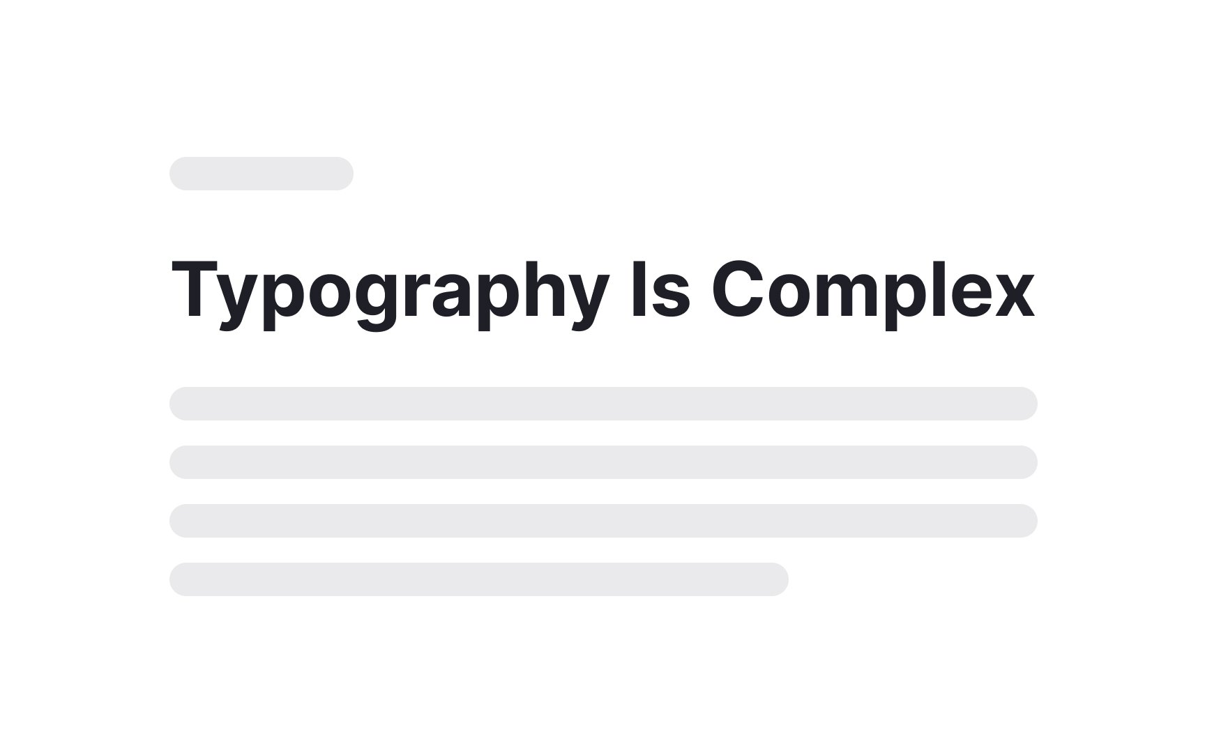
Sans-serif typefaces are, quite literally, without serifs. This means they do not include decorative strokes at the ends of the letters. While they come across as quite modern, the first sans-serif
The most popular sans-serifs are Arial, Helvetica, and Tahoma, which are compatible with almost any device — although some might say they lack personality.
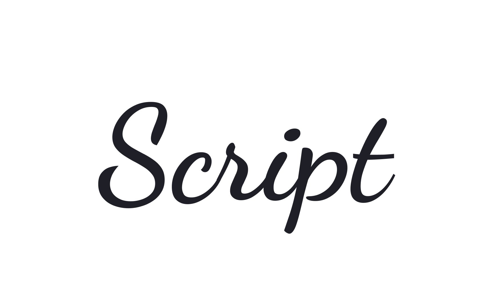
Script
Many script typefaces can be challenging to read, made worse by the fact that many schools don't teach cursive anymore. That's why they don't work well in large blocks of text or at small sizes.
Pro Tip: Consider using script typefaces for headlines, titles, and logos. They can evoke anything from a laid-back vibe to a very formal feeling.
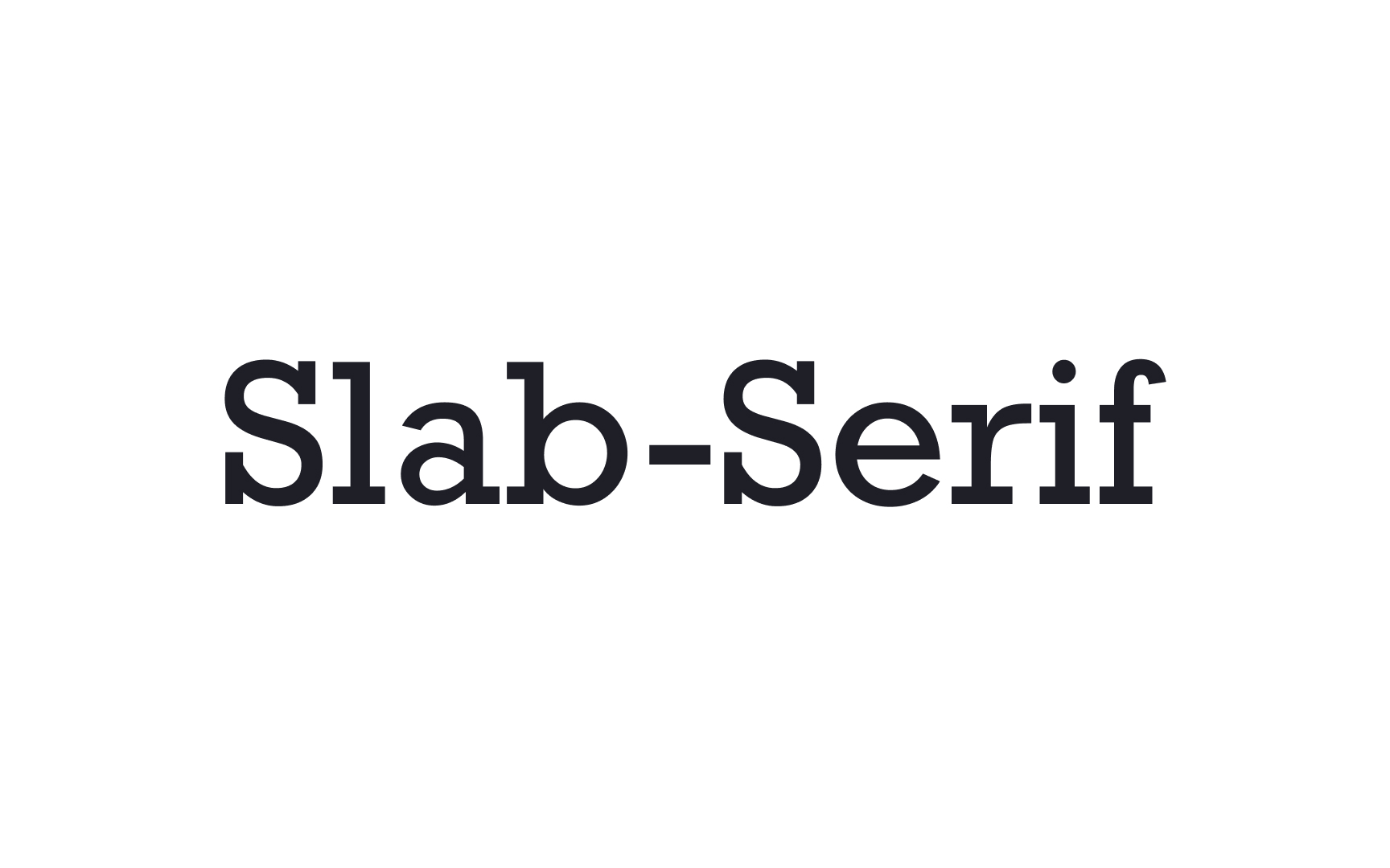
Slab serif
One downside of slab serifs is that they can be difficult to pair with other typefaces due to their heavy, block-like forms, which may overpower surrounding text. They are also generally best suited for shorter text, such as headlines or titles.

Display
Display typefaces are characterized by their unique and distinctive design, tailored to grab attention and convey a specific mood or message. In modern

Letters in monospaced
Monospaced typefaces are easier to scan than proportional typefaces. They're often used for things like code because they can make it easier to spot mistakes. But overall, they have lower readability than proportional typefaces.
Common monospaced typefaces include Courier, Courier New, Apercu Mono, or Space Mono.
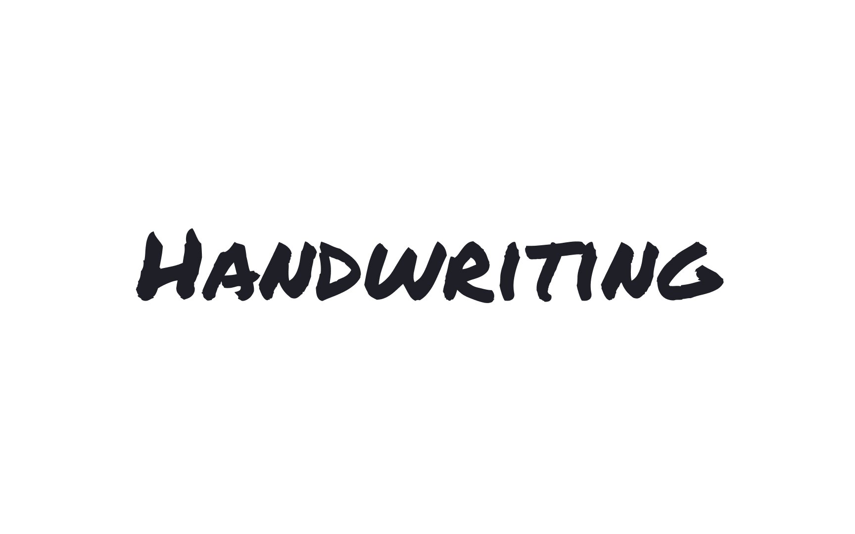
Similar to script typefaces, a handwriting
These typefaces grew in popularity in the mid-20th century, as phototypesetting techniques came on the market in the early 1950s.[4] They were largely used in advertising design through the 1970s.
A font is a specific implementation of a
For example, Helvetica Bold 12pt is a font (a specific style, size, and weight of the Helvetica typeface).
Early
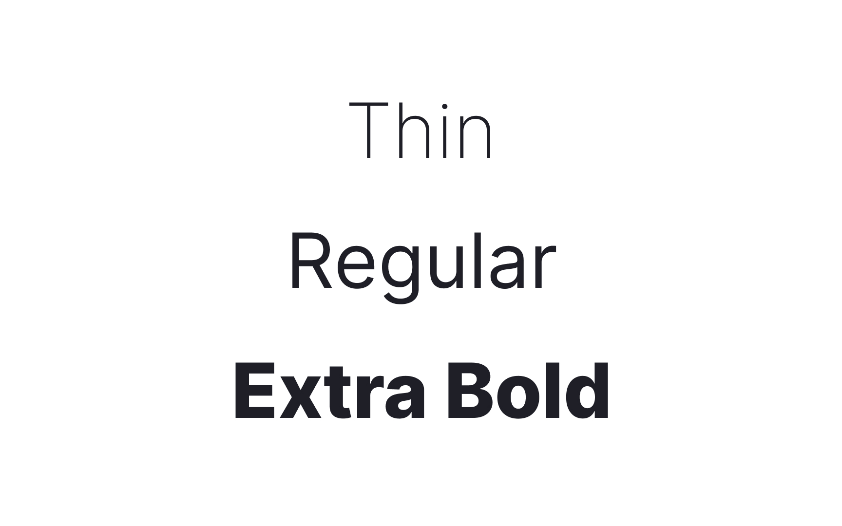
Font weight refers to the thickness of a stroke on a given
Pro Tip: Choose typefaces with different weights to help show hierarchy, emphasis, and contrast in your design.
There are diverse font variations that lend distinct emphasis and character to text. Out of them, the most common ones include:
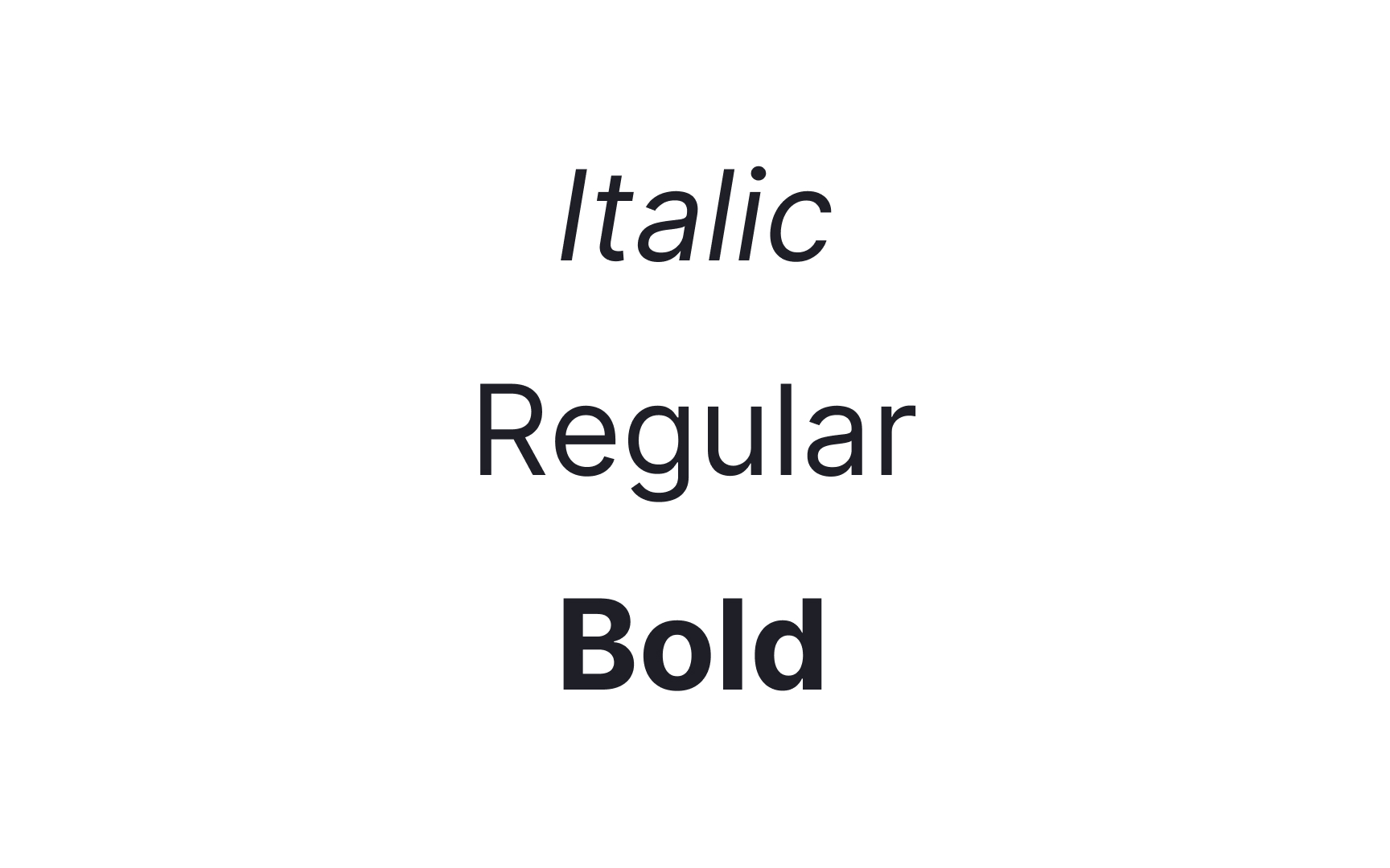
- Regular fonts: These are the most emotionally neutral
fonts and are generally the default for mosttypefaces . They're in between thin and bold fonts, making them suitable for large text passages that require a lot of reading. - Bold fonts: These are characterized by their thicker strokes, creating emphasis and highlighting important information. They are often used for headings, subheadings, and key phrases to grab attention.
- Italic fonts: These fonts lean slightly to the right, adding a sense of style and differentiation to the text. They can convey emphasis, provide a distinctive look, or indicate foreign words or titles.
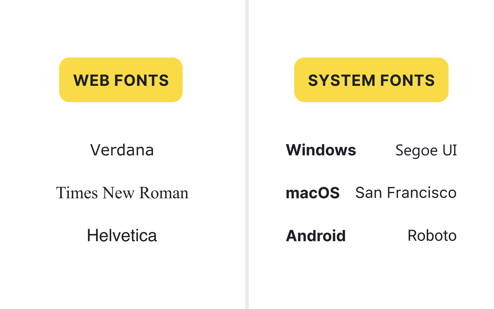
System or desktop
The advantages of system fonts include:
- Faster loading
- No need for access to external resources to load a font
- No need to add any
CSS tweaks to make fonts look right for certain browsers because they're already on most devices.[5]
Web fonts, on the other hand, are loaded from the web and used in websites. They are applied through a simple CSS rule called @font-face. Web fonts often come in formats like WOFF, EOT, or SVG, which are designed to work well in browsers.
Web fonts allow designers to create a richer, more custom look for a webpage, but they can slow down loading times and require some CSS setup.[6]
References
- Nicolas Jenson | French printer | Encyclopedia Britannica
- Display type – Fonts Knowledge - Google Fonts | Google Fonts
- Using web fonts – Fonts Knowledge - Google Fonts | Google Fonts
Top contributors


Topics
From Course

Share


Similar lessons

Typographic Terms

Elements of Typography
