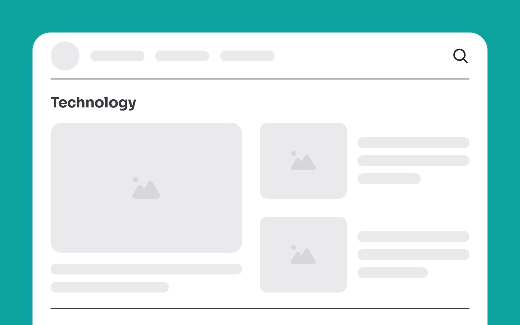
Intro to UI Dividers
Explore the different types of visual dividers in UI and where to use them effectively
Dividers are used to separate different elements in groups of content. They help create a clear visual hierarchy and improve the overall user experience by making it easier for users to understand and navigate the interface.
Color, white space, images, lines, and shadows are all great examples of dividers. But which one should you use? The choice of divider depends on the overall design aesthetic you're going for and the specific goals of the UI.

Horizontal
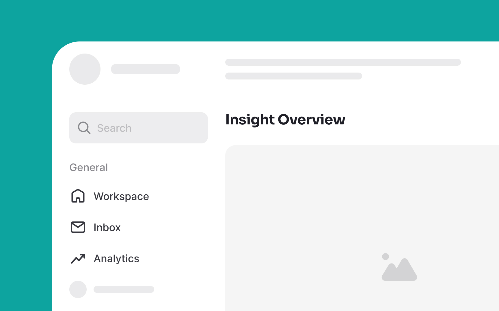
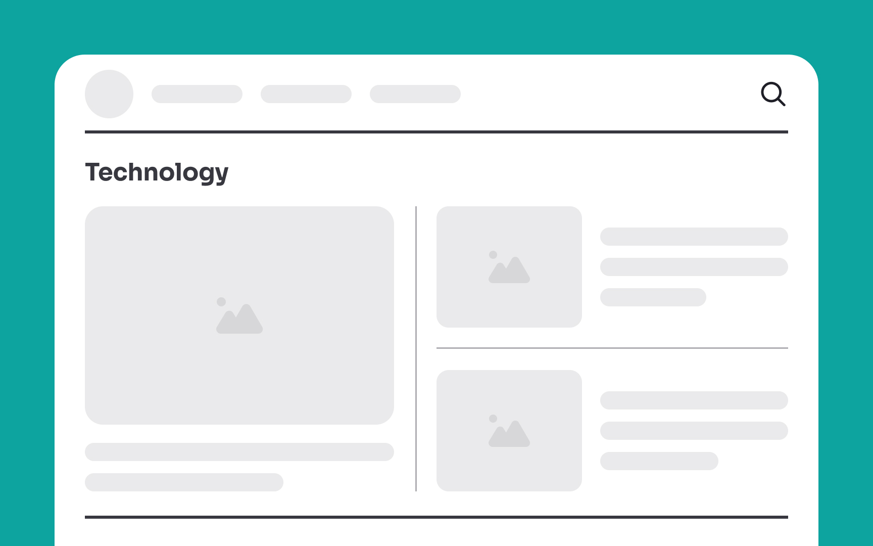
- Full-bleed dividers: These lines extend from one end of the container to the other, creating a clear and bold separation. They offer a dramatic and decisive visual break between content blocks or sections, making the separation highly noticeable. You can use full-bleed dividers to separate different content groups or even interactive and non-interactive sections of an interface.
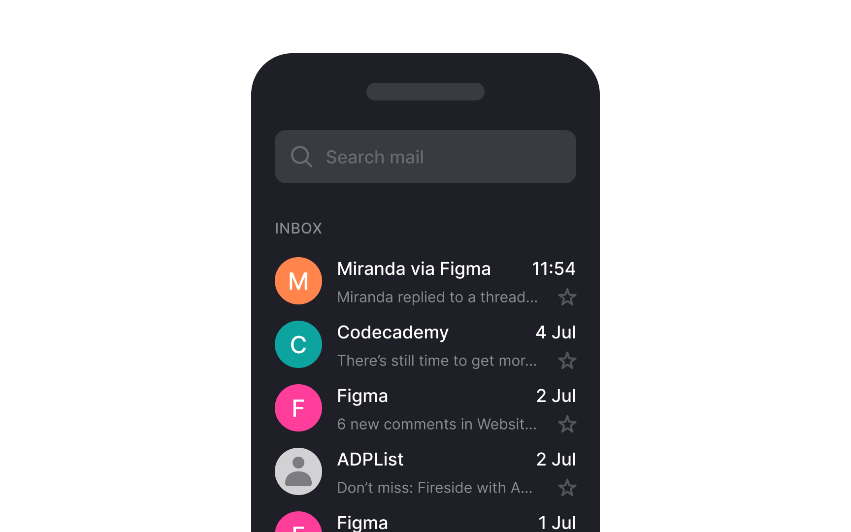
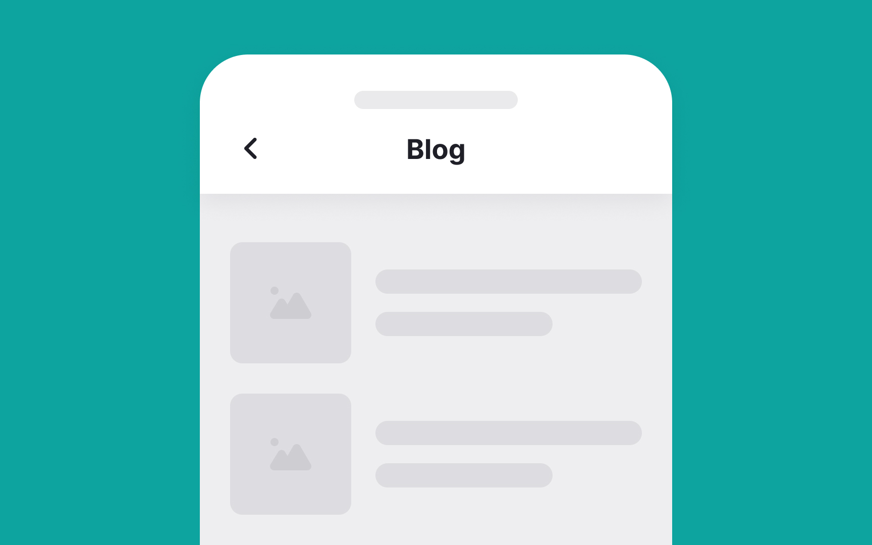
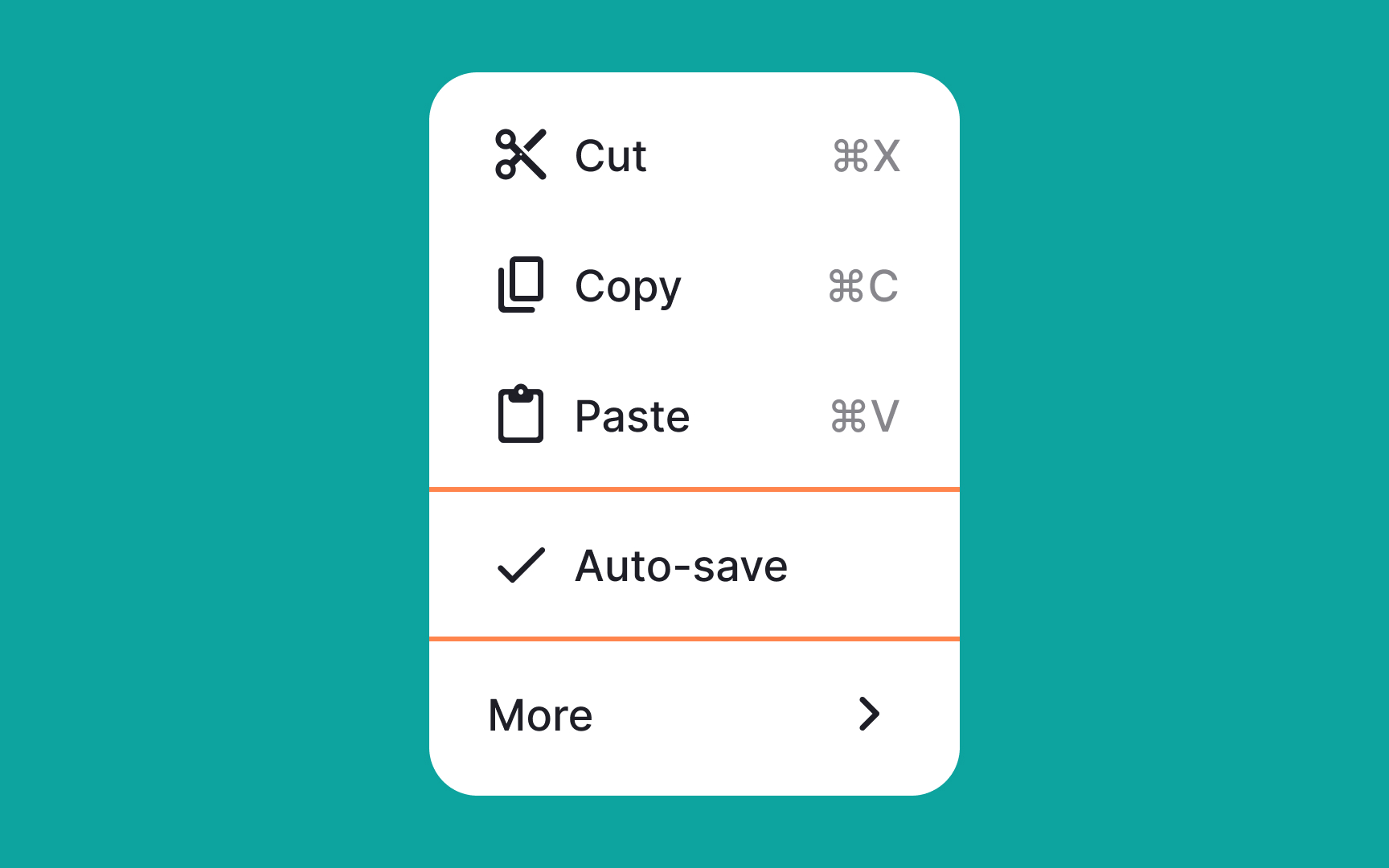
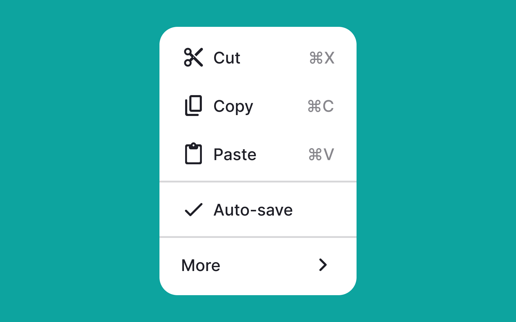
- Inset dividers: These lines are set within the boundaries of the content, rather than extending to the edges of the container. They provide a more subtle separation, maintaining a clean and organized appearance without a strong visual impact. They are most suitable for separating related content within a list, such as emails in an inbox. Always use them along with visual anchors like icons.[1]
Pro Tip: Combine full-bleed and inset dividers to establish a hierarchy of information within the interface.
Vertical line
Adjust the width of these dividers for a subtle or bold impact, but be sure to keep it consistent across your interface. You can also add a subtle indicator such as a small word positioned in the middle of the line to further enhance the differentiation. For example, you can use the word “or” in the middle of a vertical line separating a sign-up and login form.

The proximity principle suggests that elements close to each other are perceived as a cohesive group, making judicious use of negative space effective in creating distinct
Moreover, you can embrace asymmetry, allowing negative space to guide users' focus and provide a sense of balance. Use varying amounts of negative space to emphasize important elements.

For a subtle separation, use a slightly darker or lighter shade than the background color. Alternatively, for a more dramatic effect, employ contrasting colors, such as pairing dark elements with a light background or vice versa. This not only acts as a divider but also adds visual interest to the content you want to emphasize.

Shadow
You can also apply shadows strategically to separate
Pro Tip: Ensure that the shadow's contrast with the background is sufficient for visibility while maintaining a balance to avoid a cluttered or distracting appearance.
For example, in a blog layout, use subtle 1px lines between paragraphs for a clean reading experience. You can use bold 2px lines to more distinctly separate different sections on a landing page. Just keep in mind that the goal is to make dividers noticeable enough for users to navigate effortlessly but not so attention-grabbing that they overshadow the content.
When designing a
Instead, strategically using
References
- Divider – Material Design 3 | Material Design
- Visual Dividers in Mobile UI Design | Medium
Top contributors

Topics
From Course

Share


Similar lessons

Common UI Component Definitions I

Image Terminology
