The Nature of User Errors
Explore the nature of user errors and learn how to prevent them during system interactions
Understanding that to err is human is crucial for designers aiming to create user-friendly interfaces. Errors in user interactions are often not a sign of user failure but indications of design that could be improved. According to Don Norman, user errors fall into two main categories: slips and mistakes.[1]
Slips happen during routine activities when users are usually on autopilot, like accidentally typing a password known by heart into a username field. Mistakes, on the other hand, occur when there’s a fundamental misunderstanding of how things work, such as users trying to drag and drop a file into an application that only supports uploads via a file selection dialog. In this lesson, you’ll learn how to acknowledge that errors are natural and create interfaces that are more error-proof and user-friendly.
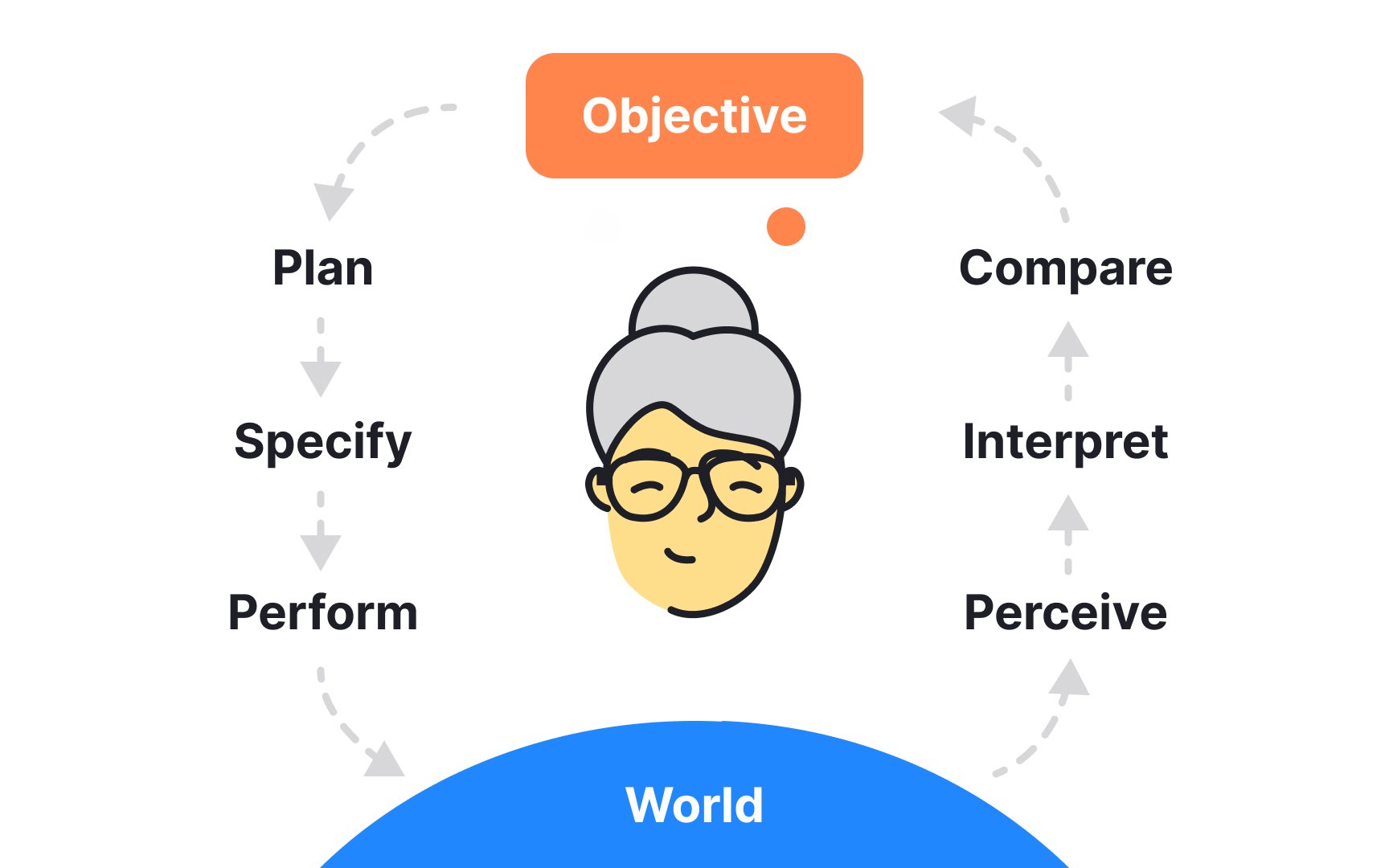
The gulfs of evaluation and execution are critical concepts in understanding how users interact with technology:
- The gulf of evaluation is the challenge users face in understanding the system's current state. For example, consider users interacting with a modern smart thermostat. If the thermostat’s display and menus are not intuitively designed, users may struggle to evaluate its current settings.
- The gulf of execution is the difficulty in performing actions to achieve desired outcomes. For example, users may find it difficult to figure out how to adjust the temperature to their comfort level.
Both gulfs represent the distance between the goals of users and what they can actually accomplish with the system. These gulfs can lead to a frustrating cycle of actions and evaluations as users attempt to align the system with their goals. Effectively bridging these gulfs in design enhances usability, making technology more accessible and satisfying to use.

Mistakes in user
Assuming that users will just learn to understand a complex system is not a good strategy. If a system is too hard to use, people are likely to give up and go somewhere else. That’s why it’s crucial to align the design with what users already know and expect, helping to prevent mistakes and improve overall satisfaction.

Discovering gaps between users' mental models and designers' mental models is crucial for creating intuitive interfaces and avoiding user mistakes. This process involves collecting user data through various research methods tailored to different stages of design development.
- Early design stages: Methods like contextual inquiry, field studies, and ethnographic studies involve observing and interacting with users in their natural environment. These approaches provide deep insights into their behaviors, expectations, and how they think a system should work. This can reveal crucial information about what users naturally expect from the product, helping to align the design more closely with these expectations.
- Later design stages: Once a prototype or system is in place, qualitative usability testing becomes key. This type of testing allows designers to watch users interact with the product in real-time, noting where they struggle or make
errors . This direct observation helps identify where the product's design does not match the user's understanding or expectations.
Slips are
Slips generally happen when users are not fully focused on the task, typically operating on autopilot. They frequently occur with experienced users who are very familiar with a task's processes, i.e., they understand the goal and the steps involved but occasionally take a wrong step due to a lapse in attention.
Conversely, mistakes occur when users have a misunderstanding about how to perform a task or implement it wrongly, often seen with newer users still learning a system’s functions.
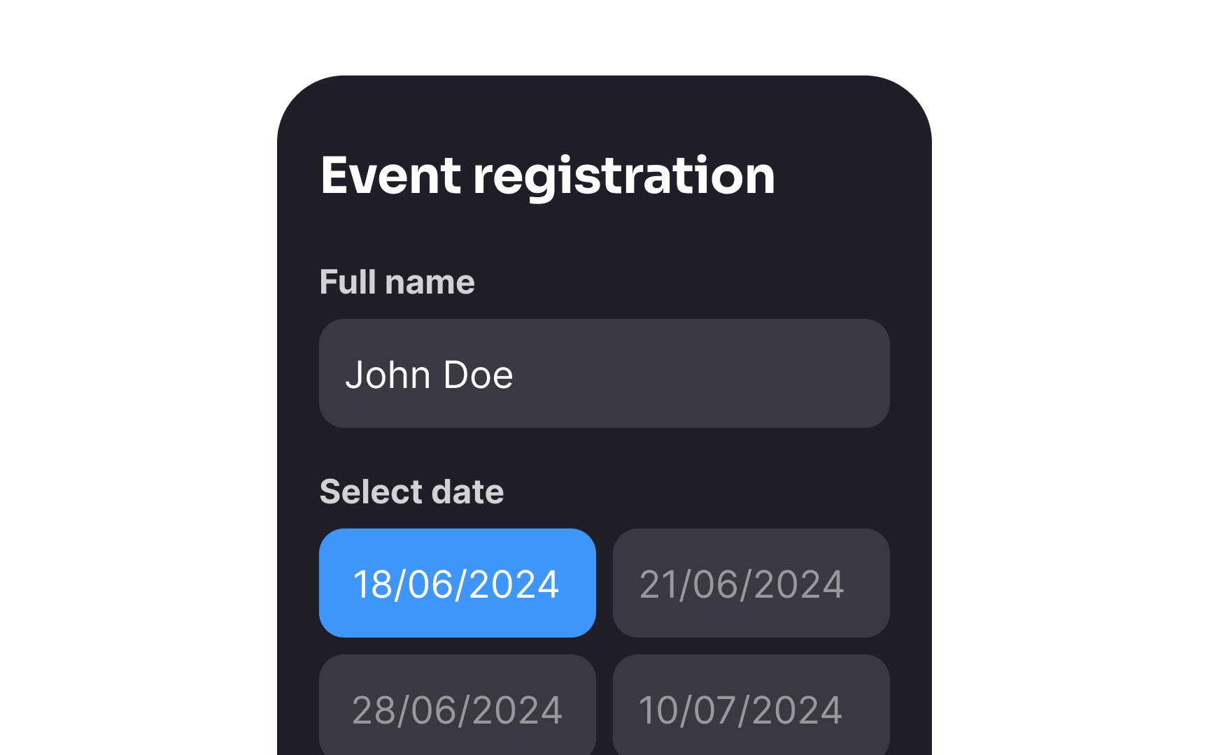
Constraints in user interfaces serve as effective tools to prevent slips by ensuring users can only make choices that are valid and intended. This helps prevent
Constraints guide users smoothly through tasks, preventing mistakes and making
Suggestions from a system can significantly reduce slips by guiding users toward correct actions before
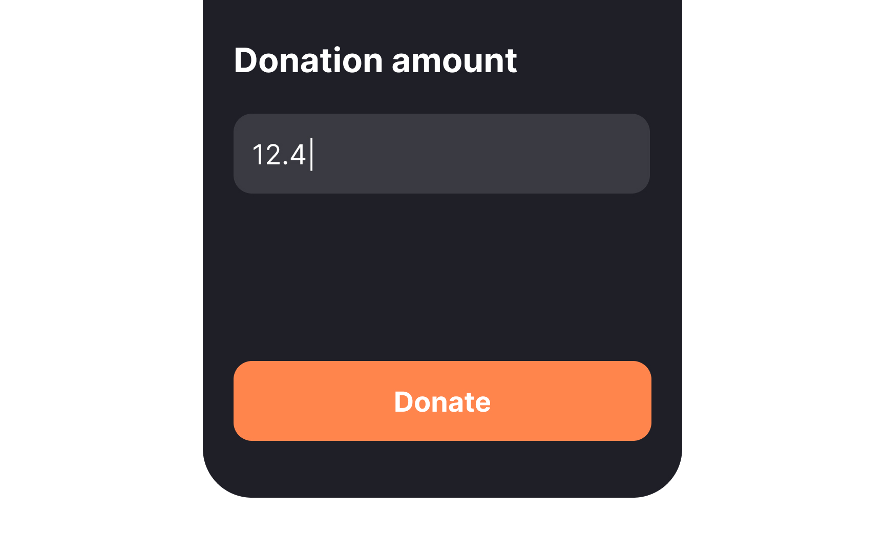
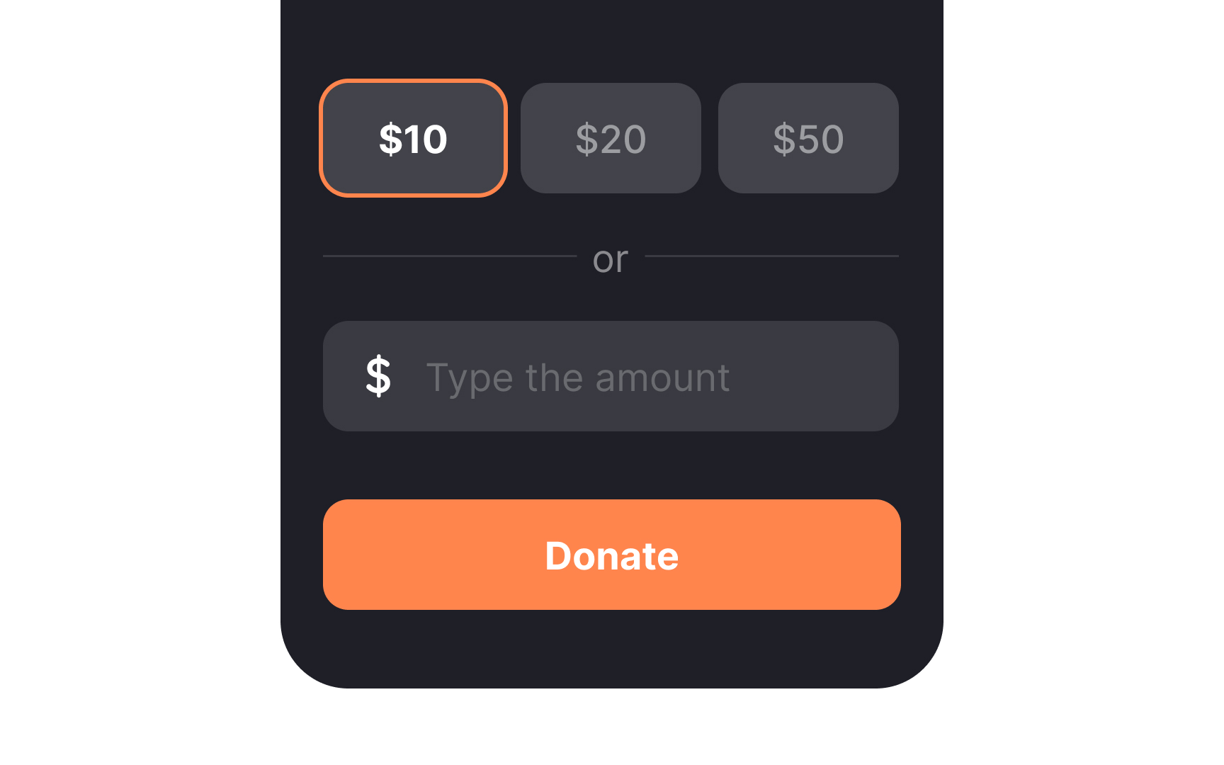
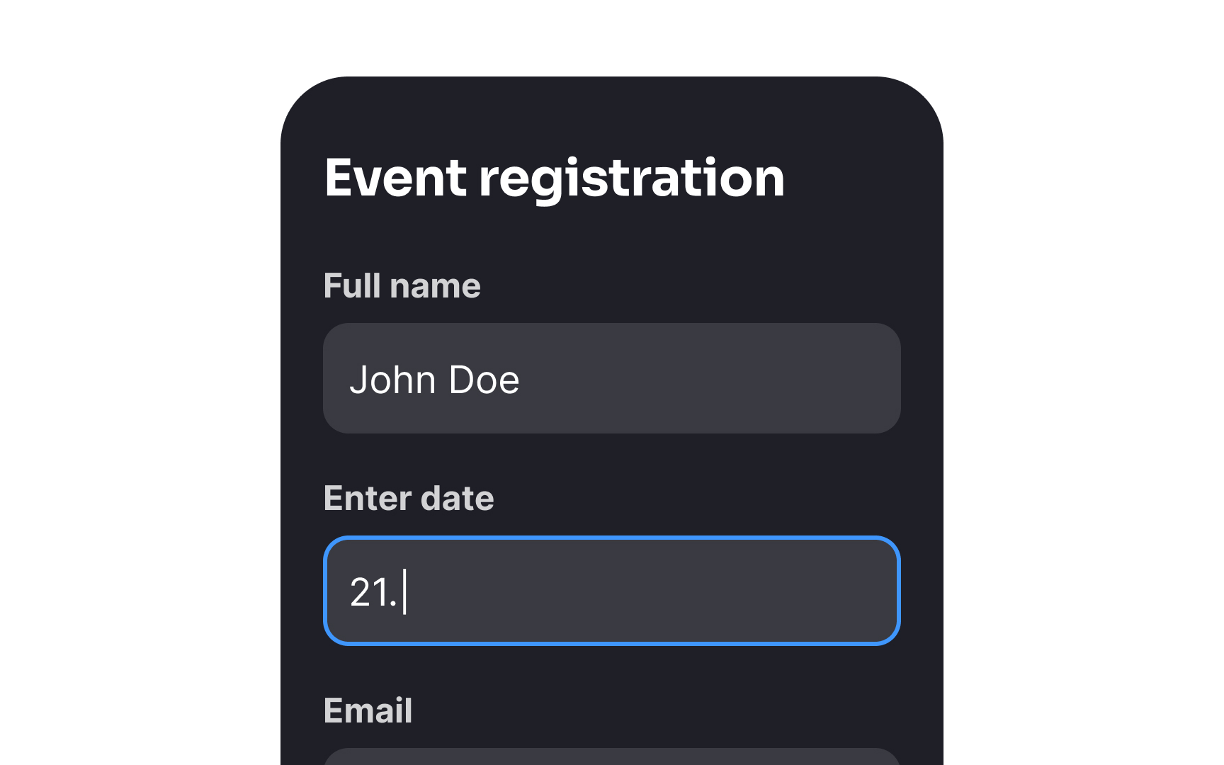
Good defaults play a crucial role in preventing slips by setting reasonable initial values that guide users toward correct selections. This not only facilitates a smoother
However, it's crucial to avoid using defaults as a dark pattern where choices are set to lead users into making decisions that benefit the service provider more than users, such as opting into

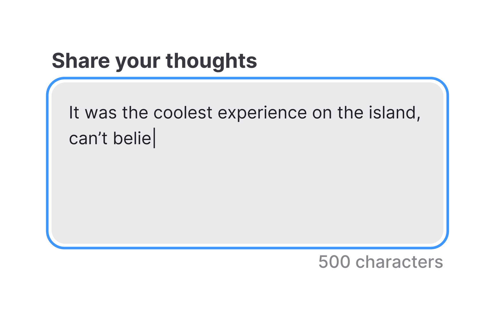
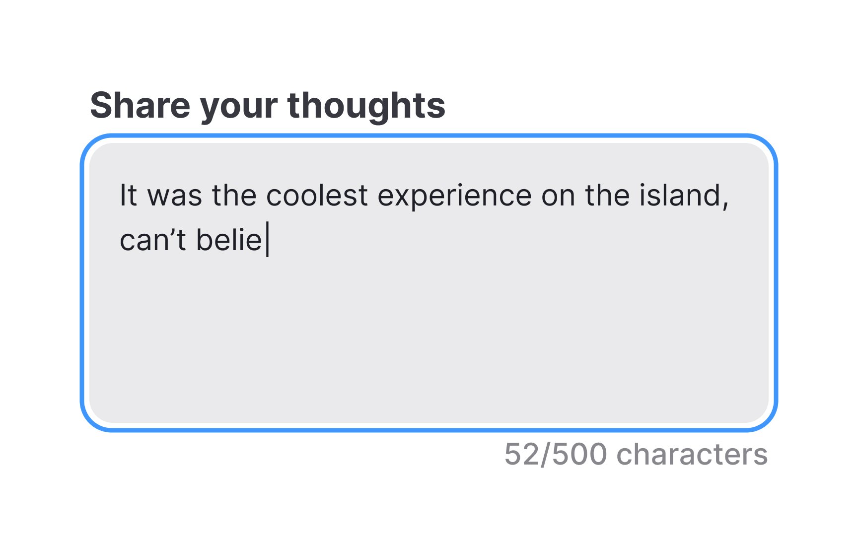
Reducing the memory burden to prevent slips and mistakes involves minimizing the amount of information users must remember while completing tasks. This approach is especially helpful in environments where distractions or multitasking are common.
Even if users are interrupted, they can quickly and accurately resume their tasks, making the
By continuously displaying this information, the system helps users verify their choices at each step without relying solely on memory.
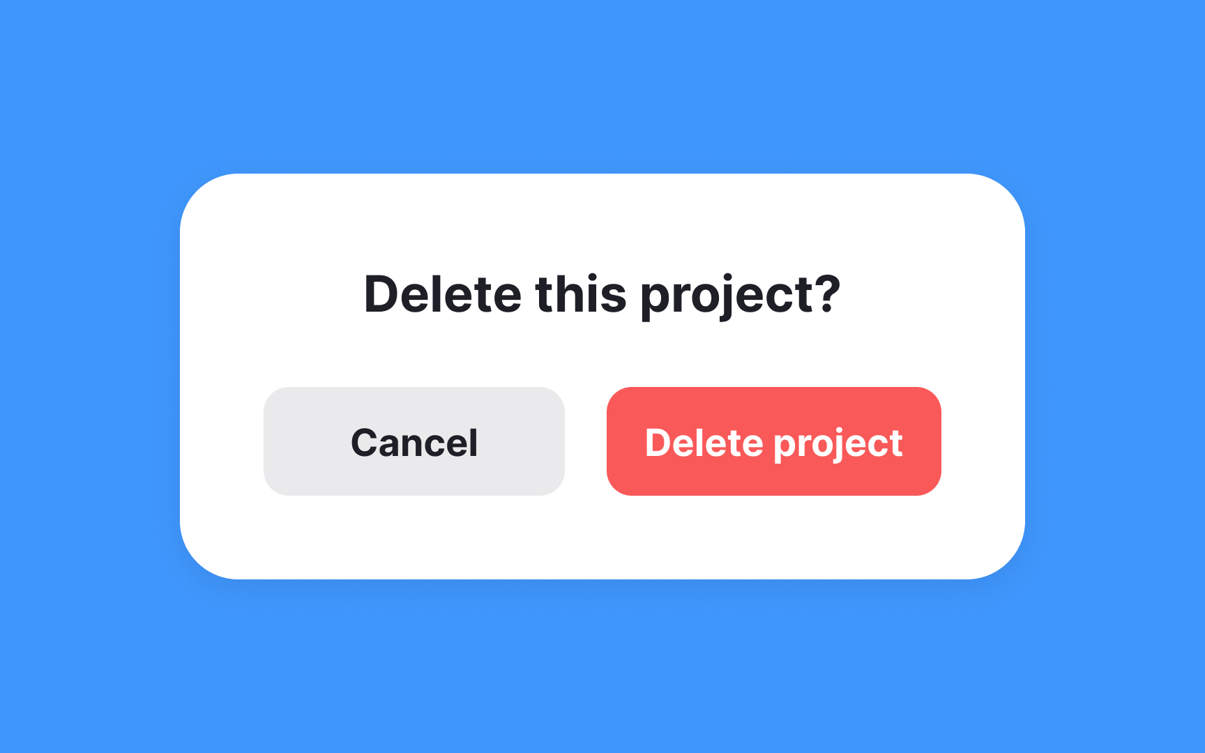
Confirmation
However, it's important to use confirmation dialogs judiciously. Overuse can lead to dialog fatigue, where users become so accustomed to dismissing confirmation dialogs that they no longer pay attention to the content, potentially leading to the very
Don't place the confirmation button in the same spot as the initial trigger button that triggered it. For example, if a user clicks "Delete" in the top-right corner, the "Confirm delete" shouldn't appear in that same position. Users in a hurry might accidentally double-click or tap twice in the same location, inadvertently confirming an action they meant to reconsider. By spatially displacing the confirmation (perhaps centering the dialog with buttons in a different location) and introducing a brief temporal buffer, you create a more deliberate decision-making moment that better protects against accidental data loss.
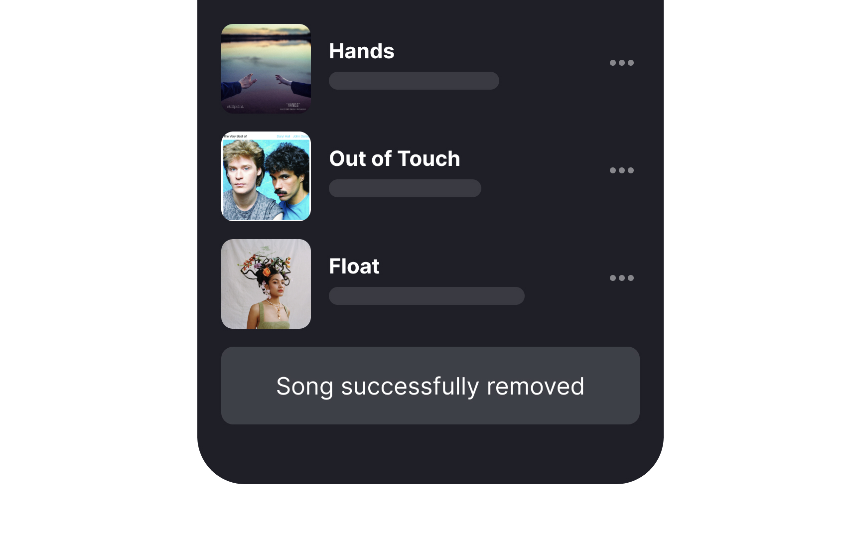
The “Undo” option in user interfaces allows users to easily reverse actions and acts as a safety net, reducing the stress and consequences of
By incorporating this feature, you acknowledge that users are human and prone to errors, particularly when multitasking or working under pressure.
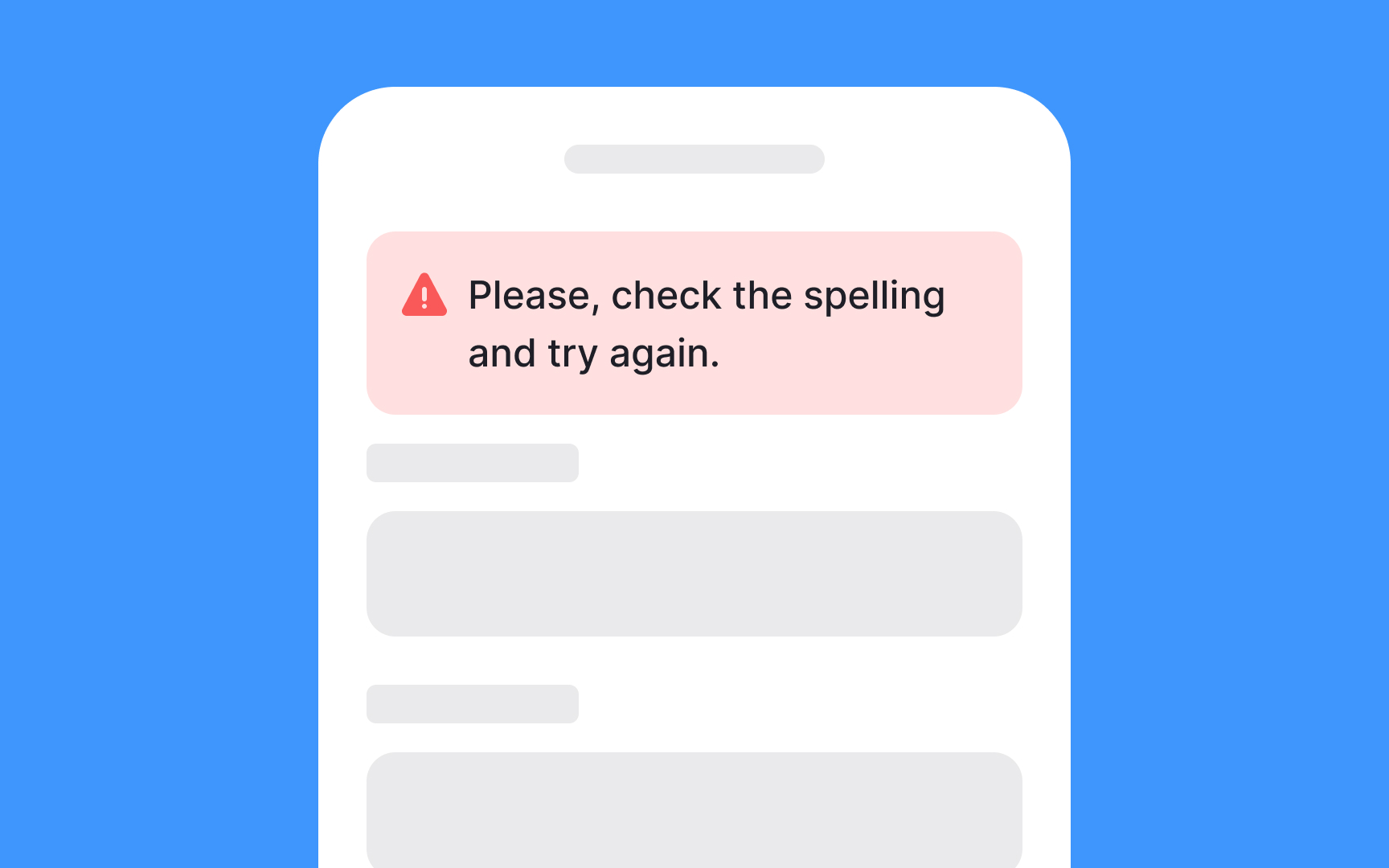
By offering contextual error warnings while users input data or make selections, systems can guide users toward correct actions without disrupting their workflow. This proactive approach to error management not only saves time but also improves user satisfaction by making
For more complex validations that may require extensive effort, such as
References
- Preventing User Errors: Avoiding Conscious Mistakes | Nielsen Norman Group
- Preventing User Errors: Avoiding Unconscious Slips | Nielsen Norman Group
Top contributors

Topics
From Course

Share


Similar lessons

Cognitive Biases

UX Laws
