How to Design Forms in UIs
Learn what goes into a form and why each element matters
Forms are how users sign up, check out, subscribe, and get in touch. They're everywhere, and they're often where experiences break down. A form that feels long, confusing, or cluttered pushes users away. One that flows smoothly keeps them moving toward completion. The difference comes down to structure: how labels relate to inputs, how elements are grouped, how much space sits between them, and how buttons guide users toward the next step. Understanding what a form is actually made of and why each piece matters makes it easier to spot problems and design forms that do their job without getting in the way.
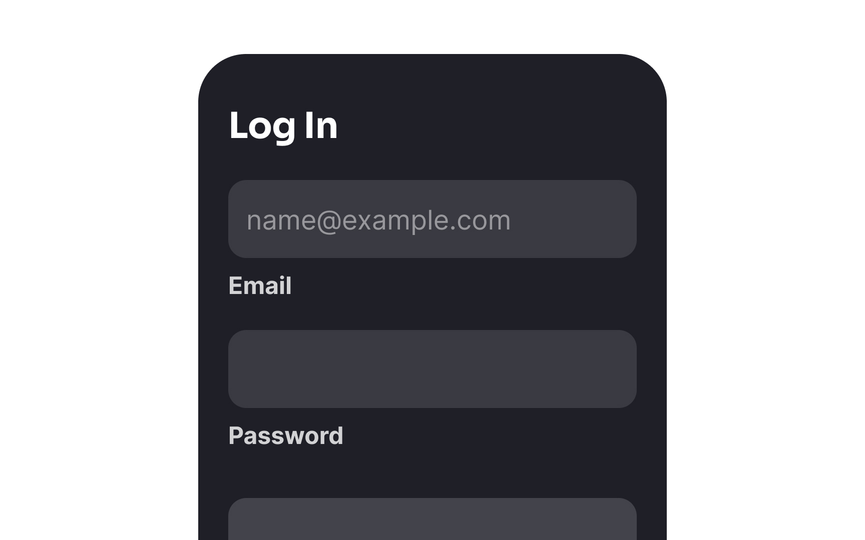
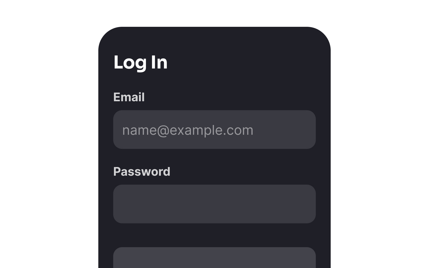
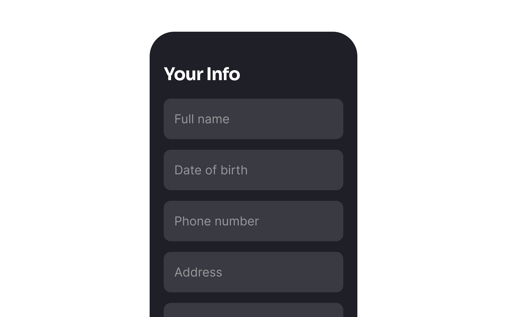
Label placement plays a key role in the usability of a form.
A simple, one-column alignment also makes it easier to transition forms to fit various screen sizes.[1] Extremely long desktop forms can have labels placed on the left side of each field to save space.
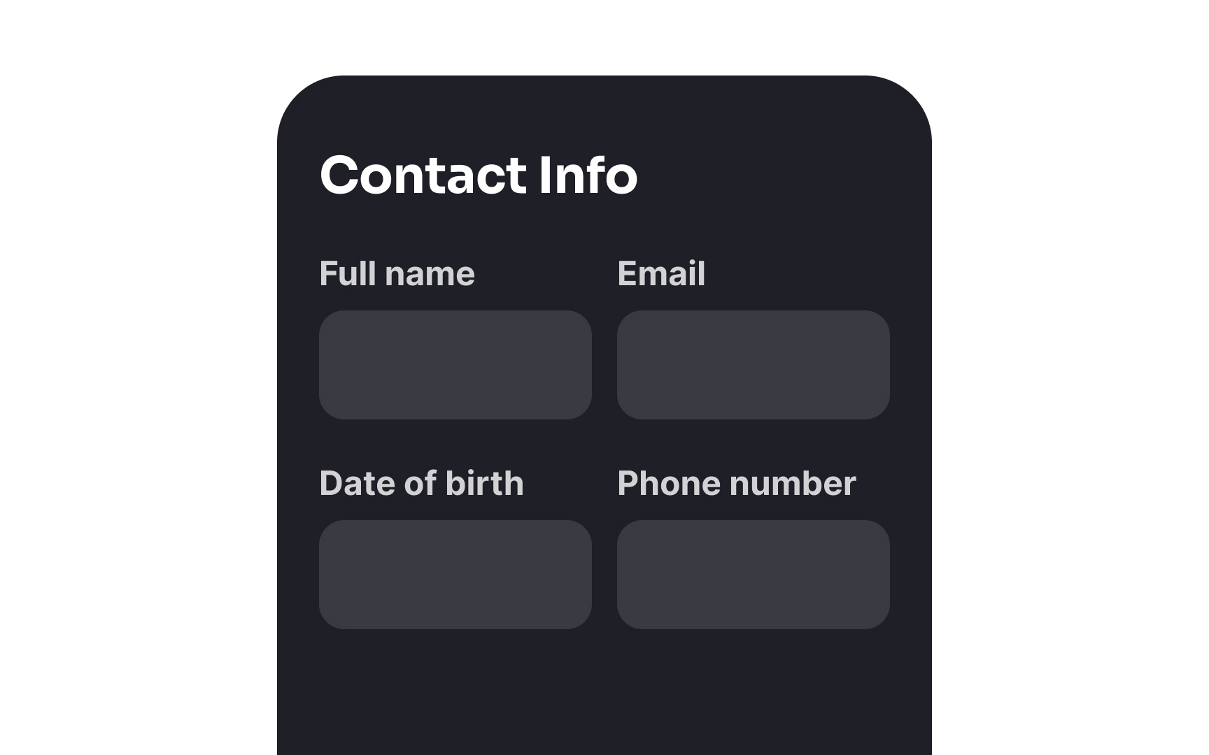
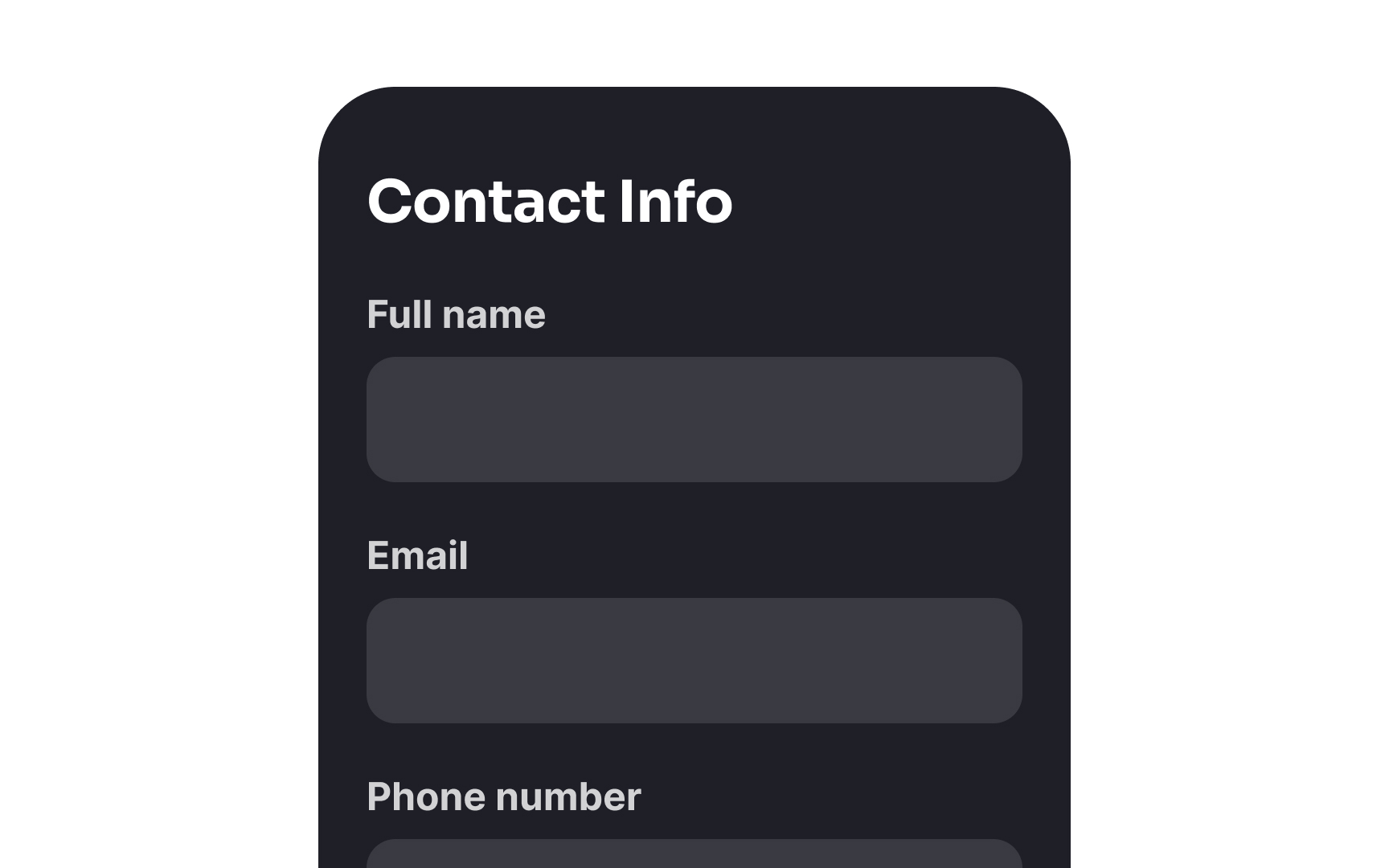
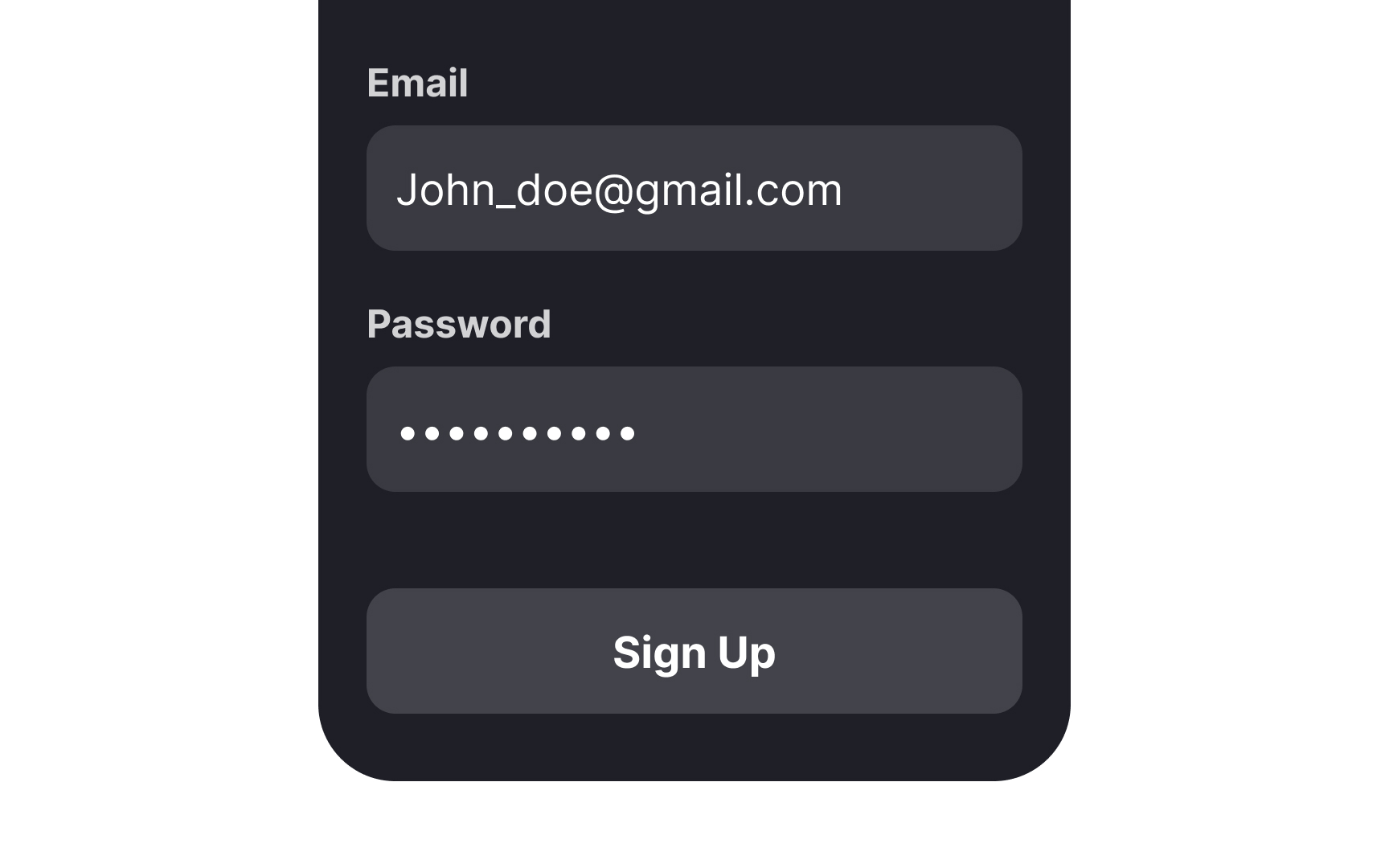
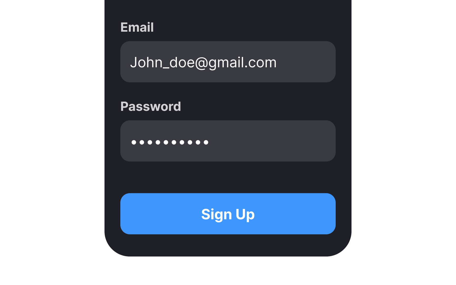
One-column form layouts have been shown to be considerably faster for users to complete when compared to multi-column forms. A study conducted by the Baymard Institute reveals that users are prone to skip
Multi-column forms slow users down because they have to jump back and forth between inputs, which can even cause them to lose track of their progress within the form. A single column flows naturally from top to bottom, easing the effort users must exert.
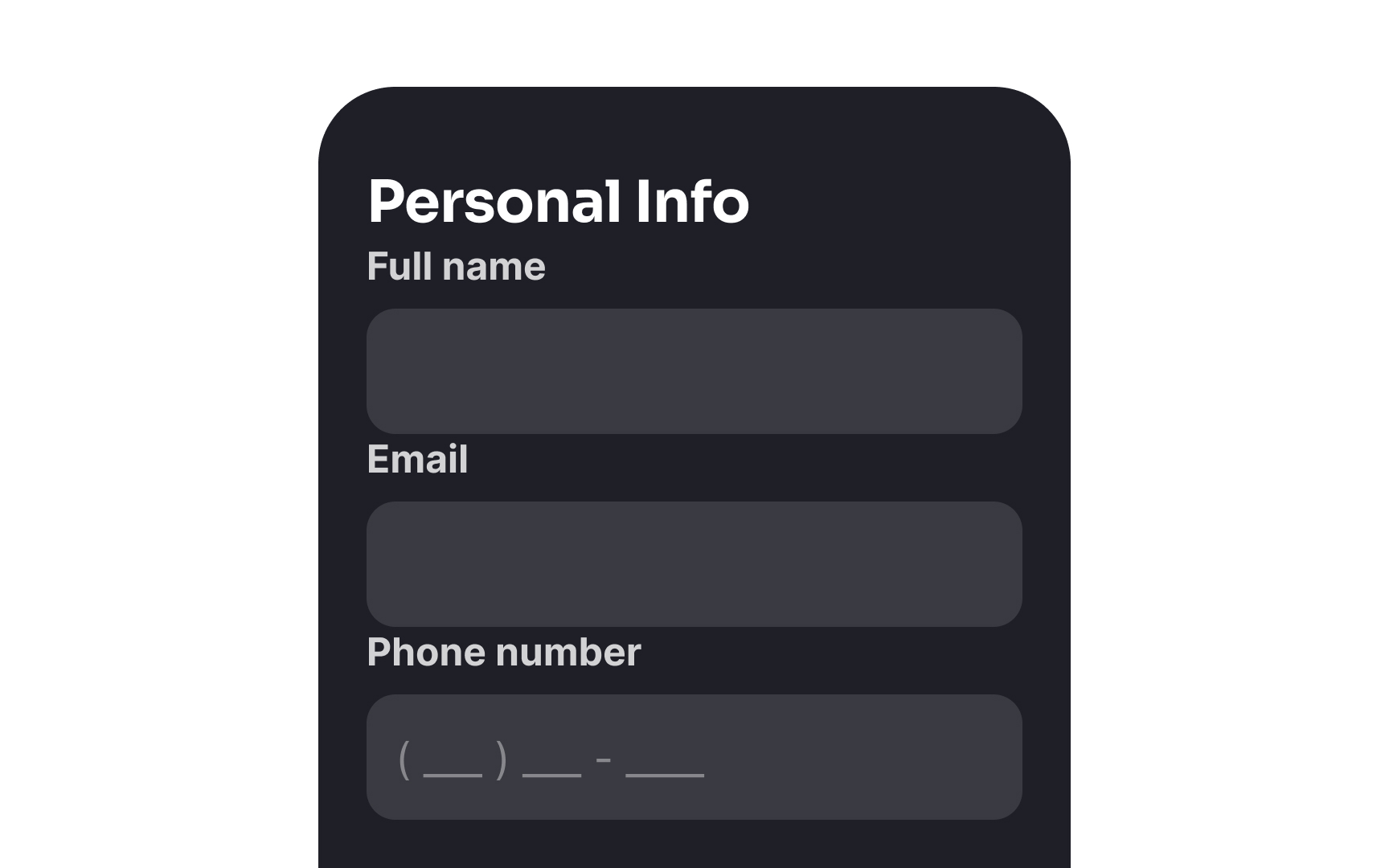
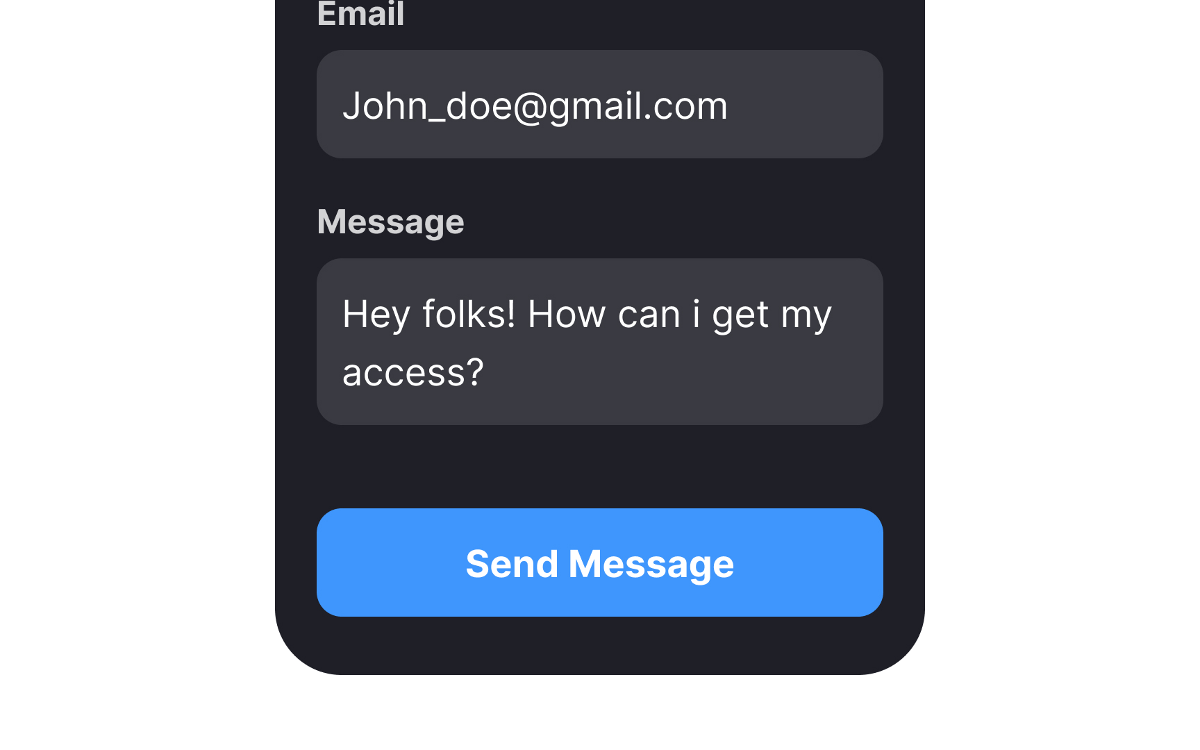
Pro Tip: Certain fields that users perceive as a coherent entity (like card number, expiration date, and CVV) can be placed in one row without confusing users.
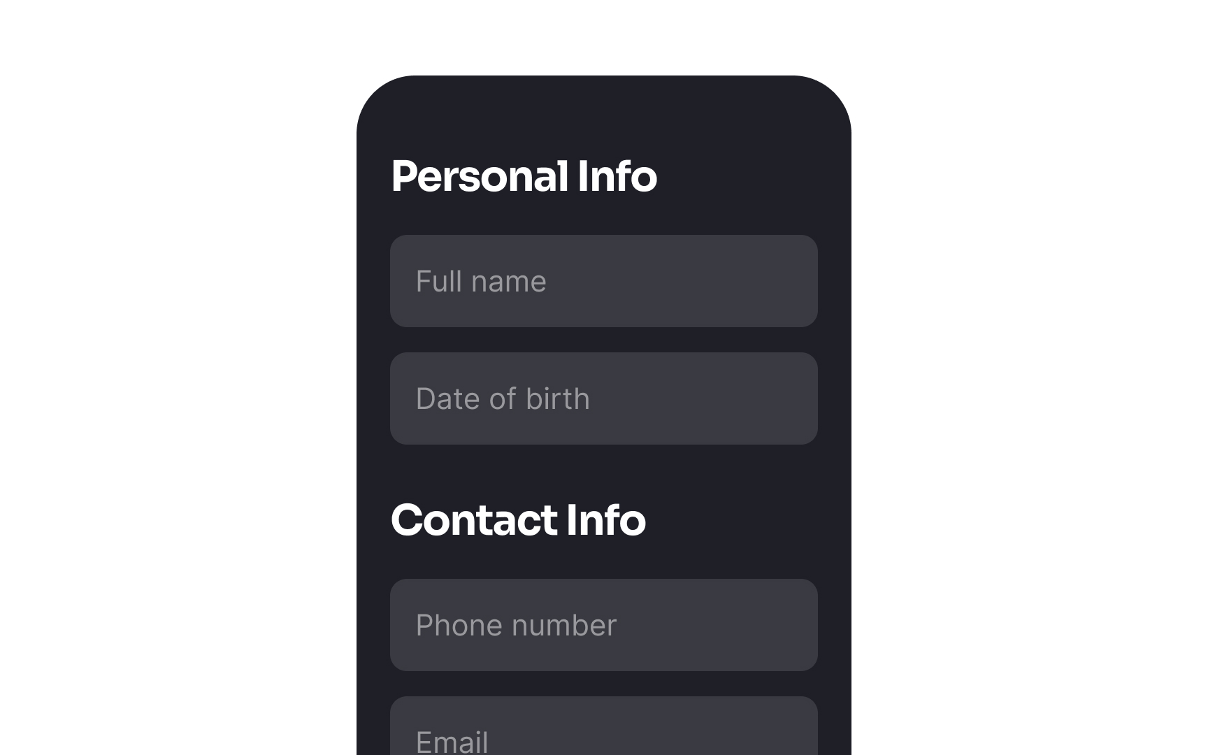
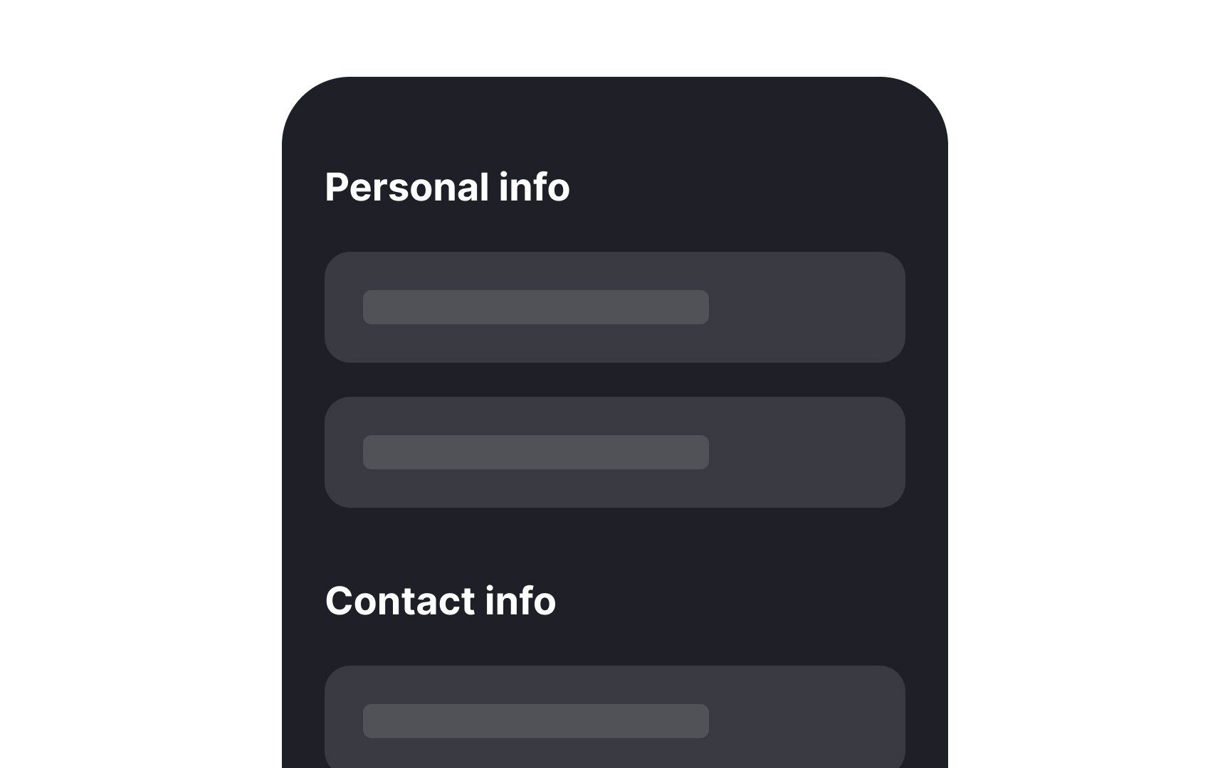
According to the principle of proximity, items that are placed near each other appear as one group and share similar attributes or functionalities.[3] Breaking down your form into logical groups, such as personal or billing information, eases the cognitive load and helps users complete forms faster and more effectively.
Use typography tools (headings, font weight, size) and spacing to separate groups, establish a solid visual hierarchy, and make forms more scannable.

Margins refer to the space that exists between elements. They create breathing room on the page, thereby helping eliminate visual clutter. If there's not enough spacing, forms feel cramped and are hard to scan.
To determine whether a form's
Pro Tip: Make sure the spacing is consistent between elements throughout the form.
On forms,
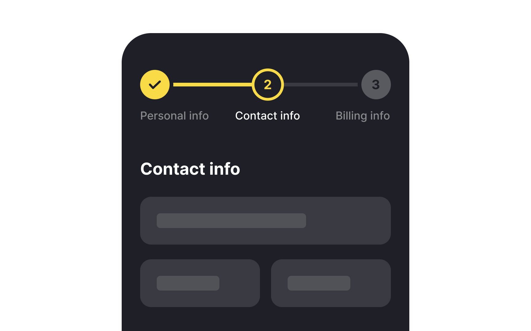
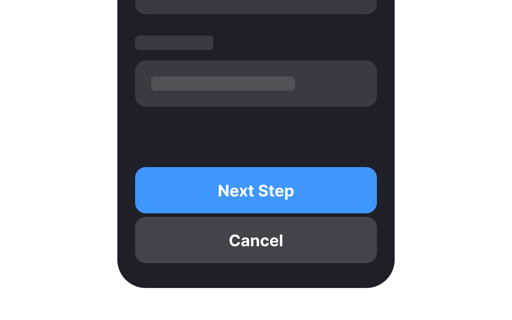
If your form includes at least 3 steps, such as a checkout form or an online survey, adding a progress tracker will give users an idea of how much more of the form they have left to fill out. Breaking down forms into multiple steps or
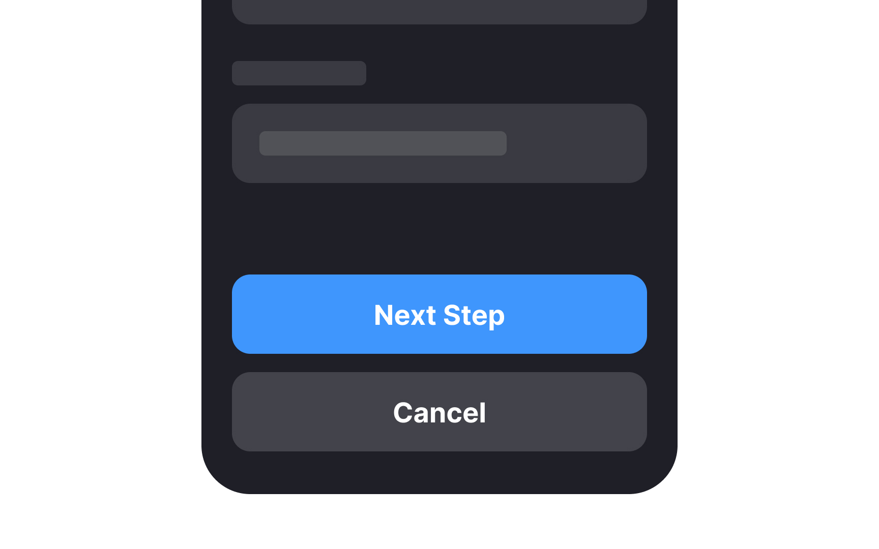
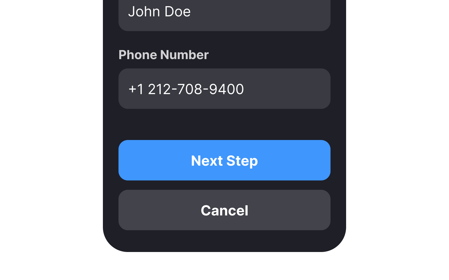
All forms require some kind of action. Primary action
At the same time, put yourself in the user’s shoes and finish the following sentence to come up with more descriptive
The primary action
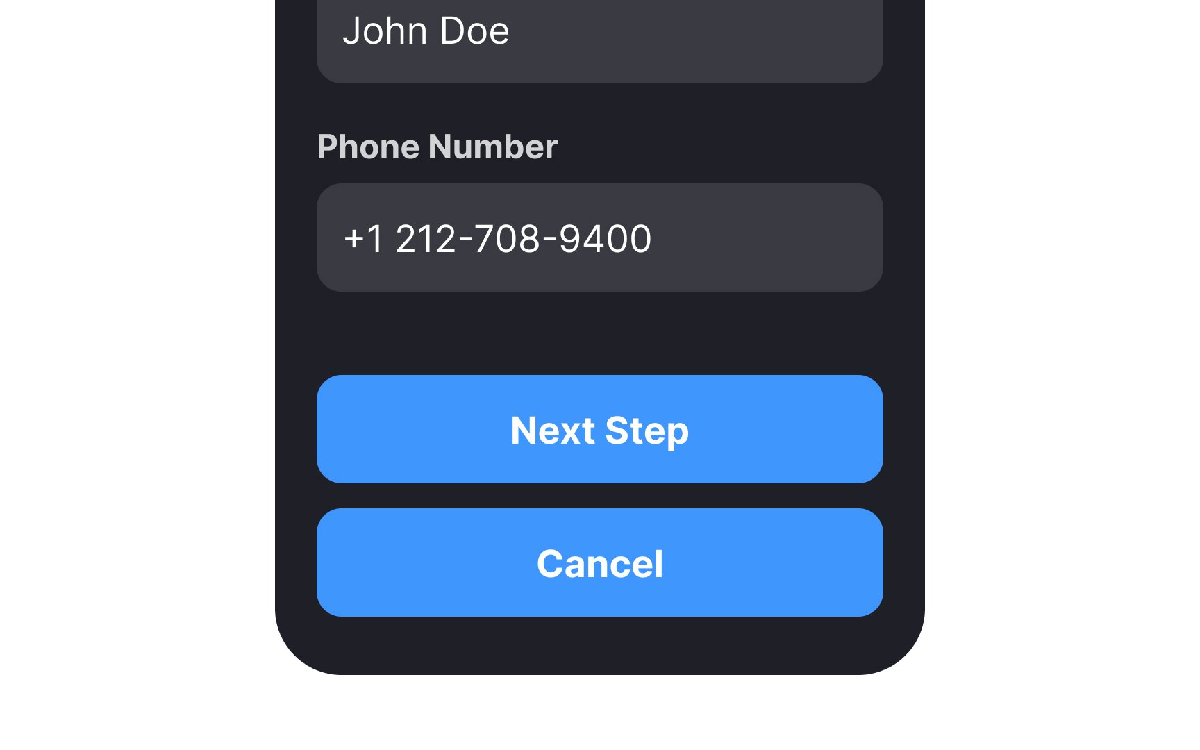
Secondary
Pro Tip: Be careful to not make secondary buttons look disabled.
References
- Website Forms Usability: Top 10 Recommendations | Nielsen Norman Group
- Proximity Principle in Visual Design | Nielsen Norman Group
Top contributors


Topics
From Course

Share


Similar lessons

Common UI Components Part I

Image Terminology
