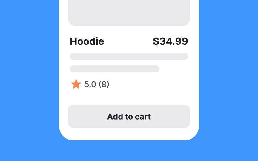
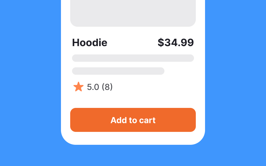
Buttons
Buttons are key interactive UI components found in dialogs, modals, forms, cards, and toolbars. Core principles for mobile button design:
- Provide adequate touch targets: Minimum size should be 44x44px (iOS) or 48x48dp (Android). Consider larger targets (around 54px) to accommodate users with varying motor skills[1]
- Space elements properly: Maintain at least 8dp/16px between interactive elements to prevent accidental taps
- Write clear labels: Use short, direct verbs that instantly convey the action. When needed, add explanatory text below for context. Example: On registration pages, explain that users can shop now and register later
- Maintain hierarchy: Distinguish between primary, secondary, and tertiary actions through visual styling. Use filled buttons for primary actions, and text buttons for secondary ones. Icons can support faster action recognition[2]


