Chart types and uses
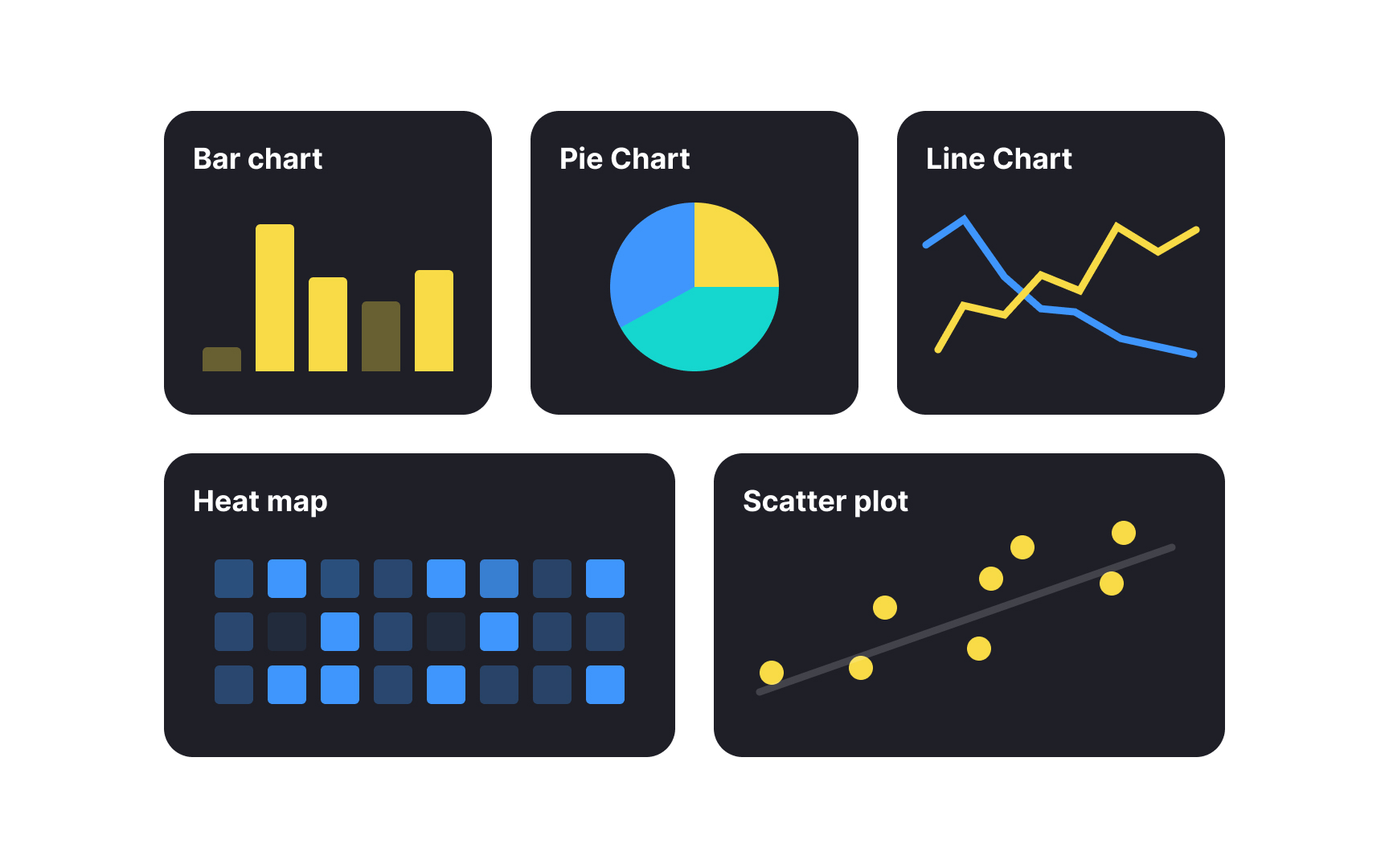
Different chart types serve specific purposes in communicating data effectively:
- Bar charts compare values across categories and work best for discrete comparisons such as monthly revenue by product or conversion rates by channel.
- Line charts reveal trends over time and excel at showing continuous data evolution like user growth or engagement metrics.
- Pie charts show how different parts make up a whole, like what percent of total sales came from in-store, online, and third-party channels.
- Heat maps use color intensity to visualize data density like displaying user click patterns on a website or showing peak usage hours.
- Scatter plots help identify relationships between two variables, making them ideal for correlation analysis like examining the connection between feature usage and retention.[1]
