Use basic components in wireframes
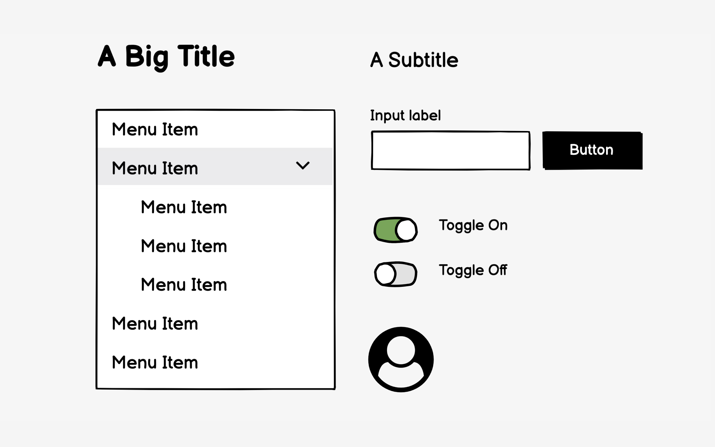
Wireframe components should communicate function, not style. A rectangle labeled "hero image" works better than a detailed photo mockup. Simple boxes with labels like "navigation menu" or "search bar" keep focus on layout and hierarchy rather than visual treatment that belongs in design phases.
Over-detailed wireframes create false precision. That perfectly styled dropdown menu suggests final design when you're still testing information architecture. Stakeholders start critiquing the border radius instead of questioning whether dropdowns are the right pattern. Basic shapes prevent these premature design discussions.
Consistency in your basic components improves comprehension. Use the same simple shapes throughout — for example, rectangles for images, squares for buttons, lines for text. This visual language helps viewers quickly understand element types without distraction. Save detailed component design for mockups where visual polish matters.
