Wireframes Usability Inspection
Learn how to conduct usability inspections on wireframes leading to actionable recommendations and iterative improvements
You might wonder why you need to test wireframes and not just the final product. Think of it as reviewing a 3D model or blueprint of a house before you begin building. You want to make sure that you don't have hallways leading to nowhere or forget to include a bathroom.
Testing final designs on an already functioning product means that you can only discover bad UX at the last stages of product development. At this point, revising and rebuilding may cost a fortune. You'll need to repeat some parts of the design process: generate new ideas, evaluate risks and constraints, collaborate with designers and developers, etc. That's why teams should start testing wireframes at the very early stages. Functionality is harder to test with static drafts, but you can certainly inspect key functions and user flows.
The best way to test wireframes is to get user feedback via user interviews or usability testing. However, recruiting users takes time and money that early-stage projects often lack. That's where usability inspection methods become invaluable.
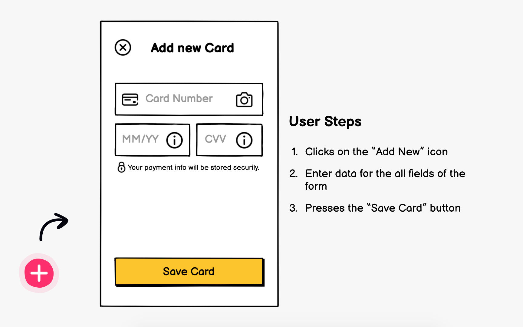
The inspection process involves evaluators systematically examining your
Common inspection methods include heuristic evaluation, cognitive walkthrough, feature inspection, and consistency inspection.[1] Each method approaches evaluation differently but shares the goal of uncovering usability issues before they reach users. The key advantage is speed and flexibility in your testing timeline.
At first glance,
However, there are some downsides:
- Theoretical principles, no matter how sound, don't capture the unpredictability of real user behavior. An expert might miss issues that become obvious when watching someone struggle with your interface.
- Evaluator bias presents another challenge. Even experienced professionals bring personal preferences and assumptions that color their assessment. What seems logical to an expert might confuse actual users, especially if evaluators don't deeply understand your specific audience's context and constraints.
- Additionally, usability principles evolve with technology and user expectations. Heuristics written decades ago might not address modern interaction patterns like gesture controls or voice interfaces. Smart teams adapt general principles to their specific product context rather than applying them blindly.
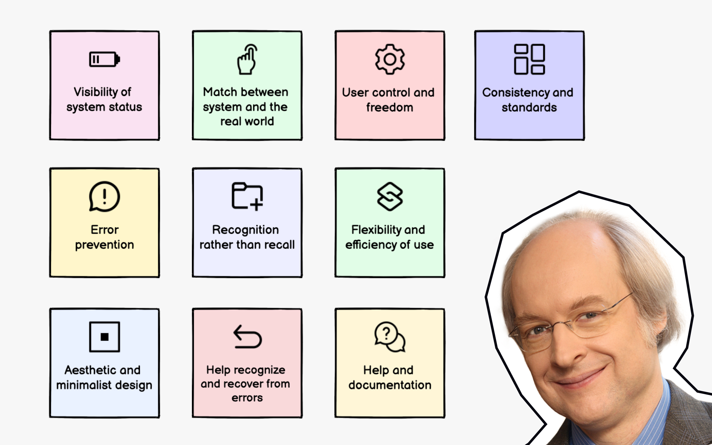
The 10 heuristics are:
- Visibility of system status
- Match between system and the real world
- User control and freedom
- Consistency and standards
- Error prevention
- Recognition rather than recall
- Flexibility and efficiency of use
- Aesthetic and minimalist design
- Help users recognize, diagnose, and recover from errors
- Help and documentation.[2]
During evaluation, experts examine each screen and interaction against these heuristics. They note violations and rate severity from cosmetic issues to usability catastrophes. For example, a missing back button violates "user control and freedom," while unclear error messages fail to "help users recognize, diagnose, and recover from errors." While created in the 1990s, these principles adapt well to modern interfaces.
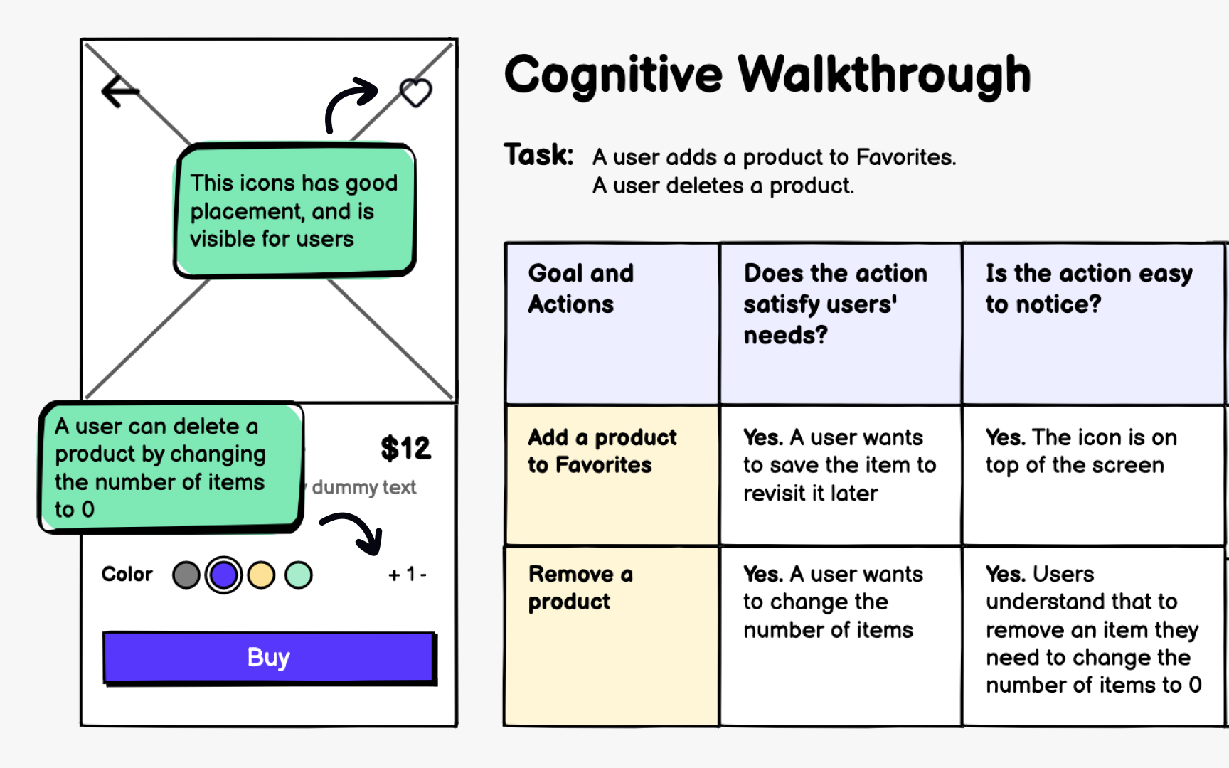
Cognitive walkthrough simulates how users navigate your interface to complete specific tasks. Evaluators step into user personas' shoes, attempting each action while asking critical questions about learnability and discoverability. This method excels at revealing first-time user struggles. The process involves defining user goals, then tracing each step required to achieve them.
At every interaction point, evaluators ask:
- Will users know what to do?
- Will they see the right control?
- Will they understand the feedback?
These questions uncover gaps between designer intentions and user understanding.
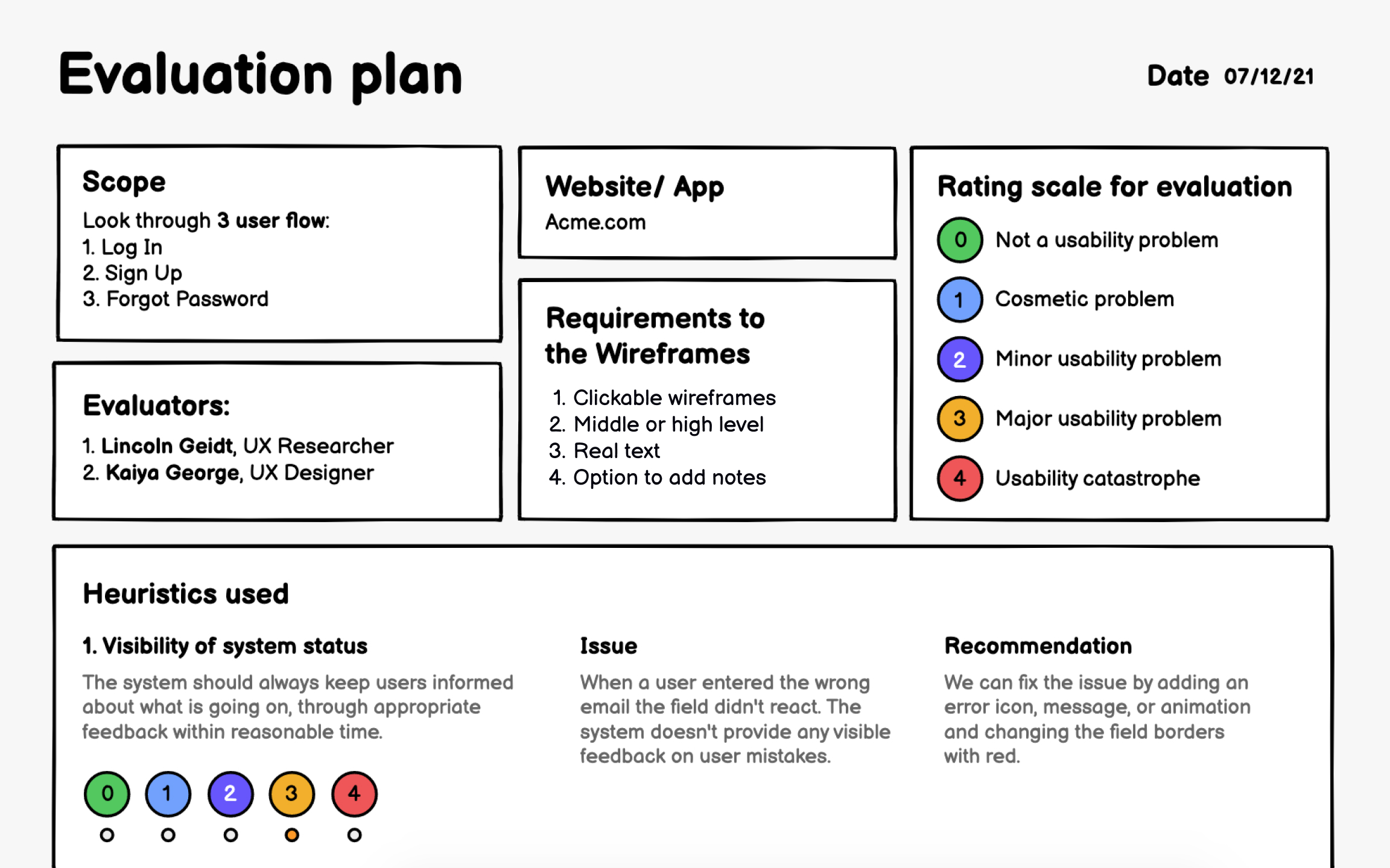
A solid evaluation plan transforms chaotic testing into systematic discovery. Without planning, you'll waste time testing random features while missing critical user journeys. Your plan should clearly define what you're testing, why it matters, and how you'll measure success.
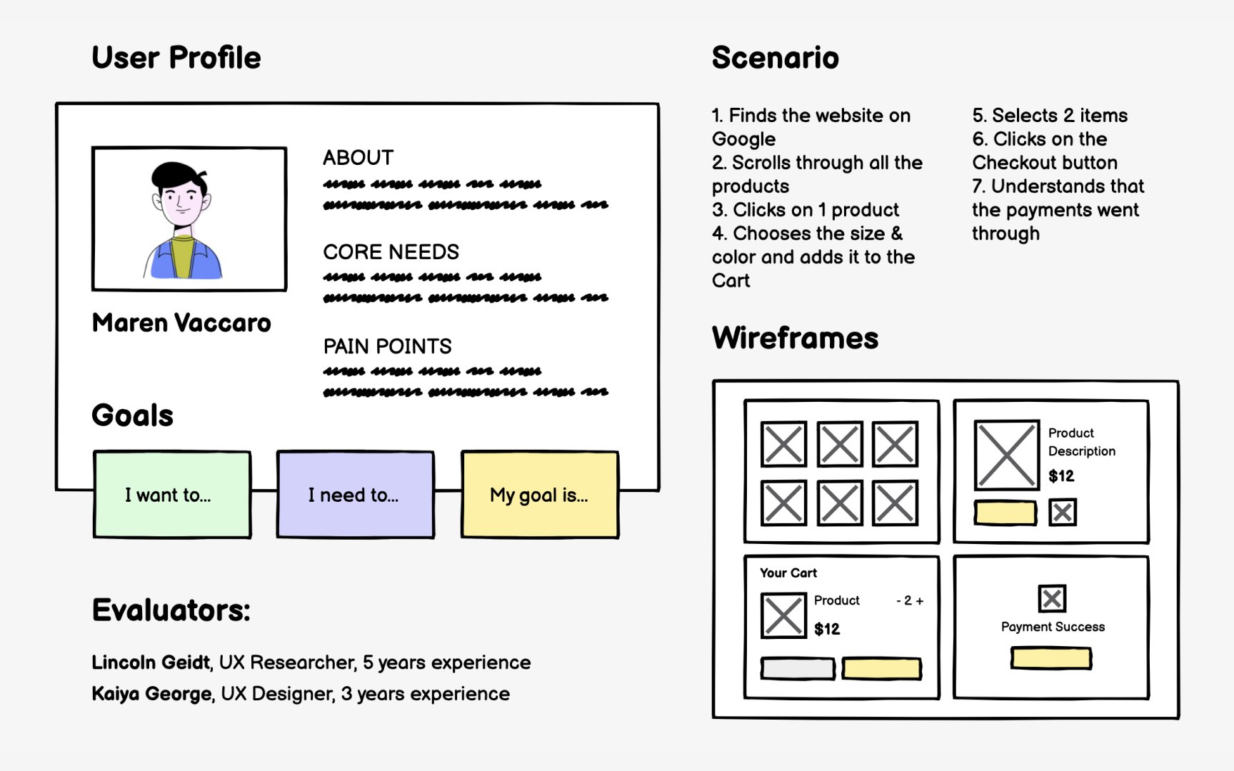
Start by defining the scope based on user priorities and business goals. You can't test everything at once, so focus on high-impact features and risky assumptions. Include user profiles, specific scenarios, relevant
Essential plan components include:
- User
personas representing your audience - Goals users want to achieve
- Scenarios showing task flows
- Wireframes covering these scenarios
- Qualified evaluators
- Evaluation criteria
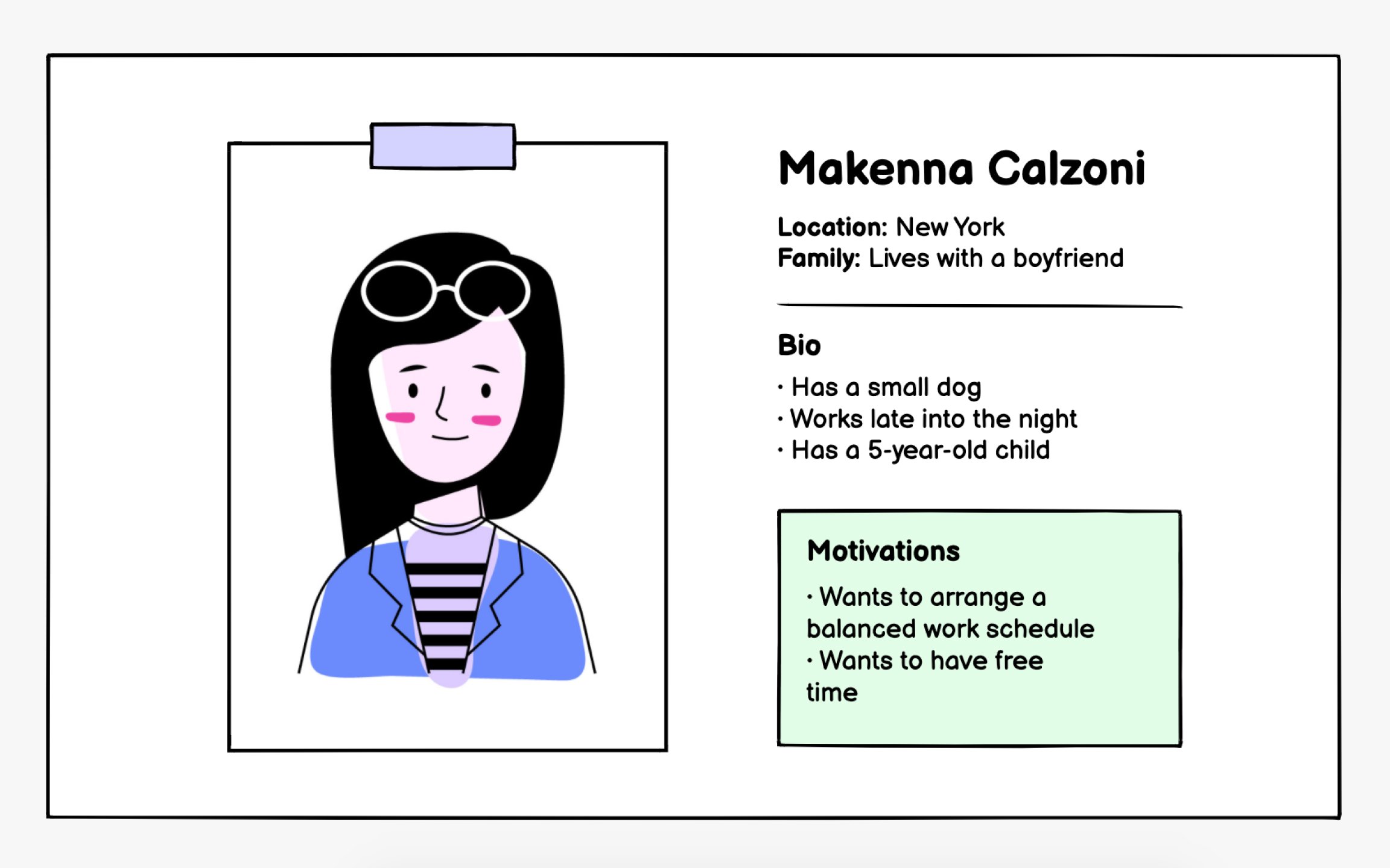
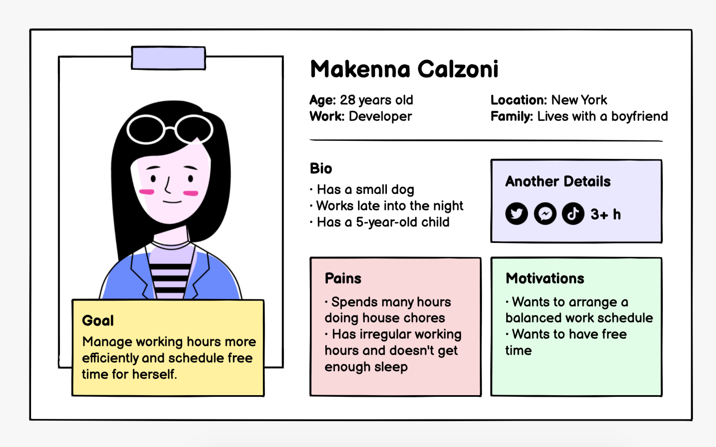
Build personas from real user data whenever possible. Analyze support tickets, conduct
Strong personas go beyond surface attributes to reveal decision-making factors. Instead of "Sarah, 35, marketing manager," create "Sarah, who needs quick campaign reports for weekly meetings but struggles with complex analytics tools." This context helps evaluators assess whether your
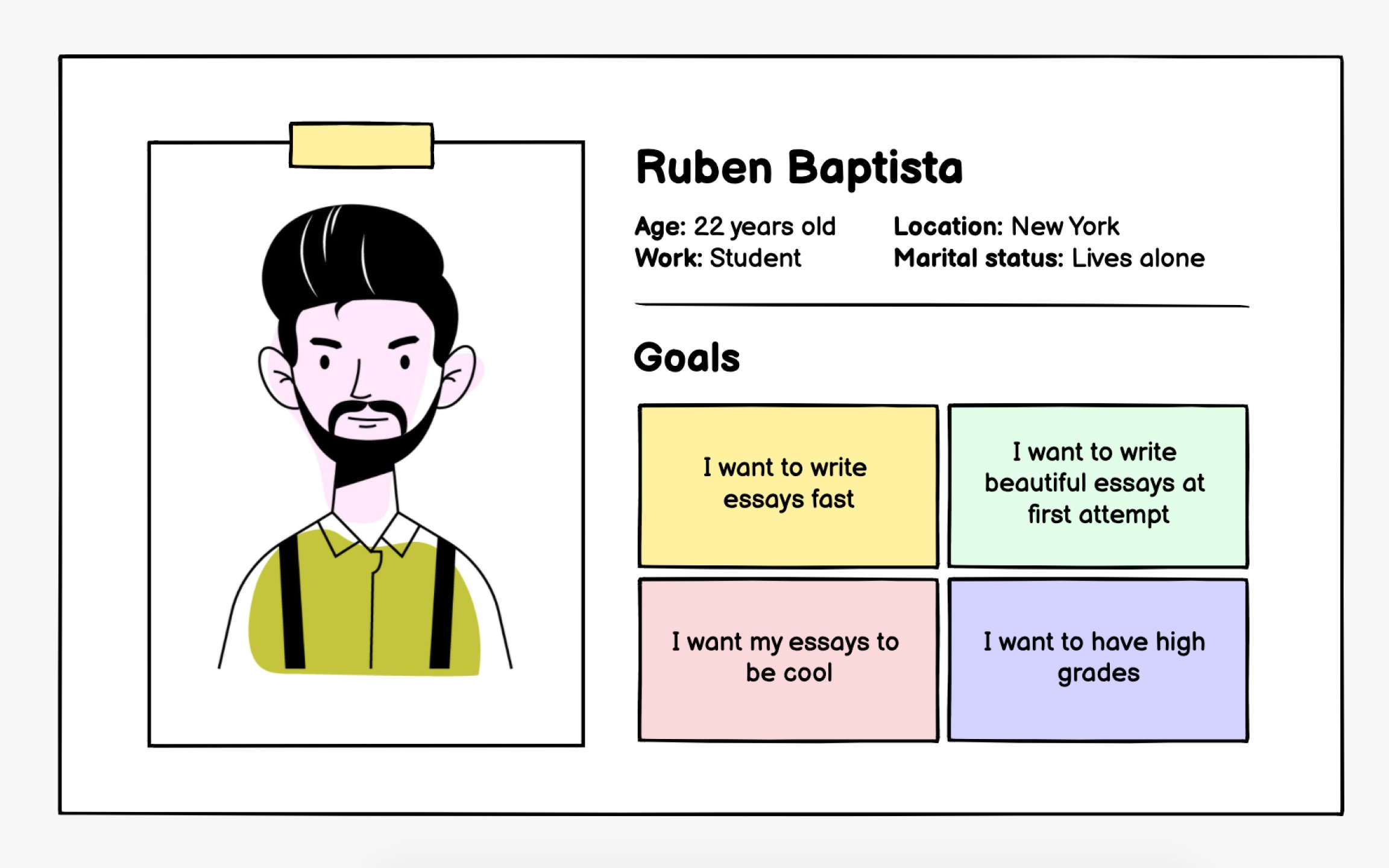
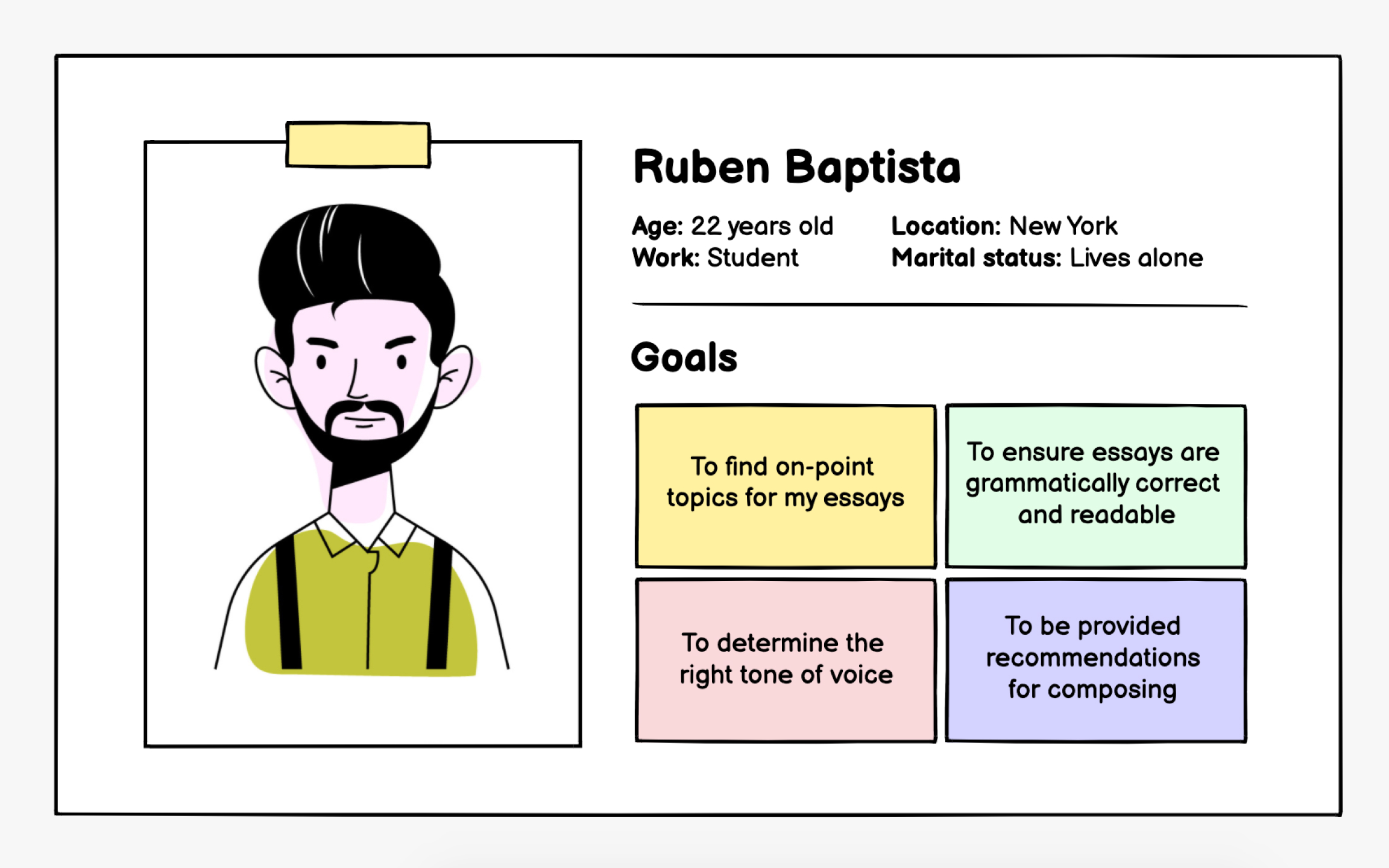
User goals drive every
Transform broad wishes into measurable objectives. "I want to be productive" becomes "I need to track time spent on client projects for accurate billing." This specificity helps evaluators assess whether your interface supports the goal efficiently. Each goal should connect directly to user value.
Well-defined goals typically include an action, context, and benefit. Structure them to highlight what users gain: "View spending patterns to identify saving opportunities" rather than just "See transaction history." This outcome-focused approach keeps evaluation centered on user success rather than feature completion.
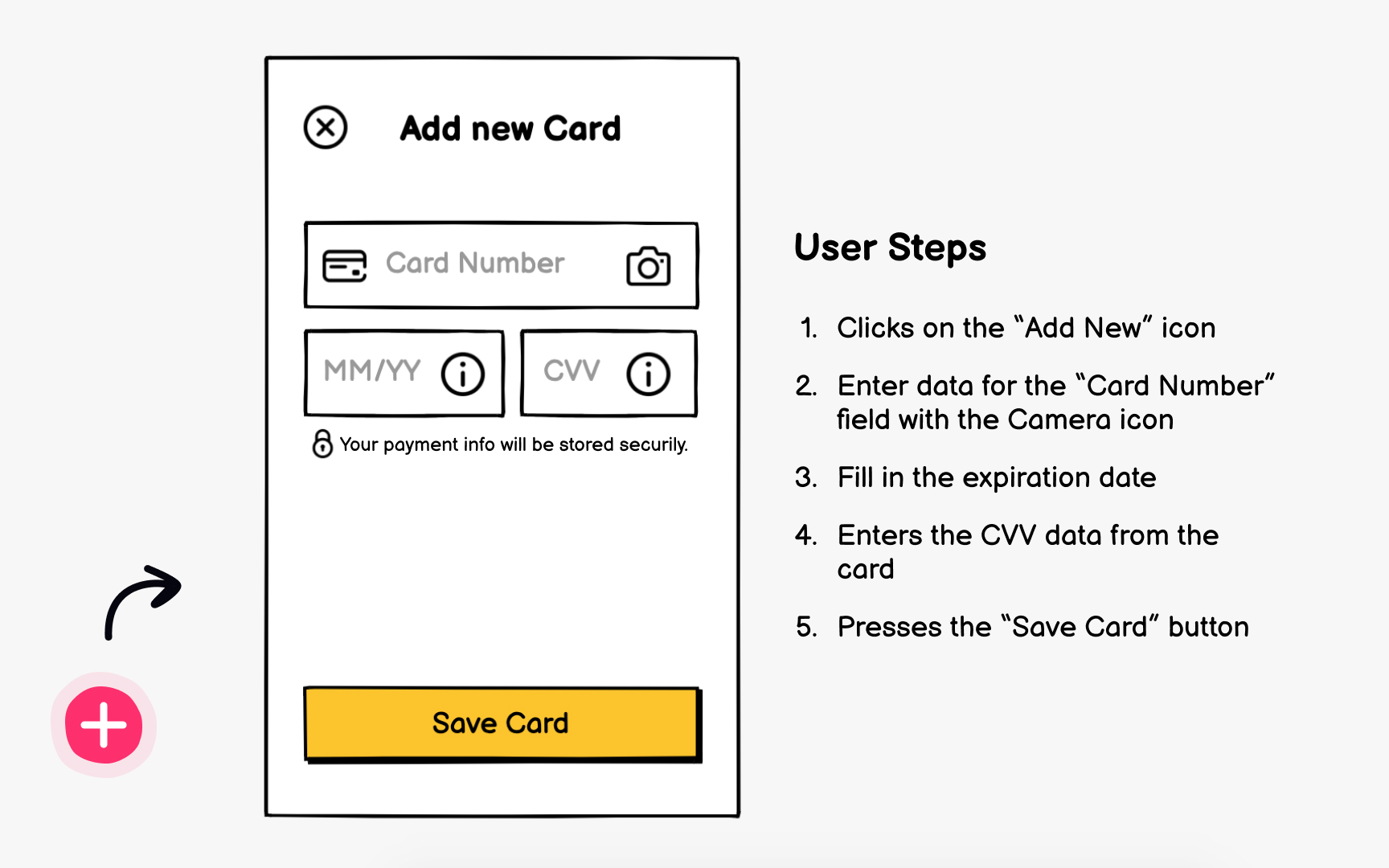
Scenarios translate user goals into concrete action sequences. They show exactly how someone moves through your interface to accomplish their objective. Good scenarios reflect realistic user behavior, including potential mistakes and alternative paths.
Build scenarios by asking the five Ws:
- Who performs this task?
- What do they want to achieve?
- When do they typically do this?
- Where are they located?
- Why does this matter to them?
Answers create context that shapes evaluation. A hurried mobile user needs different support than someone at a desktop.
Write scenarios in plain language, avoiding technical jargon that confuses stakeholders. "User clicks submit
Pro Tip: Avoid technical jargon when formulating actions. It will help all team members and stakeholders understand scenarios and provide feedback.
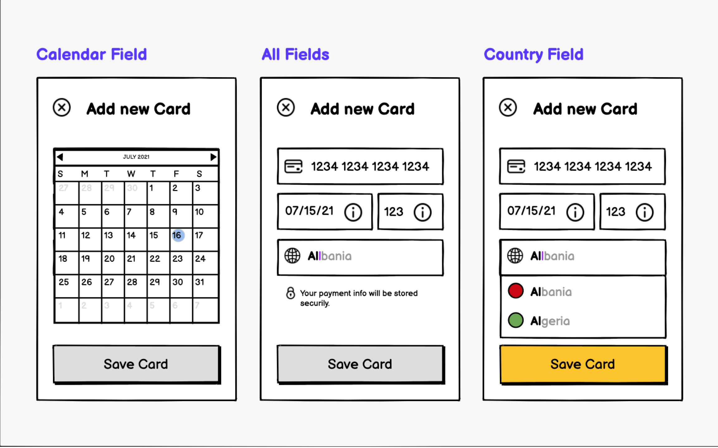
Your wireframes must support every step in your test scenarios. Missing screens or unclear transitions immediately reveal gaps in your design thinking. The fidelity level depends on what you're testing, but even rough sketches should cover complete user journeys.
Include enough detail for meaningful evaluation without getting lost in visual polish.
Interactive prototypes provide richer evaluation opportunities than static images. Click-through functionality lets evaluators experience flow and transitions. However, even paper sketches work if they include all screens and clearly show connections between steps. Completeness matters more than polish.


Evaluator selection significantly impacts inspection quality. Ideal evaluators combine
Consider mixing evaluator types for comprehensive coverage. Include usability specialists for methodological rigor, designers from other teams for fresh perspectives, and subject matter experts who understand your domain. Each brings different strengths: usability experts catch principle violations while domain experts spot workflow issues.
Ensure evaluators understand your user
Systematic
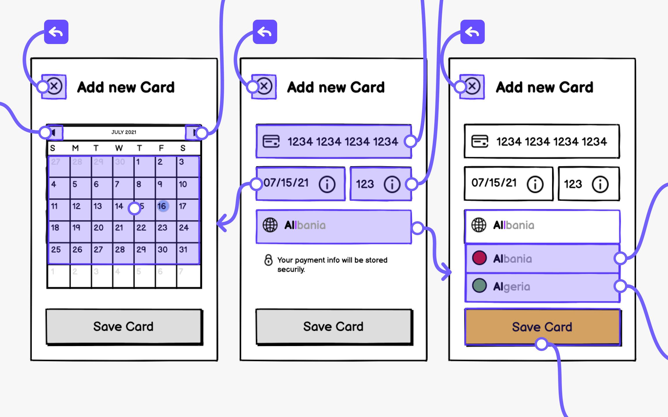
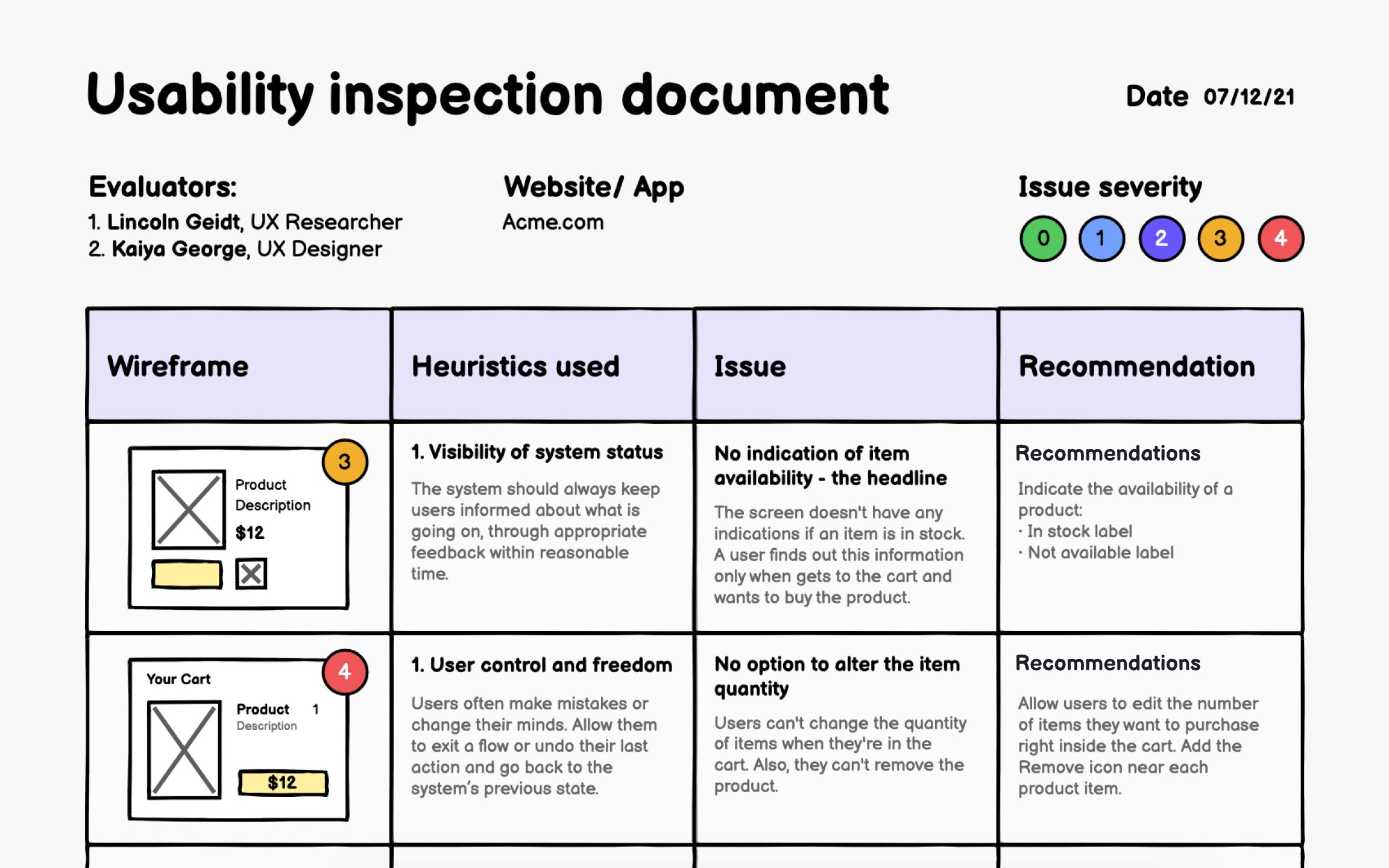
For heuristic evaluation, document:
- Affected
wireframe or element - Violated
heuristic - Severity rating (cosmetic to catastrophic)
- Improvement recommendations
- Include screenshots with annotations showing exact problem locations
This precision helps designers understand and address issues efficiently. Organize findings by severity and frequency rather than discovery order. Prioritization helps teams tackle critical issues first when time constraints limit fixes. Link related issues that might share solutions. Clear documentation also creates a reference for future iterations and similar projects.
Pro Tip: Create a findings template before inspection starts to ensure consistent documentation across evaluators.
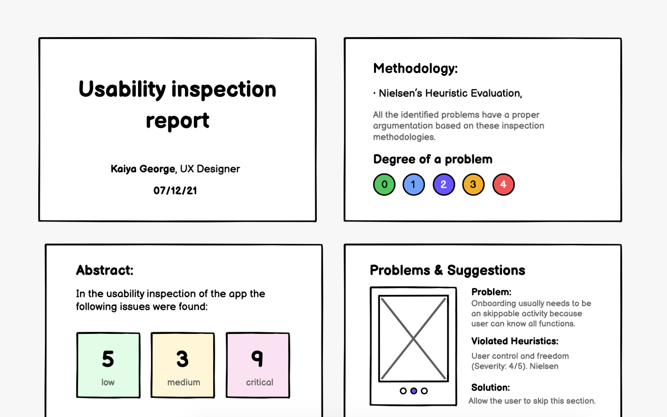
Your inspection report transforms raw findings into a compelling case for improvement. Stakeholders need more than a list of problems; they need to understand impact and see clear paths forward. Effective reports balance comprehensive
Structure reports to serve different audiences. Start with an executive summary highlighting critical issues and their user impact. Follow with detailed findings organized by severity or user journey. Include specific examples showing how problems manifest and proposed solutions with effort estimates.
Make recommendations actionable and specific. "Improve
Pro Tip: Include positive findings too. Knowing what works well is as valuable as identifying problems.
References
- Usability Inspection Method Summary: Article by Jakob Nielsen | Nielsen Norman Group
- 10 Usability Heuristics for User Interface Design | Nielsen Norman Group
Top contributors


Topics
From Course

Share


Similar lessons

Intro to Wireframing

Wireframe Fidelity
