Intro to Design Formats
Explore the diverse landscape of design formats and their applications
Design formats play a crucial role in shaping the visual presentation and organization of content in various mediums. From print materials to digital interfaces, understanding different design formats empowers designers to make informed decisions that optimize the delivery of information and create engaging user experiences.
In this lesson, we will explore the diverse landscape of design formats and their applications. We'll examine how different formats, such as brochures, posters, websites, and mobile apps, require distinct considerations to effectively communicate and captivate their intended audience.
By gaining insight into the characteristics and possibilities of each format, you'll be equipped with the knowledge to select the most suitable format for your design project. We'll also delve into the principles and strategies for structuring content within each format, maximizing readability, visual impact, and user engagement.
The format of a design defines its overall composition — the spatial constraints within which you’ll create your design. Think of the format as an artist’s canvas. For UX designers, the format is usually determined by the device you’re designing for — phone, tablet, desktop, TV, etc. And when you rotate that device, it changes from portrait to landscape, and the design constraints change accordingly. For graphic designers, formats can be of any shape and depend on what you're designing for: packaging, ads, banners, book illustration, etc.
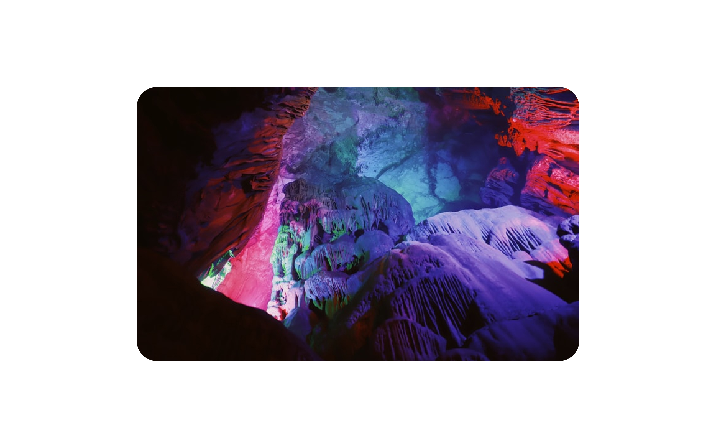
The rectangular format is also referred to as the "quadro" — an Italian word meaning painting or picture.
This is the most popular format for designing mobile and web products. It's easy to construct, frame, and display. Additionally, many human-made objects are rectangular — TV's, phones, and computer screens. We have been designing on rectangular formats for millennia, using paper, canvases, and even walls to express ourselves.
When a rectangular format is wider than it is tall, we refer to it as landscape format. This type of format is more natural for us since our eyes are aligned horizontally and we live in a horizontal plane. We’ve also grown accustomed to it because most pre-mobile device displays (TVs, computer monitors, movie screens, etc.) were landscape-oriented.
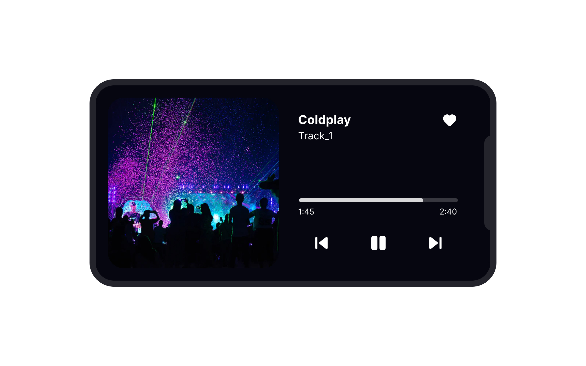
With most designing digital products, especially those meant to be used on a desktop or laptop, landscape format will be the default starting point. On products meant for a mobile audience, landscape may take a backseat to portrait format due to people’s reluctance to turn their phones.[1]
When a rectangle’s height is larger than its width, you’re looking at a portrait format. This format naturally encourages us to scan a
People have a tendency to keep their phone in portrait orientation even when viewing
Pro Tip: Orientation affects how we perceive the subject. Use the portrait format to emphasize vertical elements.
As you may imagine, the square format has the same height and width. The square has 4 axes of symmetry — the vertical, the horizontal, and the two diagonals. As a result, a user's gaze moves in a circle, not along the axes. The central subject is surrounded by equal space from all sides. The square format is great for balanced, symmetrical
Pro Tip: Use the square format when you want to draw attention to the center composition.
A circle is the universal symbol of completeness. As it has an infinite number of symmetry axes, it creates a sense of harmony and balance. In turn, this circular format separates and insulates a
Artists have favored the oval format when creating portraits for a very long time. It makes sense because the format perfectly complements a human face or bust outline. In turn, web designers often use this format in buttons or decorative elements, leading the eye along an elliptical path throughout the
Considering landscape formats are most common on desktop displays, it’s no surprise that horizontal elements dominate those UIs. Things like horizontal images, many logos, and navigation bars tend to work better with a landscape orientation. And some elements — like inputs or search bars — have to be horizontal in order to work correctly.
Vertical elements are an excellent way to save space in your
Desktop displays have taken advantage of horizontal layouts for decades. But as smartphones have grown in size and functionality, horizontal layouts have become more important for mobile devices.
While some users will keep their phones in portrait mode regardless of what they’re doing on their phones, many others will rotate their phones for certain tasks. Consider how creating a horizontal
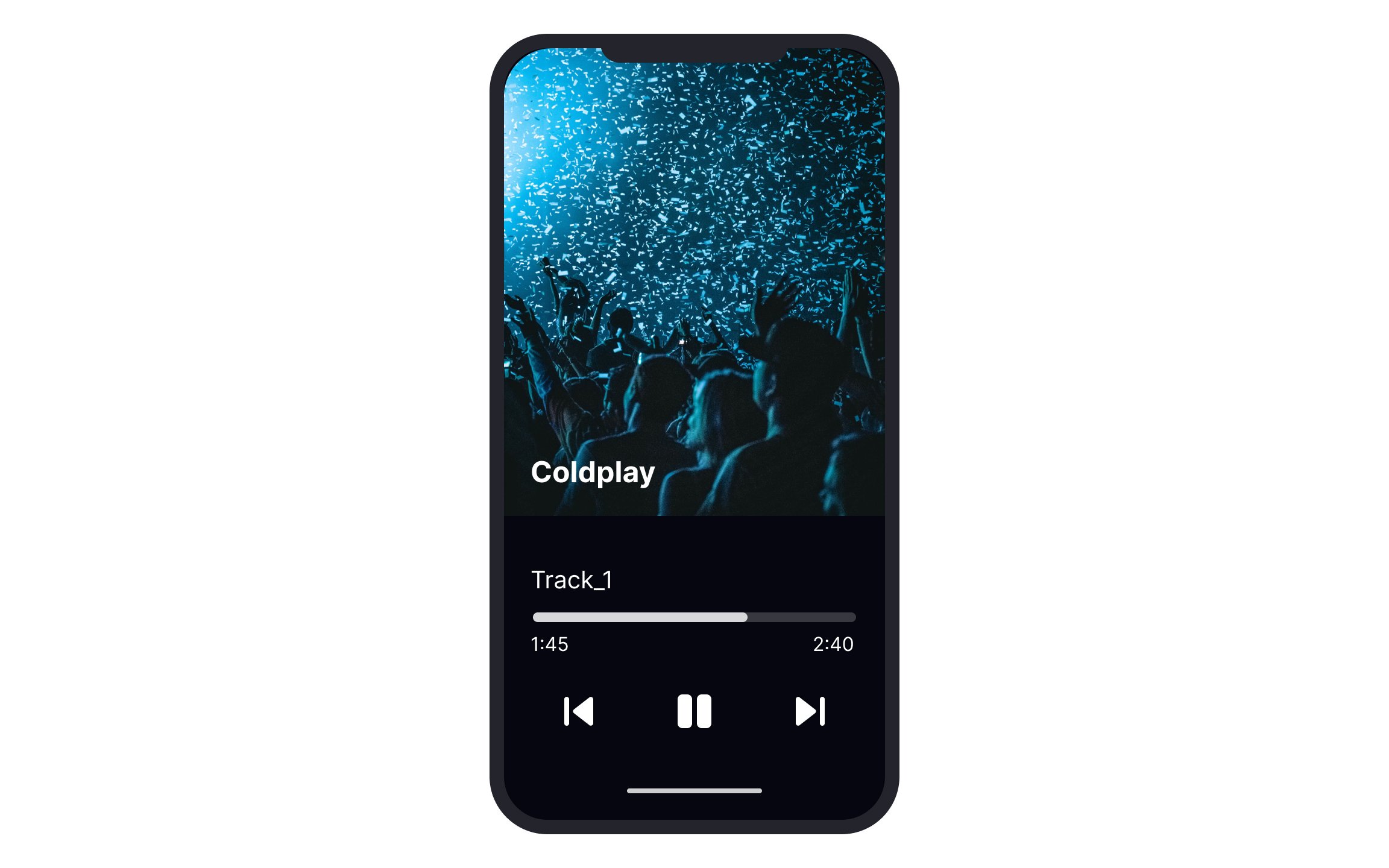
Vertical layouts, also known as portrait layouts, are the default orientation for smartphones, and the way the vast majority of people hold their phones. For that reason, a lot of apps stick to this
While vertical layouts limit the amount of horizontal space you can use, you’ve got virtually limitless vertical depth to take advantage of. Just realize that not every user will scroll endlessly.
References
- Video Looks Most Natural Horizontally, but We Hold Our Phones Vertically | Scientific American
Top contributors


Topics
From Course

Share


Similar lessons

Intro to Design Layouts

Intro to Design Grids
