CSS Length Units
Explore the diverse range of CSS length units and learn how to effectively utilize them to define sizes and distances, enabling precise control over the layout and styling of your web pages
Many CSS properties take "length" values — for example, width
, margin
, padding
, font-size
, etc. In the current CSS syntax, absolute length units like cm
or in
are fixed and mapped directly to pixels, and relative length units like em
or vw
specify a length relative to another length property.
While in some instances, certain units are preferred over others when setting a specific property, the choice of units primarily depends on the output media — whether it's a screen or paper.
Knowing CSS units is crucial in webpage design and implementation for both web-developers and designers. Let us take a closer look at the most popular CSS length units and their common use cases.
Px stands for
CSS pixels are also called reference pixels. The W3C CSS specification defines a CSS pixel as the visual angle of one pixel on a device with a pixel density of 96 PPI (pixels per square inch) and a distance from the reader of an arm's length.[1] It means that the CSS pixel dimension depends on the distance between the viewer and the display. At the same time, an element whose size is set in CSS pixels will look the same on different quality screens.
Pixels are a canonical measurement on the web because browsers handle them consistently, and other absolute length units map directly to pixels — for example, 1px=1/96in.
"In" stands for
But how often is CSS used for creating printed media? Actually, quite often. A common
Cm stands for
There's a lot of
Mm means
Millimeters and other absolute units are not recommended for use on-screen because screen sizes vary a lot. For example, the same 60x60mm image will look different on a 24in desktop display and a 6in smartphone screen, not to mention that users look at them from different distances.
Pt stands for
Pc stands for
A length set in percentage (%) is based on the length of the same yellow-box
is the child of the purple-box
. No matter how much the width of the purple-box
(parent) changes, the width of the yellow-box
(child) will always be 90% of that.
Percentage isn't technically a length unit, but it's similar to relative length units that specify a length relative to another length property. Percentage and relative length units are great for both screen and print media types and are the most frequently used
Pro Tip: When developing for the web, you'll mostly be using %
, px
and em
.
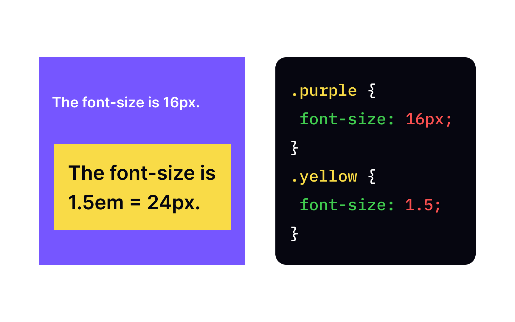
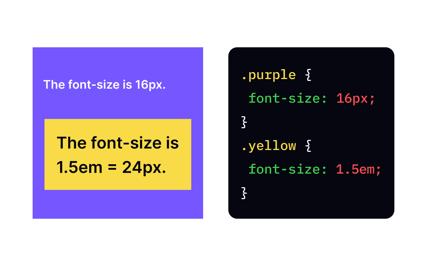
Em is a relative length unit equal to the specified font-size
of the element. In the example, we have a parent element purple
with the declaration font-size: 16px;
, and its child yellow
with font-size: 1.5em;
, which means that the child element's font size will be 24px.
Keep in mind that em units multiply upon themselves when applied to the font-size
yellow
and set its font-size
to 1.5em, the actual font size will be 16 x 1.5 x 1.5 = 36px.
Em allows specifying a variety of typographic parameters like spacing, kerning or tracking, so they're proportional to the font size used.
Rem stands for root em, and it's another relative unit based on em
, it doesn't refer to a direct parent, but the font size of the entire rem
. In contrast to em
, even in complex structure, rem
doesn't require many calculations as it's not affected by inheritance as em units are.
The rem unit acts as an em
on the entire document scale. On web pages, setting an element's dimensions in rem
allows you to scale the font size with JavaScript. When constructing scalable macro-typographic schemes, rem
is used to maintain specific proportions of the font size of individual elements, the spacing between them and the line spacing.
Ex is a relative length unit that refers to the x-height of a given font — the height of a lowercase x. As you can probably guess, it's another length unit that came to ex
is helpful in the area of microtypography — for example, to determine the position of superscript and subscript characters. The x-height can be a reference point for controlling the size of icons or bullets used in the text or to size inline
Vw stands for viewport width — a percentage of the full width of the browser window. 1vw resolves to 1% of the current viewport width. For example, if the viewport is 50cm wide, 1vw=1/2cm.
The difference between %
and vw
is most similar to the difference between em
and rem
. A %
length is relative to the containing element width, while a vw
length is relative to the full width of the browser window.
It's become very popular to use viewport units for responsive
Vh stands for viewport height — a percentage of the full viewport height, where 1vh is 1% of the current viewport height. This unit is useful when sizing boxes that adapt to different window sizes. For example, you can use vh
to set a maximum height of an
References
- Fun with Viewport Units | CSS-Tricks | CSS-Tricks